Sherwin Williams Delightful SW 6289
Contentsshow +hide -
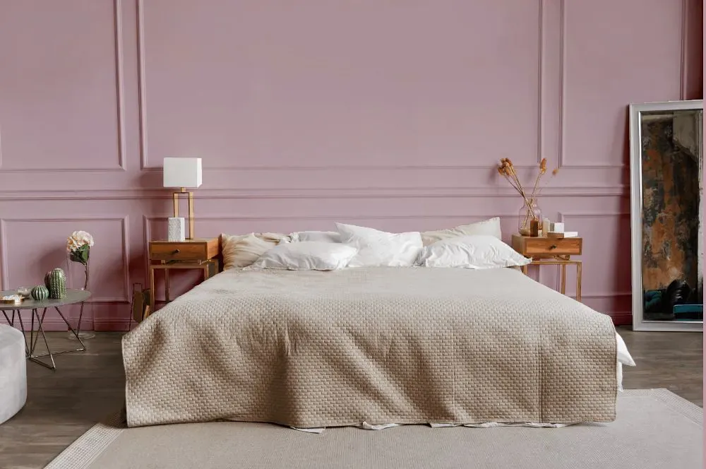
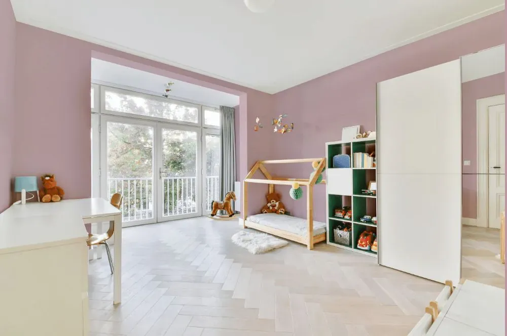
- Delightful for bedroom (1 photo)
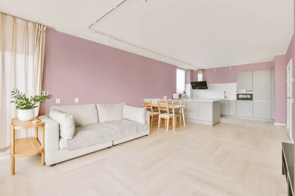
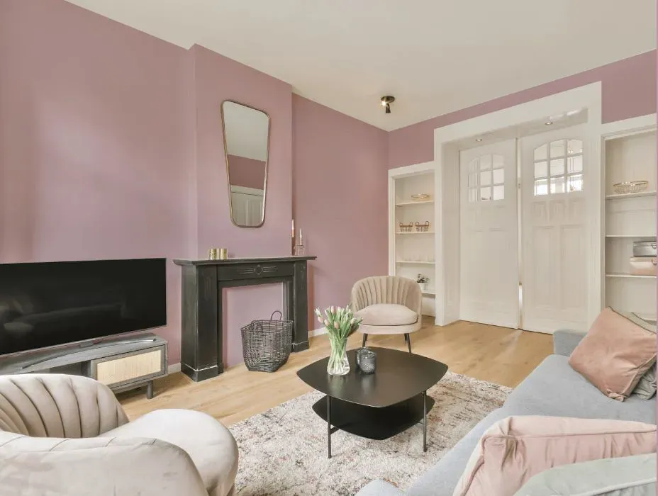
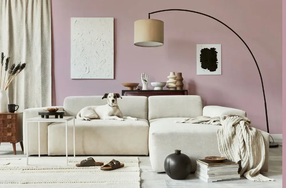
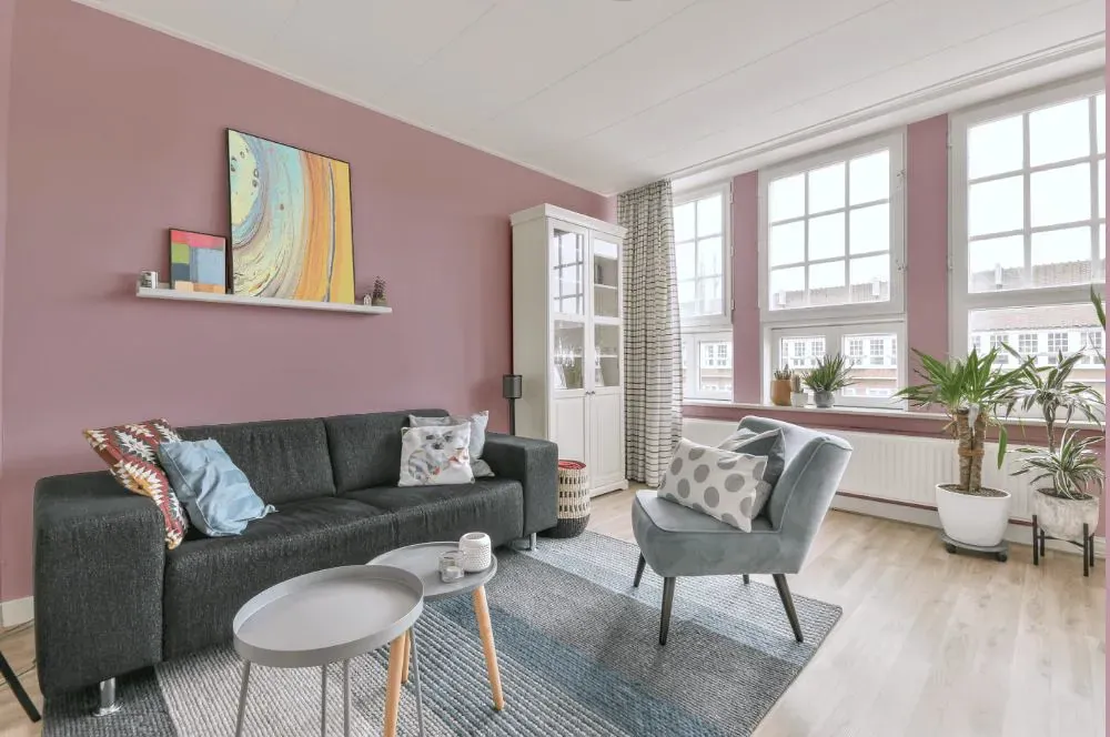
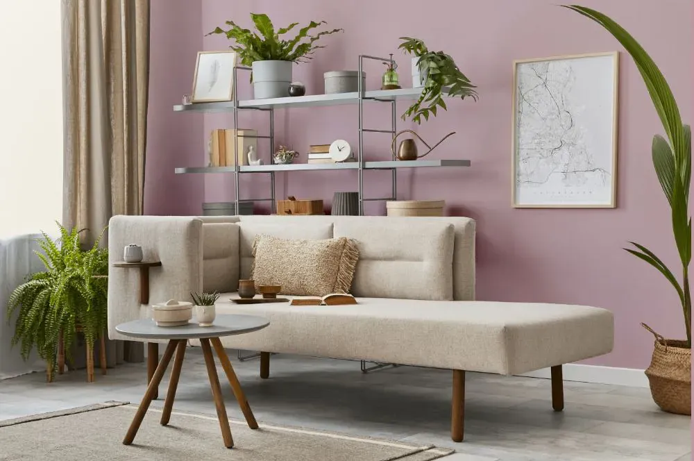
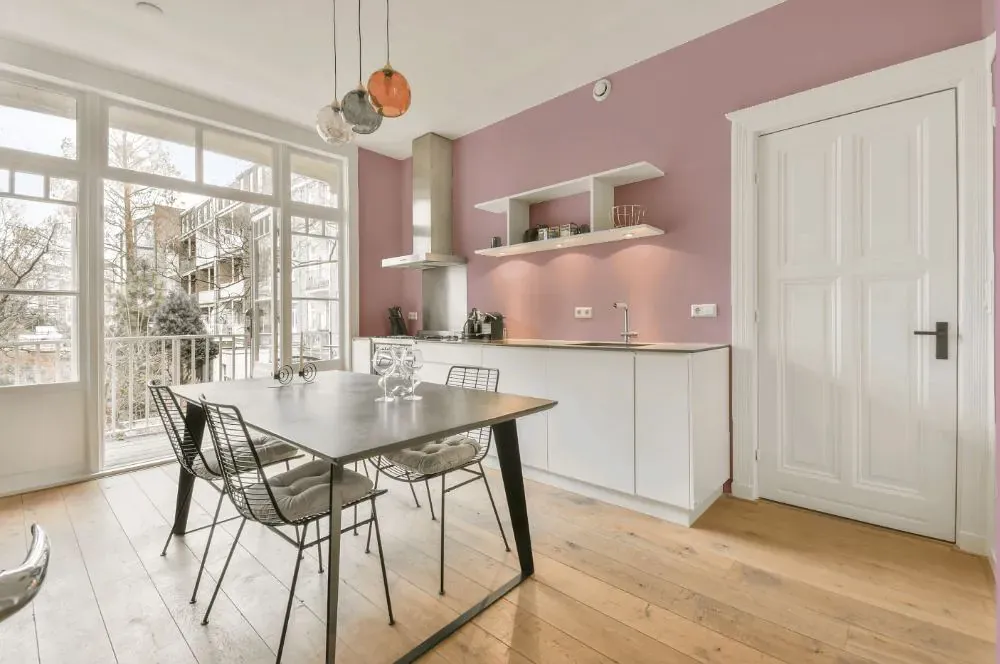
- Delightful for living room (7 photos)
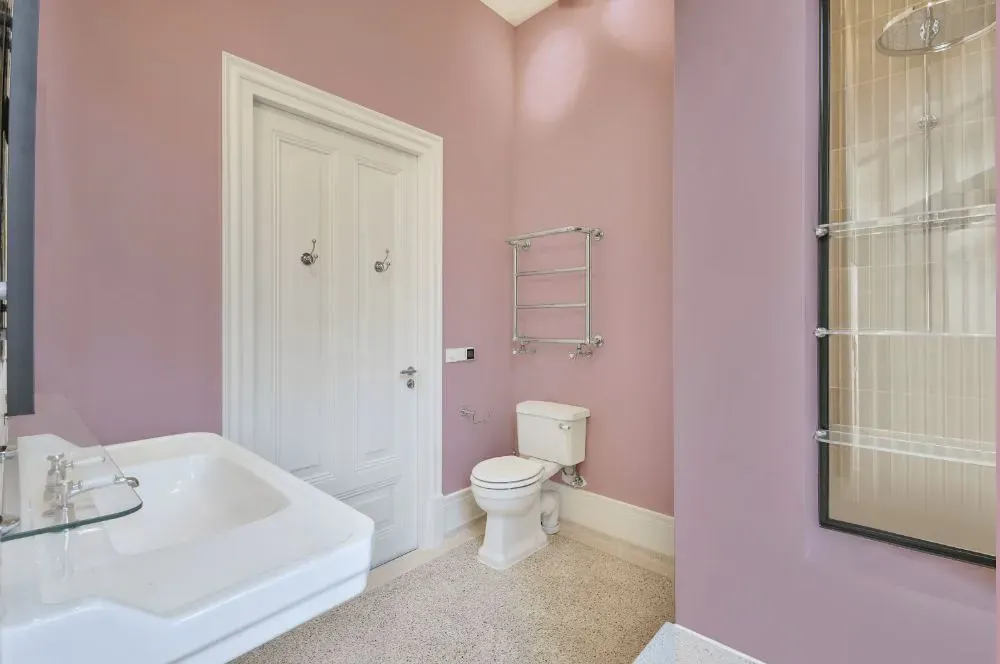
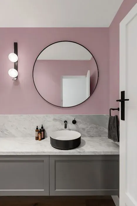
- Sherwin Williams Delightful for bathroom (2 photos)
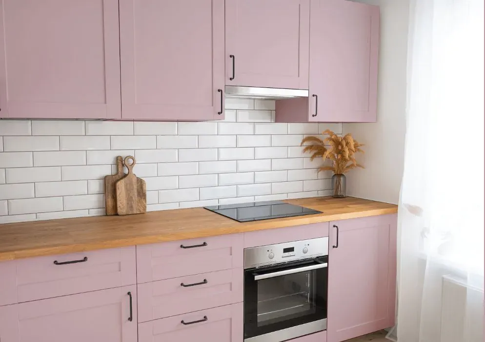
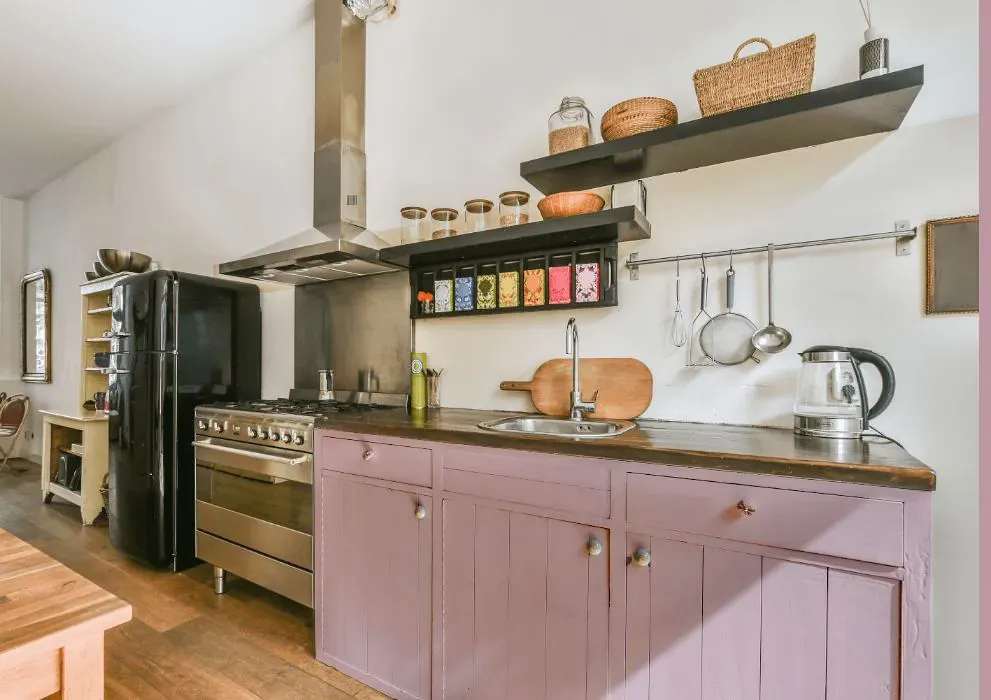
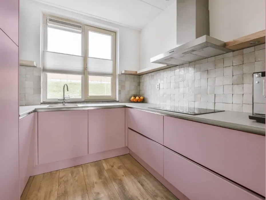
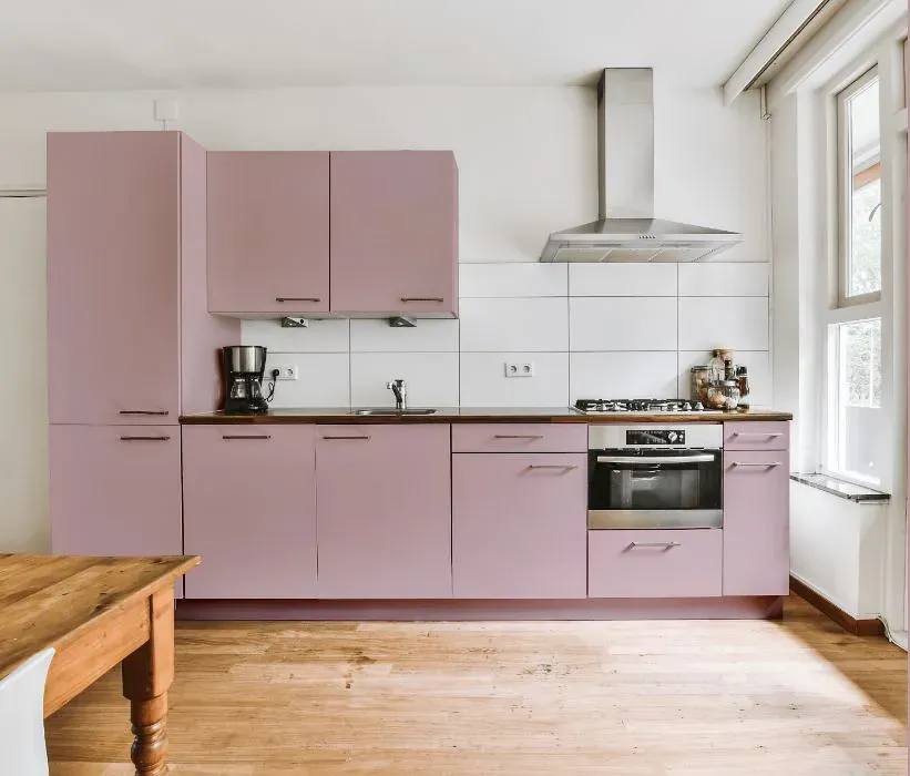
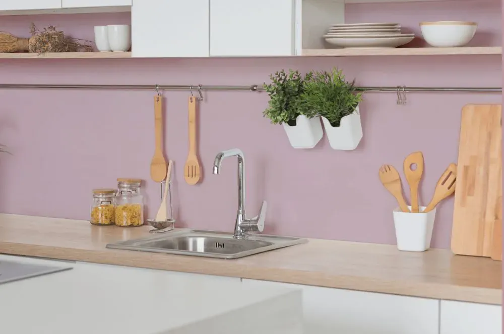
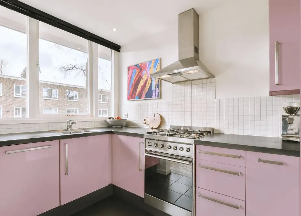
- Sherwin Williams SW 6289 on kitchen cabinets (4 photos)
- Sherwin Williams Delightful reviews (9 photos)
- What are Sherwin Williams Delightful undertones?
- Is Delightful SW 6289 cool or warm?
- How light temperature affects on Delightful
- Monochromatic color scheme
- Complementary color scheme
- Color comparison and matching
- LRV of Delightful SW 6289
- Color codes
- Color equivalents
| Official page: | Delightful SW 6289 |
| Code: | SW 6289 |
| Name: | Delightful |
| Brand: | Sherwin Williams |
| Collections: | Living Well, 2019 Naturalist |
What color is Sherwin Williams Delightful?
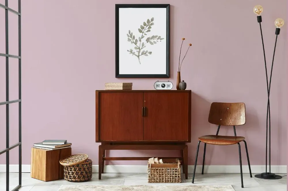
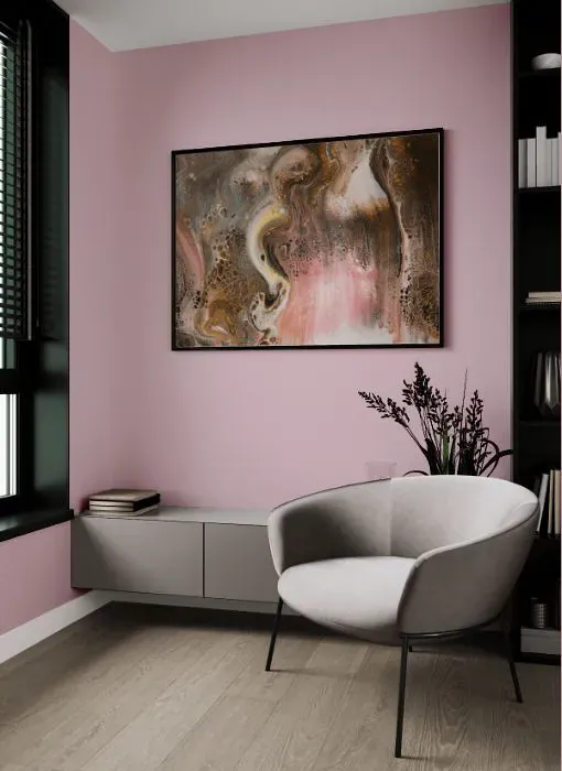
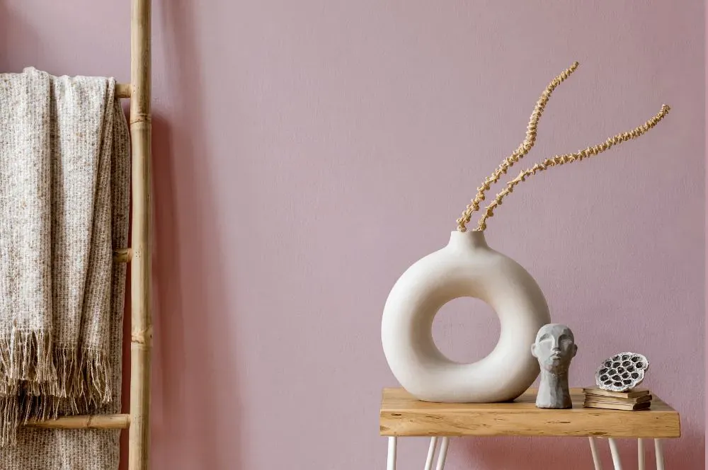
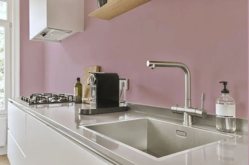
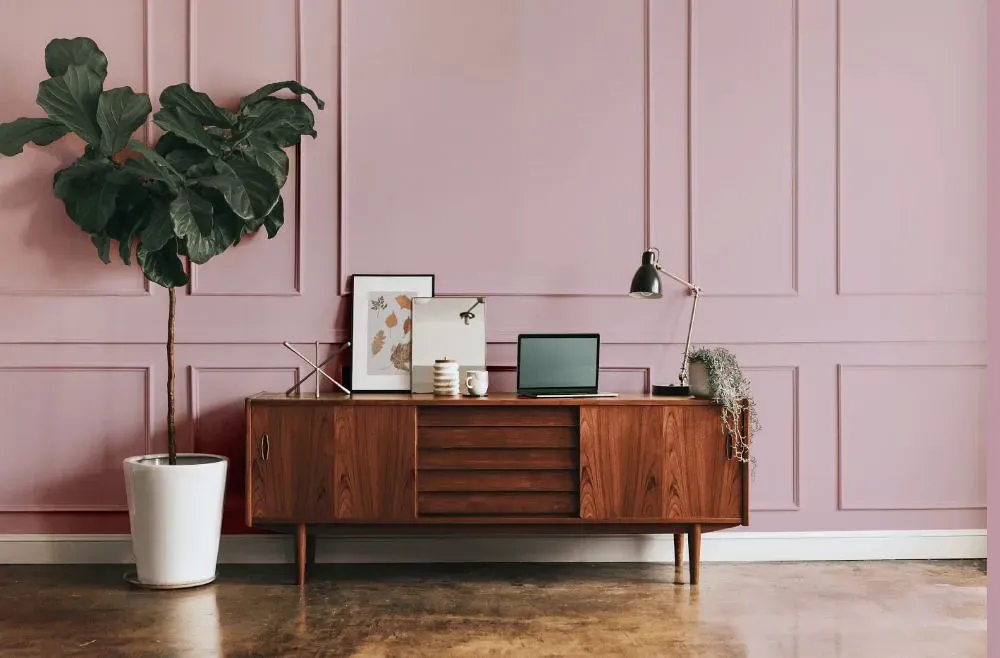
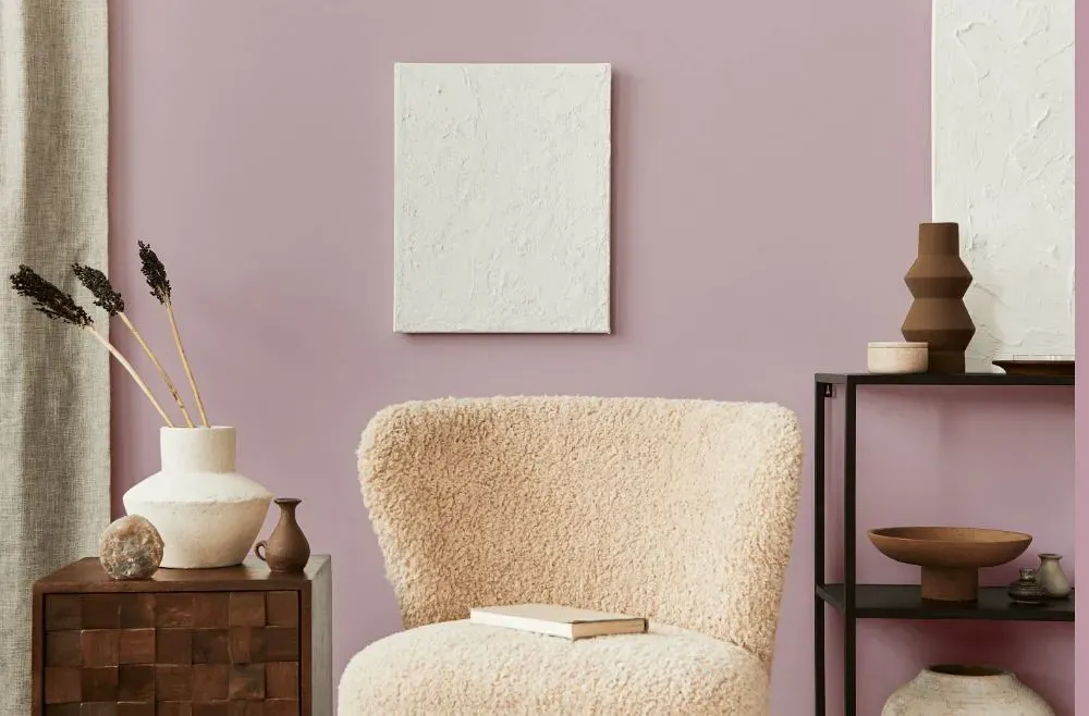
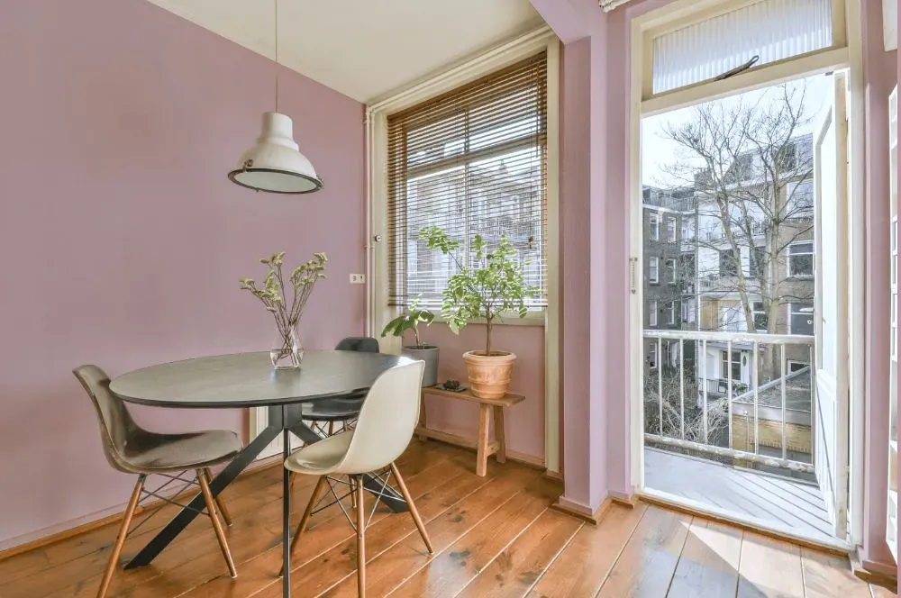
Sherwin Williams Delightful SW 6289 is a light, muted pink with a noticeable gray cast that keeps it from reading overly sweet. Its soft mauve-lavender undertone can become clearer in cooler daylight, while warm bulbs bring out a slightly rosier, powdery appearance. Delightful has enough depth for full walls in a bedroom, dressing area, or powder room without feeling heavy. Pair it with creamy white trim, pale oak, brushed nickel, and charcoal accents for a grounded contrast. On cabinetry or a single accent wall, this shade gives a restrained wash of color alongside warm neutrals and natural linen.
Loading...
LRV of Delightful
Delightful has an LRV of 50.81% and refers to Light Medium colors that reflect half of the incident light. Why LRV is important?

Light Reflectance Value measures the amount of visible and usable light that reflects from a painted surface.
Simply put, the higher the LRV of a paint color, the brighter the room you will get.
The scale goes from 0% (absolute black, absorbing all light) to 100% (pure white, reflecting all light).
Act like a pro: When choosing paint with an LRV of 50.81%, pay attention to your bulbs' brightness. Light brightness is measured in lumens. The lower the paint's LRV, the higher lumen level you need. Every square foot of room needs at least 40 lumens. That means for a 200 ft2 living room you'll need about 8000 lumens of light – e.g., eight 1000 lm bulbs.
Color codes
We have collected almost every possible color code you could ever need.
Not sure what the difference between HEX and RGB is? We break down color models in plain language. Understanding color models
| Format | Code |
|---|---|
| HEX | #d2b6be |
| RGB Decimal | 210, 182, 190 |
| RGB Percent | 82.35%, 71.37%, 74.51% |
| HSV | Hue: 343° Saturation: 13.33% Value: 82.35% |
| HSL | hsl(343, 24, 77) |
| CMYK | Cyan: 0.0 Magenta: 13.33 Yellow: 9.52 Key: 17.65 |
| YIQ | Y: 191.284 I: 14.114 Q: 8.413 |
| XYZ | X: 52.599 Y: 50.876 Z: 55.751 |
| CIE Lab | L:76.604 a:11.348 b:-0.34 |
| CIE Luv | L:76.604 u:16.129 v:-2.518 |
| Decimal | 13809342 |
| Hunter Lab | 71.328, 6.808, 3.588 |