Farrow and Ball Charlotte's Locks 268
Contentsshow +hide -
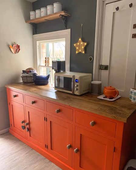
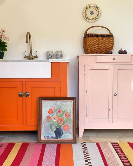
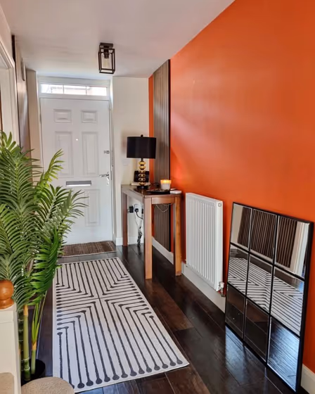
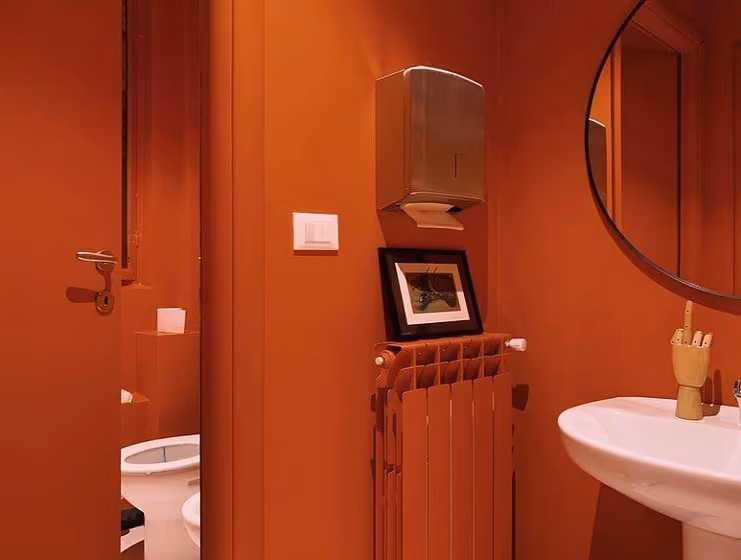
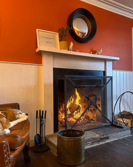
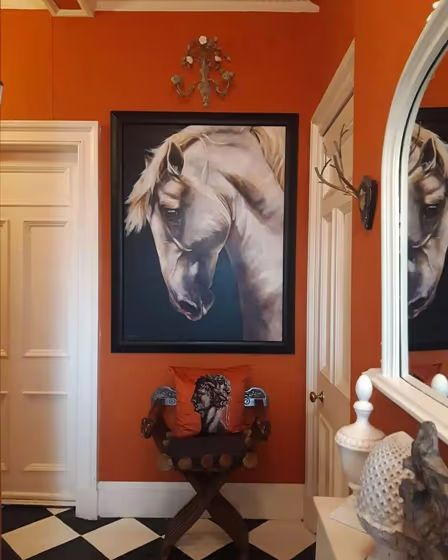
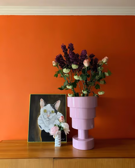
- Farrow and Ball Charlotte's Locks reviews (11 photos)
- What are Farrow and Ball Charlotte's Locks undertones?
- Is Charlotte's Locks 268 cool or warm?
- How light temperature affects on Charlotte's Locks
- Complementary color scheme
- Color comparison and matching
- LRV of Charlotte's Locks 268
- Color codes
- Color equivalents
| Official page: | Charlotte's Locks 268 |
| Code: | 268 |
| Name: | Charlotte's Locks |
| Brand: | Farrow and Ball |
What color is Farrow and Ball Charlotte's Locks?
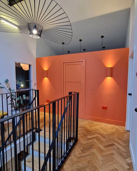
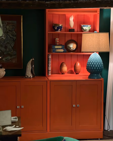
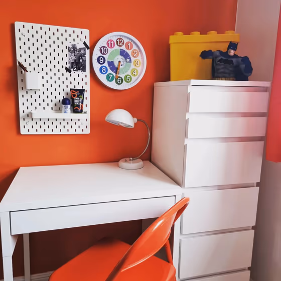
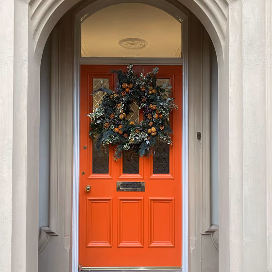
Enhance your space with Farrow and Ball 268 Charlotte's Locks, a bold and vibrant hue that exudes confidence and style. This rich color can be beautifully complemented by soft neutrals like Pointing and Cornforth White to create a balanced and sophisticated palette. For a more daring look, consider pairing Charlotte's Locks with St Giles Blue or Brinjal for a striking contrast that makes a statement. Whether used as an accent or a focal point, this versatile color lends a touch of warmth and character to any room.
Loading...
LRV of Charlotte's Locks
Charlotte's Locks has an LRV of 21.29% and refers to Medium colors that reflect a lot of light. Why LRV is important?

Light Reflectance Value measures the amount of visible and usable light that reflects from a painted surface.
Simply put, the higher the LRV of a paint color, the brighter the room you will get.
The scale goes from 0% (absolute black, absorbing all light) to 100% (pure white, reflecting all light).
Act like a pro: When choosing paint with an LRV of 21.29%, pay attention to your bulbs' brightness. Light brightness is measured in lumens. The lower the paint's LRV, the higher lumen level you need. Every square foot of room needs at least 40 lumens. That means for a 200 ft2 living room you'll need about 8000 lumens of light – e.g., eight 1000 lm bulbs.
Color codes
We have collected almost every possible color code you could ever need.
Not sure what the difference between HEX and RGB is? We break down color models in plain language. Understanding color models
| Format | Code |
|---|---|
| HEX | #d65f3d |
| RGB Decimal | 214, 95, 61 |
| RGB Percent | 83.92%, 37.25%, 23.92% |
| HSV | Hue: 13° Saturation: 71.5% Value: 83.92% |
| HSL | hsl(13, 65, 54) |
| CMYK | Cyan: 0.0 Magenta: 55.61 Yellow: 71.5 Key: 16.08 |
| YIQ | Y: 126.705 I: 81.838 Q: 14.592 |
| XYZ | X: 32.669 Y: 22.822 Z: 7.098 |
| CIE Lab | L:54.888 a:44.691 b:41.727 |
| CIE Luv | L:54.888 u:94.124 v:35.648 |
| Decimal | 14049085 |
| Hunter Lab | 47.772, 38.467, 24.631 |