Farrow and Ball Sand CC2
| Code: | CC2 |
| Name: | Sand |
| Brand: | Farrow and Ball |
| Collections: | California Collection |
What color is Farrow and Ball Sand?
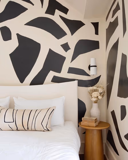
Step into a world of timeless elegance with Farrow and Ball CC2 Sand. This warm and inviting color brings a sense of tranquility to any space, making it perfect for bedrooms and living rooms. CC2 Sand pairs beautifully with both traditional and modern interiors, creating a versatile backdrop for stylish furnishings and decor. Embrace the natural simplicity of CC2 Sand in your home and transform your space into a sanctuary of comfort and sophistication.
Farrow and Ball Sand reviews
View the photos of real spaces painted with this that were not included in specific categories.Close-ups, painted furniture, storages and dressers, hallways, stairs and ceilings.
Try before you buy

100% accurate
reusable paint samples
Peel, stick,
and repeat
Twice painted
with real paint
Next day
delivery
What are Farrow and Ball Sand undertones?
The undertone of Sand can be accurately described as a Red hue, as is apparent from the color space provided. By isolating the pure hue and eliminating any tints, tones, and shades, we were able to precisely determine its undertone. This approach has proven to be more accurate than traditional methods of defining undertones on a white background, which are now considered outdated.
HEX value
HEX value:
#E2D7C1
RGB code:
226, 215, 193
Is Farrow and Ball Sand CC2 cool or warm?
With a hue of 40° thisBeigerefers warm paint shade according to HSL (Hue, Saturation, Lightness) on the color wheel.
CC2 Sand HSL code: 40, 36%, 82%
Hue - degree on a color wheel from 0 to 360. 0 is red, 120 is green, and 240 is blue.
Saturation is expressed as a percentage. At 0%, it appears as a shade of grey, and at 100%, it is in full color..
Lightness is also a percentage value. 0% is black, and 100% is white.
- Warm colors are ideal for kitchens, living rooms or bathrooms
- Warmer hues make larger spaces feel more inviting
- Warm beige shades create a cozy and inviting atmosphere, making any room feel comfortable and welcoming, perfect for living rooms, bedrooms, and hallways.
- To prevent a space from feeling too monotonous, consider pairing warm light shades with richer tones like deep greens or browns, or adding textures through fabrics and furnishings. Avoid using them in rooms with limited natural light, as they may appear too dull or yellowish
Act like a pro: Mixing warm and cool shades is a must have to get harmonius interior. Add accents that contrast with the primary color to create visual balance. If your walls are a warm color, don’t forget to add accent in cold colors (furniture, art, décor). A good practice is too use a complementary color scheme.
How light temperature affects Sand
Natural Lighting. During the day, natural light shifts from about 2000 K at sunrise/sunset to 5500–6500 K at noon.
In addition, natural‑light temperature depends on its direction:
| Direction of sunlight | Visible temp. | Hue | Duration |
|---|---|---|---|
| North | Cool | Bluish | All day |
| East | Warm | Yellow | Before noon |
| West | Warm | Orange‑red | After noon |
| South | Warm | Orange‑yellow | All day |
Artificial Lighting. When choosing bulbs, pay attention to their color‑temperature (Kelvins).
Use the slider to see how this Beige shade looks under different lighting:


4000K
Coordinating colors.
Colors that go with Farrow and Ball Sand:
Monochromatic color scheme
This scheme consists of various shades, tints, and tones of a single color. While it offers a perfect combination of hues, without accent décor it may become monotonous.
Lighter shades
CC2
Sand
Darker shades
Complementary color scheme
This color scheme is a combination of two shades that are opposite each other on the color wheel. The high contrast between these colors creates a vibrant and dynamic visual effect. For the color Sand with a orange hue, complementary colors are those with a blue hue close to 220, such as Farrow and Ball Wine Dark and Stiffkey Blue.
LRV of Sand
Sand has an LRV of 68.39% and refers to Light colors that reflect most of the incident light. Why LRV is important?
Light Reflectance Value measures the amount of visible and usable light that reflects from a painted surface.
Simply put, the higher the LRV of a paint color, the brighter the room you will get.
The scale goes from 0% (absolute black, absorbing all light) to 100% (pure white, reflecting all light).
Act like a pro: When choosing paint with an LRV of 68.39%, pay attention to your bulbs' brightness. Light brightness is measured in lumens. The lower the paint's LRV, the higher lumen level you need. Every square foot of room needs at least 40 lumens. That means for a 200 ft2 living room you’ll need about 8000 lumens of light – e.g., eight 1000 lm bulbs.
Color codes
We have collected almost every possible color code you could ever need. To copy the code, just click the icon to the right of it.
| Format | Code | |
|---|---|---|
| HEX | #e2d7c1 | |
| RGB Decimal | 226, 215, 193 | |
| RGB Percent | 88.63%, 84.31%, 75.69% | |
| HSV | Hue: 40° Saturation: 14.6% Value: 88.63% | |
| HSL | hsl(40, 36, 82) | |
| CMYK | Cyan: 0.0 Magenta: 4.87 Yellow: 14.6 Key: 11.37 | |
| YIQ | Y: 215.781 I: 13.624 Q: -4.519 | |
| XYZ | X: 65.289 Y: 68.621 Z: 60.243 | |
| CIE Lab | L:86.316 a:0.15 b:12.217 | |
| CIE Luv | L:86.316 u:7.781 v:17.864 | |
| Decimal | 14866369 | |
| Hunter Lab | 82.838, -4.281, 14.868 |
Color equivalents
Hay Bale
Dulux
45YY 75/110
Elderflower Tea
Dulux
12079
Gleam
Jotun
153
Clay - Mid
Little Greene

RAL 1013
Oyster white
RAL Classic

3
Off-White
Farrow and Ball

1
Lime White
Farrow and Ball

1519
Vanilla Latte
Jotun

2013
Matchstick
Farrow and Ball

45YY 67/120
Salisbury Stones 4
Dulux
29
Beauvais Lilac
Little Greene

40YY 67/087
Bleached Lichen 3
Dulux

33YY 65/106
Rolled Oats
Dulux

Milled Flour
Dulux
40YY 76/112
Bracken Salts 5
Dulux
282
Shadow White
Farrow and Ball

30YY 67/084
Sandy Steps
Dulux
269
Green Stone - Light
Little Greene


