Tikkurila Flamingo K319
Contentsshow +hide -
| Code: | K319 |
| Name: | Flamingo |
| Brand: | Tikkurila |
What color is Tikkurila Flamingo?
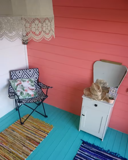
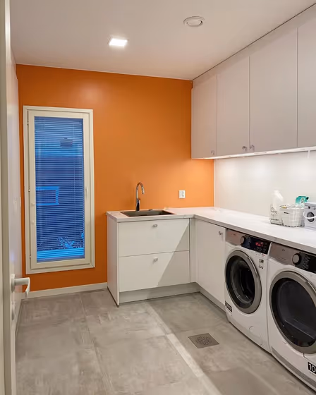
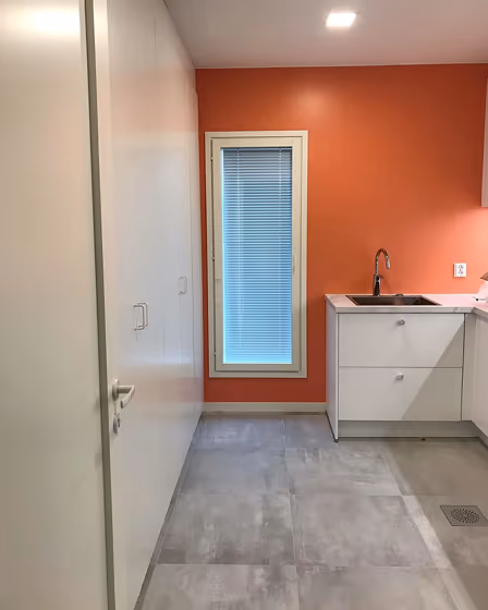
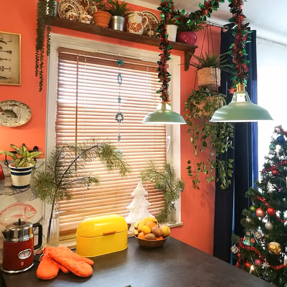
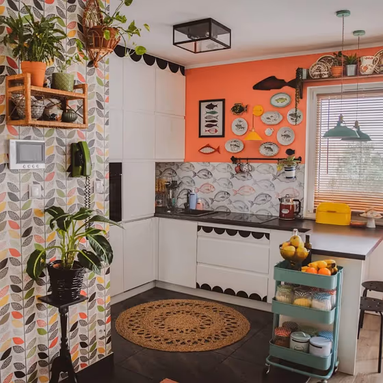
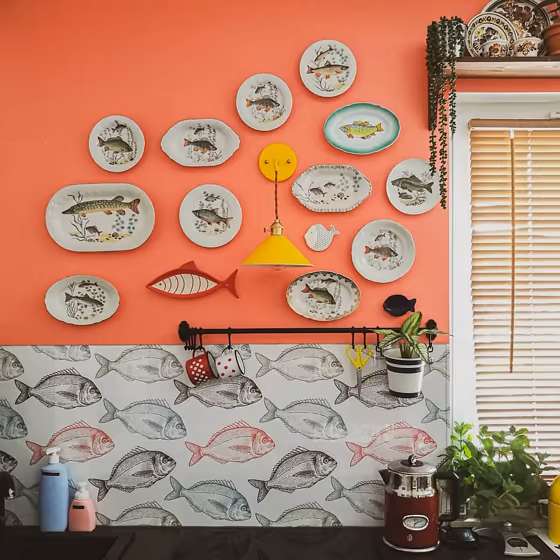
Tikkurila K319 Flamingo is a vibrant hue that adds a pop of color to any space. This playful shade pairs beautifully with neutrals like Tikkurila 990X White Pepper or earth tones such as Tikkurila G445 Caramel. For a bold contrast, consider combining Flamingo with deep blues like Tikkurila Y354 Midnight. Whether used as an accent wall or in furniture pieces, this energizing color is versatile and sure to make a statement in your home. Explore the endless possibilities of harmonizing Tikkurila K319 Flamingo with various complementary shades to create a visually striking and modern interior palette.
Loading...
LRV of Flamingo
Flamingo has an LRV of 34.2% and refers to Medium colors that reflect a lot of light. Why LRV is important?

Light Reflectance Value measures the amount of visible and usable light that reflects from a painted surface.
Simply put, the higher the LRV of a paint color, the brighter the room you will get.
The scale goes from 0% (absolute black, absorbing all light) to 100% (pure white, reflecting all light).
Act like a pro: When choosing paint with an LRV of 34.2%, pay attention to your bulbs' brightness. Light brightness is measured in lumens. The lower the paint's LRV, the higher lumen level you need. Every square foot of room needs at least 40 lumens. That means for a 200 ft2 living room you'll need about 8000 lumens of light – e.g., eight 1000 lm bulbs.
Color codes
We have collected almost every possible color code you could ever need.
Not sure what the difference between HEX and RGB is? We break down color models in plain language. Understanding color models
| Format | Code |
|---|---|
| HEX | #E68079 |
| RGB Decimal | 230, 128, 121 |
| RGB Percent | 90.20%, 50.20%, 47.45% |
| HSV | Hue: 4° Saturation: 47.39% Value: 90.2% |
| HSL | hsl(4, 69, 69) |
| CMYK | Cyan: 0.0 Magenta: 44.35 Yellow: 47.39 Key: 9.8 |
| YIQ | Y: 157.7 I: 63.031 Q: 19.398 |
| XYZ | X: 43.806 Y: 33.646 Z: 22.271 |
| CIE Lab | L:64.681 a:38.458 b:21.265 |
| CIE Luv | L:64.681 u:73.097 v:20.009 |
| Decimal | 15106169 |
| Hunter Lab | 58.005, 33.295, 17.839 |