Sherwin Williams Flower Pot SW 6334
Contentsshow +hide -
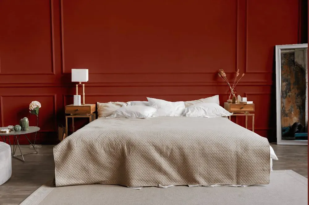
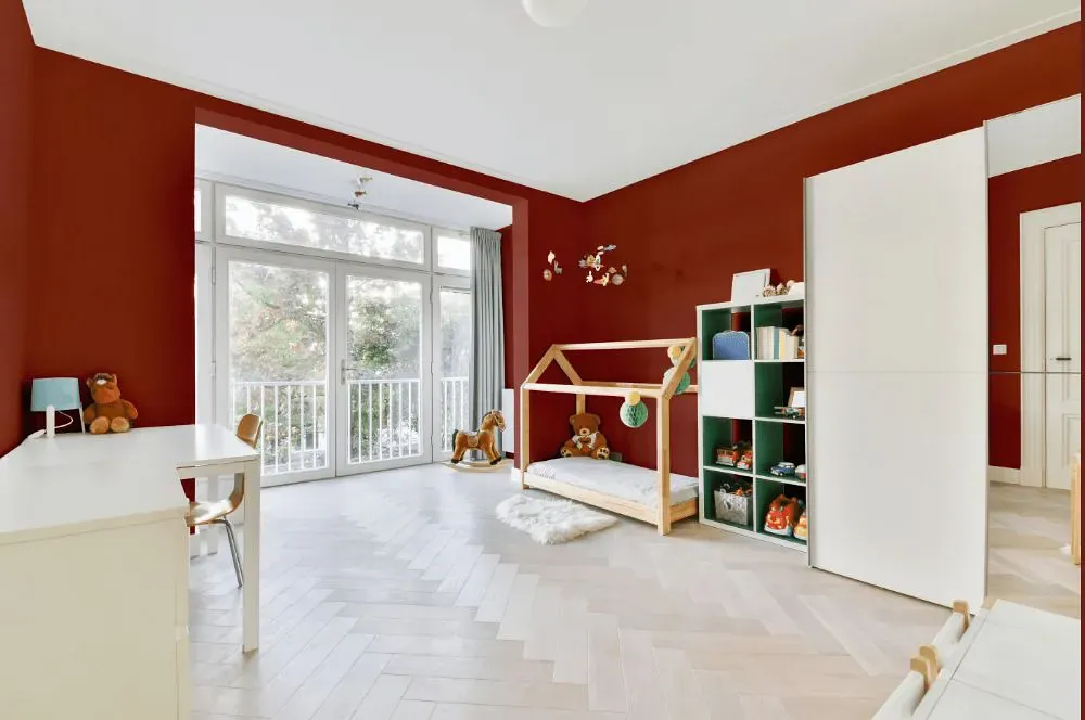
- Flower Pot for bedroom (1 photo)
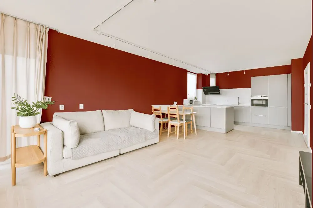
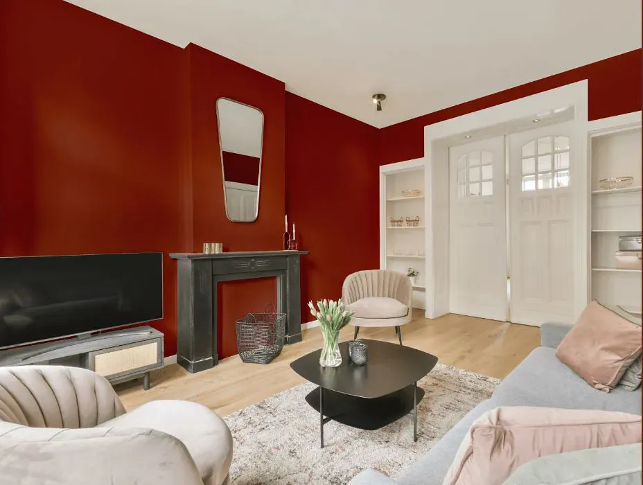
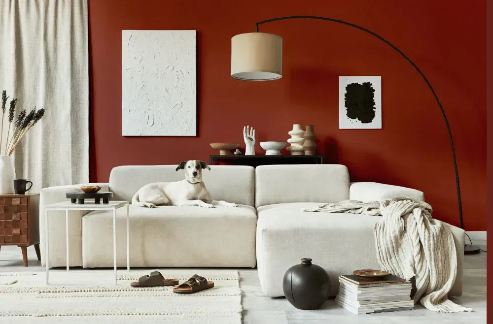
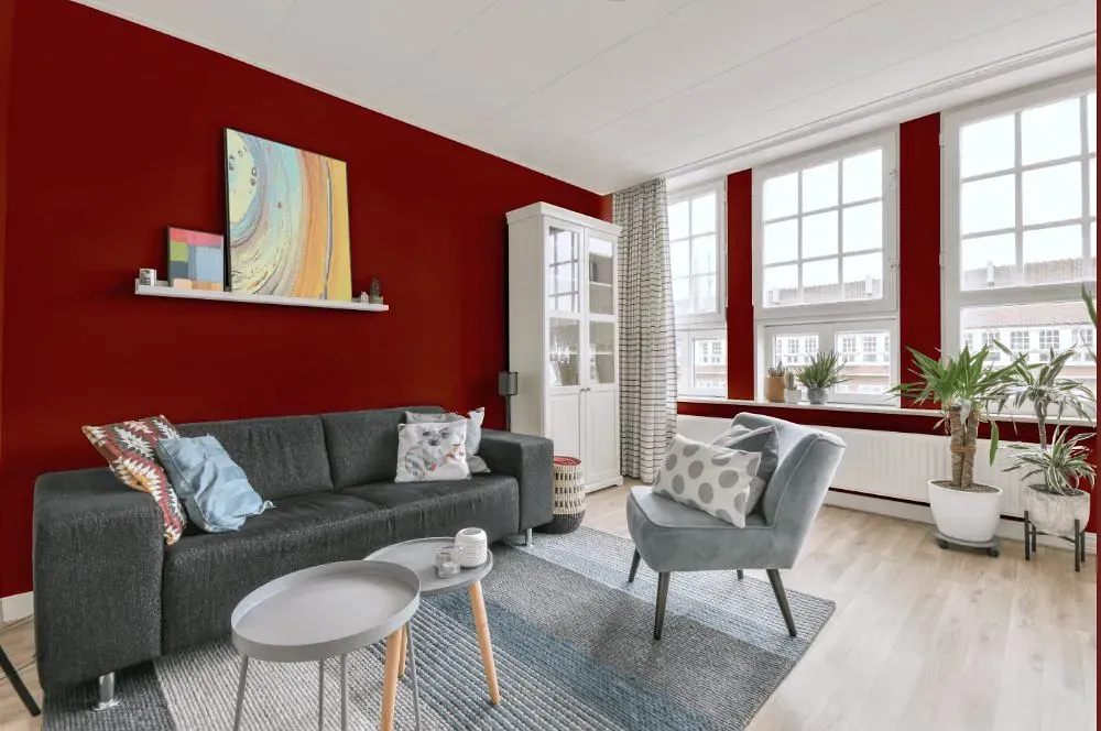
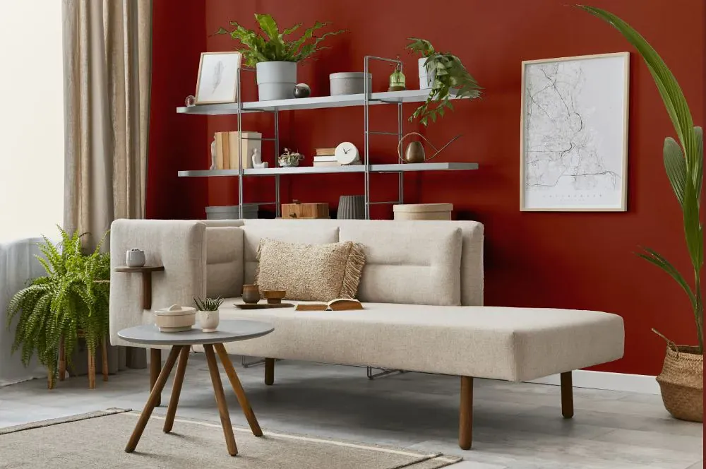
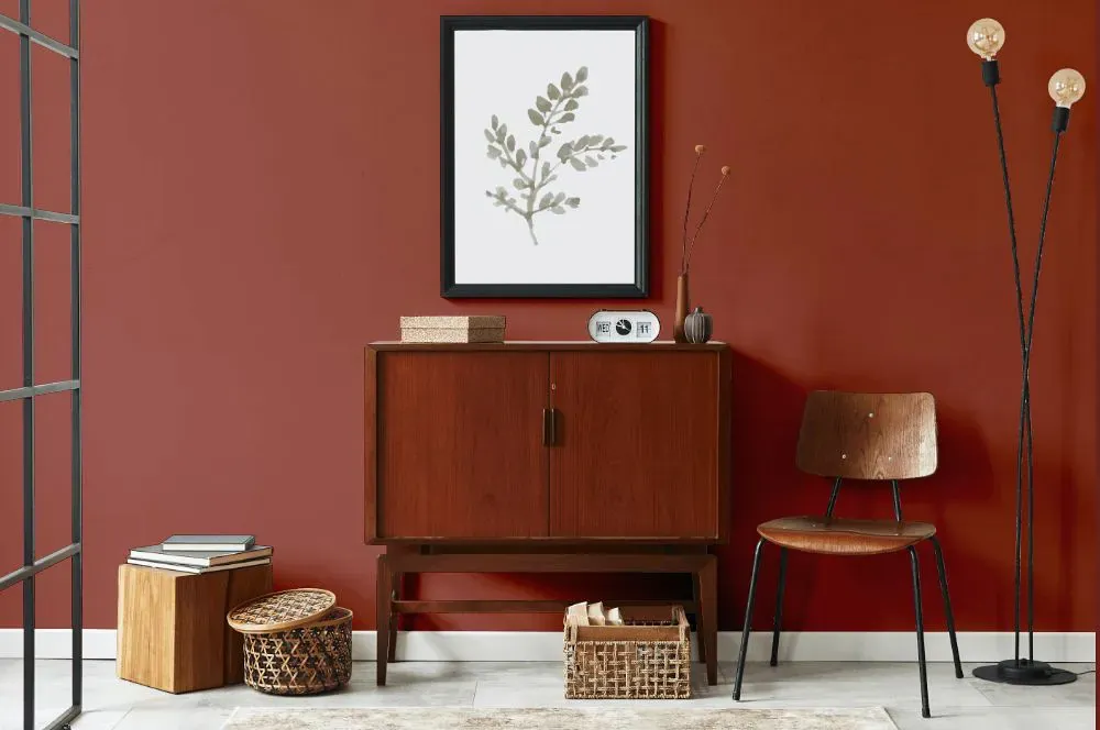
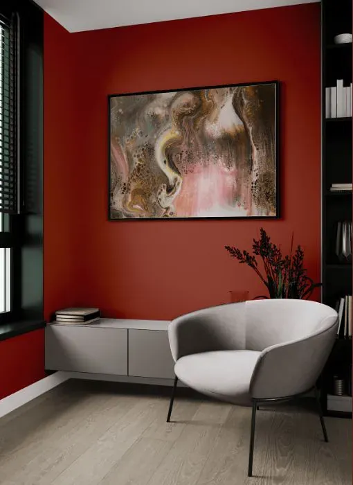
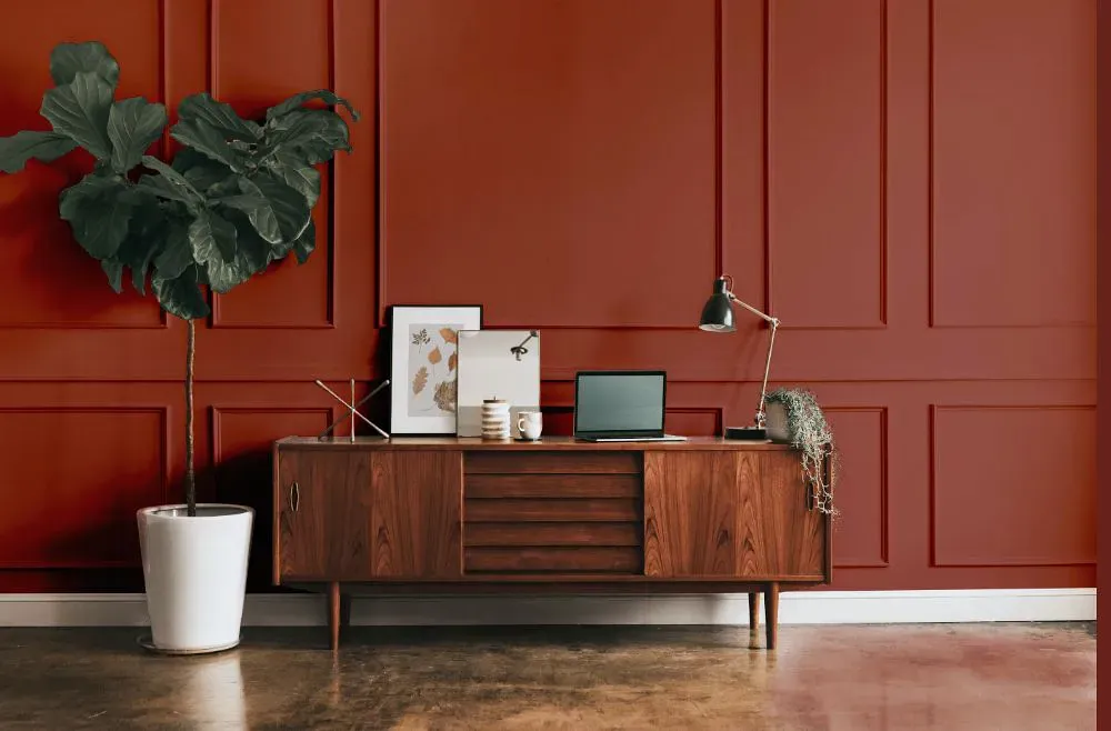
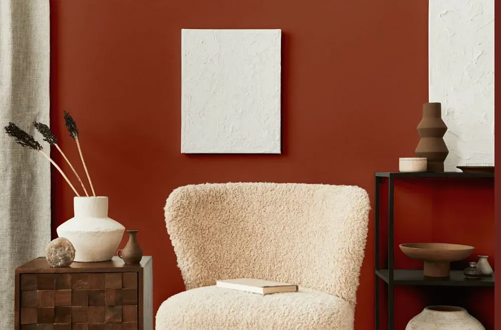
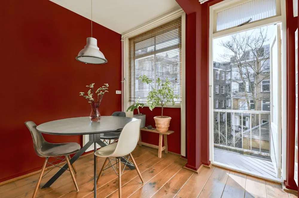
- Flower Pot for living room (7 photos)
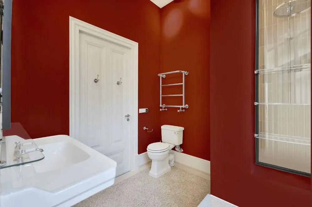
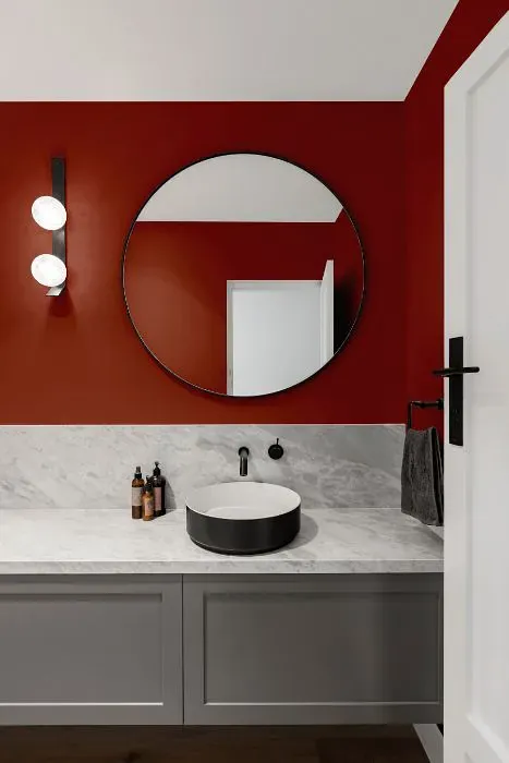
- Sherwin Williams Flower Pot for bathroom (2 photos)
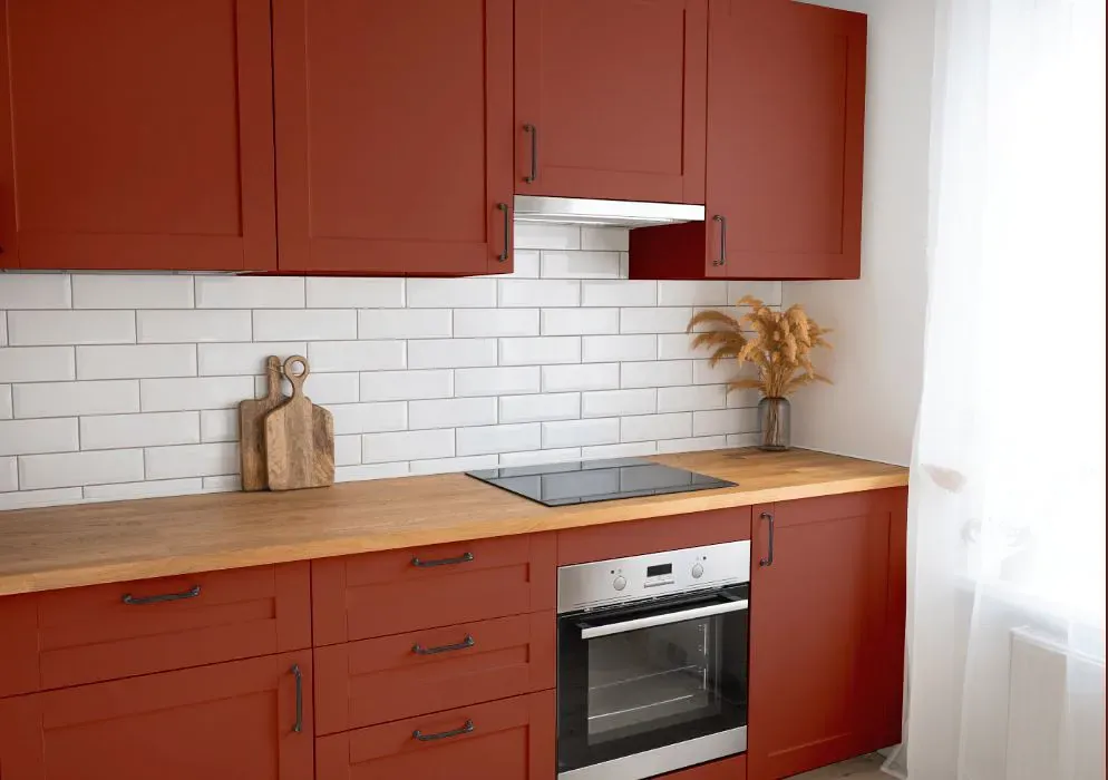
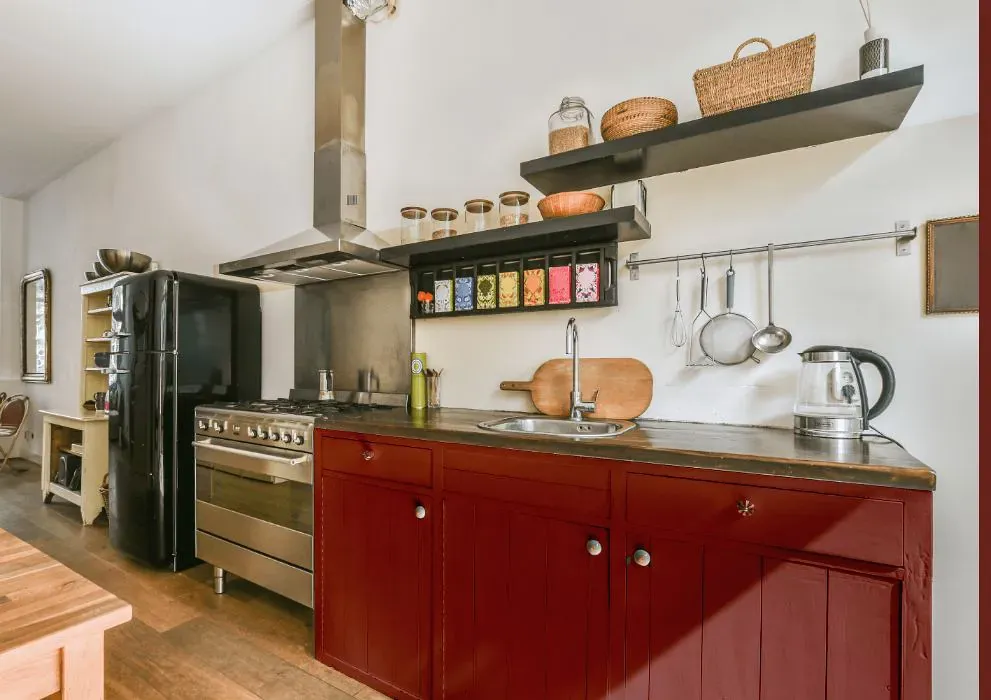
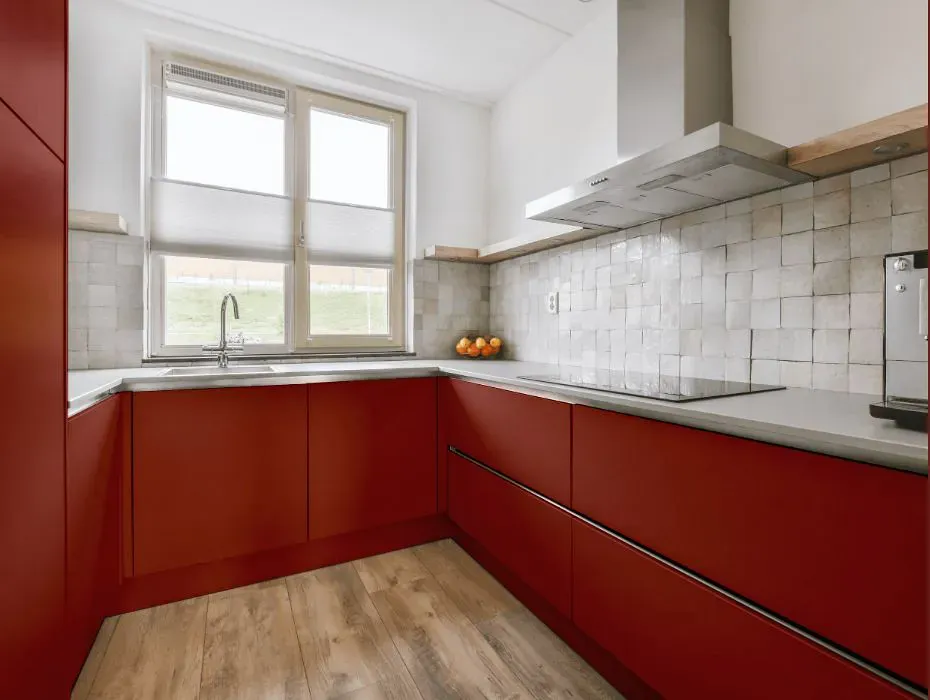
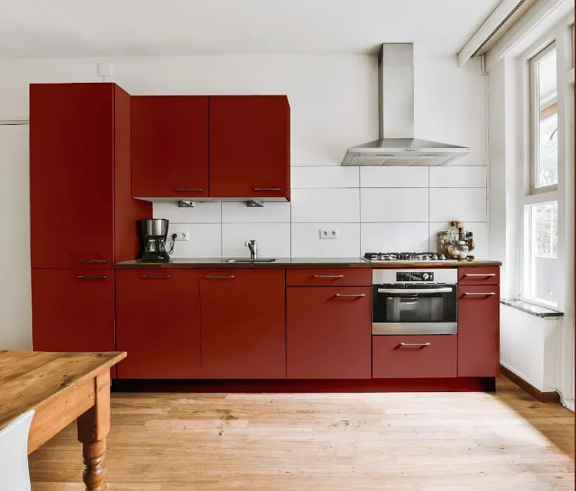
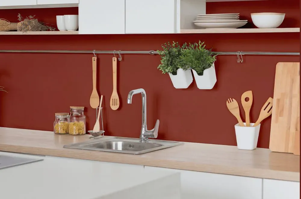
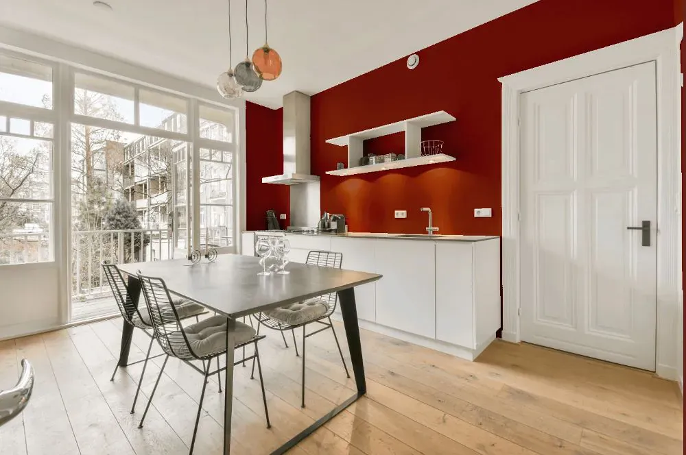
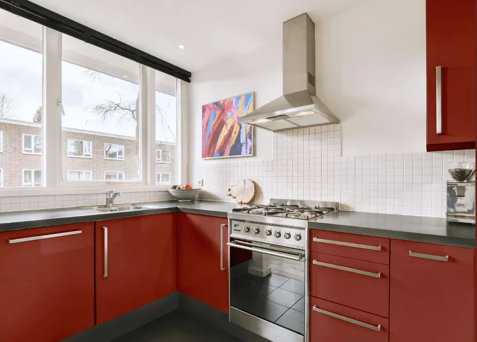
- Sherwin Williams SW 6334 on kitchen cabinets (4 photos)
- Sherwin Williams Flower Pot reviews (9 photos)
- What are Sherwin Williams Flower Pot undertones?
- Is Flower Pot SW 6334 cool or warm?
- How light temperature affects on Flower Pot
- Monochromatic color scheme
- Complementary color scheme
- Color comparison and matching
- LRV of Flower Pot SW 6334
- Color codes
- Color equivalents
| Official page: | Flower Pot SW 6334 |
| Code: | SW 6334 |
| Name: | Flower Pot |
| Brand: | Sherwin Williams |
What color is Sherwin Williams Flower Pot?
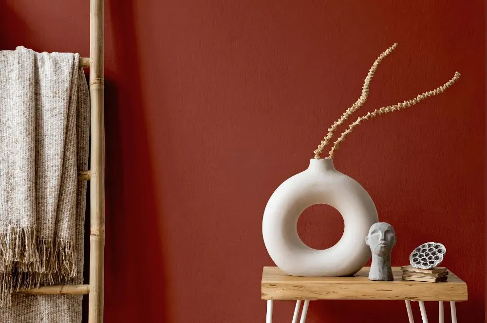
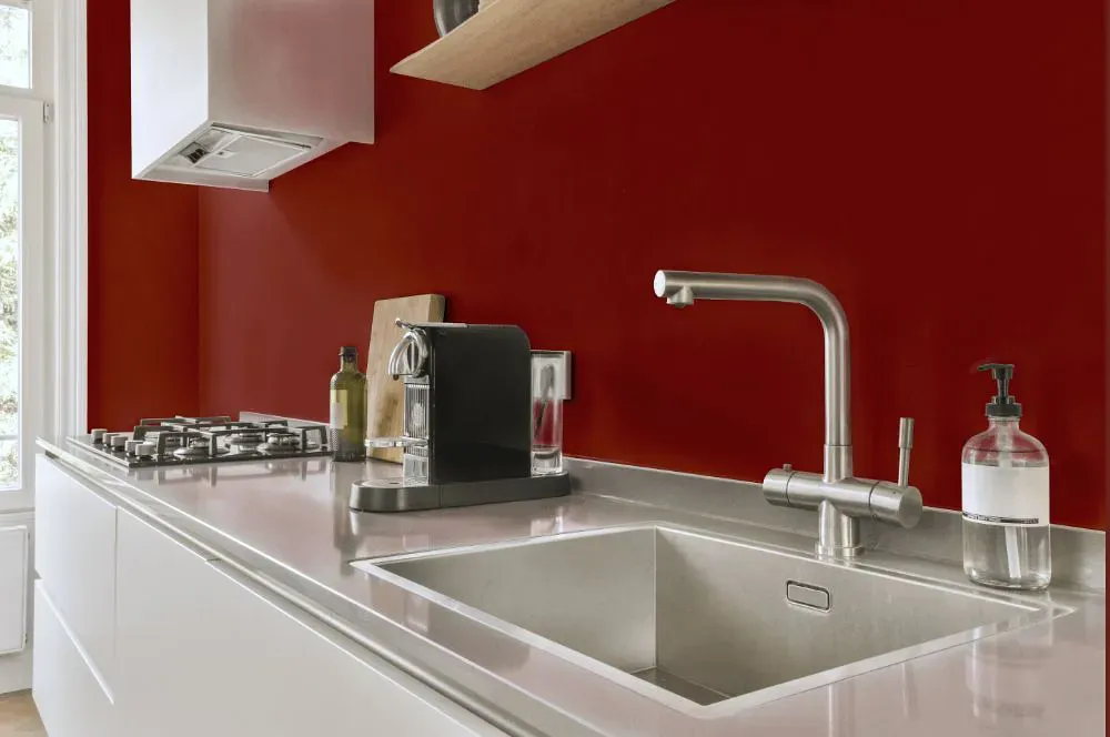
Sherwin Williams SW 6334 Flower Pot is a warm and inviting terra-cotta hue that adds a vibrant touch to any space. This earthy color pairs beautifully with soft neutrals like SW 7006, SW 7036, and SW 6108 for a harmonious balance. Incorporating accents in shades like SW 6251 or SW 6187 can further enhance the rich depth of Flower Pot. Whether used as a statement wall color or in smaller décor elements, Flower Pot brings a touch of nature indoors and creates a cozy, welcoming atmosphere.
Loading...
LRV of Flower Pot
Flower Pot has an LRV of 10.25% and refers to Medium Dark which means that this color reflects very little light. Why LRV is important?

Light Reflectance Value measures the amount of visible and usable light that reflects from a painted surface.
Simply put, the higher the LRV of a paint color, the brighter the room you will get.
The scale goes from 0% (absolute black, absorbing all light) to 100% (pure white, reflecting all light).
Act like a pro: When choosing paint with an LRV of 10.25%, pay attention to your bulbs' brightness. Light brightness is measured in lumens. The lower the paint's LRV, the higher lumen level you need. Every square foot of room needs at least 40 lumens. That means for a 200 ft2 living room you'll need about 8000 lumens of light – e.g., eight 1000 lm bulbs.
Color codes
We have collected almost every possible color code you could ever need.
Not sure what the difference between HEX and RGB is? We break down color models in plain language. Understanding color models
| Format | Code |
|---|---|
| HEX | #8f4438 |
| RGB Decimal | 143, 68, 56 |
| RGB Percent | 56.08%, 26.67%, 21.96% |
| HSV | Hue: 8° Saturation: 60.84% Value: 56.08% |
| HSL | hsl(8, 44, 39) |
| CMYK | Cyan: 0.0 Magenta: 52.45 Yellow: 60.84 Key: 43.92 |
| YIQ | Y: 89.057 I: 48.549 Q: 12.131 |
| XYZ | X: 14.11 Y: 10.261 Z: 4.978 |
| CIE Lab | L:38.307 a:30.665 b:22.119 |
| CIE Luv | L:38.307 u:55.097 v:18.136 |
| Decimal | 9389112 |
| Hunter Lab | 32.033, 22.567, 13.209 |