Sherwin Williams Framboise SW 6566
Contentsshow +hide -
- Sherwin Williams Framboise reviews (6 photos)
- What are Sherwin Williams Framboise undertones?
- Is Framboise SW 6566 cool or warm?
- How light temperature affects on Framboise
- Monochromatic color scheme
- Complementary color scheme
- Color comparison and matching
- LRV of Framboise SW 6566
- Color codes
- Color equivalents
| Official page: | Framboise SW 6566 |
| Code: | SW 6566 |
| Name: | Framboise |
| Brand: | Sherwin Williams |
What color is Sherwin Williams Framboise?
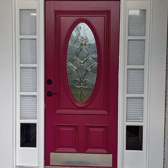
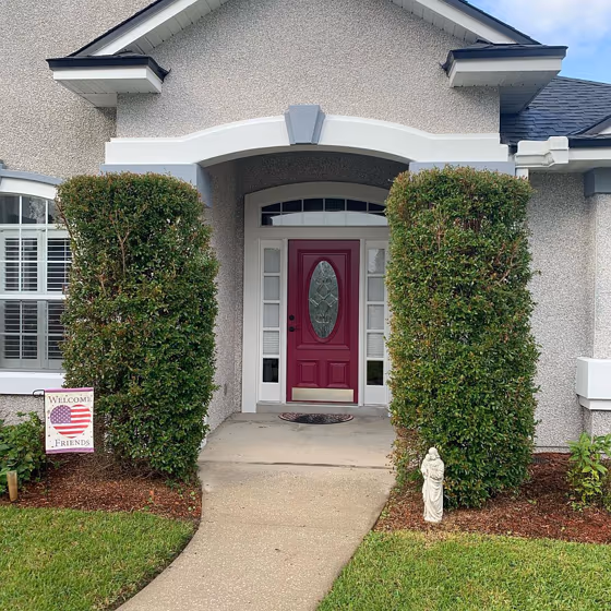
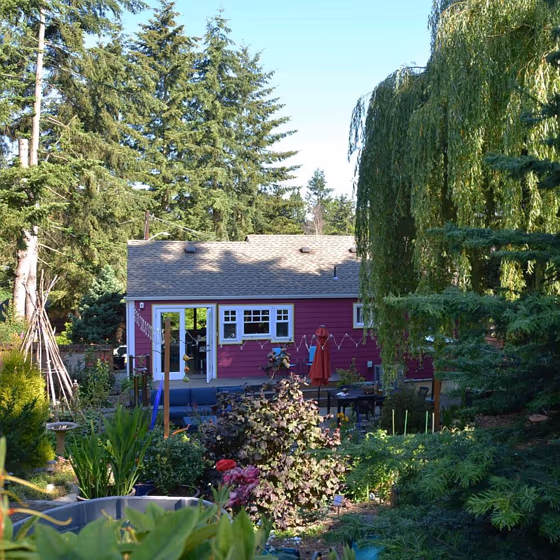
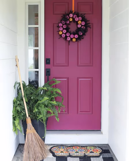
Sherwin Williams Framboise SW 6566 is a deep berry-toned shade with a clear red-violet cast and a gently muted finish. Its mid-dark value gives it enough weight for a dining room, powder room, or bedroom accent wall without reading as nearly black. In bright daylight, Framboise can show more of its raspberry-red side, while lower or warmer lighting tends to bring out its wine and plum notes. Pair it with soft cream, dusty blush, charcoal, or deep navy for contrast, and use brass, walnut, or blackened metal to reinforce its richness. This color is especially effective on cabinetry, doors, or a single enveloping wall where its saturation can be appreciated up close.
Loading...
LRV of Framboise
Framboise has an LRV of 7.59% and refers to Dark colors which means that this color almost does not reflect light. Why LRV is important?

Light Reflectance Value measures the amount of visible and usable light that reflects from a painted surface.
Simply put, the higher the LRV of a paint color, the brighter the room you will get.
The scale goes from 0% (absolute black, absorbing all light) to 100% (pure white, reflecting all light).
Act like a pro: When choosing paint with an LRV of 7.59%, pay attention to your bulbs' brightness. Light brightness is measured in lumens. The lower the paint's LRV, the higher lumen level you need. Every square foot of room needs at least 40 lumens. That means for a 200 ft2 living room you'll need about 8000 lumens of light – e.g., eight 1000 lm bulbs.
Color codes
We have collected almost every possible color code you could ever need.
Not sure what the difference between HEX and RGB is? We break down color models in plain language. Understanding color models
| Format | Code |
|---|---|
| HEX | #7c3655 |
| RGB Decimal | 124, 54, 85 |
| RGB Percent | 48.63%, 21.18%, 33.33% |
| HSV | Hue: 333° Saturation: 56.45% Value: 48.63% |
| HSL | hsl(333, 39, 35) |
| CMYK | Cyan: 0.0 Magenta: 56.45 Yellow: 31.45 Key: 51.37 |
| YIQ | Y: 78.464 I: 31.751 Q: 24.455 |
| XYZ | X: 11.271 Y: 7.58 Z: 9.461 |
| CIE Lab | L:33.093 a:34.041 b:-3.942 |
| CIE Luv | L:33.093 u:41.362 v:-10.103 |
| Decimal | 8140373 |
| Hunter Lab | 27.532, 24.894, -1.102 |