Sherwin Williams Exuberant Pink SW 6840
Contentsshow +hide -
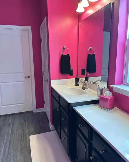
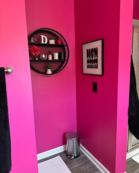
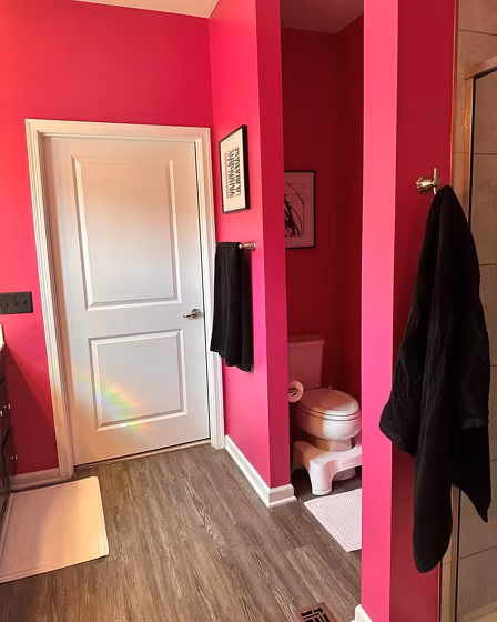
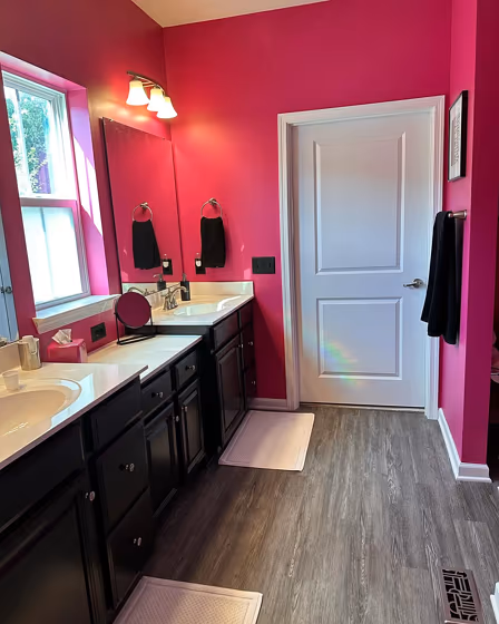
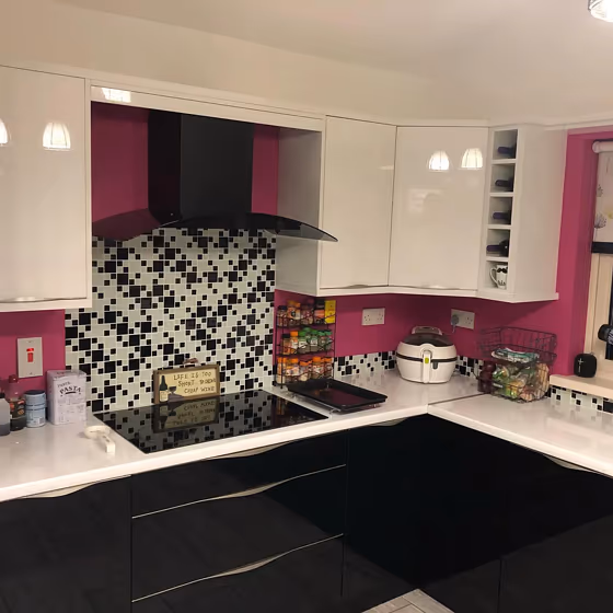
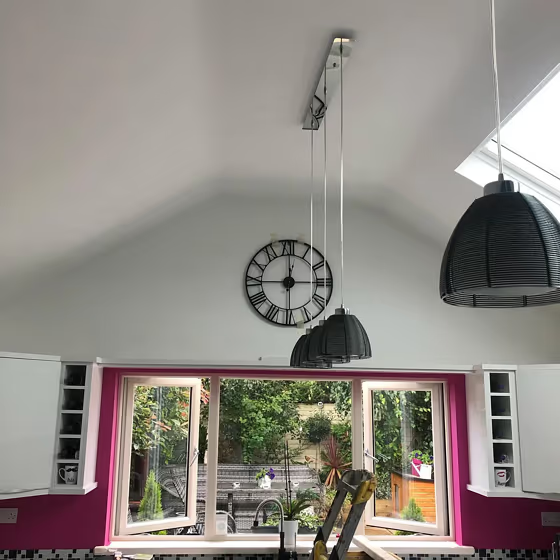
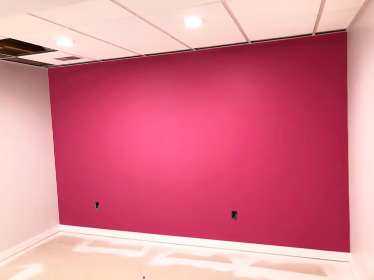
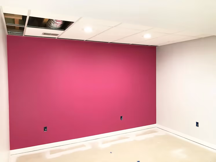
- Sherwin Williams Exuberant Pink for bathroom (4 photos)
- Exuberant Pink for exterior (2 photos)
- Sherwin Williams Exuberant Pink reviews (6 photos)
- What are Sherwin Williams Exuberant Pink undertones?
- Is Exuberant Pink SW 6840 cool or warm?
- How light temperature affects on Exuberant Pink
- Monochromatic color scheme
- Complementary color scheme
- Color comparison and matching
- LRV of Exuberant Pink SW 6840
- Color codes
- Color equivalents
| Official page: | Exuberant Pink SW 6840 |
| Code: | SW 6840 |
| Name: | Exuberant Pink |
| Brand: | Sherwin Williams |
| Collections: | High Voltage, Restless Nomad, 2018 Unity |
What color is Sherwin Williams Exuberant Pink?
Sherwin Williams SW 6840 Exuberant Pink is a vibrant and energetic color that brings a playful pop to any space. This lively shade pairs beautifully with cool tones like SW 6170 Techno Gray and SW 6204 Sea Salt for a balanced and harmonious look. For a bold and contemporary feel, combine Exuberant Pink with warm tones such as SW 6772 Cayenne and SW 6690 Gambol Gold. Whether used as an accent wall or as part of a colorful palette, Exuberant Pink adds a fun and stylish touch to any room. Explore the versatility of this hue by mixing it with neutrals or creating a statement look with complementary shades.
Loading...
LRV of Exuberant Pink
Exuberant Pink has an LRV of 16.6% and refers to Medium Dark which means that this color reflects very little light. Why LRV is important?

Light Reflectance Value measures the amount of visible and usable light that reflects from a painted surface.
Simply put, the higher the LRV of a paint color, the brighter the room you will get.
The scale goes from 0% (absolute black, absorbing all light) to 100% (pure white, reflecting all light).
Act like a pro: When choosing paint with an LRV of 16.6%, pay attention to your bulbs' brightness. Light brightness is measured in lumens. The lower the paint's LRV, the higher lumen level you need. Every square foot of room needs at least 40 lumens. That means for a 200 ft2 living room you'll need about 8000 lumens of light – e.g., eight 1000 lm bulbs.
Color codes
We have collected almost every possible color code you could ever need.
Not sure what the difference between HEX and RGB is? We break down color models in plain language. Understanding color models
| Format | Code |
|---|---|
| HEX | #b54d7f |
| RGB Decimal | 181, 77, 127 |
| RGB Percent | 70.98%, 30.20%, 49.80% |
| HSV | Hue: 331° Saturation: 57.46% Value: 70.98% |
| HSL | hsl(331, 41, 51) |
| CMYK | Cyan: 0.0 Magenta: 57.46 Yellow: 29.83 Key: 29.02 |
| YIQ | Y: 113.796 I: 45.906 Q: 37.56 |
| XYZ | X: 25.541 Y: 16.666 Z: 21.945 |
| CIE Lab | L:47.837 a:47.497 b:-7.198 |
| CIE Luv | L:47.837 u:63.085 v:-17.998 |
| Decimal | 11881855 |
| Hunter Lab | 40.824, 40.235, -3.294 |