Tikkurila G304
Contentsshow +hide -
| Code: | G304 |
| Name: | |
| Brand: | Tikkurila |
What color is Tikkurila G304?
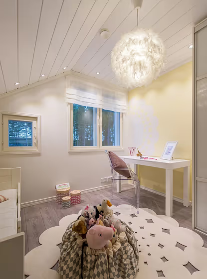
Experience a luxurious and soothing atmosphere with Tikkurila Alabaster, code G304, a timeless and elegant off-white hue. This color is perfect for creating a warm and inviting ambiance in living rooms, bedrooms, and home offices. Alabaster adds a touch of sophistication to any space while providing a versatile backdrop for various design styles. Its soft and neutral tones make it a great choice for those looking to infuse their interiors with a sense of tranquility and refinement. Embrace the classic beauty of G304 Alabaster and transform your home into a haven of calm and sophistication.
Loading...
LRV of G304
G304 has an LRV of 82.32% and refers to White colors that reflect almost all light. Why LRV is important?

Light Reflectance Value measures the amount of visible and usable light that reflects from a painted surface.
Simply put, the higher the LRV of a paint color, the brighter the room you will get.
The scale goes from 0% (absolute black, absorbing all light) to 100% (pure white, reflecting all light).
Act like a pro: When choosing paint with an LRV of 82.32%, pay attention to your bulbs' brightness. Light brightness is measured in lumens. The lower the paint's LRV, the higher lumen level you need. Every square foot of room needs at least 40 lumens. That means for a 200 ft2 living room you'll need about 8000 lumens of light – e.g., eight 1000 lm bulbs.
Color codes
We have collected almost every possible color code you could ever need.
Not sure what the difference between HEX and RGB is? We break down color models in plain language. Understanding color models
| Format | Code |
|---|---|
| HEX | #F8EBC1 |
| RGB Decimal | 248, 235, 193 |
| RGB Percent | 97.25%, 92.16%, 75.69% |
| HSV | Hue: 46° Saturation: 22.18% Value: 97.25% |
| HSL | hsl(46, 80, 86) |
| CMYK | Cyan: 0.0 Magenta: 5.24 Yellow: 22.18 Key: 2.75 |
| YIQ | Y: 234.099 I: 21.243 Q: -10.32 |
| XYZ | X: 78.045 Y: 83.225 Z: 62.39 |
| CIE Lab | L:93.113 a:-2.107 b:22.008 |
| CIE Luv | L:93.113 u:10.18 v:32.114 |
| Decimal | 16313281 |
| Hunter Lab | 91.228, -6.943, 23.311 |