Tikkurila G358
Contentsshow +hide -
| Code: | G358 |
| Name: | |
| Brand: | Tikkurila |
What color is Tikkurila G358?
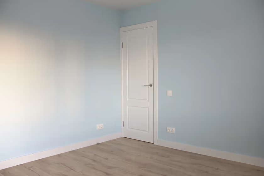
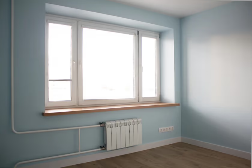
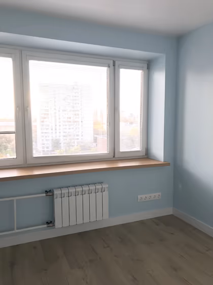
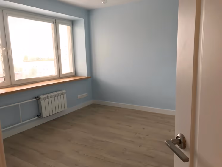
The Tikkurila G358 color exudes sophistication and warmth with its rich hues. This deep and elegant shade pairs beautifully with neutrals like white and beige to create a timeless and classic look. For a more modern and contemporary feel, consider combining it with grey or charcoal tones. The Tikkurila G358 color brings a sense of depth and character to any space, making it a versatile choice for both traditional and modern interiors alike. Its versatility allows for endless possibilities when creating a visually stunning and harmonious color palette.
Loading...
LRV of G358
G358 has an LRV of 71.71% and refers to Light colors that reflect most of the incident light. Why LRV is important?

Light Reflectance Value measures the amount of visible and usable light that reflects from a painted surface.
Simply put, the higher the LRV of a paint color, the brighter the room you will get.
The scale goes from 0% (absolute black, absorbing all light) to 100% (pure white, reflecting all light).
Act like a pro: When choosing paint with an LRV of 71.71%, pay attention to your bulbs' brightness. Light brightness is measured in lumens. The lower the paint's LRV, the higher lumen level you need. Every square foot of room needs at least 40 lumens. That means for a 200 ft2 living room you'll need about 8000 lumens of light – e.g., eight 1000 lm bulbs.
Color codes
We have collected almost every possible color code you could ever need.
Not sure what the difference between HEX and RGB is? We break down color models in plain language. Understanding color models
| Format | Code |
|---|---|
| HEX | #CEE2E5 |
| RGB Decimal | 206, 226, 229 |
| RGB Percent | 80.78%, 88.63%, 89.80% |
| HSV | Hue: 188° Saturation: 10.04% Value: 89.8% |
| HSL | hsl(188, 31, 85) |
| CMYK | Cyan: 10.04 Magenta: 1.31 Yellow: 0.0 Key: 10.2 |
| YIQ | Y: 220.362 I: -12.882 Q: -3.297 |
| XYZ | X: 66.789 Y: 73.171 Z: 84.712 |
| CIE Lab | L:88.529 a:-6.036 b:-3.724 |
| CIE Luv | L:88.529 u:-10.936 v:-4.699 |
| Decimal | 13558501 |
| Hunter Lab | 85.54, -10.324, 1.162 |