Tikkurila G489
| Code: | G489 |
| Name: | |
| Brand: | Tikkurila |
What color is Tikkurila G489?
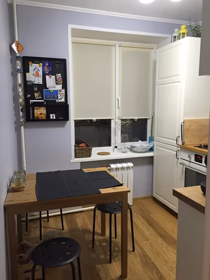
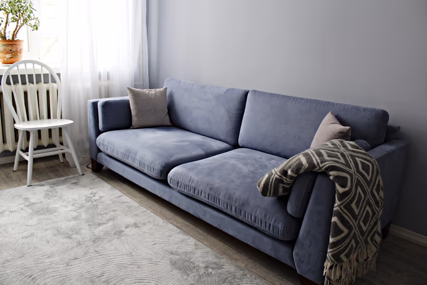
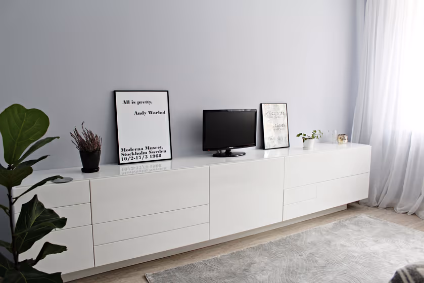
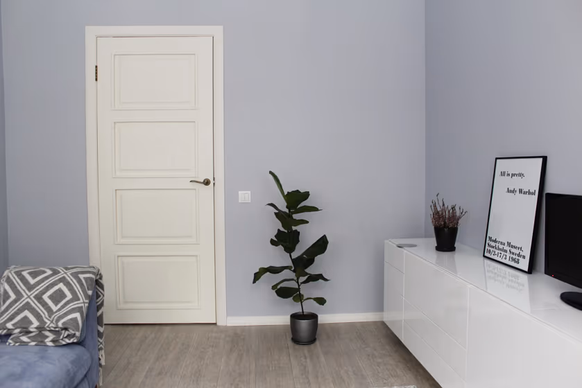
Introducing the captivating shade of color Blue Lagoon, also known as Tikkurila's G489. This serene and sophisticated hue brings a sense of tranquility and elegance to any space. Blue Lagoon is perfect for creating a calming atmosphere in bedrooms, where its soothing tones promote relaxation and restful sleep. In living rooms, this versatile color can be paired with neutrals or metallic accents to infuse a sense of modernity and sophistication. Whether used as an accent wall or throughout the room, Tikkurila G489 Blue Lagoon adds a touch of timeless beauty to interiors.
Tikkurila G489 reviews
View the photos of real spaces painted with this that were not included in specific categories.Close-ups, painted furniture, storages and dressers, hallways, stairs and ceilings.
Try before you buy

100% accurate
reusable paint samples
Peel, stick,
and repeat
Twice painted
with real paint
Next day
delivery
What are Tikkurila G489 undertones?
The undertone of G489 can be accurately described as a Blue hue, as is apparent from the color space provided. By isolating the pure hue and eliminating any tints, tones, and shades, we were able to precisely determine its undertone. This approach has proven to be more accurate than traditional methods of defining undertones on a white background, which are now considered outdated.
HEX value
HEX value:
#C6CBD3
RGB code:
198, 203, 211
Is Tikkurila G489 cool or warm?
With a hue of 217° thisBluerefers cool paint shade according to HSL (Hue, Saturation, Lightness) on the color wheel.
G489 HSL code: 217, 13%, 80%
Hue - degree on a color wheel from 0 to 360. 0 is red, 120 is green, and 240 is blue.
Saturation is expressed as a percentage. At 0%, it appears as a shade of grey, and at 100%, it is in full color..
Lightness is also a percentage value. 0% is black, and 100% is white.
- Cooler hues have a calm and relaxation effect
- Cool blue shades make a room feel sleek, fresh, and modern, perfect for bedrooms, bathrooms, and home offices where a sense of calm and sophistication is desired.
- Light, soft colors like pastel blues and greens make a room feel fresh and open. They're great for bathrooms, nurseries, and kitchens, creating a calm and inviting atmosphere. Just avoid using these colors in north-facing rooms, as they might feel too cold.
Act like a pro: Mixing warm and cool shades is a must have to get harmonius interior. Add accents that contrast with the primary color to create visual balance. If your walls are a warm color, don’t forget to add accent in cold colors (furniture, art, décor). A good practice is too use a complementary color scheme.
How light temperature affects G489
Natural Lighting. During the day, natural light shifts from about 2000 K at sunrise/sunset to 5500–6500 K at noon.
In addition, natural‑light temperature depends on its direction:
| Direction of sunlight | Visible temp. | Hue | Duration |
|---|---|---|---|
| North | Cool | Bluish | All day |
| East | Warm | Yellow | Before noon |
| West | Warm | Orange‑red | After noon |
| South | Warm | Orange‑yellow | All day |
Artificial Lighting. When choosing bulbs, pay attention to their color‑temperature (Kelvins).
Use the slider to see how this Blue shade looks under different lighting:


4000K
Coordinating colors.
Colors that go with Tikkurila G489:
Complementary color scheme
This color scheme is a combination of two shades that are opposite each other on the color wheel. The high contrast between these colors creates a vibrant and dynamic visual effect. For the color G489 with a blue hue, complementary colors are those with a orange hue close to 37, such as Tikkurila Cloister and Vulcanite.
LRV of G489
G489 has an LRV of 59.25% and refers to Light colors that reflect most of the incident light. Why LRV is important?
Light Reflectance Value measures the amount of visible and usable light that reflects from a painted surface.
Simply put, the higher the LRV of a paint color, the brighter the room you will get.
The scale goes from 0% (absolute black, absorbing all light) to 100% (pure white, reflecting all light).
Act like a pro: When choosing paint with an LRV of 59.25%, pay attention to your bulbs' brightness. Light brightness is measured in lumens. The lower the paint's LRV, the higher lumen level you need. Every square foot of room needs at least 40 lumens. That means for a 200 ft2 living room you’ll need about 8000 lumens of light – e.g., eight 1000 lm bulbs.
Color codes
We have collected almost every possible color code you could ever need. To copy the code, just click the icon to the right of it.
| Format | Code | |
|---|---|---|
| HEX | #C6CBD3 | |
| RGB Decimal | 198, 203, 211 | |
| RGB Percent | 77.65%, 79.61%, 82.75% | |
| HSV | Hue: 217° Saturation: 6.16% Value: 82.75% | |
| HSL | hsl(217, 13, 80) | |
| CMYK | Cyan: 6.16 Magenta: 3.79 Yellow: 0.0 Key: 17.25 | |
| YIQ | Y: 202.417 I: -5.55 Q: 1.432 | |
| XYZ | X: 56.399 Y: 59.42 Z: 70.108 | |
| CIE Lab | L:81.522 a:-0.194 b:-4.561 | |
| CIE Luv | L:81.522 u:-3.21 v:-6.922 | |
| Decimal | 13028307 | |
| Hunter Lab | 77.085, -4.298, 0.035 |
Color equivalents
Moon Waves 5
Dulux
30BB 62/044
Mineral Haze 2
Dulux
70BB 65/056
Imperial Mauve 4
Dulux
Hazy Lilac
Dulux
70BB 65/066
Starlit Night 5
Dulux
English Lavender
Dulux
166
Gauze - Dark
Little Greene

90BB 65/049
Midnight Iris 4
Dulux
10BB 64/052
Niagara Blues 5
Dulux
Fragile Blossom
Dulux
Dove
Dulux
Wild Water 5
Dulux
10RB 65/042
Brooklyn Nights 5
Dulux
4177
Heath Violet
Jotun
90BB 67/069
Marble Swirl 6
Dulux
50BB 63/094
Morning Jewel 5
Dulux
G488
Tikkurila

4062
Classic Blue
Jotun

Moon Waves 4
Dulux
90BG 63/043
Steel Symphony 5
Dulux


