Sherwin Williams Granite Peak SW 6250
Contentsshow +hide -
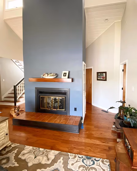
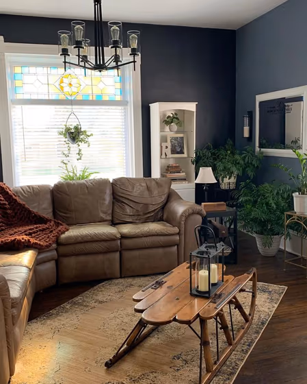
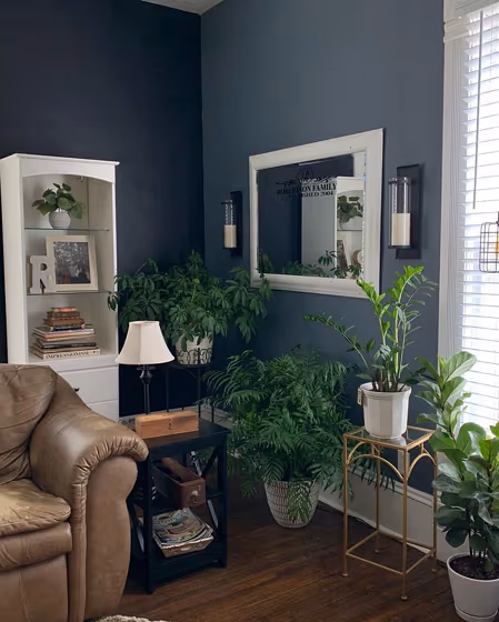
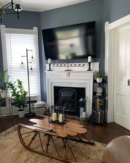
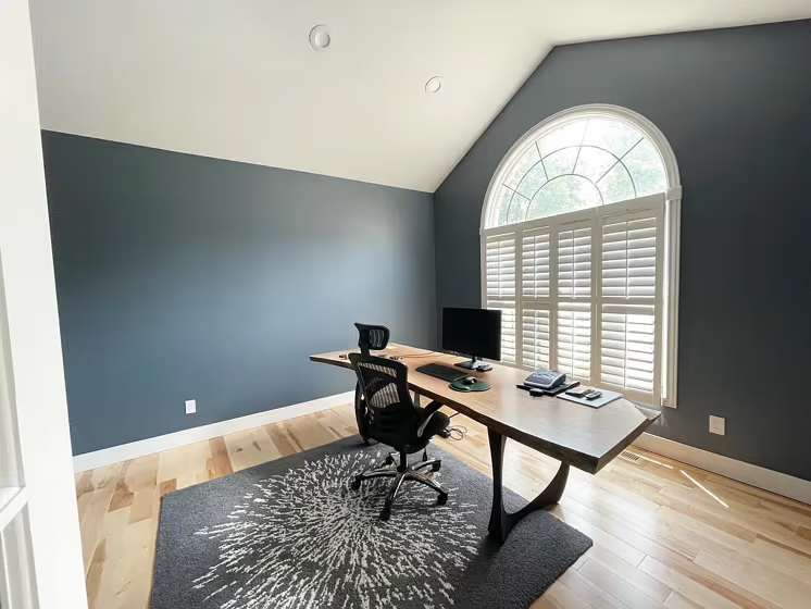
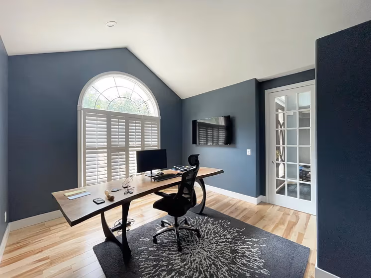
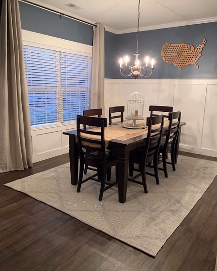
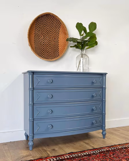
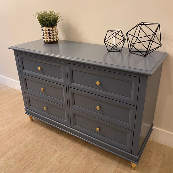
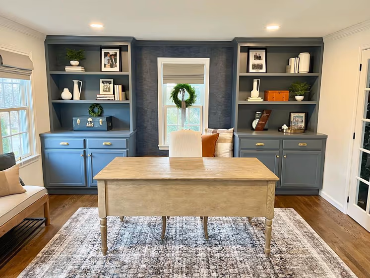
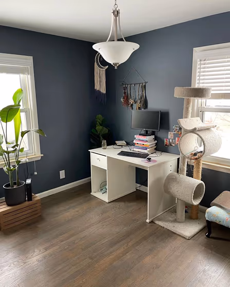
- Granite Peak for living room (4 photos)
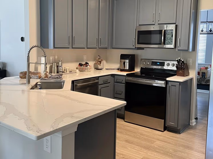
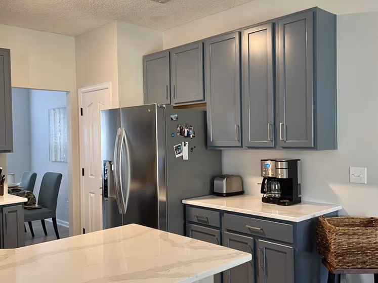
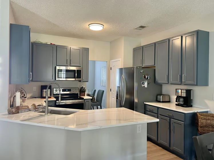
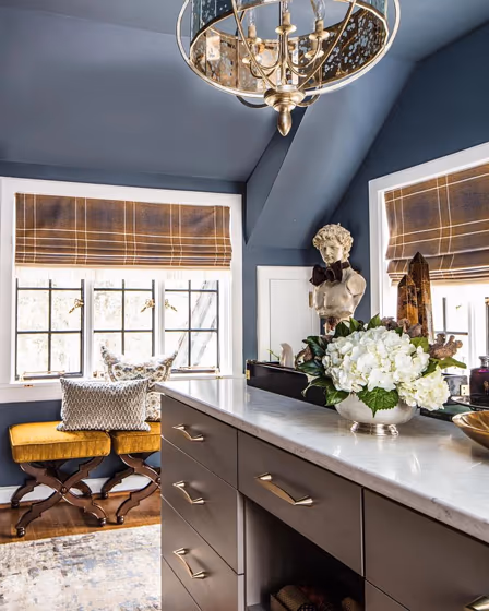
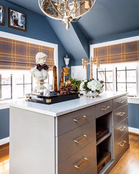
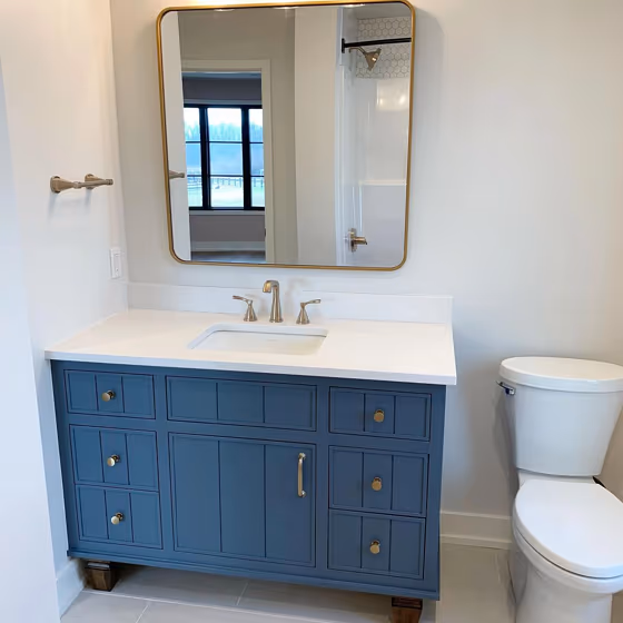
- Sherwin Williams SW 6250 on kitchen cabinets (3 photos)
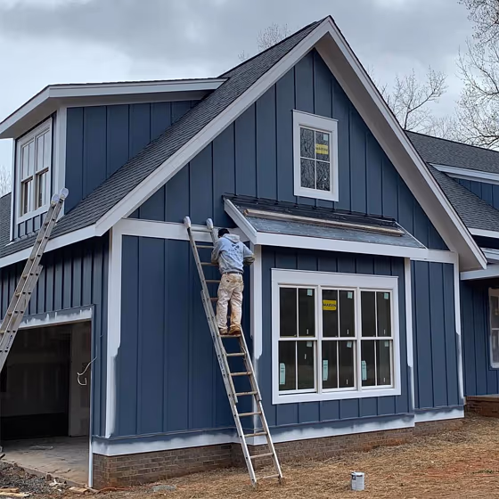
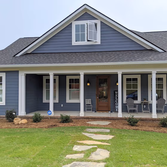
- Granite Peak for exterior (2 photos)
- Sherwin Williams Granite Peak reviews (10 photos)
- What are Sherwin Williams Granite Peak undertones?
- Is Granite Peak SW 6250 cool or warm?
- How light temperature affects on Granite Peak
- Monochromatic color scheme
- Complementary color scheme
- Color comparison and matching
- LRV of Granite Peak SW 6250
- Color codes
- Color equivalents
| Official page: | Granite Peak SW 6250 |
| Code: | SW 6250 |
| Name: | Granite Peak |
| Brand: | Sherwin Williams |
| Collections: | 2020 Haven |
What color is Sherwin Williams Granite Peak?
Sherwin Williams Granite Peak SW 6250 is a muted, medium-depth blue-gray with a distinctly cool cast. Its low-saturation color keeps the blue restrained, reading more like weathered slate than a bright naval tone. In strong daylight, Granite Peak can show its softened blue side, while dimmer rooms tend to pull it toward a deeper graphite gray. It gives home offices, bedrooms, and exterior trim a grounded look without making the surface feel black. Pair it with crisp white, pale gray, light oak, brushed nickel, or black metal for a clean, architectural contrast.
Loading...
LRV of Granite Peak
Granite Peak has an LRV of 14.35% and refers to Medium Dark which means that this color reflects very little light. Why LRV is important?

Light Reflectance Value measures the amount of visible and usable light that reflects from a painted surface.
Simply put, the higher the LRV of a paint color, the brighter the room you will get.
The scale goes from 0% (absolute black, absorbing all light) to 100% (pure white, reflecting all light).
Act like a pro: When choosing paint with an LRV of 14.35%, pay attention to your bulbs' brightness. Light brightness is measured in lumens. The lower the paint's LRV, the higher lumen level you need. Every square foot of room needs at least 40 lumens. That means for a 200 ft2 living room you'll need about 8000 lumens of light – e.g., eight 1000 lm bulbs.
Color codes
We have collected almost every possible color code you could ever need.
Not sure what the difference between HEX and RGB is? We break down color models in plain language. Understanding color models
| Format | Code |
|---|---|
| HEX | #606b75 |
| RGB Decimal | 96, 107, 117 |
| RGB Percent | 37.65%, 41.96%, 45.88% |
| HSV | Hue: 209° Saturation: 17.95% Value: 45.88% |
| HSL | hsl(209, 10, 42) |
| CMYK | Cyan: 17.95 Magenta: 8.55 Yellow: 0.0 Key: 54.12 |
| YIQ | Y: 104.851 I: -9.768 Q: 0.785 |
| XYZ | X: 13.291 Y: 14.286 Z: 18.882 |
| CIE Lab | L:44.641 a:-1.856 b:-6.977 |
| CIE Luv | L:44.641 u:-6.261 v:-9.269 |
| Decimal | 6318965 |
| Hunter Lab | 37.797, -3.375, -3.161 |