Tikkurila Ink M350
| Code: | M350 |
| Name: | Ink |
| Brand: | Tikkurila |
What color is Tikkurila Ink?
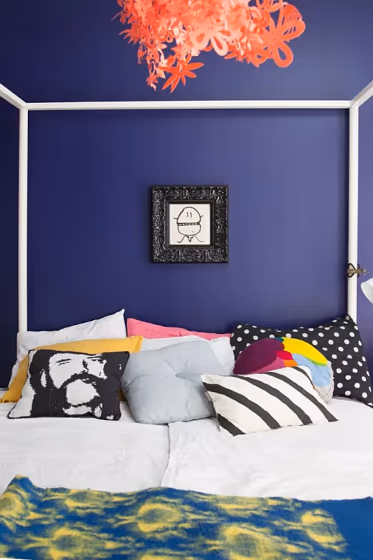
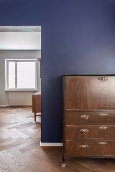
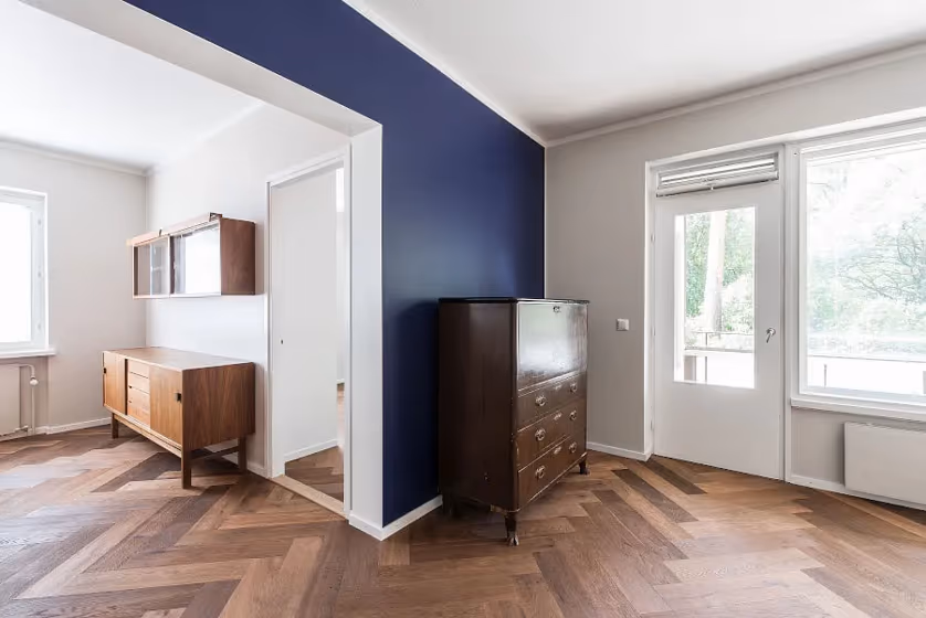
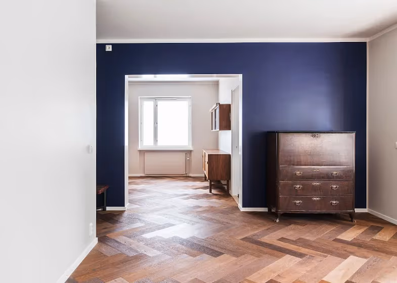
Step into a realm of sophistication with Tikkurila's rich and luxurious M350 Ink. This deep shade of ink boasts a captivating depth that elevates any space it graces with its presence. Perfect for creating a bold statement in a study or home office, M350 Ink exudes an air of intelligence and creativity. Infuse your living room with a touch of drama by incorporating this color on an accent wall or through statement furniture pieces. For those seeking a modern and elegant touch, M350 Ink is the ideal choice for a bedroom or dining room, enveloping the space in a warm and inviting ambiance.
Tikkurila Ink reviews
View the photos of real spaces painted with this that were not included in specific categories.Close-ups, painted furniture, storages and dressers, hallways, stairs and ceilings.
Try before you buy

100% accurate
reusable paint samples
Peel, stick,
and repeat
Twice painted
with real paint
Next day
delivery
What are Tikkurila Ink undertones?
The undertone of Ink can be accurately described as a Blue hue, as is apparent from the color space provided. By isolating the pure hue and eliminating any tints, tones, and shades, we were able to precisely determine its undertone. This approach has proven to be more accurate than traditional methods of defining undertones on a white background, which are now considered outdated.
HEX value
HEX value:
#3D4360
RGB code:
61, 67, 96
Is Tikkurila Ink M350 cool or warm?
With a hue of 230° thisdark bluerefers cool paint shade according to HSL (Hue, Saturation, Lightness) on the color wheel.
M350 Ink HSL code: 230, 22%, 31%
Hue - degree on a color wheel from 0 to 360. 0 is red, 120 is green, and 240 is blue.
Saturation is expressed as a percentage. At 0%, it appears as a shade of grey, and at 100%, it is in full color..
Lightness is also a percentage value. 0% is black, and 100% is white.
- Cooler hues have a calm and relaxation effect
- Cool blue shades make a room feel sleek, fresh, and modern, perfect for bedrooms, bathrooms, and home offices where a sense of calm and sophistication is desired.
- Dark, cool shades create a dramatic and sophisticated atmosphere, making them a great choice for bedrooms and living rooms when you want to make a bold yet calming statement. However, be cautious about using dark, cool colors in small spaces, as they can make the room feel smaller and more enclosed.
Act like a pro: Mixing warm and cool shades is a must have to get harmonius interior. Add accents that contrast with the primary color to create visual balance. If your walls are a warm color, don’t forget to add accent in cold colors (furniture, art, décor). A good practice is too use a complementary color scheme.
How light temperature affects Ink
Natural Lighting. During the day, natural light shifts from about 2000 K at sunrise/sunset to 5500–6500 K at noon.
In addition, natural‑light temperature depends on its direction:
| Direction of sunlight | Visible temp. | Hue | Duration |
|---|---|---|---|
| North | Cool | Bluish | All day |
| East | Warm | Yellow | Before noon |
| West | Warm | Orange‑red | After noon |
| South | Warm | Orange‑yellow | All day |
Artificial Lighting. When choosing bulbs, pay attention to their color‑temperature (Kelvins).
Use the slider to see how this dark blue shade looks under different lighting:


4000K
Coordinating colors.
Colors that go with Tikkurila Ink:
Complementary color scheme
This color scheme is a combination of two shades that are opposite each other on the color wheel. The high contrast between these colors creates a vibrant and dynamic visual effect. For the color Ink with a blue hue, complementary colors are those with a orange hue close to 50, such as Tikkurila Chalk.
M350
Ink
LRV of Ink
Ink has an LRV of 6.35% and refers to Dark colors which means that this color almost does not reflect light. Why LRV is important?
Light Reflectance Value measures the amount of visible and usable light that reflects from a painted surface.
Simply put, the higher the LRV of a paint color, the brighter the room you will get.
The scale goes from 0% (absolute black, absorbing all light) to 100% (pure white, reflecting all light).
Act like a pro: When choosing paint with an LRV of 6.35%, pay attention to your bulbs' brightness. Light brightness is measured in lumens. The lower the paint's LRV, the higher lumen level you need. Every square foot of room needs at least 40 lumens. That means for a 200 ft2 living room you’ll need about 8000 lumens of light – e.g., eight 1000 lm bulbs.
Color codes
We have collected almost every possible color code you could ever need. To copy the code, just click the icon to the right of it.
| Format | Code | |
|---|---|---|
| HEX | #3D4360 | |
| RGB Decimal | 61, 67, 96 | |
| RGB Percent | 23.92%, 26.27%, 37.65% | |
| HSV | Hue: 230° Saturation: 36.46% Value: 37.65% | |
| HSL | hsl(230, 22, 31) | |
| CMYK | Cyan: 36.46 Magenta: 30.21 Yellow: 0.0 Key: 62.35 | |
| YIQ | Y: 68.512 I: -12.894 Q: 7.756 | |
| XYZ | X: 6.042 Y: 5.851 Z: 11.874 | |
| CIE Lab | L:29.033 a:5.446 b:-17.91 | |
| CIE Luv | L:29.033 u:-4.19 v:-23.207 | |
| Decimal | 4014944 | |
| Hunter Lab | 24.188, 2.26, -12.174 |
Color equivalents
83BB 07/202
Plush Velvet 1
Dulux
Indigo Night
Dulux
67BB 09/166
Mystical Night
Dulux
Amethyst Falls 1
Dulux
Oxford Blue (Heritage)
Dulux

91BB 07/263
Martian Skies 1
Dulux
95BB 07/350
Plush Velvet 2
Dulux
Regal Purple
Dulux
10RB 10/116
Brooklyn Nights 1
Dulux
Plum Compote
Dulux
Baked Aubergine
Dulux
10RB 10/219
Purple Polka 1
Dulux
50BB 08/171
Sapphire Salute
Dulux

Amethyst Falls 2
Dulux
56BB 07/196
Deep Pacific
Dulux
70BB 09/241
Starlit Night 1
Dulux
N431
Tikkurila

Peaceful Night
Dulux
RAL 5003
Sapphire blue
RAL Classic


