Sherwin Williams Intuitive SW 6017
Contentsshow +hide -
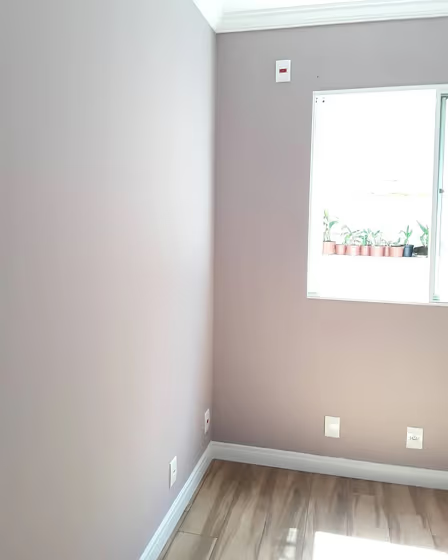
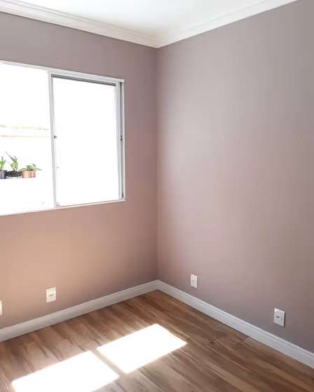
- Sherwin Williams Intuitive reviews (2 photos)
- What are Sherwin Williams Intuitive undertones?
- Is Intuitive SW 6017 cool or warm?
- How light temperature affects on Intuitive
- Monochromatic color scheme
- Complementary color scheme
- Color comparison and matching
- LRV of Intuitive SW 6017
- Color codes
- Color equivalents
| Official page: | Intuitive SW 6017 |
| Code: | SW 6017 |
| Name: | Intuitive |
| Brand: | Sherwin Williams |
| Collections: | Living Well, Luxe |
What color is Sherwin Williams Intuitive?
Sherwin Williams SW 6017 Intuitive is a versatile hue that exudes sophistication and depth. This rich hue serves as the perfect backdrop for pairing with complementary colors such as a crisp white like SW 7006 Extra White for a clean and modern look. For a bolder statement, consider accentuating SW 6017 Intuitive with navy blue, like SW 6244 Naval, to create a striking contrast. The velvety depth of SW 6017 Intuitive adds an element of elegance to any space, making it a timeless choice for interior design projects.
Loading...
LRV of Intuitive
Intuitive has an LRV of 38.45% and refers to Medium colors that reflect a lot of light. Why LRV is important?

Light Reflectance Value measures the amount of visible and usable light that reflects from a painted surface.
Simply put, the higher the LRV of a paint color, the brighter the room you will get.
The scale goes from 0% (absolute black, absorbing all light) to 100% (pure white, reflecting all light).
Act like a pro: When choosing paint with an LRV of 38.45%, pay attention to your bulbs' brightness. Light brightness is measured in lumens. The lower the paint's LRV, the higher lumen level you need. Every square foot of room needs at least 40 lumens. That means for a 200 ft2 living room you'll need about 8000 lumens of light – e.g., eight 1000 lm bulbs.
Color codes
We have collected almost every possible color code you could ever need.
Not sure what the difference between HEX and RGB is? We break down color models in plain language. Understanding color models
| Format | Code |
|---|---|
| HEX | #b3a3a5 |
| RGB Decimal | 179, 163, 165 |
| RGB Percent | 70.20%, 63.92%, 64.71% |
| HSV | Hue: 352° Saturation: 8.94% Value: 70.2% |
| HSL | hsl(352, 10, 67) |
| CMYK | Cyan: 0.0 Magenta: 8.94 Yellow: 7.82 Key: 29.8 |
| YIQ | Y: 168.012 I: 8.892 Q: 4.007 |
| XYZ | X: 38.478 Y: 38.495 Z: 40.99 |
| CIE Lab | L:68.384 a:6.156 b:1.077 |
| CIE Luv | L:68.384 u:9.303 v:0.498 |
| Decimal | 11772837 |
| Hunter Lab | 62.045, 2.122, 4.261 |