Tikkurila K494

Code:K494
Name:
Brand:Tikkurila

What color is Tikkurila K494?

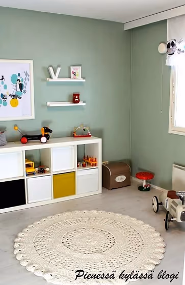
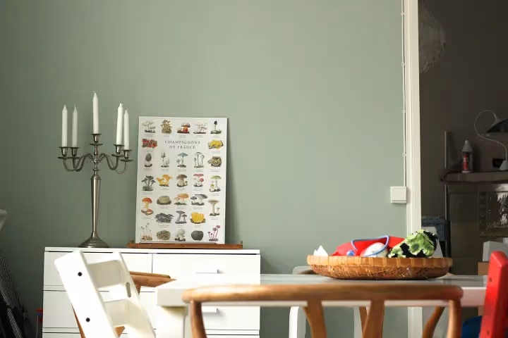
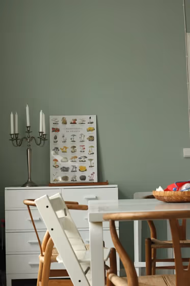
The Tikkurila K494 paint color encapsulates a sense of sophistication and warmth, exuding a timeless elegance that effortlessly enhances any space. This rich hue strikes the perfect balance between depth and vibrancy, making it a versatile choice for various design styles. Pair K494 with complementary tones such as soft greiges, muted blues, and earthy greens to create a harmonious color palette that evokes a sense of tranquility and refinement. Whether used as an accent or as a main color, K494 adds a touch of understated luxury to interiors, elevating the overall aesthetic with its timeless appeal.

Tikkurila K494 reviews

View the photos of real spaces painted with this that were not included in specific categories.Close-ups, painted furniture, storages and dressers, hallways, stairs and ceilings.

Interior with paint color Tikkurila  K494
Image source
Interior with paint color Tikkurila  K494
Source link not active
Interior with paint color Tikkurila  K494
Source link not active
Interior with paint color Tikkurila  K494
Image source
Interior with paint color Tikkurila  K494
Source link not active
Interior with paint color Tikkurila  K494
Source link not active
Interior with paint color Tikkurila  K494
Image source
Interior with paint color Tikkurila  K494
Source link not active
Interior with paint color Tikkurila  K494
Source link not active

Try before you buy

Samplize samples on the wall
Samplize logo

100% accurate
reusable paint samples

Peel, stick and repeat

Peel, stick,
and repeat

Twice painted samples

Twice painted
with real paint

Fast delivery

Next day
delivery

Shop now

What are Tikkurila K494 undertones?

The undertone of K494 can be accurately described as a Green hue, as is apparent from the color space provided. By isolating the pure hue and eliminating any tints, tones, and shades, we were able to precisely determine its undertone. This approach has proven to be more accurate than traditional methods of defining undertones on a white background, which are now considered outdated.

R
G
B

HEX value

HEX value:

#BBC5B7

RGB code:

187, 197, 183

Is Tikkurila K494 cool or warm?

warm
Color wheel
cool

With a hue of 103° thisGreenrefers cool paint shade according to HSL (Hue, Saturation, Lightness) on the color wheel.

K494 HSL code: 103, 11%, 75%

Hue - degree on a color wheel from 0 to 360. 0 is red, 120 is green, and 240 is blue.
Saturation is expressed as a percentage. At 0%, it appears as a shade of grey, and at 100%, it is in full color..
Lightness is also a percentage value. 0% is black, and 100% is white.

  • Cooler hues have a calm and relaxation effect
  • Cool green shades bring a refreshing and tranquil vibe to a space, making it feel rejuvenating and connected to nature, ideal for bathrooms, bedrooms, and living rooms.
  • Using mid-tone cool colors like soft greys and muted blues can help create a calming and modern look in rooms like home offices, bathrooms, and bedrooms. But avoid using these shades in rooms without natural light, as they may look dull.

Act like a pro: Mixing warm and cool shades is a must have to get harmonius interior. Add accents that contrast with the primary color to create visual balance. If your walls are a warm color, don’t forget to add accent in cold colors (furniture, art, décor). A good practice is too use a complementary color scheme.

How light temperature affects K494

Natural Lighting. During the day, natural light shifts from about 2000 K at sunrise/sunset to 5500–6500 K at noon.

In addition, natural‑light temperature depends on its direction:

Direction of sunlightVisible temp.HueDuration
NorthCoolBluishAll day
EastWarmYellowBefore noon
WestWarmOrange‑redAfter noon
SouthWarmOrange‑yellowAll day

Artificial Lighting. When choosing bulbs, pay attention to their color‑temperature (Kelvins).
Use the slider to see how this Green shade looks under different lighting:

Living‑room mockup
Living‑room overlay

4000K

2000K
3000K
4000K
5000K
6000K
7000K

LRV of K494

K494 has an LRV of 52.94% and refers to Light Medium colors that reflect half of the incident lightWhy LRV is important?

Light Reflectance Value scale illustration

Light Reflectance Value measures the amount of visible and usable light that reflects from a painted surface.
Simply put, the higher the LRV of a paint color, the brighter the room you will get.
The scale goes from 0% (absolute black, absorbing all light) to 100% (pure white, reflecting all light).

Act like a pro: When choosing paint with an LRV of 52.94%, pay attention to your bulbs' brightness. Light brightness is measured in lumens. The lower the paint's LRV, the higher lumen level you need. Every square foot of room needs at least 40 lumens. That means for a 200 ft2 living room you’ll need about 8000 lumens of light – e.g., eight 1000 lm bulbs.

Color codes

We have collected almost every possible color code you could ever need. To copy the code, just click the icon to the right of it.

FormatCode
HEX#BBC5B7Copy color code
RGB Decimal187, 197, 183Copy color code
RGB Percent73.33%, 77.25%, 71.76%Copy color code
HSVHue: 103° Saturation: 7.11% Value: 77.25%Copy color code
HSLhsl(103, 11, 75)Copy color code
CMYKCyan: 5.08 Magenta: 0.0 Yellow: 7.11 Key: 22.75Copy color code
YIQY: 192.414 I: -1.46 Q: -6.472Copy color code
XYZX: 49.005 Y: 53.916 Z: 52.612Copy color code
CIE LabL:78.413 a:-6.02 b:5.839Copy color code
CIE LuvL:78.413 u:-4.921 v:9.646Copy color code
Decimal12305847Copy color code
Hunter Lab73.428, -9.369, 8.917Copy color code