Tikkurila K496

Code:K496
Name:
Brand:Tikkurila

What color is Tikkurila K496?

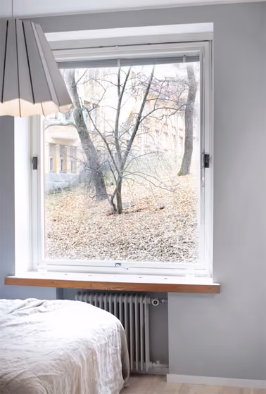
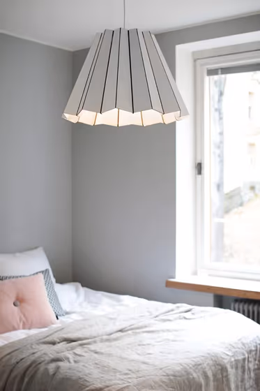
The Tikkurila K496 paint color brings a sense of sophistication and modernity to any space, creating a stylish and contemporary atmosphere. This versatile color pairs beautifully with warm neutrals like a creamy off-white or a subtle dove gray. For a bolder look, consider pairing K496 with deep navy blue accents or rich earthy tones like terracotta. The understated elegance of Tikkurila K496 makes it a perfect choice for creating a chic and timeless interior design palette.

Tikkurila K496 reviews

View the photos of real spaces painted with this that were not included in specific categories.Close-ups, painted furniture, storages and dressers, hallways, stairs and ceilings.

Interior with paint color Tikkurila  K496
Image source
Interior with paint color Tikkurila  K496
Image source
Interior with paint color Tikkurila  K496
Image source
Interior with paint color Tikkurila  K496
Image source
Interior with paint color Tikkurila  K496
Image source

Try before you buy

Samplize samples on the wall
Samplize logo

100% accurate
reusable paint samples

Peel, stick and repeat

Peel, stick,
and repeat

Twice painted samples

Twice painted
with real paint

Fast delivery

Next day
delivery

Shop now

What are Tikkurila K496 undertones?

The undertone of K496 can be accurately described as a Green hue, as is apparent from the color space provided. By isolating the pure hue and eliminating any tints, tones, and shades, we were able to precisely determine its undertone. This approach has proven to be more accurate than traditional methods of defining undertones on a white background, which are now considered outdated.

R
G
B

HEX value

HEX value:

#B9BCBB

RGB code:

185, 188, 187

Is Tikkurila K496 cool or warm?

warm
Color wheel
cool

With a hue of 160° thisGreyrefers cool paint shade according to HSL (Hue, Saturation, Lightness) on the color wheel.

K496 HSL code: 160, 2%, 73%

Hue - degree on a color wheel from 0 to 360. 0 is red, 120 is green, and 240 is blue.
Saturation is expressed as a percentage. At 0%, it appears as a shade of grey, and at 100%, it is in full color..
Lightness is also a percentage value. 0% is black, and 100% is white.

  • Cooler hues have a calm and relaxation effect
  • Cool grey shades are versatile and provide a neutral canvas for your interior design. They seamlessly complement any style, whether it's Victorian, Scandinavian, or Modern.
  • Light, soft colors like pastel blues and greens make a room feel fresh and open. They're great for bathrooms, nurseries, and kitchens, creating a calm and inviting atmosphere. Just avoid using these colors in north-facing rooms, as they might feel too cold.

Act like a pro: Mixing warm and cool shades is a must have to get harmonius interior. Add accents that contrast with the primary color to create visual balance. If your walls are a warm color, don’t forget to add accent in cold colors (furniture, art, décor). A good practice is too use a complementary color scheme.

How light temperature affects K496

Natural Lighting. During the day, natural light shifts from about 2000 K at sunrise/sunset to 5500–6500 K at noon.

In addition, natural‑light temperature depends on its direction:

Direction of sunlightVisible temp.HueDuration
NorthCoolBluishAll day
EastWarmYellowBefore noon
WestWarmOrange‑redAfter noon
SouthWarmOrange‑yellowAll day

Artificial Lighting. When choosing bulbs, pay attention to their color‑temperature (Kelvins).
Use the slider to see how this Grey shade looks under different lighting:

Living‑room mockup
Living‑room overlay

4000K

2000K
3000K
4000K
5000K
6000K
7000K

Coordinating colors.
Colors that go with Tikkurila K496:

Monochromatic color scheme

Monochromatic color scheme

This scheme consists of various shades, tints, and tones of a single color. While it offers a perfect combination of hues, without accent décor it may become monotonous.

Lighter shades

K496

LRV of K496

K496 has an LRV of 49.69% and refers to Light Medium colors that reflect half of the incident lightWhy LRV is important?

Light Reflectance Value scale illustration

Light Reflectance Value measures the amount of visible and usable light that reflects from a painted surface.
Simply put, the higher the LRV of a paint color, the brighter the room you will get.
The scale goes from 0% (absolute black, absorbing all light) to 100% (pure white, reflecting all light).

Act like a pro: When choosing paint with an LRV of 49.69%, pay attention to your bulbs' brightness. Light brightness is measured in lumens. The lower the paint's LRV, the higher lumen level you need. Every square foot of room needs at least 40 lumens. That means for a 200 ft2 living room you’ll need about 8000 lumens of light – e.g., eight 1000 lm bulbs.

Color codes

We have collected almost every possible color code you could ever need. To copy the code, just click the icon to the right of it.

FormatCode
HEX#B9BCBBCopy color code
RGB Decimal185, 188, 187Copy color code
RGB Percent72.55%, 73.73%, 73.33%Copy color code
HSVHue: 160° Saturation: 1.6% Value: 73.73%Copy color code
HSLhsl(160, 2, 73)Copy color code
CMYKCyan: 1.6 Magenta: 0.0 Yellow: 0.53 Key: 26.27Copy color code
YIQY: 186.989 I: -1.466 Q: -0.946Copy color code
XYZX: 46.958 Y: 49.868 Z: 54.152Copy color code
CIE LabL:75.988 a:-1.232 b:0.143Copy color code
CIE LuvL:75.988 u:-1.638 v:0.425Copy color code
Decimal12172475Copy color code
Hunter Lab70.618, -4.885, 3.967Copy color code
Copy color code
Copy paint color code