Tikkurila Fell L430
| Code: | L430 |
| Name: | Fell |
| Brand: | Tikkurila |
What color is Tikkurila Fell?
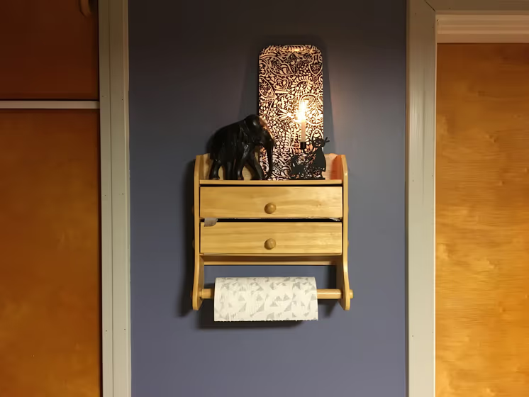
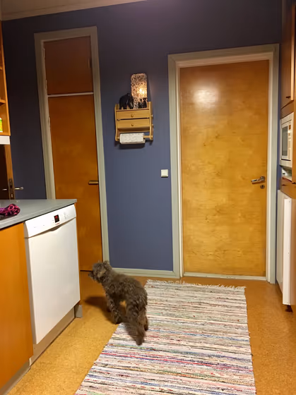
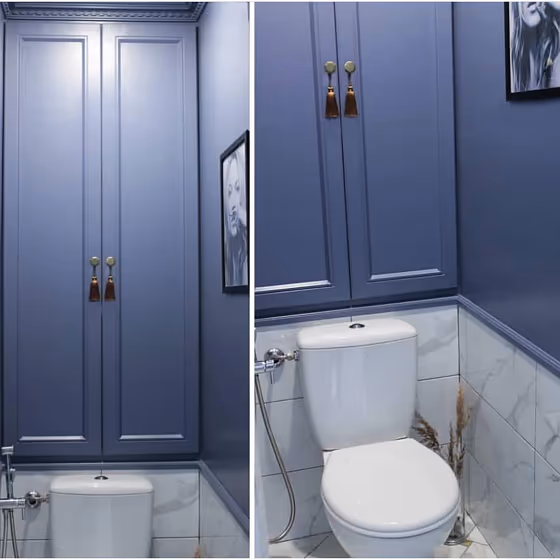
Enhance your space with the timeless elegance of Tikkurila L430 Fell, a warm and inviting hue that exudes sophistication. This rich shade pairs beautifully with contrasting colors like L149 Vanamo Green, creating a harmonious and balanced color scheme. For a modern twist, consider combining it with L497 Salmiakki Black or L448 Lupine Blue for a striking visual impact. Elevate your interiors with Tikkurila L430 Fell and unlock a world of design possibilities that will transform your space into a sanctuary of style and comfort.
Tikkurila Fell reviews
View the photos of real spaces painted with this that were not included in specific categories.Close-ups, painted furniture, storages and dressers, hallways, stairs and ceilings.
Try before you buy

100% accurate
reusable paint samples
Peel, stick,
and repeat
Twice painted
with real paint
Next day
delivery
What are Tikkurila Fell undertones?
The undertone of Fell can be accurately described as a Blue hue, as is apparent from the color space provided. By isolating the pure hue and eliminating any tints, tones, and shades, we were able to precisely determine its undertone. This approach has proven to be more accurate than traditional methods of defining undertones on a white background, which are now considered outdated.
HEX value
HEX value:
#75839A
RGB code:
117, 131, 154
Is Tikkurila Fell L430 cool or warm?
With a hue of 217° thisdark bluerefers cool paint shade according to HSL (Hue, Saturation, Lightness) on the color wheel.
L430 Fell HSL code: 217, 15%, 53%
Hue - degree on a color wheel from 0 to 360. 0 is red, 120 is green, and 240 is blue.
Saturation is expressed as a percentage. At 0%, it appears as a shade of grey, and at 100%, it is in full color..
Lightness is also a percentage value. 0% is black, and 100% is white.
- Cooler hues have a calm and relaxation effect
- Cool blue shades make a room feel sleek, fresh, and modern, perfect for bedrooms, bathrooms, and home offices where a sense of calm and sophistication is desired.
- Dark, cool shades create a dramatic and sophisticated atmosphere, making them a great choice for bedrooms and living rooms when you want to make a bold yet calming statement. However, be cautious about using dark, cool colors in small spaces, as they can make the room feel smaller and more enclosed.
Act like a pro: Mixing warm and cool shades is a must have to get harmonius interior. Add accents that contrast with the primary color to create visual balance. If your walls are a warm color, don’t forget to add accent in cold colors (furniture, art, décor). A good practice is too use a complementary color scheme.
How light temperature affects Fell
Natural Lighting. During the day, natural light shifts from about 2000 K at sunrise/sunset to 5500–6500 K at noon.
In addition, natural‑light temperature depends on its direction:
| Direction of sunlight | Visible temp. | Hue | Duration |
|---|---|---|---|
| North | Cool | Bluish | All day |
| East | Warm | Yellow | Before noon |
| West | Warm | Orange‑red | After noon |
| South | Warm | Orange‑yellow | All day |
Artificial Lighting. When choosing bulbs, pay attention to their color‑temperature (Kelvins).
Use the slider to see how this dark blue shade looks under different lighting:


4000K
Coordinating colors.
Colors that go with Tikkurila Fell:
Monochromatic color scheme
This scheme consists of various shades, tints, and tones of a single color. While it offers a perfect combination of hues, without accent décor it may become monotonous.
Darker shades
L430
Fell
Complementary color scheme
This color scheme is a combination of two shades that are opposite each other on the color wheel. The high contrast between these colors creates a vibrant and dynamic visual effect. For the color Fell with a blue hue, complementary colors are those with a orange hue close to 37, such as Tikkurila Vulcanite and Claystone.
LRV of Fell
Fell has an LRV of 22.29% and refers to Medium colors that reflect a lot of light. Why LRV is important?
Light Reflectance Value measures the amount of visible and usable light that reflects from a painted surface.
Simply put, the higher the LRV of a paint color, the brighter the room you will get.
The scale goes from 0% (absolute black, absorbing all light) to 100% (pure white, reflecting all light).
Act like a pro: When choosing paint with an LRV of 22.29%, pay attention to your bulbs' brightness. Light brightness is measured in lumens. The lower the paint's LRV, the higher lumen level you need. Every square foot of room needs at least 40 lumens. That means for a 200 ft2 living room you’ll need about 8000 lumens of light – e.g., eight 1000 lm bulbs.
Color codes
We have collected almost every possible color code you could ever need. To copy the code, just click the icon to the right of it.
| Format | Code | |
|---|---|---|
| HEX | #75839A | |
| RGB Decimal | 117, 131, 154 | |
| RGB Percent | 45.88%, 51.37%, 60.39% | |
| HSV | Hue: 217° Saturation: 24.03% Value: 60.39% | |
| HSL | hsl(217, 15, 53) | |
| CMYK | Cyan: 24.03 Magenta: 14.94 Yellow: 0.0 Key: 39.61 | |
| YIQ | Y: 129.436 I: -15.734 Q: 4.196 | |
| XYZ | X: 21.283 Y: 22.347 Z: 33.755 | |
| CIE Lab | L:54.393 a:0.205 b:-13.992 | |
| CIE Luv | L:54.393 u:-8.387 v:-20.483 | |
| Decimal | 7701402 | |
| Hunter Lab | 47.273, -2.362, -9.245 |
Color equivalents
Blue Incense
Dulux
70BB 21/147
Imperial Mauve 1
Dulux
278
Pale Lupin
Little Greene

RAL 5014
Pigeon blue
RAL Classic

70BB 27/201
Spring Crocus
Dulux
70BB 24/245
Martian Skies 4
Dulux
S431
Delft
Tikkurila

Pressed Thistle
Dulux
4618
Evening Light
Jotun

Sapphire Springs 5
Dulux
70BB 28/224
Martian Skies 5
Dulux
10BB 28/116
Niagara Blues 2
Dulux
30BB 21/056
Grey Splendor
Dulux
L433
Atlantis
Tikkurila

S500
Surf
Tikkurila

K431
Tikkurila


