Sherwin Williams Latte SW 6108
Contentsshow +hide -
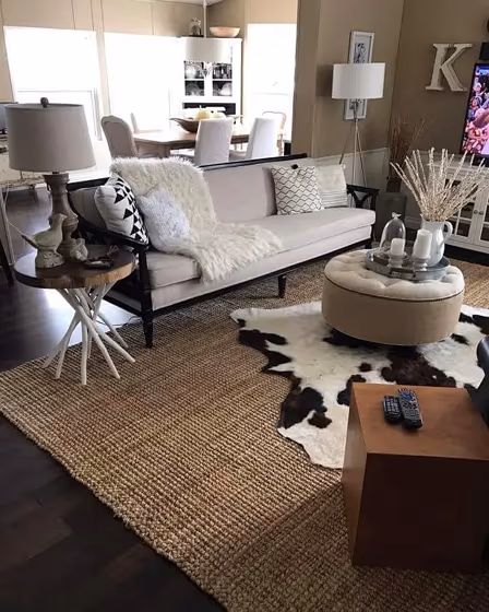
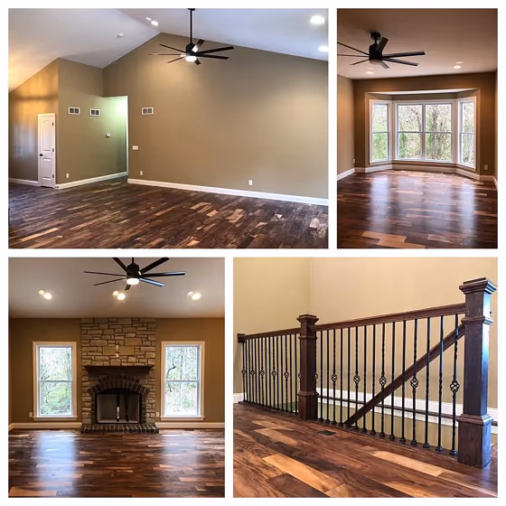
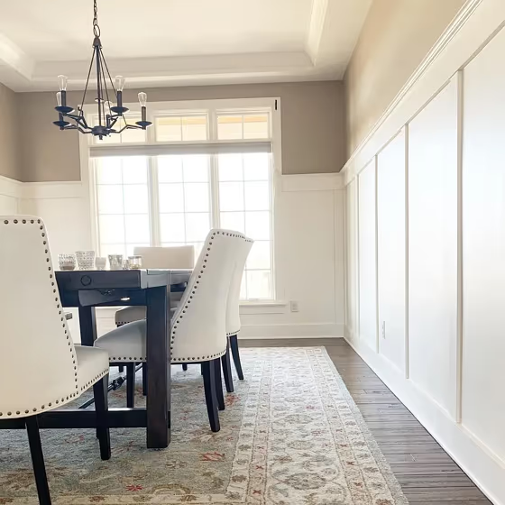
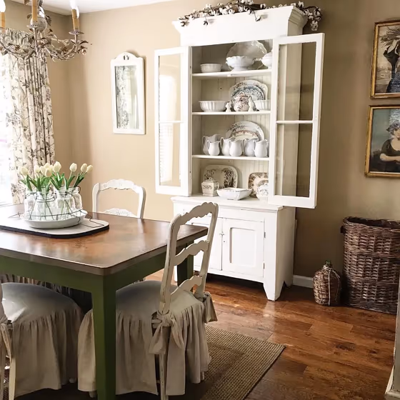
- Latte for living room (2 photos)
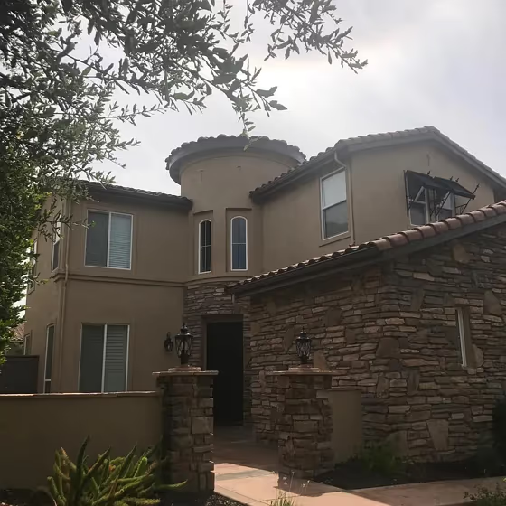
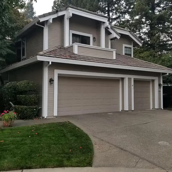
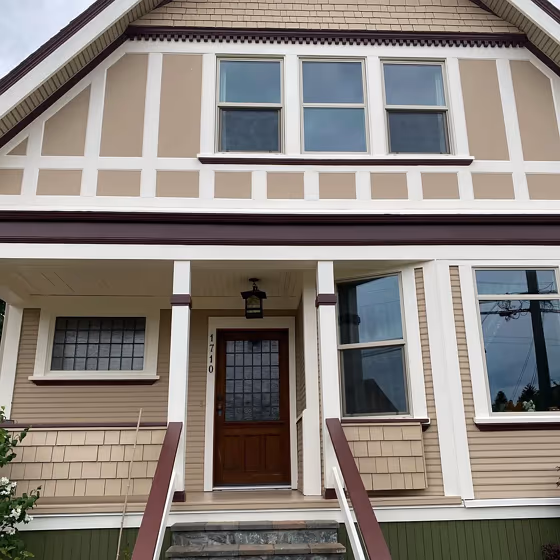
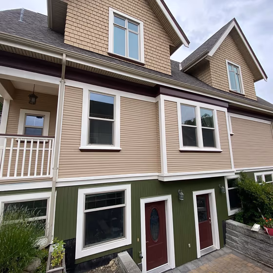
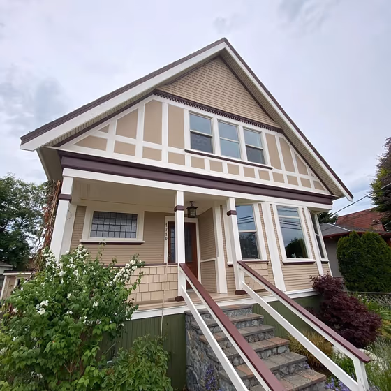
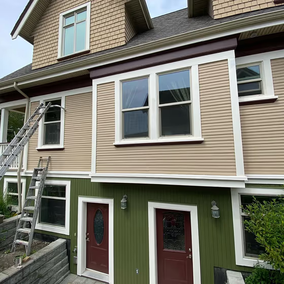
- Latte for exterior (6 photos)
- Sherwin Williams Latte reviews (2 photos)
- What are Sherwin Williams Latte undertones?
- Is Latte SW 6108 cool or warm?
- How light temperature affects on Latte
- Monochromatic color scheme
- Complementary color scheme
- Color comparison and matching
- LRV of Latte SW 6108
- Color codes
- Color equivalents
| Official page: | Latte SW 6108 |
| Code: | SW 6108 |
| Name: | Latte |
| Brand: | Sherwin Williams |
| Collections: | Warm Neutrals |
What color is Sherwin Williams Latte?
Sherwin Williams Latte SW 6108 is a muted, medium-light beige with clear warm brown and soft golden undertones. Its depth keeps it from reading as a pale cream, giving walls a grounded tan presence without becoming overly dark. In bright natural light, Latte can look lighter and more buff-toned, while evening light tends to bring out its warmer brown cast. It suits living rooms, dining areas, and bedrooms where wood furniture, woven textures, or aged brass are part of the mix. Pair this shade with warm white trim, medium oak, cognac leather, and muted olive or clay accents for a layered, earthy palette.
Loading...
LRV of Latte
Latte has an LRV of 37.57% and refers to Medium colors that reflect a lot of light. Why LRV is important?

Light Reflectance Value measures the amount of visible and usable light that reflects from a painted surface.
Simply put, the higher the LRV of a paint color, the brighter the room you will get.
The scale goes from 0% (absolute black, absorbing all light) to 100% (pure white, reflecting all light).
Act like a pro: When choosing paint with an LRV of 37.57%, pay attention to your bulbs' brightness. Light brightness is measured in lumens. The lower the paint's LRV, the higher lumen level you need. Every square foot of room needs at least 40 lumens. That means for a 200 ft2 living room you'll need about 8000 lumens of light – e.g., eight 1000 lm bulbs.
Color codes
We have collected almost every possible color code you could ever need.
Not sure what the difference between HEX and RGB is? We break down color models in plain language. Understanding color models
| Format | Code |
|---|---|
| HEX | #baa185 |
| RGB Decimal | 186, 161, 133 |
| RGB Percent | 72.94%, 63.14%, 52.16% |
| HSV | Hue: 32° Saturation: 28.49% Value: 72.94% |
| HSL | hsl(32, 28, 63) |
| CMYK | Cyan: 0.0 Magenta: 13.44 Yellow: 28.49 Key: 27.06 |
| YIQ | Y: 165.283 I: 23.895 Q: -3.425 |
| XYZ | X: 37.228 Y: 37.624 Z: 27.485 |
| CIE Lab | L:67.742 a:4.874 b:17.985 |
| CIE Luv | L:67.742 u:17.487 v:23.499 |
| Decimal | 12231045 |
| Hunter Lab | 61.338, 0.996, 16.369 |