Little Greene Confetti 274
| Official page: | Confetti 274 |
| Code: | 274 |
| Name: | Confetti |
| Brand: | Little Greene |
| Collections: | Colours of England |
What color is Little Greene Confetti?
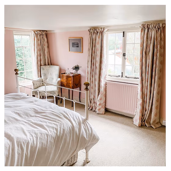
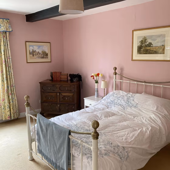
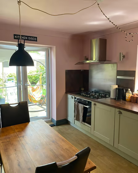
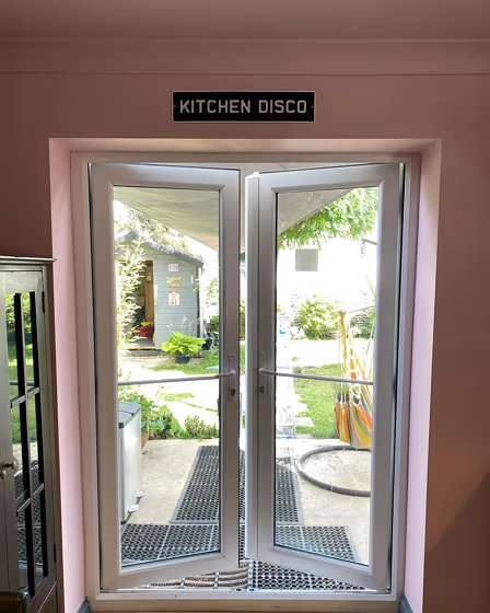
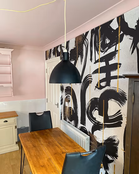
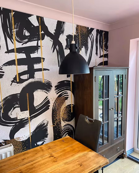
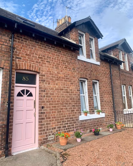
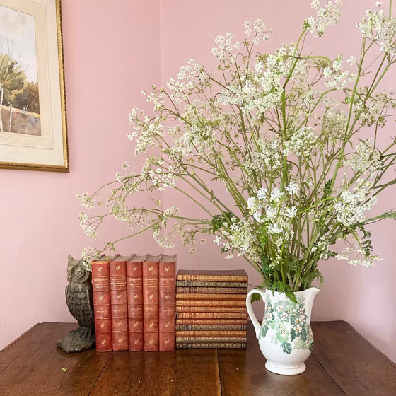
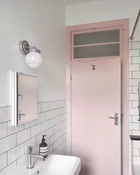
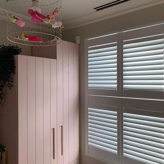
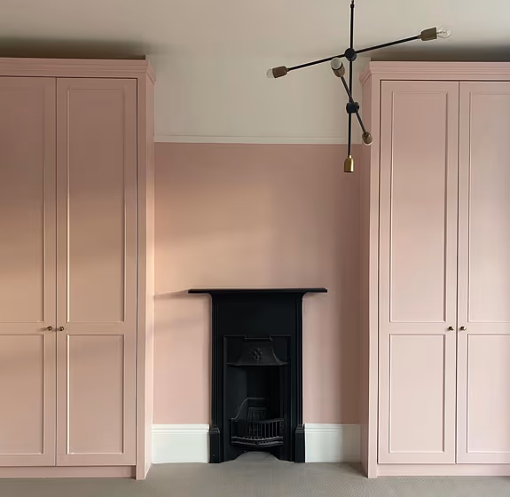
Immerse your space in the soft and sophisticated charm of Little Greene 274 Confetti. This gentle shade, reminiscent of delicate rose petals, adds a touch of warmth and elegance to any room. Pair Confetti with the timeless elegance of Little Edwardian 198 for a classic look, or create a modern contrast with the deep richness of Little Goblin 312. Whether used as the main color or as an accent, Little Greene 274 Confetti brings a sense of tranquility and grace to your interiors. Elevate your home decor with this versatile and inviting hue.
Confetti for bedroom
We’ve hand-picked a beautiful collection of photos of this amazing Beige shade used in real bedrooms. Take a look and imagine how this wonderful warm Light paint color could transform your own bedroom space.
Little Greene Confetti reviews
View the photos of real spaces painted with this that were not included in specific categories.Close-ups, painted furniture, storages and dressers, hallways, stairs and ceilings.
Try before you buy

100% accurate
reusable paint samples
Peel, stick,
and repeat
Twice painted
with real paint
Next day
delivery
What are Little Greene Confetti undertones?
The undertone of Confetti can be accurately described as a Red hue, as is apparent from the color space provided. By isolating the pure hue and eliminating any tints, tones, and shades, we were able to precisely determine its undertone. This approach has proven to be more accurate than traditional methods of defining undertones on a white background, which are now considered outdated.
HEX value
HEX value:
#E9D0CF
RGB code:
233, 208, 207
Is Little Greene Confetti 274 cool or warm?
With a hue of 2° thisPinkrefers warm paint shade according to HSL (Hue, Saturation, Lightness) on the color wheel.
274 Confetti HSL code: 2, 37%, 86%
Hue - degree on a color wheel from 0 to 360. 0 is red, 120 is green, and 240 is blue.
Saturation is expressed as a percentage. At 0%, it appears as a shade of grey, and at 100%, it is in full color..
Lightness is also a percentage value. 0% is black, and 100% is white.
- Warm colors are ideal for kitchens, living rooms or bathrooms
- Warmer hues make larger spaces feel more inviting
- Warm pink shades offer a cheerful and inviting ambiance, making spaces feel cozy and vibrant, perfect for bedrooms, living rooms, and creative spaces.
- Warm purple shades add a rich and luxurious feel to a room, creating a sense of depth and warmth, ideal for bedrooms, living rooms, and dining areas.
- To prevent a space from feeling too monotonous, consider pairing warm light shades with richer tones like deep greens or browns, or adding textures through fabrics and furnishings. Avoid using them in rooms with limited natural light, as they may appear too dull or yellowish
Act like a pro: Mixing warm and cool shades is a must have to get harmonius interior. Add accents that contrast with the primary color to create visual balance. If your walls are a warm color, don’t forget to add accent in cold colors (furniture, art, décor). A good practice is too use a complementary color scheme.
How light temperature affects Confetti
Natural Lighting. During the day, natural light shifts from about 2000 K at sunrise/sunset to 5500–6500 K at noon.
In addition, natural‑light temperature depends on its direction:
| Direction of sunlight | Visible temp. | Hue | Duration |
|---|---|---|---|
| North | Cool | Bluish | All day |
| East | Warm | Yellow | Before noon |
| West | Warm | Orange‑red | After noon |
| South | Warm | Orange‑yellow | All day |
Artificial Lighting. When choosing bulbs, pay attention to their color‑temperature (Kelvins).
Use the slider to see how this Pink shade looks under different lighting:


4000K
Coordinating colors.
Colors that go with Little Greene Confetti:
Monochromatic color scheme
This scheme consists of various shades, tints, and tones of a single color. While it offers a perfect combination of hues, without accent décor it may become monotonous.
Lighter shades
274
Confetti
Complementary color scheme
This color scheme is a combination of two shades that are opposite each other on the color wheel. The high contrast between these colors creates a vibrant and dynamic visual effect. For the color Confetti with a red hue, complementary colors are those with a green hue close to 182, such as Little Greene Pleat and Harley Green.
Color codes
We have collected almost every possible color code you could ever need. To copy the code, just click the icon to the right of it.
| Format | Code | |
|---|---|---|
| HEX | #e9d0cf | |
| RGB Decimal | 233, 208, 207 | |
| RGB Percent | 91.37%, 81.57%, 81.18% | |
| HSV | Hue: 2° Saturation: 11.16% Value: 91.37% | |
| HSL | hsl(2, 37, 86) | |
| CMYK | Cyan: 0.0 Magenta: 10.73 Yellow: 11.16 Key: 8.63 | |
| YIQ | Y: 215.361 I: 15.219 Q: 4.977 | |
| XYZ | X: 67.421 Y: 66.942 Z: 68.384 | |
| CIE Lab | L:85.475 a:8.528 b:3.681 | |
| CIE Luv | L:85.475 u:14.884 v:3.961 | |
| Decimal | 15323343 | |
| Hunter Lab | 81.818, 3.909, 7.718 |
Color equivalents
90RR 68/090
Adobe Pink 5
Dulux
90RR 69/101
Party Surprise 4
Dulux
70RR 67/092
Candy Love 5
Dulux
10YR 67/100
Ballerina Dance
Dulux
Sorbet
Dulux
30YR 66/099
Sicilian Summer 5
Dulux
3021
Petal Pink
Jotun
10YR 67/111
Burnt Autumn 5
Dulux
220
Pink Slip
Little Greene

80RR 77/083
Iced Gem
Dulux
30YR 67/113
Thai Magic 5
Dulux
55RR 75/106
Rose Trellis 5
Dulux
230
Calamine
Farrow and Ball

Y408
Tikkurila

30RR 67/093
Waterlily Blush 5
Dulux
Y411
Milkshake
Tikkurila

Sweet Nougat
Dulux
Y421
Orchid
Tikkurila


