Little Greene Down 242
Official color page: | Down 242 |
Color code: | 242 |
Color name: | Down |
Brand: | Little Greene |
Color collections: | Grey |
What color is Little Greene Down?
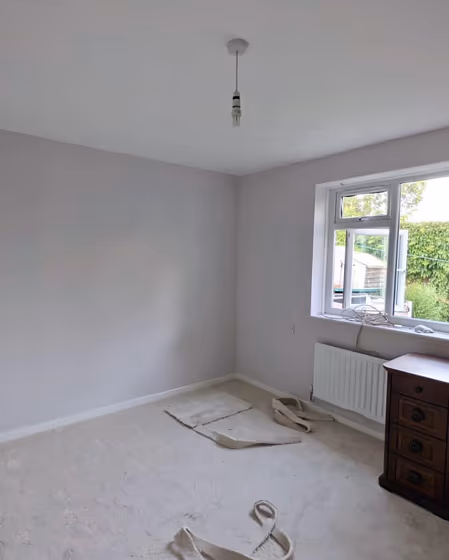
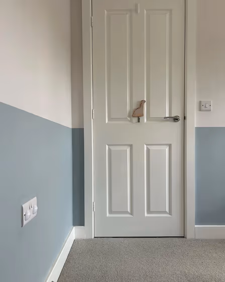
Step into a world of sophistication with Little Greene 242 Down. This elegant shade adds a touch of understated glamour to any space, whether it's a cozy living room or a luxurious bedroom. The subtle warmth of 242 Down creates a welcoming atmosphere, perfect for intimate gatherings or peaceful retreats. Its versatility allows it to seamlessly complement both modern and traditional interiors, making it an ideal choice for those seeking a timeless yet contemporary aesthetic. Let Little Greene's 242 Down transform your home into a sanctuary of style and comfort.
Little Greene Down reviews
View the photos of real spaces painted with this that were not included in specific categories.Close-ups, painted furniture, storages and dressers, hallways, stairs and ceilings.
What are Little Greene Down undertones?
Red is Little Greene Down undertone color, as you can clearly see on the color field below. To determine this undertone we’ve removed all the tints, tones, shades and get HUE (pure color). Seems that undertone definition on a white sheet is already outdated and rather inaccurate
HEX value
HEX value:
#EEE6DD
RGB code:
238, 230, 221
Is Little Greene Down 242 cool or warm?
With a hue of 32° this Pink refers warm paint shade according to HSL (Hue, Saturation, Lightness) on the color wheel.
242 Down HSL code: 32, 33%, 90%
Hue - degree on a color wheel from 0 to 360. 0 is red, 120 is green, and 240 is blue.
Saturation is a percentage value. 0% is a shade of grey, and 100% is the full color.
Lightness is also a percentage value. 0% is black, and 100% is white.
- Warm Pink will make even large rooms feel cozy and intimate
- Warm Pink undertones tend to make you feel happy, energized and playful
- Warm paint colors are ideal for kitchens, living rooms or bathrooms
- Warmer hues make larger spaces feel more inviting
Act like a pro: Mixing warm and cool shades is a must have to get harmonius interior. Add accents that contrast with the primary color to create visual balance. If your walls are a warm color, don’t forget to add accent in cold colors (furniture, art, décor). A good practice is too use a complementary color scheme.
Coordinating colors.
Colors that go with Little Greene Down:
Monochromatic color scheme
This scheme consists of different shades, tints, and tones of a single color. It's the perfect hue combination, but with no accent decor it's pretty boring.
Lighter shades
Little Greene 242 Down
Complementary color scheme
This color scheme is a combination of two colors that are opposite each other on the color wheel. The high contrast between these colors creates a vibrant and dynamic visual effect.
Little Greene 242 Down
Color comparison
Down 242 vs Julie's Dream 26
Two gorgeous paint colors, but which one is right for you? Our comparison has got you covered.