Little Greene Silt 40
| Official page: | Silt 40 |
| Code: | 40 |
| Name: | Silt |
| Brand: | Little Greene |
| Collections: | Colours of England, Colour Scales |
What color is Little Greene Silt?
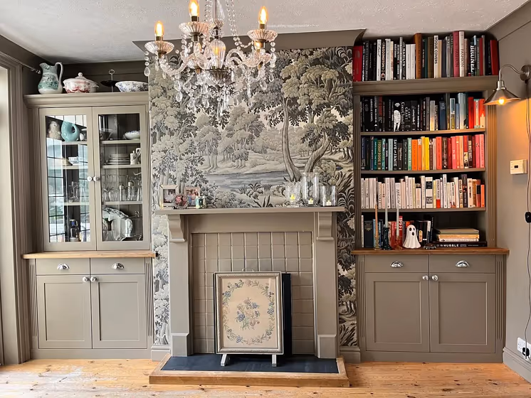
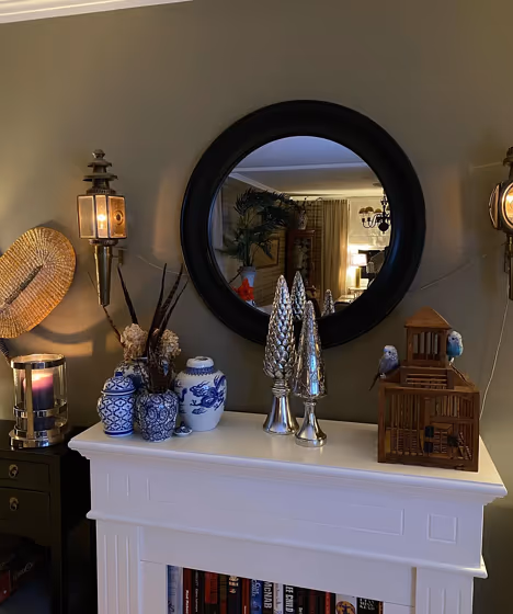
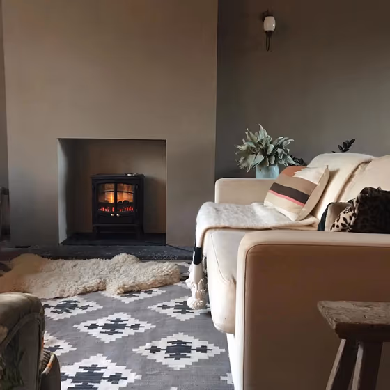
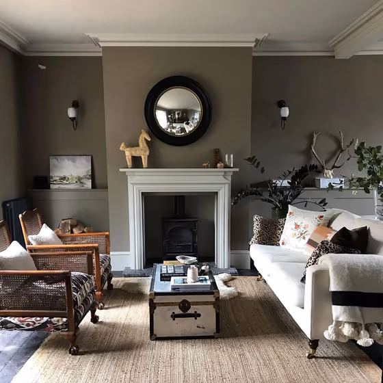
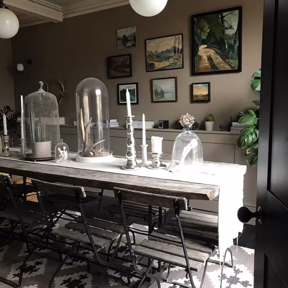
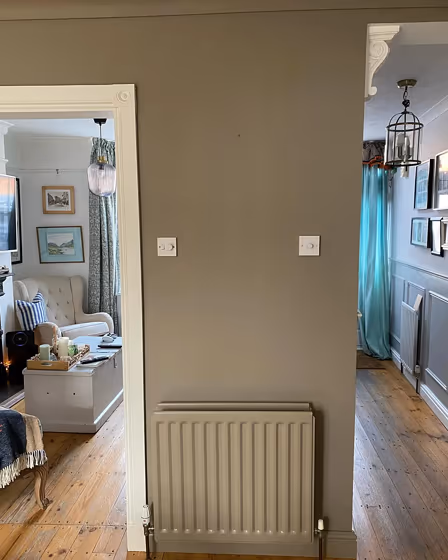
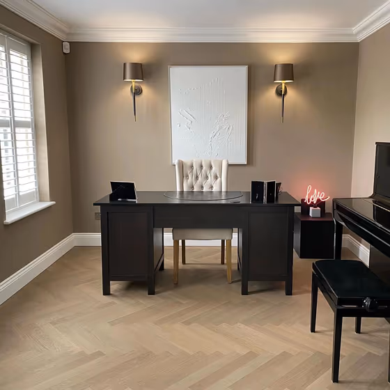
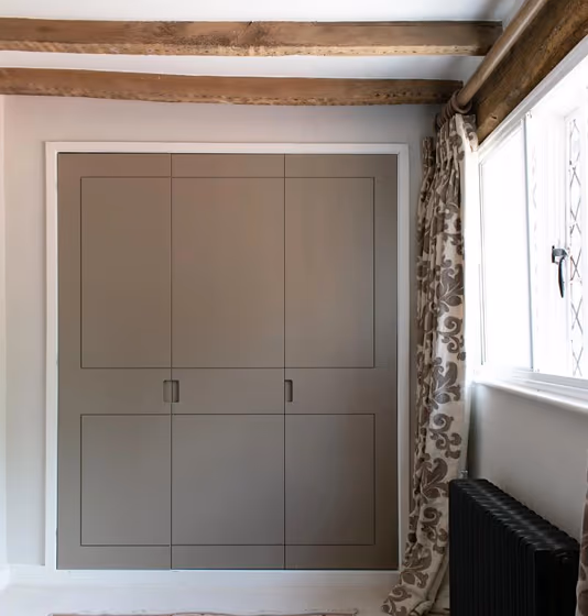
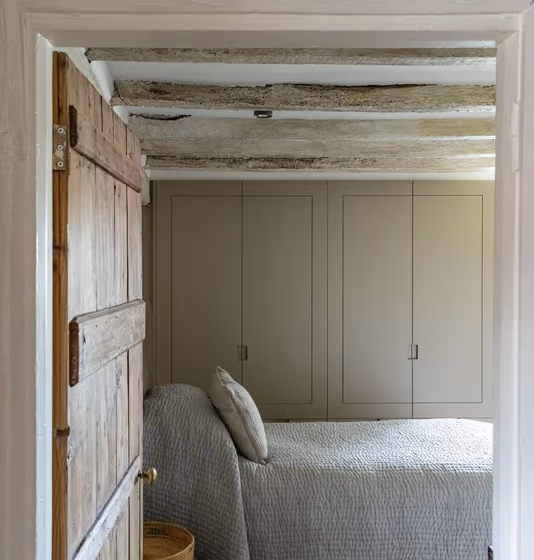
Introducing the sophisticated warmth of Little Greene 40 Silt, a versatile tone that effortlessly infuses any space with understated elegance. This inviting shade, perfect for creating a serene ambiance, pairs beautifully with tones such as 123 Clay, 87 Birch, and 255 Pewter to elevate your interior scheme. Whether used as a main color or as an accent, 40 Silt adds a touch of tranquility and refinement to any room. Embrace the timeless appeal of this hue and create a harmonious atmosphere that exudes style and sophistication. Experience the subtle richness of Little Greene 40 Silt and transform your living space into a haven of comfort and beauty.
Silt for living room
Check out this stunning Mid-tone color used in real living rooms. Explore how this Grey shade can create a unique space
Little Greene Silt reviews
View the photos of real spaces painted with this that were not included in specific categories.Close-ups, painted furniture, storages and dressers, hallways, stairs and ceilings.
Try before you buy

100% accurate
reusable paint samples
Peel, stick,
and repeat
Twice painted
with real paint
Next day
delivery
What are Little Greene Silt undertones?
The undertone of Silt can be accurately described as a Red hue, as is apparent from the color space provided. By isolating the pure hue and eliminating any tints, tones, and shades, we were able to precisely determine its undertone. This approach has proven to be more accurate than traditional methods of defining undertones on a white background, which are now considered outdated.
HEX value
HEX value:
#857E6C
RGB code:
133, 126, 108
Is Little Greene Silt 40 cool or warm?
With a hue of 43° thisGreyrefers warm paint shade according to HSL (Hue, Saturation, Lightness) on the color wheel.
40 Silt HSL code: 43, 10%, 47%
Hue - degree on a color wheel from 0 to 360. 0 is red, 120 is green, and 240 is blue.
Saturation is expressed as a percentage. At 0%, it appears as a shade of grey, and at 100%, it is in full color..
Lightness is also a percentage value. 0% is black, and 100% is white.
- Warm colors are ideal for kitchens, living rooms or bathrooms
- Warmer hues make larger spaces feel more inviting
- Warm grey shades are versatile and provide a neutral canvas for your interior design. They seamlessly complement any style, whether it's Victorian, Scandinavian, or Modern.
- Warm mid-tone shades like terracotta and warm beige create a cozy and inviting atmosphere in living rooms, bedrooms, and kitchens. They can brighten up spaces without being too overwhelming. However, it's best to avoid using these shades in very sunny rooms, as they can become too intense.
Act like a pro: Mixing warm and cool shades is a must have to get harmonius interior. Add accents that contrast with the primary color to create visual balance. If your walls are a warm color, don’t forget to add accent in cold colors (furniture, art, décor). A good practice is too use a complementary color scheme.
How light temperature affects Silt
Natural Lighting. During the day, natural light shifts from about 2000 K at sunrise/sunset to 5500–6500 K at noon.
In addition, natural‑light temperature depends on its direction:
| Direction of sunlight | Visible temp. | Hue | Duration |
|---|---|---|---|
| North | Cool | Bluish | All day |
| East | Warm | Yellow | Before noon |
| West | Warm | Orange‑red | After noon |
| South | Warm | Orange‑yellow | All day |
Artificial Lighting. When choosing bulbs, pay attention to their color‑temperature (Kelvins).
Use the slider to see how this Grey shade looks under different lighting:


4000K
Coordinating colors.
Colors that go with Little Greene Silt:
Monochromatic color scheme
This scheme consists of various shades, tints, and tones of a single color. While it offers a perfect combination of hues, without accent décor it may become monotonous.
Lighter shades
Complementary color scheme
This color scheme is a combination of two shades that are opposite each other on the color wheel. The high contrast between these colors creates a vibrant and dynamic visual effect. For the color Silt with a orange hue, complementary colors are those with a blue hue close to 223, such as Little Greene Juniper Ash and Pale Lupin.
Color codes
We have collected almost every possible color code you could ever need. To copy the code, just click the icon to the right of it.
| Format | Code | |
|---|---|---|
| HEX | #857e6c | |
| RGB Decimal | 133, 126, 108 | |
| RGB Percent | 52.16%, 49.41%, 42.35% | |
| HSV | Hue: 43° Saturation: 18.8% Value: 52.16% | |
| HSL | hsl(43, 10, 47) | |
| CMYK | Cyan: 0.0 Magenta: 5.26 Yellow: 18.8 Key: 47.84 | |
| YIQ | Y: 126.041 I: 9.955 Q: -4.121 | |
| XYZ | X: 19.84 Y: 20.991 Z: 17.19 | |
| CIE Lab | L:52.94 a:-0.554 b:10.768 | |
| CIE Luv | L:52.94 u:5.237 v:14.277 | |
| Decimal | 8748652 | |
| Hunter Lab | 45.816, -2.881, 9.826 |
Color equivalents
11012
Rustic Brown
Jotun

10965
Hipster Brown
Jotun

RAL 7002
Olive grey
RAL Classic

40YY 25/074
Urban Walk
Dulux

RAL 1035
Pearl beige
RAL Classic

8469
Green Leaf
Jotun

50YY 27/105
Common Dormouse
Dulux
12181
Soft Comfort
Jotun

RAL 7003
Moss grey
RAL Classic

8479
Evergreen
Jotun

RAL 7023
Concrete grey
RAL Classic

Warm Graphite
Dulux
RAL 7034
Yellow grey
RAL Classic

RAL 7048
Pearl mouse grey
RAL Classic

Warm Grey
Dulux
02YY 22/055
Praline Melt
Dulux

Weathered Penny
Dulux
1462
Evening Sky
Jotun


