Sherwin Williams Mindful Gray SW 7016
Contentsshow +hide -
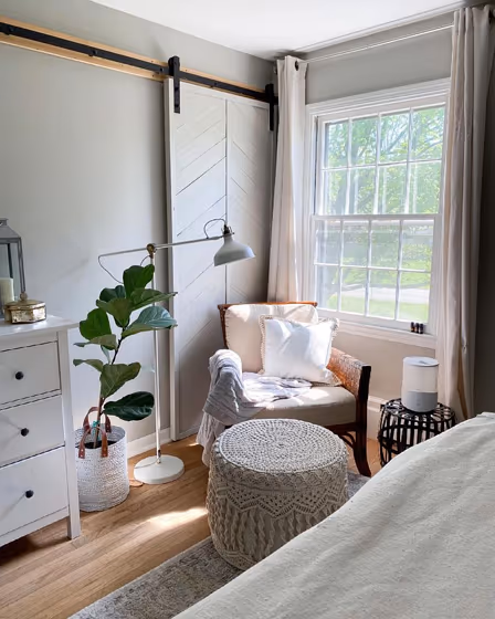
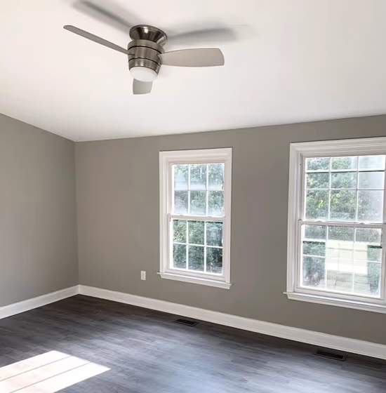
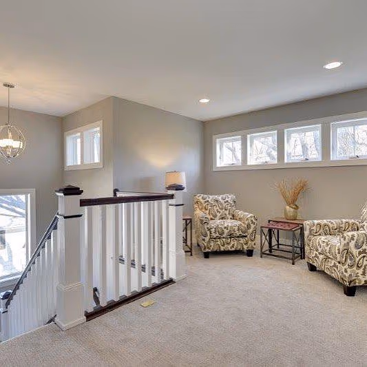
- Mindful Gray for bedroom (2 photos)
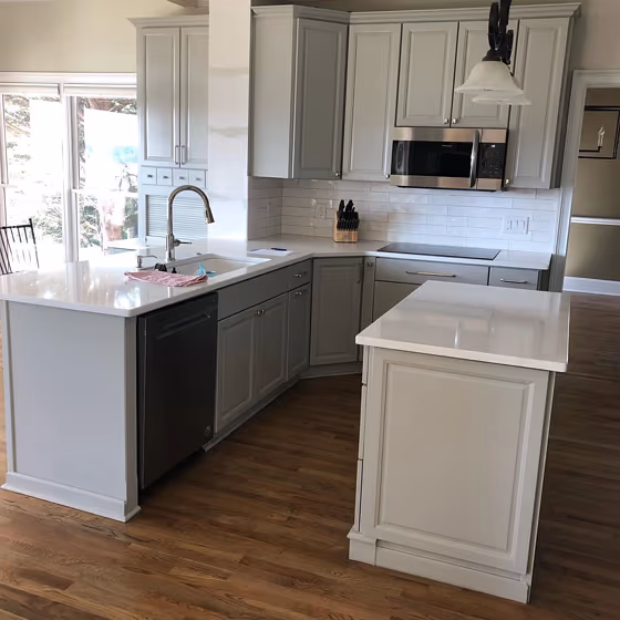
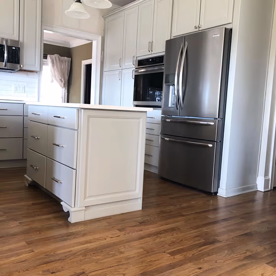
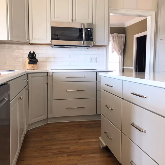
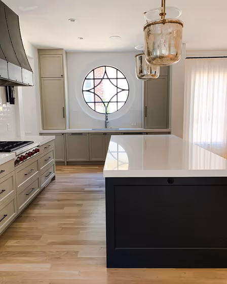
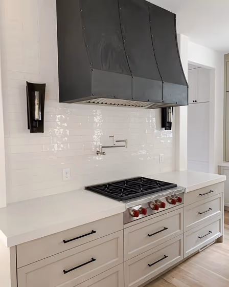
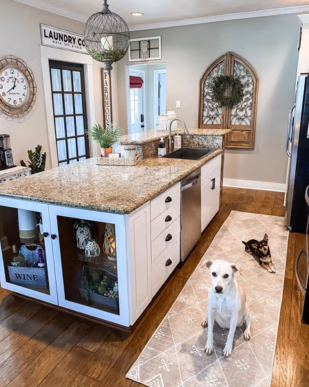
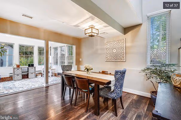
- Sherwin Williams SW 7016 on kitchen cabinets (5 photos)
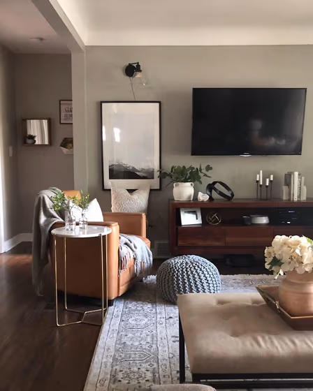
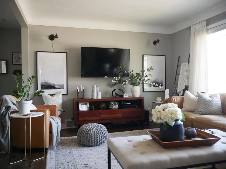
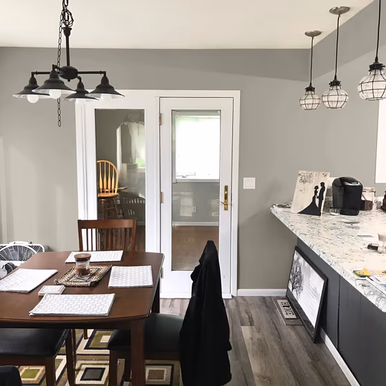
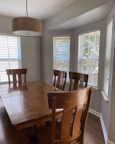
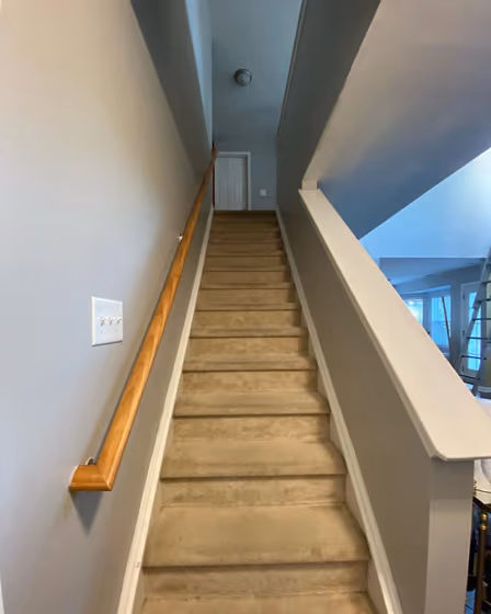
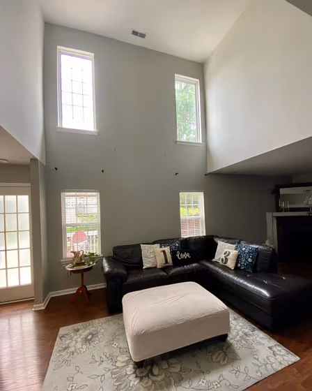
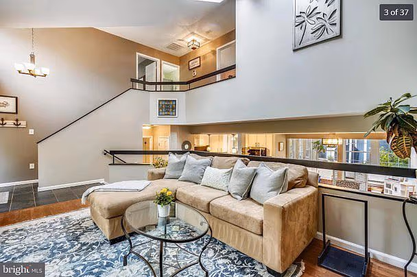
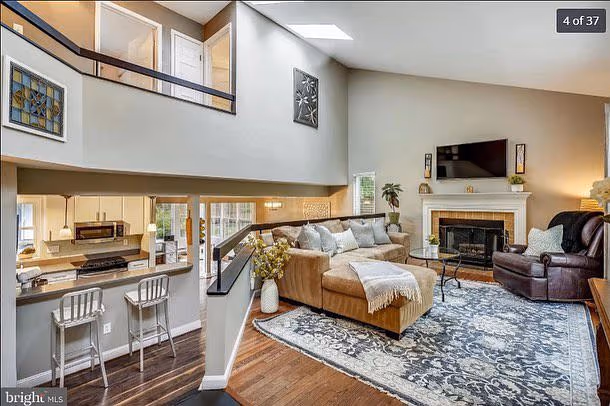
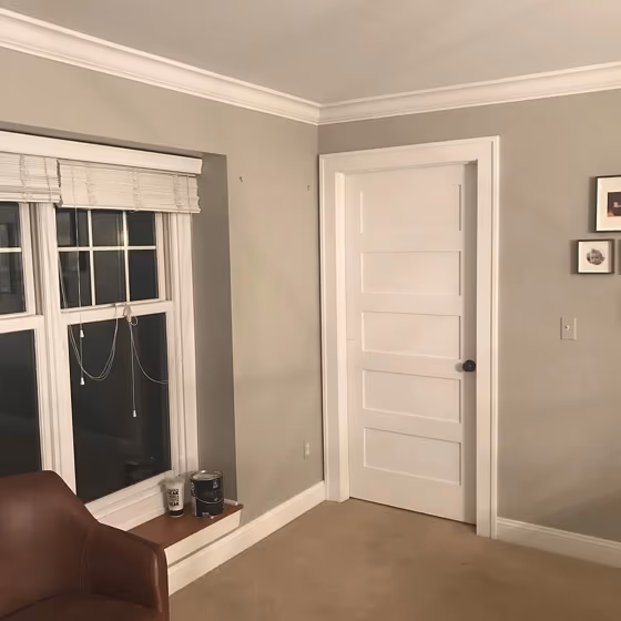
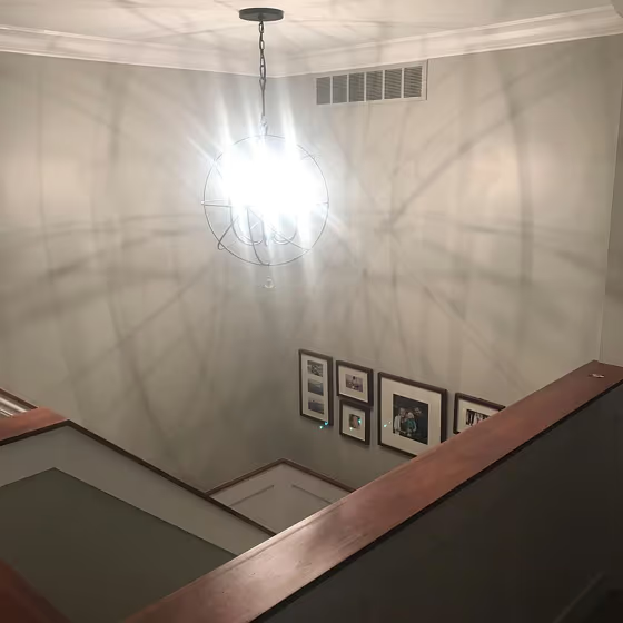
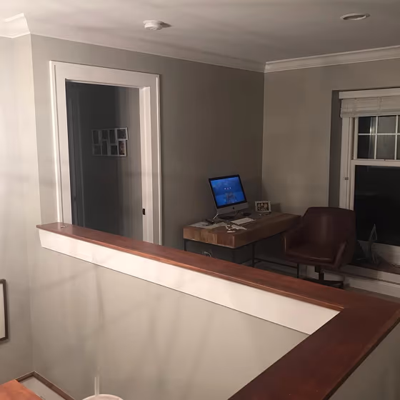
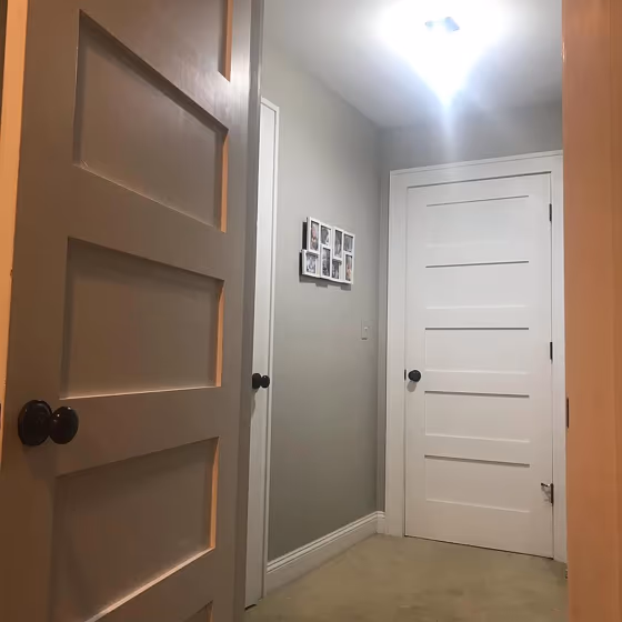
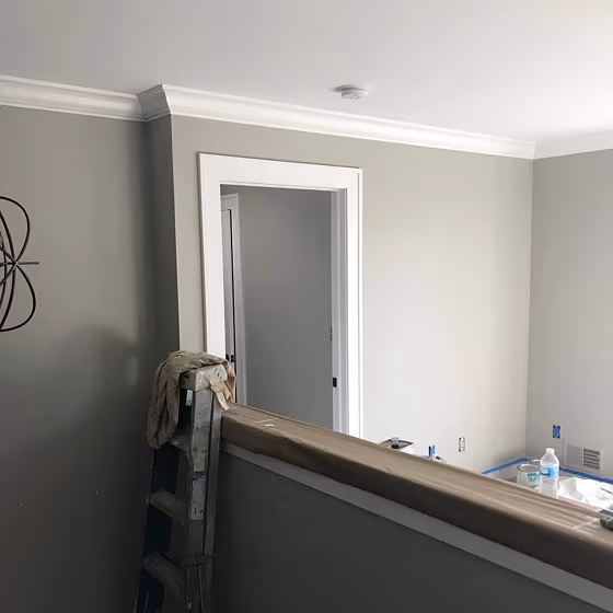
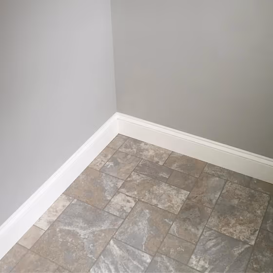
- Sherwin Williams Mindful Gray reviews (18 photos)
- What are Sherwin Williams Mindful Gray undertones?
- Is Mindful Gray SW 7016 cool or warm?
- How light temperature affects on Mindful Gray
- Monochromatic color scheme
- Complementary color scheme
- Color comparison and matching
- LRV of Mindful Gray SW 7016
- Color codes
- Color equivalents
| Official page: | Mindful Gray SW 7016 |
| Code: | SW 7016 |
| Name: | Mindful Gray |
| Brand: | Sherwin Williams |
| Collections: | Nurturer, Living Well - Renew, Top 50 Colors |
What color is Sherwin Williams Mindful Gray?
Sherwin Williams SW 7016, Mindful Gray, is a versatile and calming hue that adds depth to any space. This soft gray pairs beautifully with warm neutrals like SW 7008 Alabaster and SW 7036 Accessible Beige, creating a harmonious and inviting atmosphere. You can also accentuate Mindful Gray with pops of color such as SW 6244 Naval or SW 6690 Gambol Gold for a more dynamic look. The subtle undertones of Mindful Gray make it a perfect choice for creating a sophisticated and timeless interior design scheme.
Loading...
LRV of Mindful Gray
Mindful Gray has an LRV of 47.7% and refers to Light Medium colors that reflect half of the incident light. Why LRV is important?

Light Reflectance Value measures the amount of visible and usable light that reflects from a painted surface.
Simply put, the higher the LRV of a paint color, the brighter the room you will get.
The scale goes from 0% (absolute black, absorbing all light) to 100% (pure white, reflecting all light).
Act like a pro: When choosing paint with an LRV of 47.7%, pay attention to your bulbs' brightness. Light brightness is measured in lumens. The lower the paint's LRV, the higher lumen level you need. Every square foot of room needs at least 40 lumens. That means for a 200 ft2 living room you'll need about 8000 lumens of light – e.g., eight 1000 lm bulbs.
Color codes
We have collected almost every possible color code you could ever need.
Not sure what the difference between HEX and RGB is? We break down color models in plain language. Understanding color models
| Format | Code |
|---|---|
| HEX | #bcb7ad |
| RGB Decimal | 188, 183, 173 |
| RGB Percent | 73.73%, 71.76%, 67.84% |
| HSV | Hue: 40° Saturation: 7.98% Value: 73.73% |
| HSL | hsl(40, 10, 71) |
| CMYK | Cyan: 0.0 Magenta: 2.66 Yellow: 7.98 Key: 26.27 |
| YIQ | Y: 183.355 I: 6.193 Q: -2.054 |
| XYZ | X: 45.214 Y: 47.576 Z: 46.325 |
| CIE Lab | L:74.557 a:-0.016 b:5.709 |
| CIE Luv | L:74.557 u:3.486 v:8.31 |
| Decimal | 12367789 |
| Hunter Lab | 68.975, -3.698, 8.462 |