Sherwin Williams Nettle SW 9535
Contentsshow +hide -
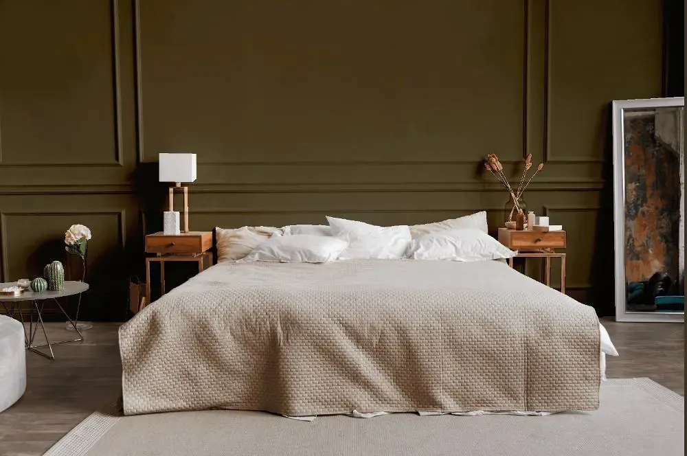
- Nettle for bedroom (1 photo)
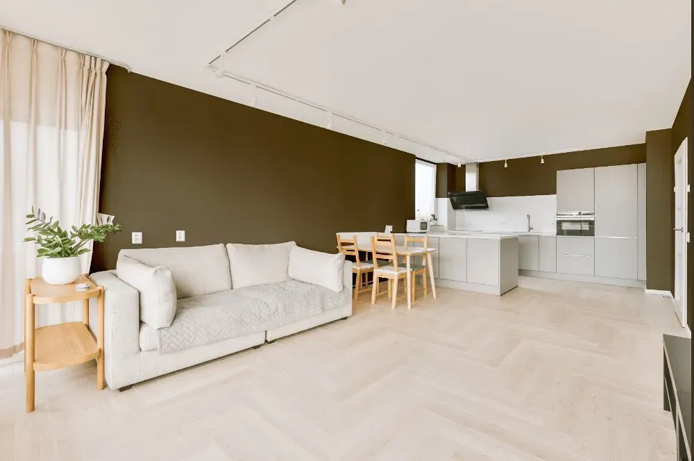
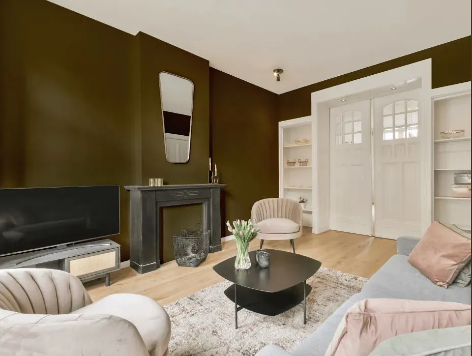
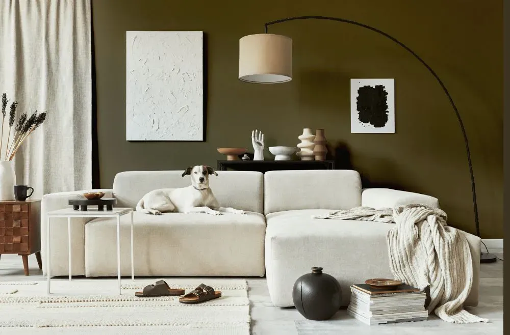
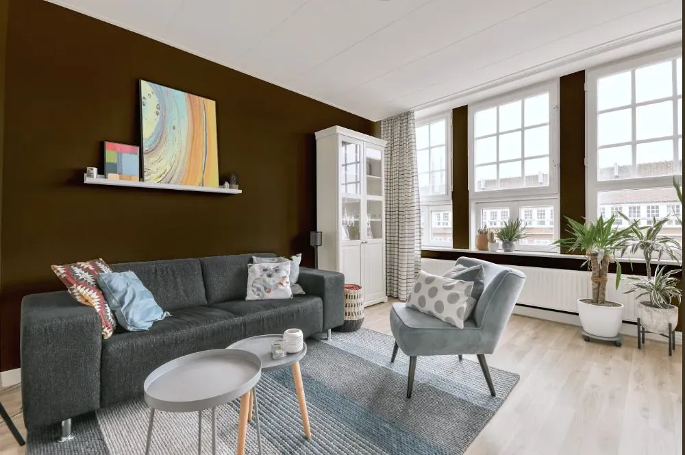
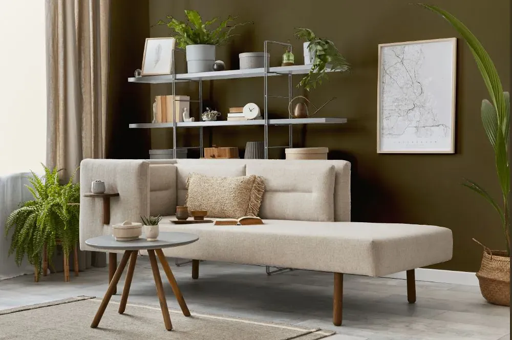
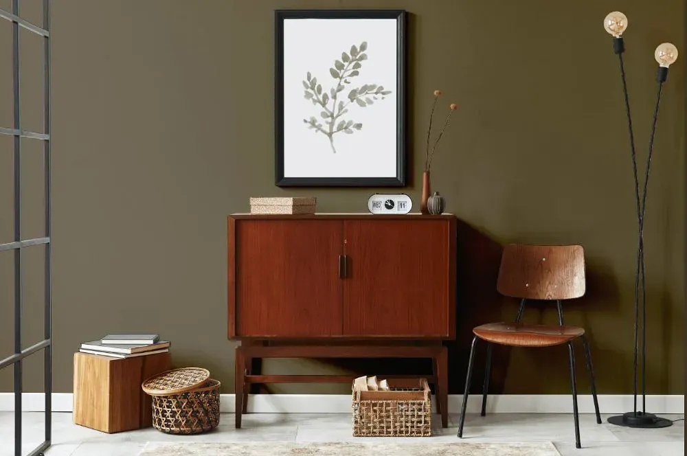
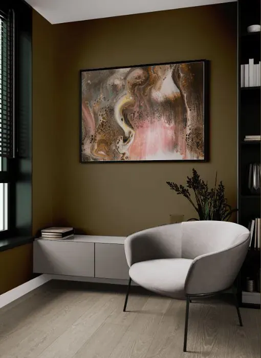
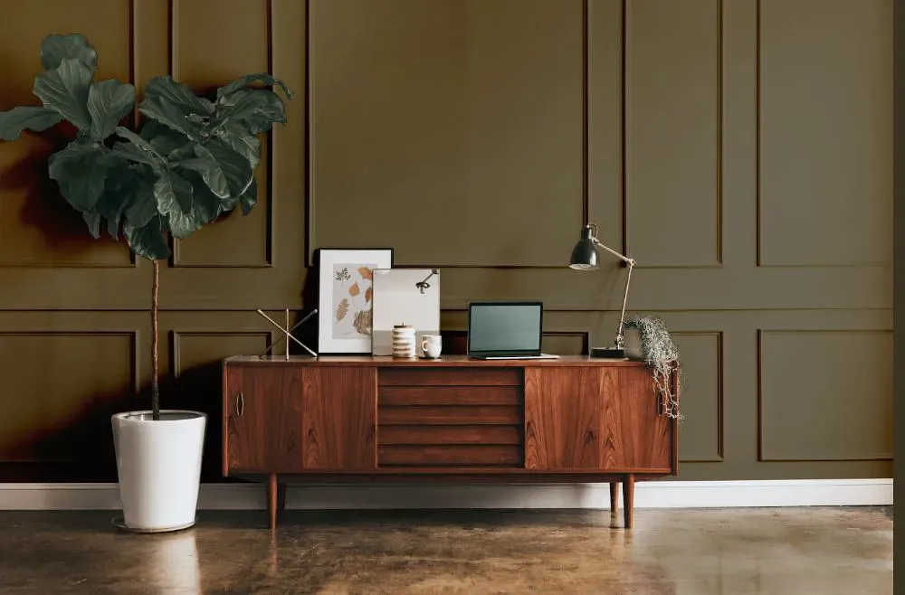
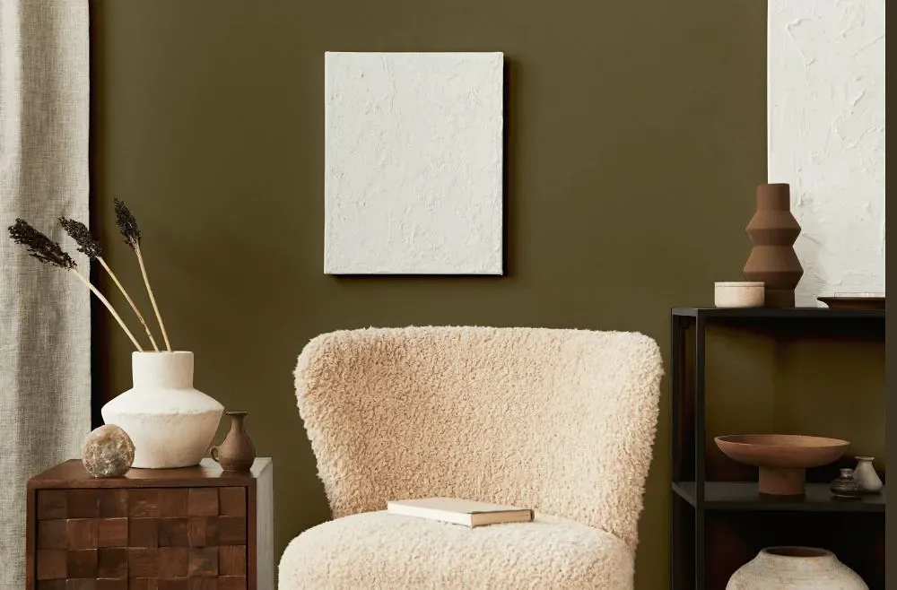
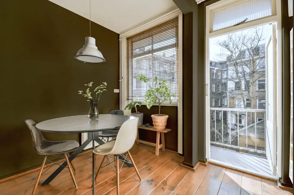
- Nettle for living room (7 photos)
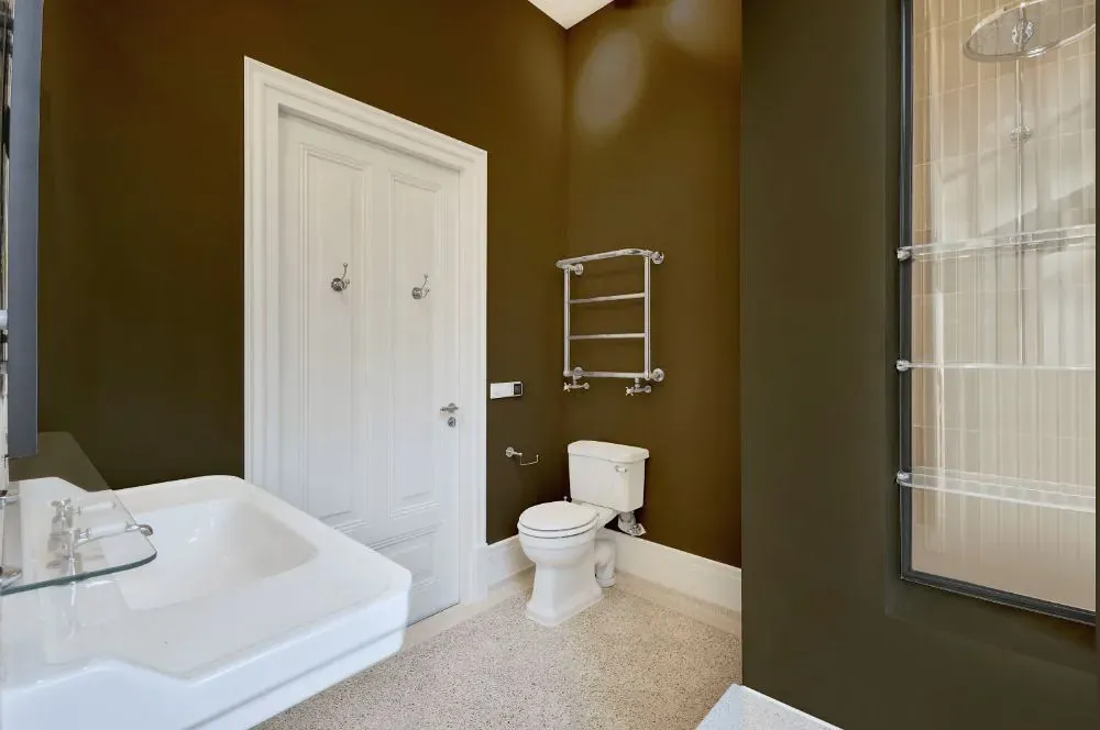
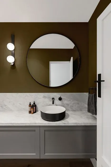
- Sherwin Williams Nettle for bathroom (2 photos)
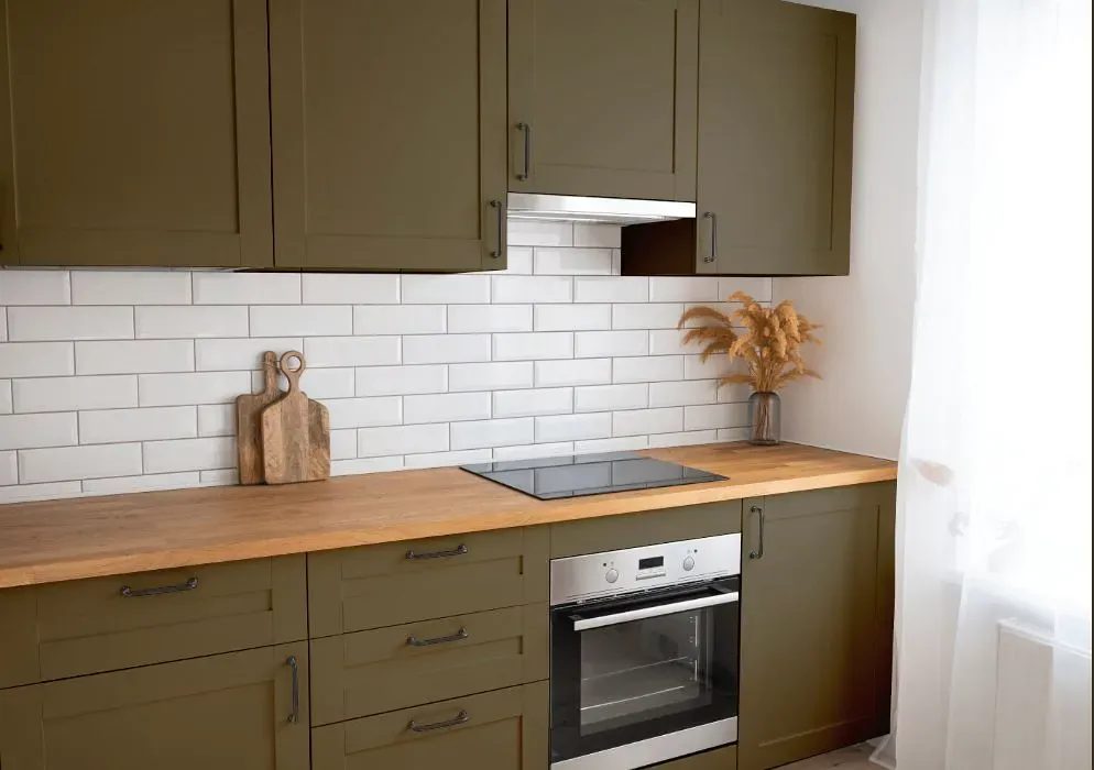
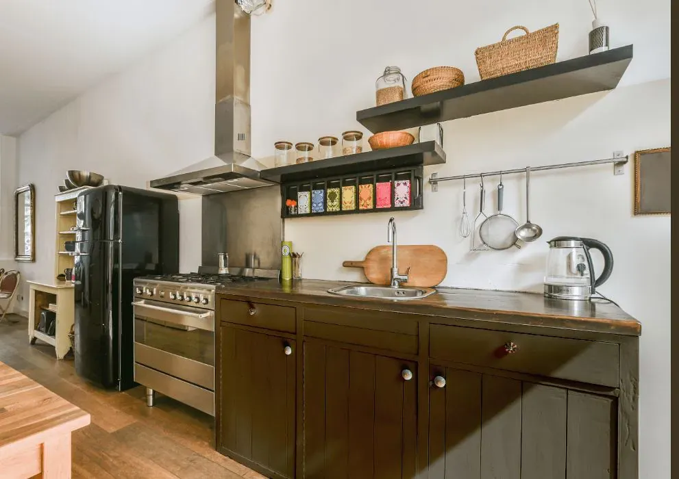
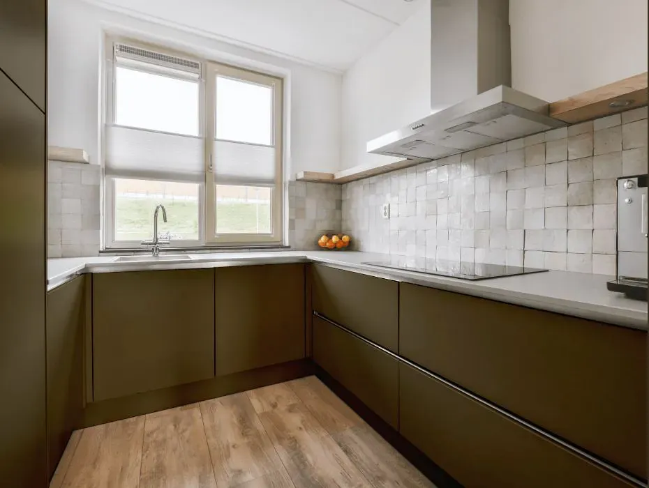
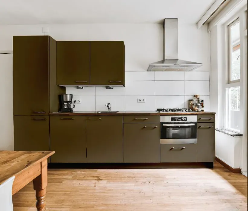
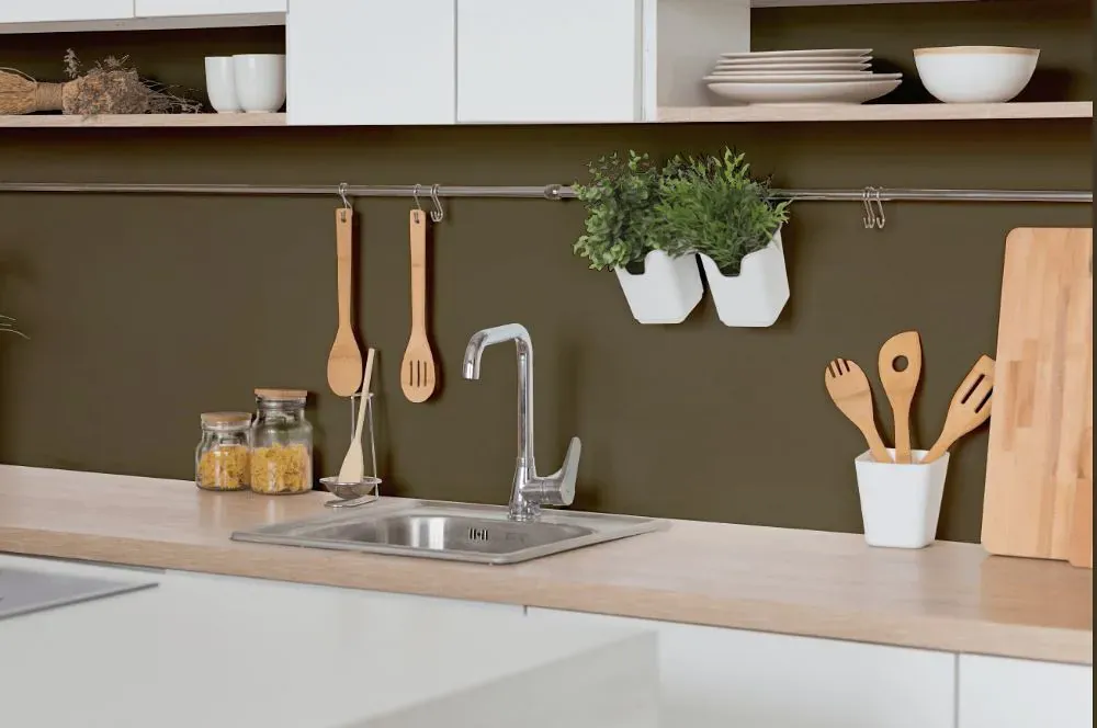
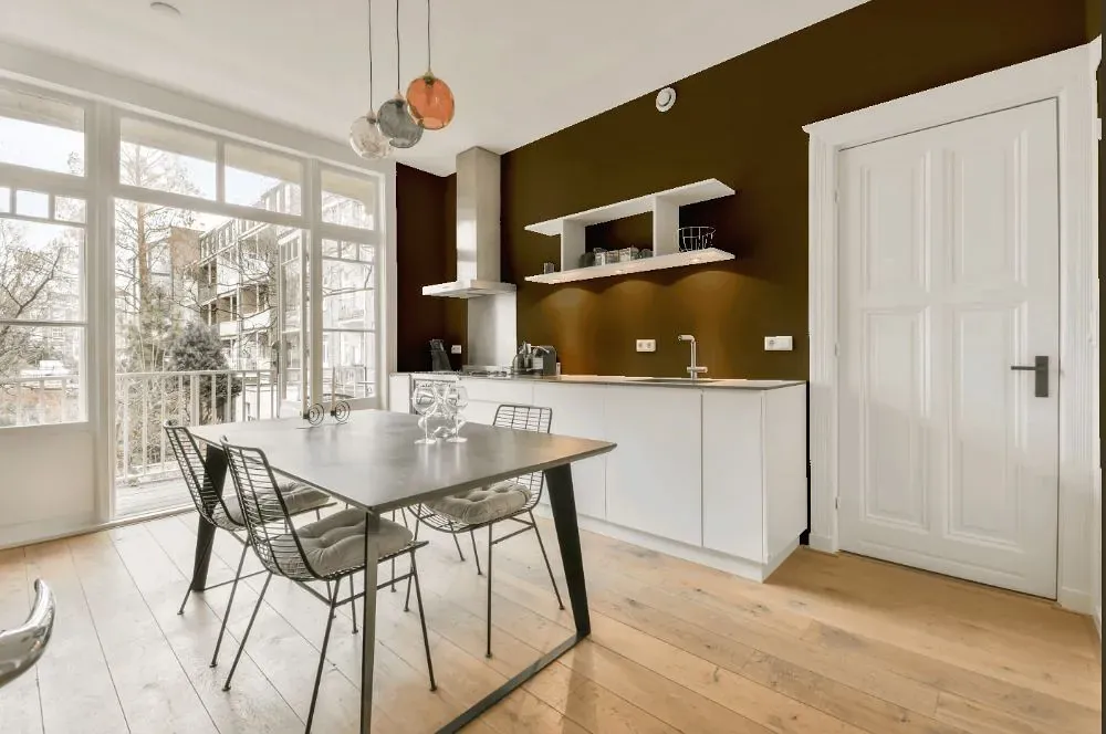
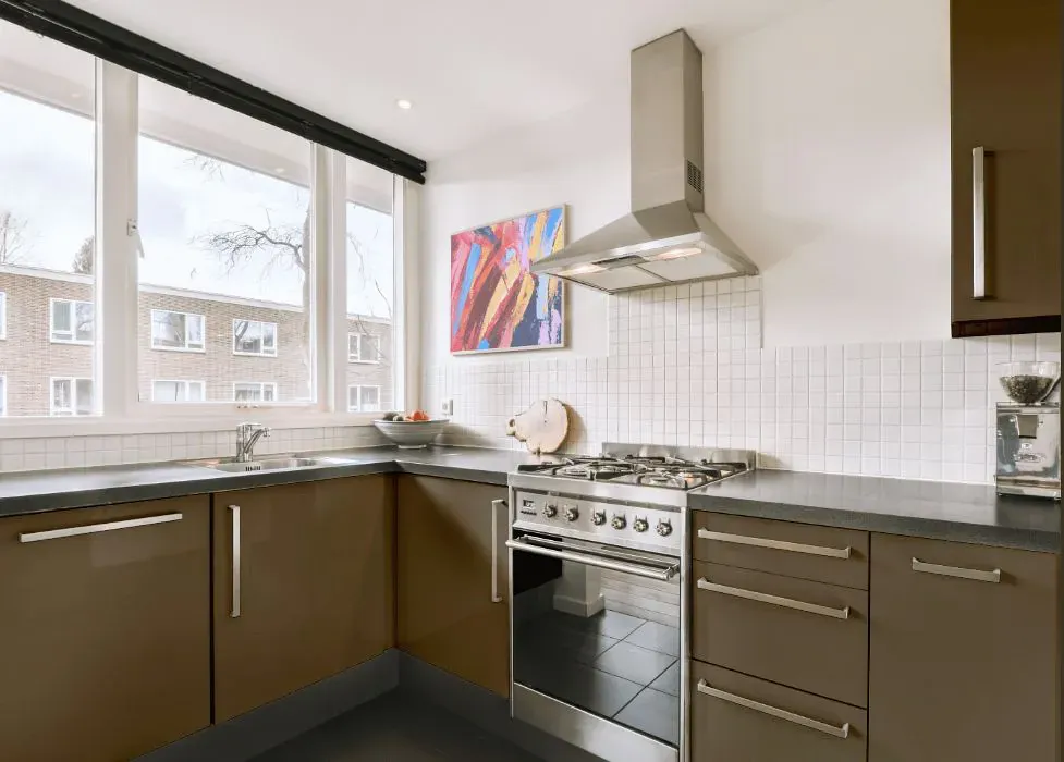
- Sherwin Williams SW 9535 on kitchen cabinets (4 photos)
- Sherwin Williams Nettle reviews (9 photos)
- What are Sherwin Williams Nettle undertones?
- Is Nettle SW 9535 cool or warm?
- How light temperature affects on Nettle
- Monochromatic color scheme
- Complementary color scheme
- Color comparison and matching
- LRV of Nettle SW 9535
- Color codes
- Color equivalents
| Code: | SW 9535 |
| Name: | Nettle |
| Brand: | Sherwin Williams |
| Collections: | Emerald Designer Edition - Form + Function |
What color is Sherwin Williams Nettle?
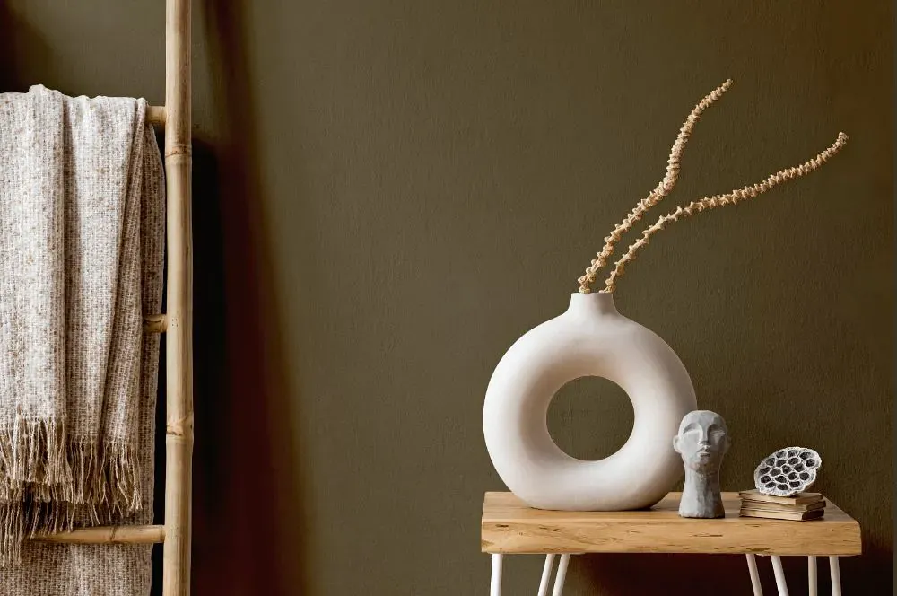
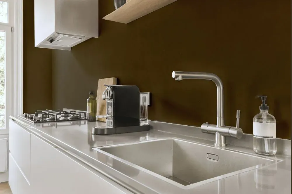
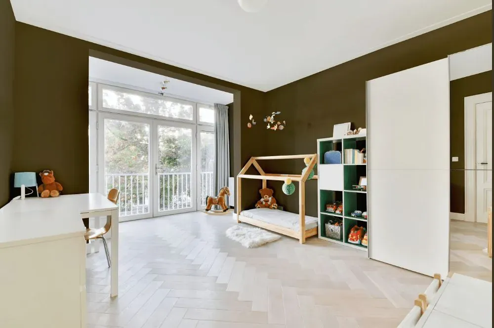
Sherwin Williams Nettle SW 9535 is a deep, muted brown with an earthy olive-khaki cast. Its low-saturation character keeps it from reading overly green, while the warm brown base gives it a grounded, weathered look. In bright natural light, the subdued olive undertone may be more noticeable; in dimmer rooms, it can settle into a darker brown. Use Nettle on cabinetry, a study wall, exterior trim, or a front door where its depth can add definition without looking black. It pairs well with warm off-whites, clay-toned neutrals, aged brass, natural oak, and dark leather.
Loading...
LRV of Nettle
Nettle has an LRV of 10.64% and refers to Medium Dark which means that this color reflects very little light. Why LRV is important?

Light Reflectance Value measures the amount of visible and usable light that reflects from a painted surface.
Simply put, the higher the LRV of a paint color, the brighter the room you will get.
The scale goes from 0% (absolute black, absorbing all light) to 100% (pure white, reflecting all light).
Act like a pro: When choosing paint with an LRV of 10.64%, pay attention to your bulbs' brightness. Light brightness is measured in lumens. The lower the paint's LRV, the higher lumen level you need. Every square foot of room needs at least 40 lumens. That means for a 200 ft2 living room you'll need about 8000 lumens of light – e.g., eight 1000 lm bulbs.
Color codes
We have collected almost every possible color code you could ever need.
Not sure what the difference between HEX and RGB is? We break down color models in plain language. Understanding color models
| Format | Code |
|---|---|
| HEX | #665b44 |
| RGB Decimal | 102, 91, 68 |
| RGB Percent | 40.00%, 35.69%, 26.67% |
| HSV | Hue: 41° Saturation: 33.33% Value: 40.0% |
| HSL | hsl(41, 20, 33) |
| CMYK | Cyan: 0.0 Magenta: 10.78 Yellow: 33.33 Key: 60.0 |
| YIQ | Y: 91.667 I: 13.946 Q: -4.831 |
| XYZ | X: 10.264 Y: 10.725 Z: 6.997 |
| CIE Lab | L:39.113 a:0.547 b:14.914 |
| CIE Luv | L:39.113 u:8.062 v:17.317 |
| Decimal | 6708036 |
| Hunter Lab | 32.749, -1.365, 10.257 |