Tikkurila Nile V386
Contentsshow +hide -
| Code: | V386 |
| Name: | Nile |
| Brand: | Tikkurila |
What color is Tikkurila Nile?
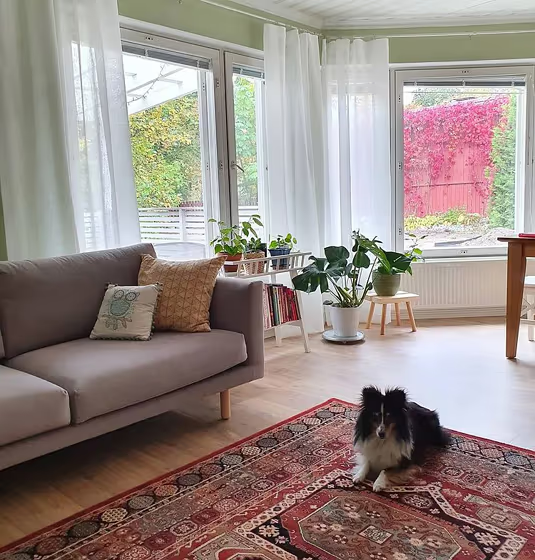
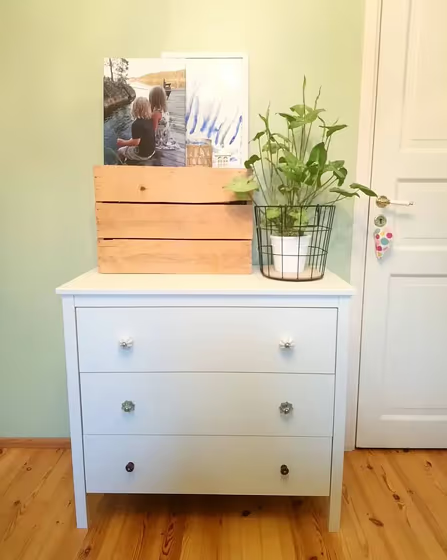
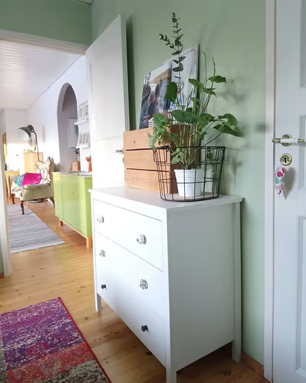
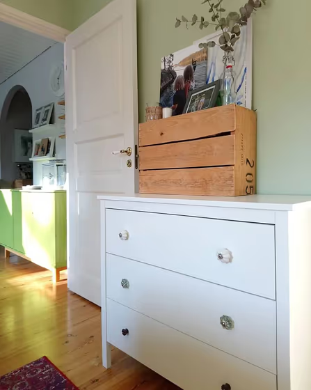
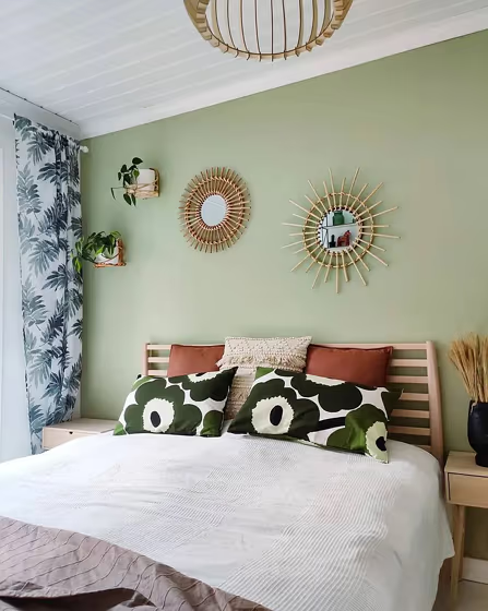
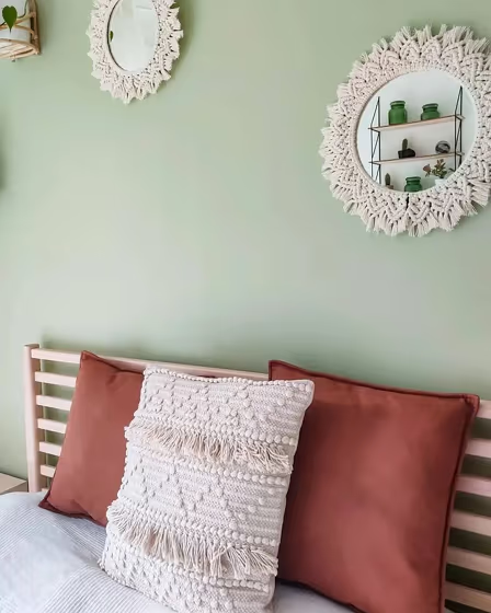
Introducing the stunning Tikkurila V386 Nile, a serene and sophisticated hue that effortlessly transforms any space into a tranquil oasis. This dreamy shade captures the essence of a peaceful river flowing through lush landscapes, bringing a sense of calm and rejuvenation to your home. Perfect for creating a soothing ambiance, V386 Nile is ideal for bedrooms, living rooms, and home offices where relaxation and focus are essential. Infuse your interiors with the timeless elegance of V386 Nile and watch as your rooms come to life with a touch of natural beauty and serenity.
Loading...
LRV of Nile
Nile has an LRV of 52.18% and refers to Light Medium colors that reflect half of the incident light. Why LRV is important?

Light Reflectance Value measures the amount of visible and usable light that reflects from a painted surface.
Simply put, the higher the LRV of a paint color, the brighter the room you will get.
The scale goes from 0% (absolute black, absorbing all light) to 100% (pure white, reflecting all light).
Act like a pro: When choosing paint with an LRV of 52.18%, pay attention to your bulbs' brightness. Light brightness is measured in lumens. The lower the paint's LRV, the higher lumen level you need. Every square foot of room needs at least 40 lumens. That means for a 200 ft2 living room you'll need about 8000 lumens of light – e.g., eight 1000 lm bulbs.
Color codes
We have collected almost every possible color code you could ever need.
Not sure what the difference between HEX and RGB is? We break down color models in plain language. Understanding color models
| Format | Code |
|---|---|
| HEX | #C2C3A4 |
| RGB Decimal | 194, 195, 164 |
| RGB Percent | 76.08%, 76.47%, 64.31% |
| HSV | Hue: 62° Saturation: 15.9% Value: 76.47% |
| HSL | hsl(62, 21, 70) |
| CMYK | Cyan: 0.51 Magenta: 0.0 Yellow: 15.9 Key: 23.53 |
| YIQ | Y: 191.167 I: 9.366 Q: -9.859 |
| XYZ | X: 48.463 Y: 53.18 Z: 42.824 |
| CIE Lab | L:77.981 a:-5.644 b:15.503 |
| CIE Luv | L:77.981 u:1.071 v:23.054 |
| Decimal | 12764068 |
| Hunter Lab | 72.925, -8.994, 16.231 |