Sherwin Williams Nutshell SW 6040
Contentsshow +hide -
| Official page: | Nutshell SW 6040 |
| Code: | SW 6040 |
| Name: | Nutshell |
| Brand: | Sherwin Williams |
| Collections: | 2018 Sincerity |
What color is Sherwin Williams Nutshell?
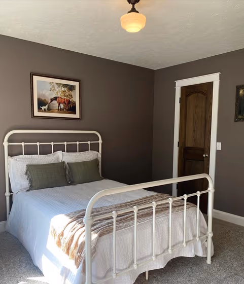
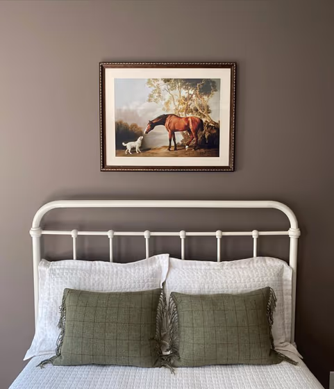
Step into a world of warmth and sophistication with Sherwin Williams Nutshell (SW 6040). This luscious hue brings elegance and coziness to any space it graces, making it perfect for living rooms, bedrooms, and dining areas. Nutshell's rich undertones create a welcoming atmosphere, while its versatility allows it to complement a range of design styles, from modern to traditional. Infuse your home with a touch of luxury and refinement by incorporating Nutshell (SW 6040) into your decor scheme. Let this inviting color envelop you in a sense of comfort and style that is both timeless and trendsetting.
Loading...
LRV of Nutshell
Nutshell has an LRV of 14.42% and refers to Medium Dark which means that this color reflects very little light. Why LRV is important?

Light Reflectance Value measures the amount of visible and usable light that reflects from a painted surface.
Simply put, the higher the LRV of a paint color, the brighter the room you will get.
The scale goes from 0% (absolute black, absorbing all light) to 100% (pure white, reflecting all light).
Act like a pro: When choosing paint with an LRV of 14.42%, pay attention to your bulbs' brightness. Light brightness is measured in lumens. The lower the paint's LRV, the higher lumen level you need. Every square foot of room needs at least 40 lumens. That means for a 200 ft2 living room you'll need about 8000 lumens of light – e.g., eight 1000 lm bulbs.
Color codes
We have collected almost every possible color code you could ever need.
| Format | Code |
|---|---|
| HEX | #756761 |
| RGB Decimal | 117, 103, 97 |
| RGB Percent | 45.88%, 40.39%, 38.04% |
| HSV | Hue: 18° Saturation: 17.09% Value: 45.88% |
| HSL | hsl(18, 9, 42) |
| CMYK | Cyan: 0.0 Magenta: 11.97 Yellow: 17.09 Key: 54.12 |
| YIQ | Y: 106.502 I: 10.271 Q: 1.094 |
| XYZ | X: 14.344 Y: 14.346 Z: 13.319 |
| CIE Lab | L:44.725 a:4.457 b:5.416 |
| CIE Luv | L:44.725 u:8.758 v:6.258 |
| Decimal | 7694177 |
| Hunter Lab | 37.876, 1.316, 5.663 |