Sherwin Williams Opaline SW 6189
Contentsshow +hide -
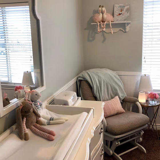
- Opaline for bedroom (1 photo)
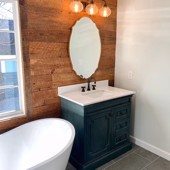
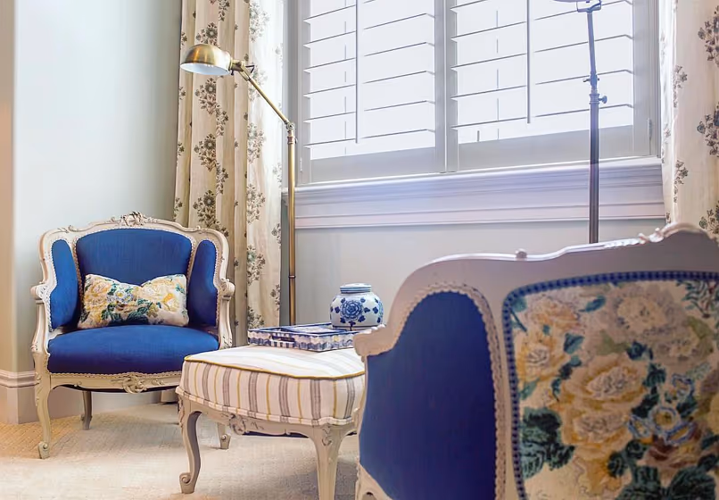
- Sherwin Williams Opaline reviews (3 photos)
- What are Sherwin Williams Opaline undertones?
- Is Opaline SW 6189 cool or warm?
- How light temperature affects on Opaline
- Monochromatic color scheme
- Complementary color scheme
- Color comparison and matching
- LRV of Opaline SW 6189
- Color codes
- Color equivalents
| Official page: | Opaline SW 6189 |
| Code: | SW 6189 |
| Name: | Opaline |
| Brand: | Sherwin Williams |
| Collections: | Pottery Barn Kids, Living Well - Recharge |
What color is Sherwin Williams Opaline?
Sherwin Williams SW 6189 Opaline exudes a tranquil and elegant vibe, making it a versatile choice for any interior. This subtle blend of green and gray pairs beautifully with earthy tones like SW 7040 Smokehouse and SW 7034 Status Bronze for a cohesive and sophisticated look. When combined with accents in SW 7008 Alabaster, Opaline creates a soft and welcoming ambiance, perfect for creating a serene space. Whether used as a wall color or in furnishings, Opaline adds a touch of sophistication to any room.
Loading...
LRV of Opaline
Opaline has an LRV of 73.05% and refers to Off‑White colors that reflect a lot of light. Why LRV is important?

Light Reflectance Value measures the amount of visible and usable light that reflects from a painted surface.
Simply put, the higher the LRV of a paint color, the brighter the room you will get.
The scale goes from 0% (absolute black, absorbing all light) to 100% (pure white, reflecting all light).
Act like a pro: When choosing paint with an LRV of 73.05%, pay attention to your bulbs' brightness. Light brightness is measured in lumens. The lower the paint's LRV, the higher lumen level you need. Every square foot of room needs at least 40 lumens. That means for a 200 ft2 living room you'll need about 8000 lumens of light – e.g., eight 1000 lm bulbs.
Color codes
We have collected almost every possible color code you could ever need.
Not sure what the difference between HEX and RGB is? We break down color models in plain language. Understanding color models
| Format | Code |
|---|---|
| HEX | #dcdfd7 |
| RGB Decimal | 220, 223, 215 |
| RGB Percent | 86.27%, 87.45%, 84.31% |
| HSV | Hue: 82° Saturation: 3.59% Value: 87.45% |
| HSL | hsl(82, 11, 86) |
| CMYK | Cyan: 1.35 Magenta: 0.0 Yellow: 3.59 Key: 12.55 |
| YIQ | Y: 221.191 I: 0.783 Q: -3.124 |
| XYZ | X: 68.166 Y: 72.897 Z: 74.751 |
| CIE Lab | L:88.399 a:-2.44 b:3.564 |
| CIE Luv | L:88.399 u:-1.26 v:5.82 |
| Decimal | 14475223 |
| Hunter Lab | 85.38, -6.904, 7.857 |