Sherwin Williams Forget-Me-Not SW 6824
Contentsshow +hide -
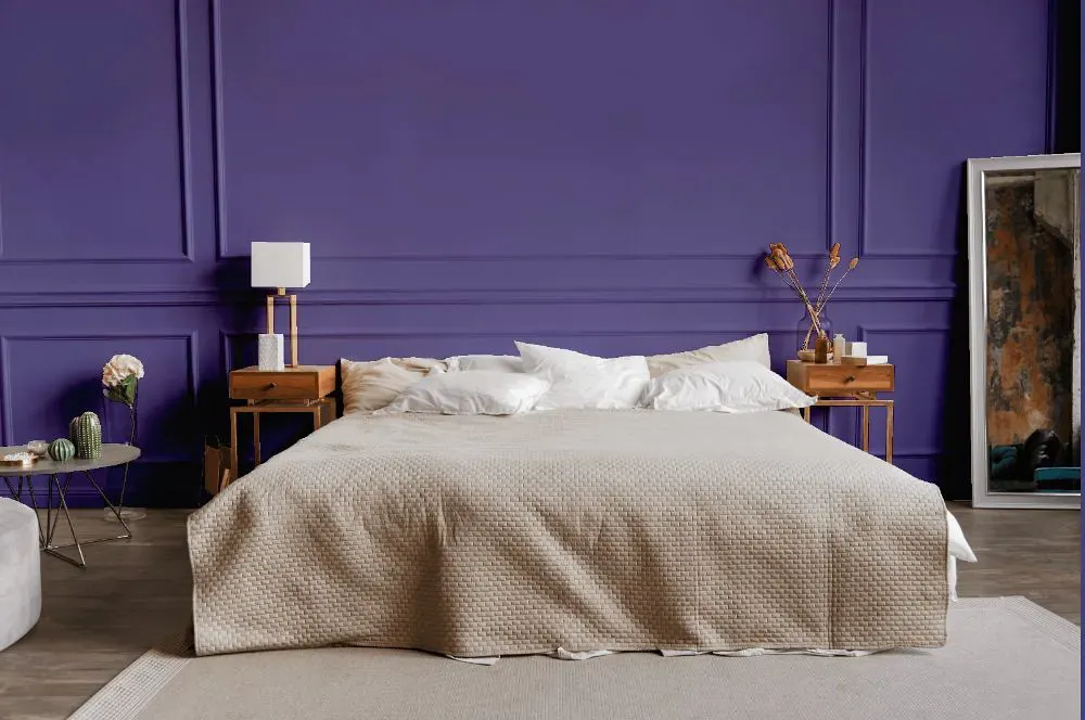
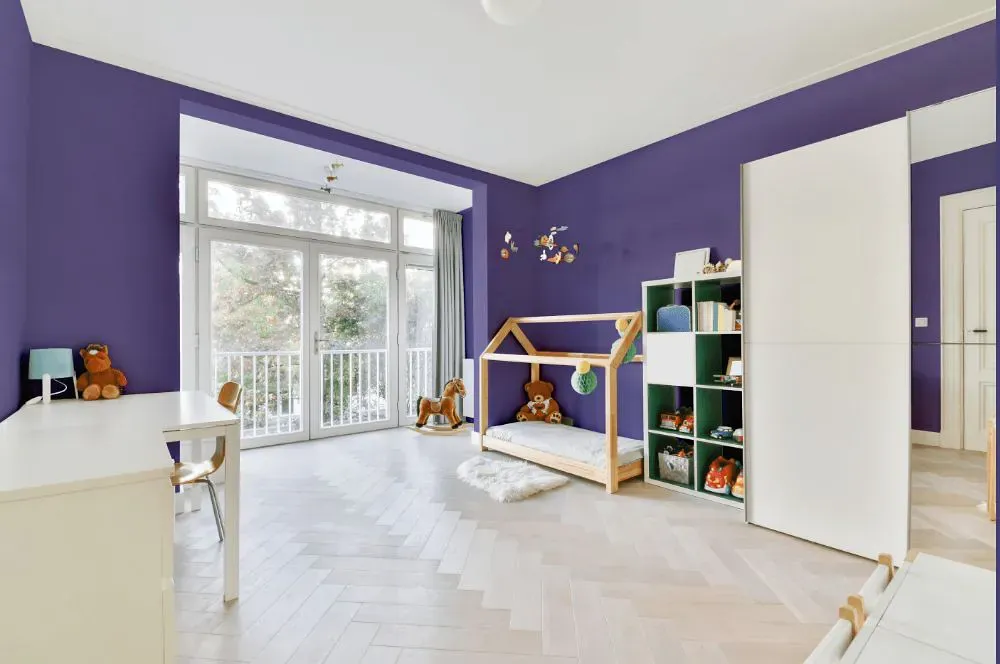
- Forget-Me-Not for bedroom (1 photo)
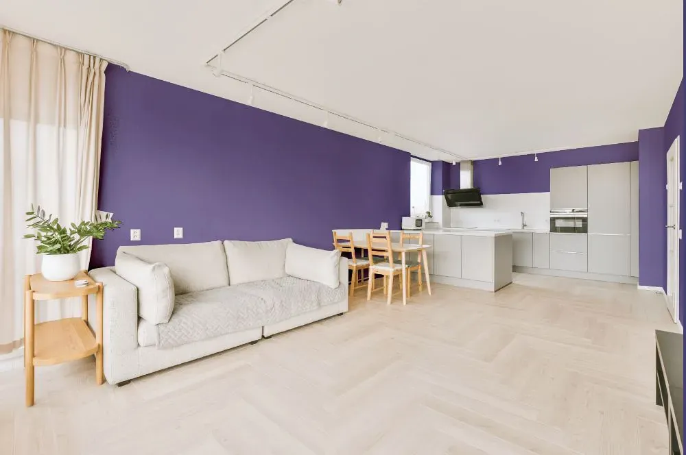
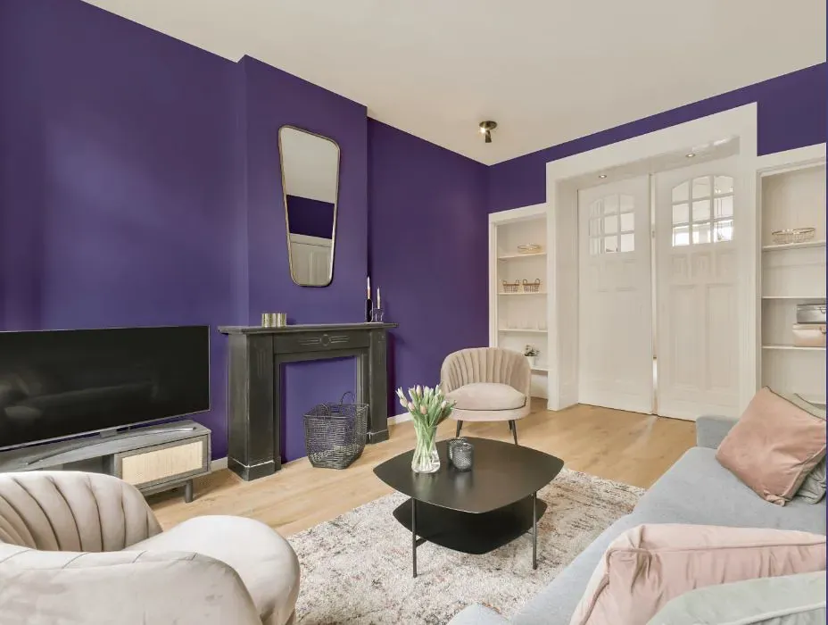
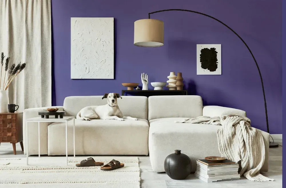
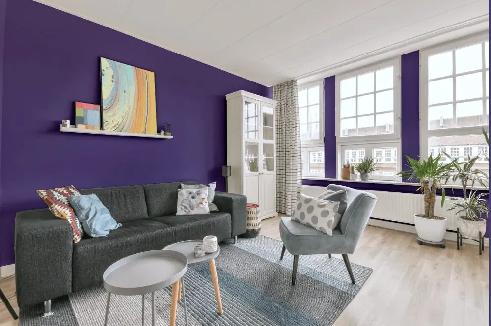
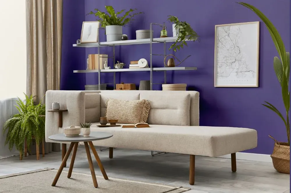
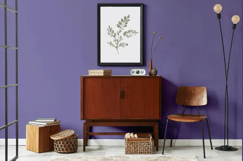
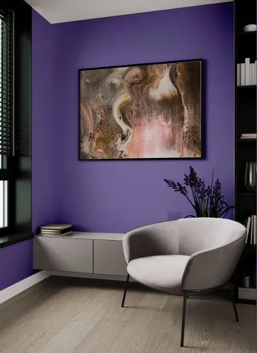
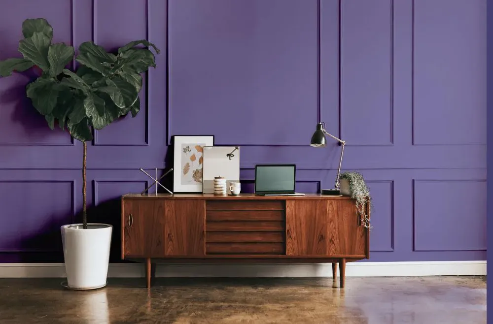
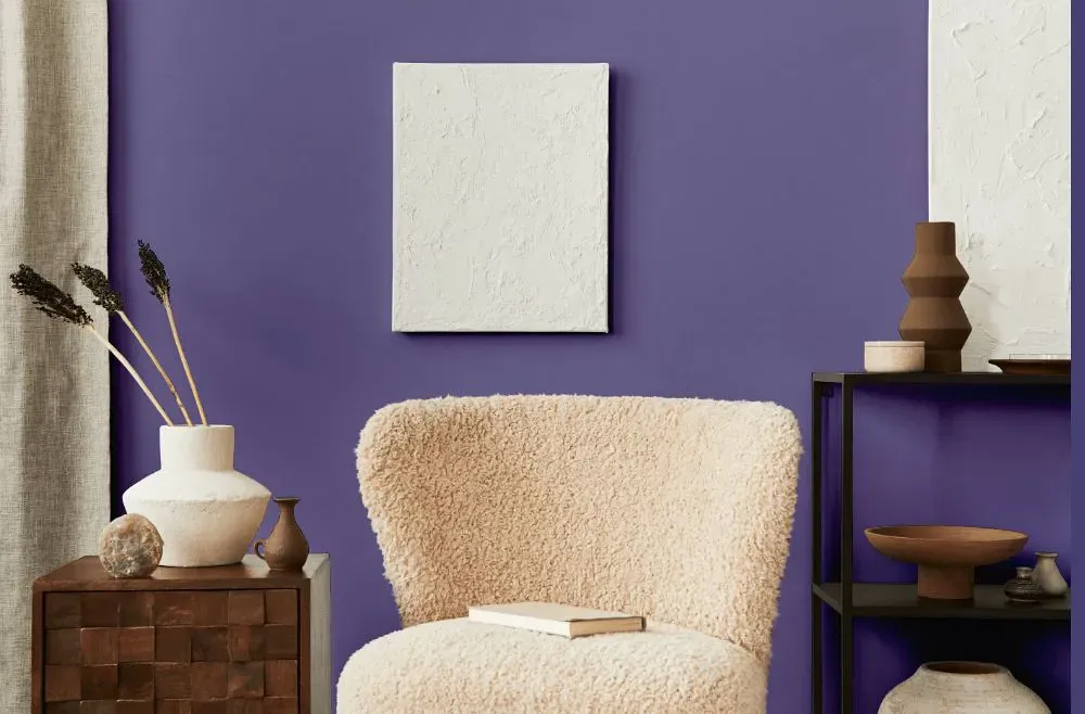
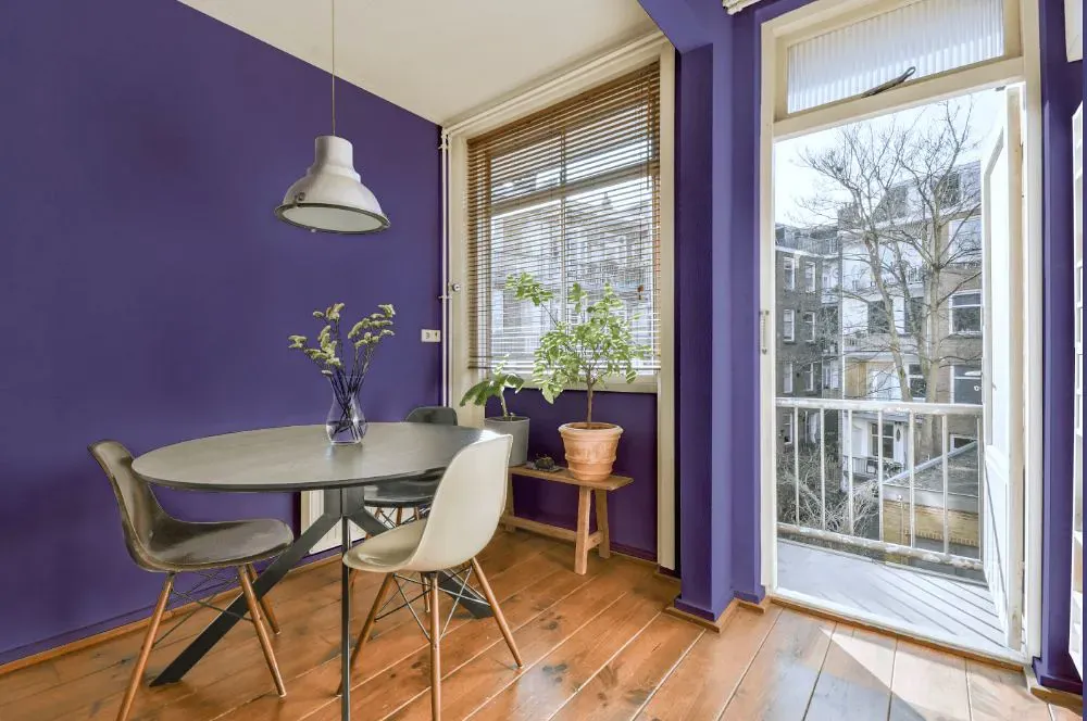
- Forget-Me-Not for living room (7 photos)
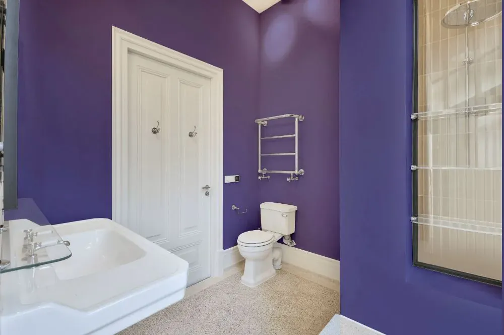
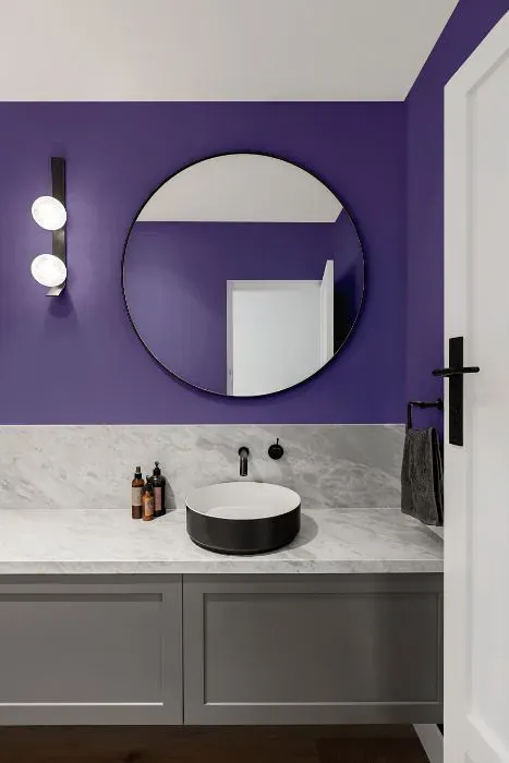
- Sherwin Williams Forget-Me-Not for bathroom (2 photos)
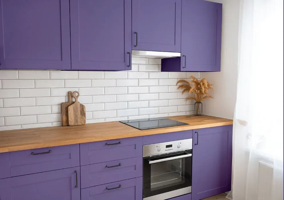
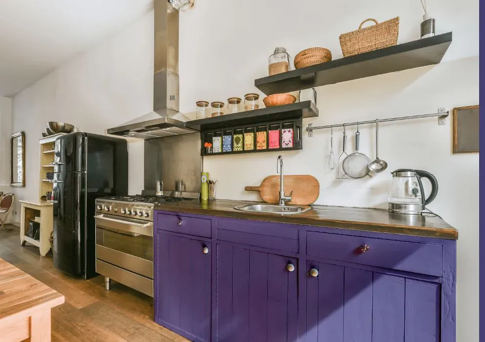
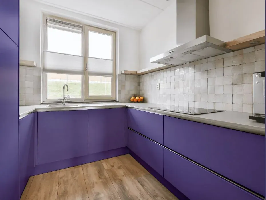
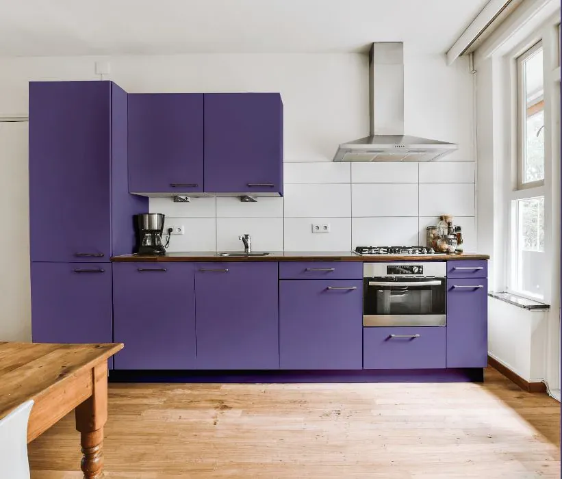
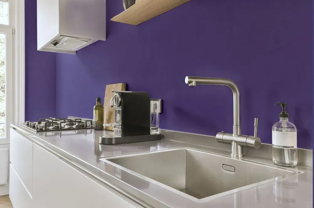
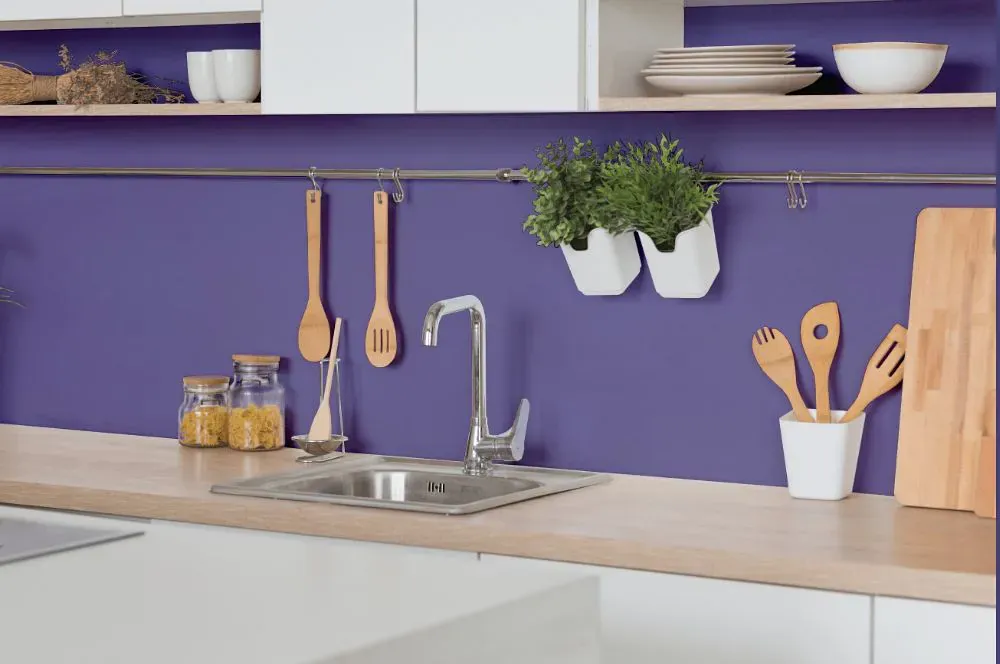
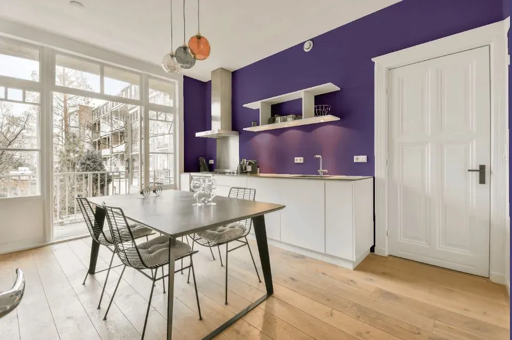
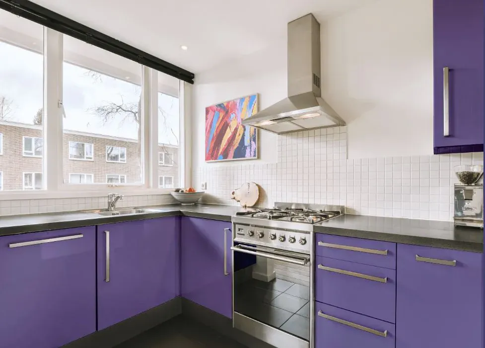
- Sherwin Williams SW 6824 on kitchen cabinets (4 photos)
- Sherwin Williams Forget-Me-Not reviews (9 photos)
- What are Sherwin Williams Forget-Me-Not undertones?
- Is Forget-Me-Not SW 6824 cool or warm?
- How light temperature affects on Forget-Me-Not
- Monochromatic color scheme
- Complementary color scheme
- Color comparison and matching
- LRV of Forget-Me-Not SW 6824
- Color codes
- Color equivalents
| Official page: | Forget-Me-Not SW 6824 |
| Code: | SW 6824 |
| Name: | Forget-Me-Not |
| Brand: | Sherwin Williams |
What color is Sherwin Williams Forget-Me-Not?
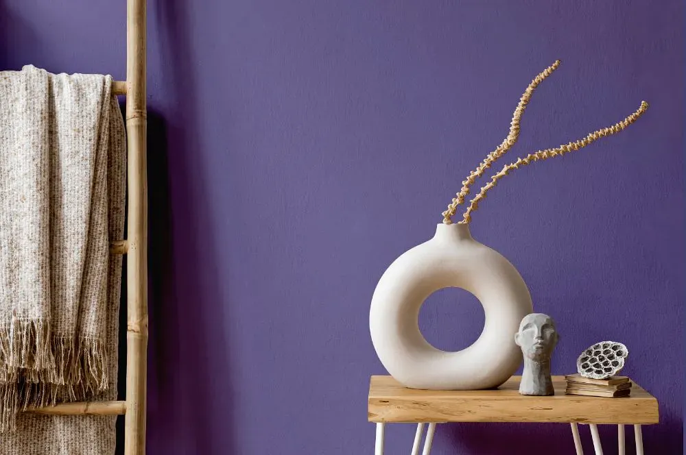
Introduce a touch of elegance to your space with Sherwin Williams SW 6824 Forget-Me-Not. This soothing hue harmonizes beautifully with soft greys like SW 7023 Requisite Gray and muted greens such as SW 7735 Palm Leaf. Consider pairing Forget-Me-Not with crisp whites like SW 7005 Pure White for a refreshing and serene atmosphere. Whether used as an accent or as the main color, SW 6824 adds a hint of sophistication and tranquility to any room. Experiment with different combinations to create a space that exudes timeless charm and sophistication.
Loading...
LRV of Forget-Me-Not
Forget-Me-Not has an LRV of 15.83% and refers to Medium Dark which means that this color reflects very little light. Why LRV is important?

Light Reflectance Value measures the amount of visible and usable light that reflects from a painted surface.
Simply put, the higher the LRV of a paint color, the brighter the room you will get.
The scale goes from 0% (absolute black, absorbing all light) to 100% (pure white, reflecting all light).
Act like a pro: When choosing paint with an LRV of 15.83%, pay attention to your bulbs' brightness. Light brightness is measured in lumens. The lower the paint's LRV, the higher lumen level you need. Every square foot of room needs at least 40 lumens. That means for a 200 ft2 living room you'll need about 8000 lumens of light – e.g., eight 1000 lm bulbs.
Color codes
We have collected almost every possible color code you could ever need.
Not sure what the difference between HEX and RGB is? We break down color models in plain language. Understanding color models
| Format | Code |
|---|---|
| HEX | #716998 |
| RGB Decimal | 113, 105, 152 |
| RGB Percent | 44.31%, 41.18%, 59.61% |
| HSV | Hue: 250° Saturation: 30.92% Value: 59.61% |
| HSL | hsl(250, 19, 50) |
| CMYK | Cyan: 25.66 Magenta: 30.92 Yellow: 0.0 Key: 40.39 |
| YIQ | Y: 112.75 I: -10.336 Q: 16.319 |
| XYZ | X: 17.527 Y: 15.88 Z: 31.839 |
| CIE Lab | L:46.817 a:13.832 b:-24.443 |
| CIE Luv | L:46.817 u:1.07 v:-37.392 |
| Decimal | 7432600 |
| Hunter Lab | 39.85, 8.771, -19.475 |