Tikkurila Panorama J428
| Code: | J428 |
| Name: | Panorama |
| Brand: | Tikkurila |
What color is Tikkurila Panorama?
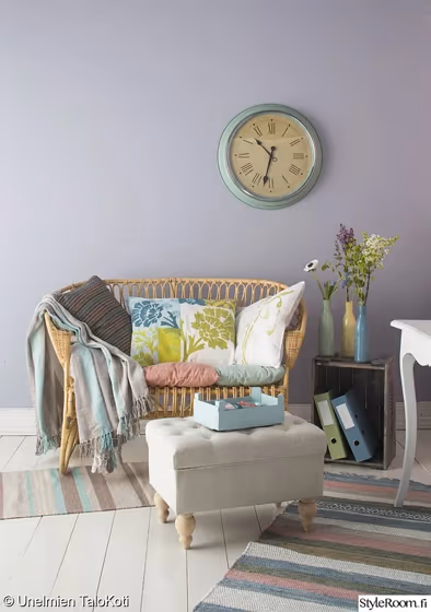
The rich and versatile Tikkurila J428 Panorama exudes a warm and inviting vibe to any interior. This color pairs harmoniously with soft neutrals like pearl white and light beige, enhancing its depth and sophistication. Complementing accents in cool shades such as dusky blue and sage green can create a serene and balanced color palette, ideal for a modern and stylish space. J428 Panorama's timeless appeal makes it a perfect choice for those seeking a subtle yet elegant ambiance in their home.
Tikkurila Panorama reviews
View the photos of real spaces painted with this that were not included in specific categories.Close-ups, painted furniture, storages and dressers, hallways, stairs and ceilings.
Try before you buy

100% accurate
reusable paint samples
Peel, stick,
and repeat
Twice painted
with real paint
Next day
delivery
What are Tikkurila Panorama undertones?
The undertone of Panorama can be accurately described as a Blue hue, as is apparent from the color space provided. By isolating the pure hue and eliminating any tints, tones, and shades, we were able to precisely determine its undertone. This approach has proven to be more accurate than traditional methods of defining undertones on a white background, which are now considered outdated.
HEX value
HEX value:
#AFB2BF
RGB code:
175, 178, 191
Is Tikkurila Panorama J428 cool or warm?
With a hue of 229° thisPurplerefers cool paint shade according to HSL (Hue, Saturation, Lightness) on the color wheel.
J428 Panorama HSL code: 229, 11%, 72%
Hue - degree on a color wheel from 0 to 360. 0 is red, 120 is green, and 240 is blue.
Saturation is expressed as a percentage. At 0%, it appears as a shade of grey, and at 100%, it is in full color..
Lightness is also a percentage value. 0% is black, and 100% is white.
- Cooler hues have a calm and relaxation effect
- Cool purple shades add a touch of elegance and creativity to a room, making it feel luxurious and imaginative, ideal for bedrooms, creative spaces, and living areas.
- Using mid-tone cool colors like soft greys and muted blues can help create a calming and modern look in rooms like home offices, bathrooms, and bedrooms. But avoid using these shades in rooms without natural light, as they may look dull.
Act like a pro: Mixing warm and cool shades is a must have to get harmonius interior. Add accents that contrast with the primary color to create visual balance. If your walls are a warm color, don’t forget to add accent in cold colors (furniture, art, décor). A good practice is too use a complementary color scheme.
How light temperature affects Panorama
Natural Lighting. During the day, natural light shifts from about 2000 K at sunrise/sunset to 5500–6500 K at noon.
In addition, natural‑light temperature depends on its direction:
| Direction of sunlight | Visible temp. | Hue | Duration |
|---|---|---|---|
| North | Cool | Bluish | All day |
| East | Warm | Yellow | Before noon |
| West | Warm | Orange‑red | After noon |
| South | Warm | Orange‑yellow | All day |
Artificial Lighting. When choosing bulbs, pay attention to their color‑temperature (Kelvins).
Use the slider to see how this Purple shade looks under different lighting:


4000K
Coordinating colors.
Colors that go with Tikkurila Panorama:
Complementary color scheme
This color scheme is a combination of two shades that are opposite each other on the color wheel. The high contrast between these colors creates a vibrant and dynamic visual effect. For the color Panorama with a blue hue, complementary colors are those with a orange hue close to 49, such as Tikkurila and Steam.
J428
Panorama
LRV of Panorama
Panorama has an LRV of 44.91% and refers to Light Medium colors that reflect half of the incident light. Why LRV is important?
Light Reflectance Value measures the amount of visible and usable light that reflects from a painted surface.
Simply put, the higher the LRV of a paint color, the brighter the room you will get.
The scale goes from 0% (absolute black, absorbing all light) to 100% (pure white, reflecting all light).
Act like a pro: When choosing paint with an LRV of 44.91%, pay attention to your bulbs' brightness. Light brightness is measured in lumens. The lower the paint's LRV, the higher lumen level you need. Every square foot of room needs at least 40 lumens. That means for a 200 ft2 living room you’ll need about 8000 lumens of light – e.g., eight 1000 lm bulbs.
Color codes
We have collected almost every possible color code you could ever need. To copy the code, just click the icon to the right of it.
| Format | Code | |
|---|---|---|
| HEX | #AFB2BF | |
| RGB Decimal | 175, 178, 191 | |
| RGB Percent | 68.63%, 69.80%, 74.90% | |
| HSV | Hue: 229° Saturation: 8.38% Value: 74.9% | |
| HSL | hsl(229, 11, 72) | |
| CMYK | Cyan: 8.38 Magenta: 6.81 Yellow: 0.0 Key: 25.1 | |
| YIQ | Y: 178.585 I: -5.965 Q: 3.411 | |
| XYZ | X: 43.001 Y: 44.716 Z: 55.642 | |
| CIE Lab | L:72.704 a:1.493 b:-6.959 | |
| CIE Luv | L:72.704 u:-2.39 v:-10.737 | |
| Decimal | 11514559 | |
| Hunter Lab | 66.87, -2.238, -2.525 |
Color equivalents
Stormy Haze
Dulux
Lavender Quartz
Dulux
10RB 49/062
Brooklyn Nights 4
Dulux
Violet Storm
Dulux
30RB 50/072
Violet Surprise 3
Dulux
30BB 45/049
Restful Slumber
Dulux
Moon Waves 4
Dulux
Marble Swirl 4
Dulux
4062
Classic Blue
Jotun

50BB 46/129
Morning Jewel 4
Dulux

70BB 44/144
Starlit Night 4
Dulux
J490
Rain
Tikkurila

Lilac Skies
Dulux
English Lavender
Dulux
Summer Dusk
Dulux
K500
Tikkurila

Lilac Heather 3
Dulux
Silent Steel
Dulux
Moon Waves 3
Dulux
K498
Haven
Tikkurila


