Sherwin Williams Paperwhite SW 7105
Contentsshow +hide -
- Sherwin Williams Paperwhite reviews (5 photos)
- What are Sherwin Williams Paperwhite undertones?
- Is Paperwhite SW 7105 cool or warm?
- How light temperature affects on Paperwhite
- Monochromatic color scheme
- Complementary color scheme
- Color comparison and matching
- LRV of Paperwhite SW 7105
- Color codes
- Color equivalents
| Code: | SW 7105 |
| Name: | Paperwhite |
| Brand: | Sherwin Williams |
What color is Sherwin Williams Paperwhite?
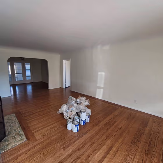
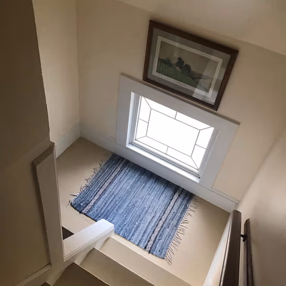
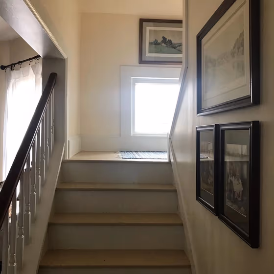
Sherwin Williams Paperwhite SW 7105 is a very light, warm off-white with a soft cream-beige cast rather than a stark, icy white appearance. Its pale value keeps rooms bright, while the #f7efde color gives it a gentle hint of warmth that can make white trim look crisper by comparison. In daylight, Paperwhite reads as a clean creamy neutral; under warm evening bulbs, its subtle ivory character may become more noticeable. It suits living rooms, bedrooms, hallways, and ceilings where a lighter backdrop is wanted without the sharpness of pure white. Pair it with natural oak, woven linen, warm stone, muted sage, clay accents, or deeper brown-black details for contrast.
Loading...
LRV of Paperwhite
Paperwhite has an LRV of 86.7% and refers to White colors that reflect almost all light. Why LRV is important?

Light Reflectance Value measures the amount of visible and usable light that reflects from a painted surface.
Simply put, the higher the LRV of a paint color, the brighter the room you will get.
The scale goes from 0% (absolute black, absorbing all light) to 100% (pure white, reflecting all light).
Act like a pro: When choosing paint with an LRV of 86.7%, pay attention to your bulbs' brightness. Light brightness is measured in lumens. The lower the paint's LRV, the higher lumen level you need. Every square foot of room needs at least 40 lumens. That means for a 200 ft2 living room you'll need about 8000 lumens of light – e.g., eight 1000 lm bulbs.
Color codes
We have collected almost every possible color code you could ever need.
Not sure what the difference between HEX and RGB is? We break down color models in plain language. Understanding color models
| Format | Code |
|---|---|
| HEX | #f7efde |
| RGB Decimal | 247, 239, 222 |
| RGB Percent | 96.86%, 93.73%, 87.06% |
| HSV | Hue: 41° Saturation: 10.12% Value: 96.86% |
| HSL | hsl(41, 61, 92) |
| CMYK | Cyan: 0.0 Magenta: 3.24 Yellow: 10.12 Key: 3.14 |
| YIQ | Y: 239.454 I: 10.23 Q: -3.598 |
| XYZ | X: 82.407 Y: 86.782 Z: 81.497 |
| CIE Lab | L:94.646 a:-0.148 b:9.179 |
| CIE Luv | L:94.646 u:5.605 v:13.82 |
| Decimal | 16248798 |
| Hunter Lab | 93.157, -5.123, 13.341 |