Tikkurila Parchment F466
Contentsshow +hide -
| Code: | F466 |
| Name: | Parchment |
| Brand: | Tikkurila |
What color is Tikkurila Parchment?
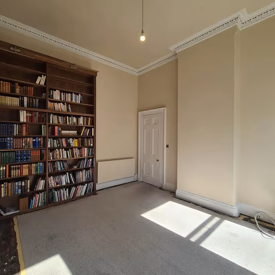
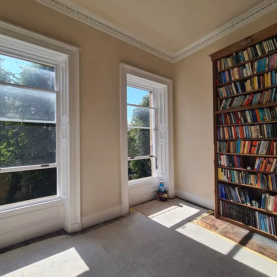
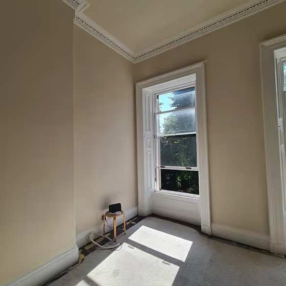
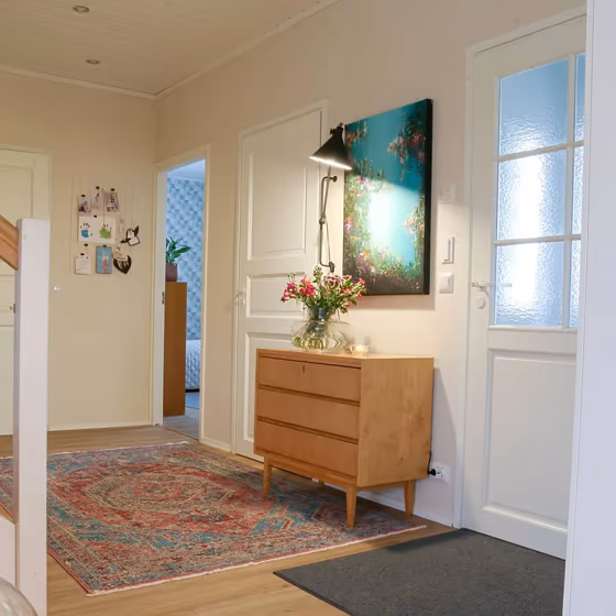
Tikkurila F466 Parchment exudes a timeless elegance with its warm and inviting nature. This versatile color pairs harmoniously with hues such as Tikkurila G405 Foggy Grey and Tikkurila Y487 Sand Beige, creating a sophisticated and cohesive color palette. The subtle undertones of Parchment effortlessly complement both neutral tones and bold accents, making it a perfect choice for a variety of interior design styles. Whether used as a main color or as an accent, F466 Parchment brings a sense of serenity and sophistication to any space. Elevate your home décor with this classic yet contemporary shade that transcends trends.
Loading...
LRV of Parchment
Parchment has an LRV of 75.01% and refers to Off‑White colors that reflect a lot of light. Why LRV is important?

Light Reflectance Value measures the amount of visible and usable light that reflects from a painted surface.
Simply put, the higher the LRV of a paint color, the brighter the room you will get.
The scale goes from 0% (absolute black, absorbing all light) to 100% (pure white, reflecting all light).
Act like a pro: When choosing paint with an LRV of 75.01%, pay attention to your bulbs' brightness. Light brightness is measured in lumens. The lower the paint's LRV, the higher lumen level you need. Every square foot of room needs at least 40 lumens. That means for a 200 ft2 living room you'll need about 8000 lumens of light – e.g., eight 1000 lm bulbs.
Color codes
We have collected almost every possible color code you could ever need.
Not sure what the difference between HEX and RGB is? We break down color models in plain language. Understanding color models
| Format | Code |
|---|---|
| HEX | #EBDFCF |
| RGB Decimal | 235, 223, 207 |
| RGB Percent | 92.16%, 87.45%, 81.18% |
| HSV | Hue: 34° Saturation: 11.91% Value: 92.16% |
| HSL | hsl(34, 41, 87) |
| CMYK | Cyan: 0.0 Magenta: 5.11 Yellow: 11.91 Key: 7.84 |
| YIQ | Y: 224.764 I: 12.292 Q: -2.441 |
| XYZ | X: 71.909 Y: 74.944 Z: 69.692 |
| CIE Lab | L:89.367 a:1.436 b:9.306 |
| CIE Luv | L:89.367 u:7.974 v:13.572 |
| Decimal | 15458255 |
| Hunter Lab | 86.57, -3.227, 12.868 |