Tikkurila Acropolis F458
Contentsshow +hide -
| Code: | F458 |
| Name: | Acropolis |
| Brand: | Tikkurila |
What color is Tikkurila Acropolis?
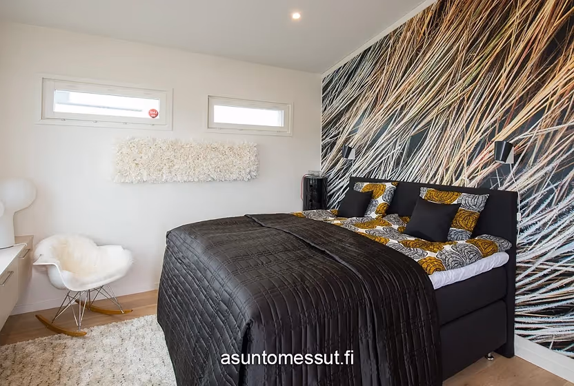
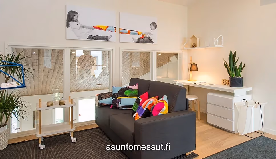
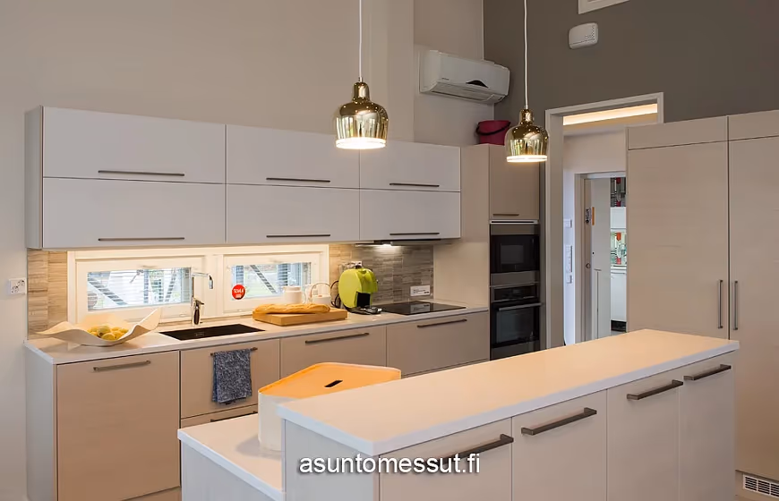
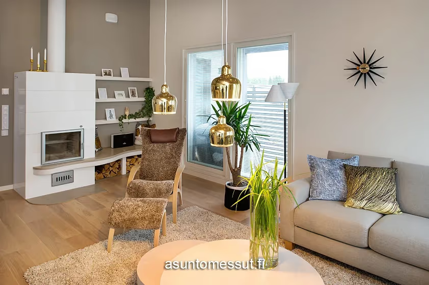
Step into a world of sophistication with Tikkurila F458 (Acropolis). This enchanting shade effortlessly blends tranquility and style, creating a serene ambiance in any space. Whether adorning the walls of a cozy living room or bringing a touch of elegance to a chic bedroom, F458 (Acropolis) exudes timeless charm. This versatile color is perfect for spaces where a touch of modernity is desired, such as upscale dining rooms or sleek home offices. Elevate your interiors with the refined allure of Tikkurila F458 (Acropolis).
Loading...
LRV of Acropolis
Acropolis has an LRV of 82.92% and refers to White colors that reflect almost all light. Why LRV is important?

Light Reflectance Value measures the amount of visible and usable light that reflects from a painted surface.
Simply put, the higher the LRV of a paint color, the brighter the room you will get.
The scale goes from 0% (absolute black, absorbing all light) to 100% (pure white, reflecting all light).
Act like a pro: When choosing paint with an LRV of 82.92%, pay attention to your bulbs' brightness. Light brightness is measured in lumens. The lower the paint's LRV, the higher lumen level you need. Every square foot of room needs at least 40 lumens. That means for a 200 ft2 living room you'll need about 8000 lumens of light – e.g., eight 1000 lm bulbs.
Color codes
We have collected almost every possible color code you could ever need.
Not sure what the difference between HEX and RGB is? We break down color models in plain language. Understanding color models
| Format | Code |
|---|---|
| HEX | #F1EADF |
| RGB Decimal | 241, 234, 223 |
| RGB Percent | 94.51%, 91.76%, 87.45% |
| HSV | Hue: 37° Saturation: 7.47% Value: 94.51% |
| HSL | hsl(37, 39, 91) |
| CMYK | Cyan: 0.0 Magenta: 2.9 Yellow: 7.47 Key: 5.49 |
| YIQ | Y: 234.839 I: 7.706 Q: -1.942 |
| XYZ | X: 79.015 Y: 82.875 Z: 81.626 |
| CIE Lab | L:92.96 a:0.487 b:6.176 |
| CIE Luv | L:92.96 u:4.66 v:9.241 |
| Decimal | 15854303 |
| Hunter Lab | 91.036, -4.382, 10.563 |