Sherwin Williams Ponder SW 7079
Contentsshow +hide -
| Official page: | Ponder SW 7079 |
| Code: | SW 7079 |
| Name: | Ponder |
| Brand: | Sherwin Williams |
| Collections: | Living Well |
What color is Sherwin Williams Ponder?
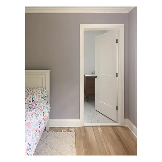
Step into a cozy retreat painted in Sherwin Williams' tranquil SW 7079 Ponder. This soft, soothing green-grey hue effortlessly blends nature with modern design, creating a serene ambiance in any space. SW 7079 Ponder is perfect for bedrooms, living rooms, and home offices, where its calming presence encourages relaxation and focus. Pair it with crisp white accents and natural textures for a refreshing, contemporary look that invites tranquility into your home. Let SW 7079 Ponder envelop you in a sense of peace and harmony, making it a versatile and timeless choice for your interiors.
Loading...
LRV of Ponder
Ponder has an LRV of 47.74% and refers to Light Medium colors that reflect half of the incident light. Why LRV is important?

Light Reflectance Value measures the amount of visible and usable light that reflects from a painted surface.
Simply put, the higher the LRV of a paint color, the brighter the room you will get.
The scale goes from 0% (absolute black, absorbing all light) to 100% (pure white, reflecting all light).
Act like a pro: When choosing paint with an LRV of 47.74%, pay attention to your bulbs' brightness. Light brightness is measured in lumens. The lower the paint's LRV, the higher lumen level you need. Every square foot of room needs at least 40 lumens. That means for a 200 ft2 living room you'll need about 8000 lumens of light – e.g., eight 1000 lm bulbs.
Color codes
We have collected almost every possible color code you could ever need.
Not sure what the difference between HEX and RGB is? We break down color models in plain language. Understanding color models
| Format | Code |
|---|---|
| HEX | #bcb6b6 |
| RGB Decimal | 188, 182, 182 |
| RGB Percent | 73.73%, 71.37%, 71.37% |
| HSV | Hue: 0° Saturation: 3.19% Value: 73.73% |
| HSL | hsl(0, 4, 73) |
| CMYK | Cyan: 0.0 Magenta: 3.19 Yellow: 3.19 Key: 26.27 |
| YIQ | Y: 183.794 I: 3.575 Q: 1.269 |
| XYZ | X: 45.909 Y: 47.525 Z: 50.998 |
| CIE Lab | L:74.524 a:2.112 b:0.756 |
| CIE Luv | L:74.524 u:3.452 v:0.75 |
| Decimal | 12367542 |
| Hunter Lab | 68.938, -1.772, 4.396 |