Dulux Potters Clay 3 / Treasured Memory / 50RR 72/010
Contentsshow +hide -
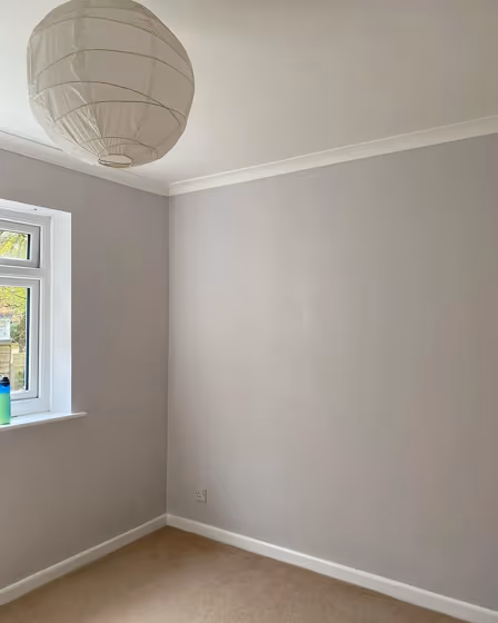
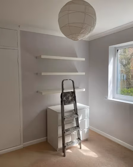
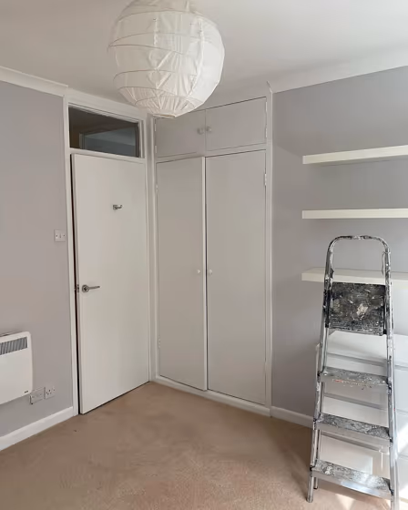
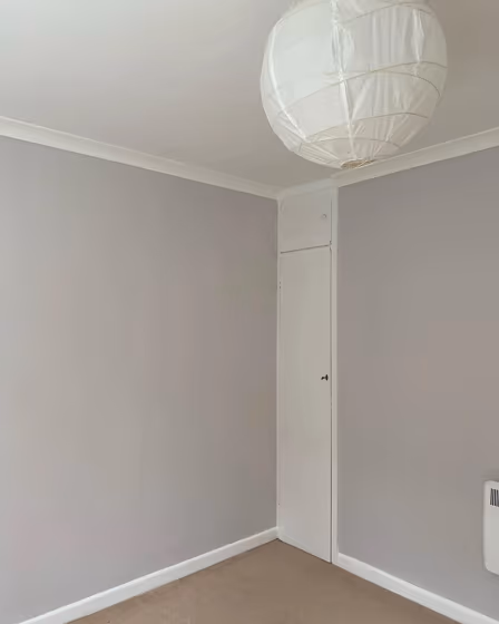
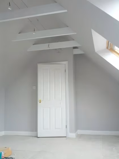
- Dulux Potters Clay 3 reviews (5 photos)
- What are Dulux Potters Clay 3 undertones?
- Is Potters Clay 3 50RR 72/010 cool or warm?
- How light temperature affects on Potters Clay 3
- Monochromatic color scheme
- Complementary color scheme
- Color comparison and matching
- LRV of Potters Clay 3 50RR 72/010
- Color codes
- Color equivalents
| Code: | 50RR 72/010 |
| Name: | Potters Clay 3 |
| Brand: | Dulux |
What color is Dulux Potters Clay 3?
Elevate your space with the warm and sophisticated charm of Dulux Potters Clay 3 (50RR 72/010). This rich and earthy hue adds depth and character to any room, creating a cozy and inviting atmosphere. Potters Clay 3 pairs beautifully with creamy neutrals like off-white and beige for a timeless look. For a more modern vibe, try combining it with trendy shades like sage green or mustard yellow. Infuse your home with style and warmth by incorporating Dulux 50RR 72/010 Potters Clay 3 into your color palette.
Loading...
LRV of Potters Clay 3
Potters Clay 3 has an LRV of 70.47% and refers to Light colors that reflect most of the incident light. Why LRV is important?

Light Reflectance Value measures the amount of visible and usable light that reflects from a painted surface.
Simply put, the higher the LRV of a paint color, the brighter the room you will get.
The scale goes from 0% (absolute black, absorbing all light) to 100% (pure white, reflecting all light).
Act like a pro: When choosing paint with an LRV of 70.47%, pay attention to your bulbs' brightness. Light brightness is measured in lumens. The lower the paint's LRV, the higher lumen level you need. Every square foot of room needs at least 40 lumens. That means for a 200 ft2 living room you'll need about 8000 lumens of light – e.g., eight 1000 lm bulbs.
Color codes
We have collected almost every possible color code you could ever need.
Not sure what the difference between HEX and RGB is? We break down color models in plain language. Understanding color models
| Format | Code |
|---|---|
| HEX | #dddad8 |
| RGB Decimal | 221, 218, 216 |
| RGB Percent | 86.67%, 85.49%, 84.71% |
| HSV | Hue: 24° Saturation: 2.26% Value: 86.67% |
| HSL | hsl(24, 7, 86) |
| CMYK | Cyan: 0.0 Magenta: 1.36 Yellow: 2.26 Key: 13.33 |
| YIQ | Y: 218.669 I: 2.43 Q: 0.012 |
| XYZ | X: 67.282 Y: 70.473 Z: 75.005 |
| CIE Lab | L:87.228 a:0.662 b:1.346 |
| CIE Luv | L:87.228 u:1.819 v:1.922 |
| Decimal | 14539480 |
| Hunter Lab | 83.948, -3.847, 5.79 |