Sherwin Williams Practical Beige SW 6100
Contentsshow +hide -
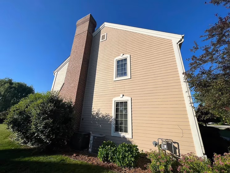
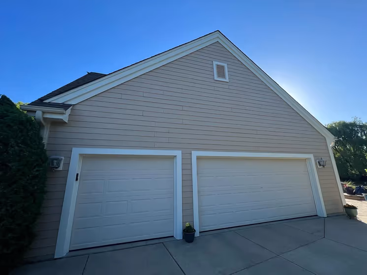
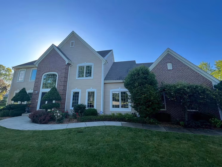
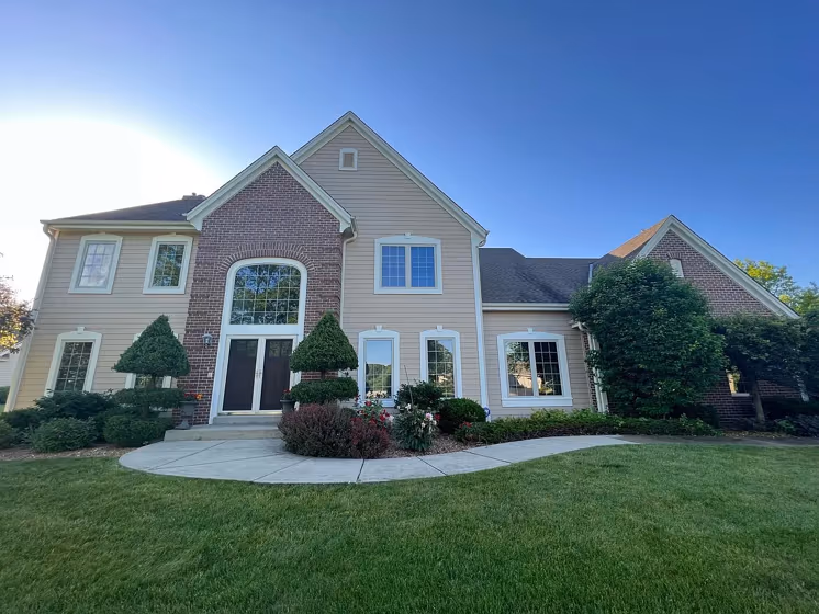
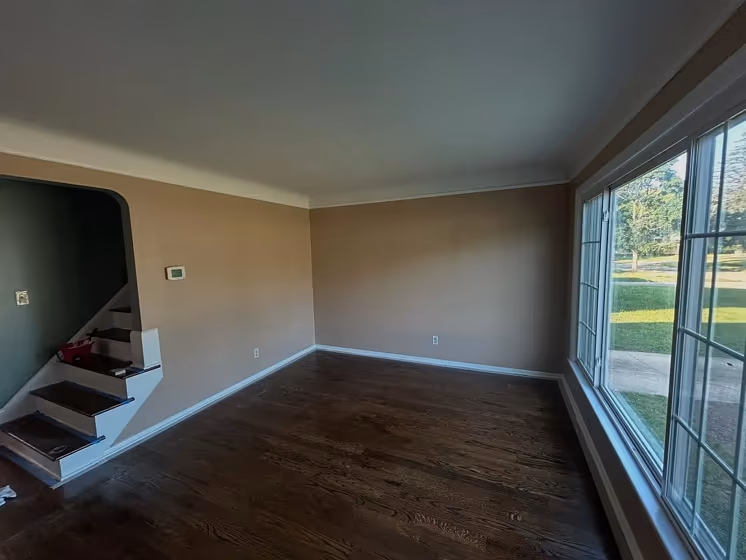
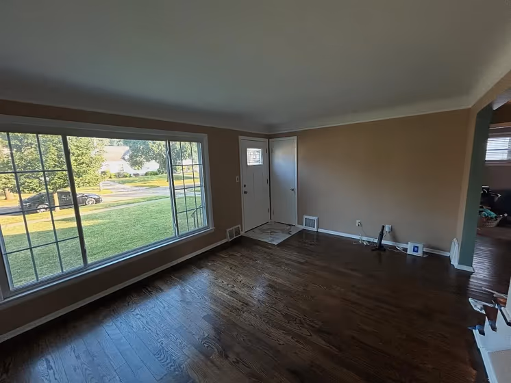
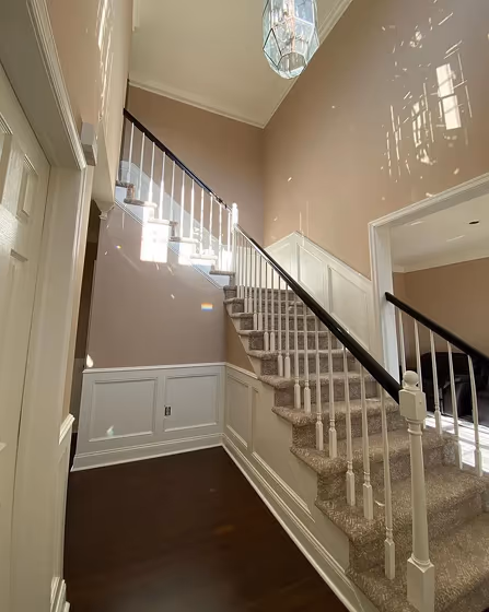
- Practical Beige for exterior (4 photos)
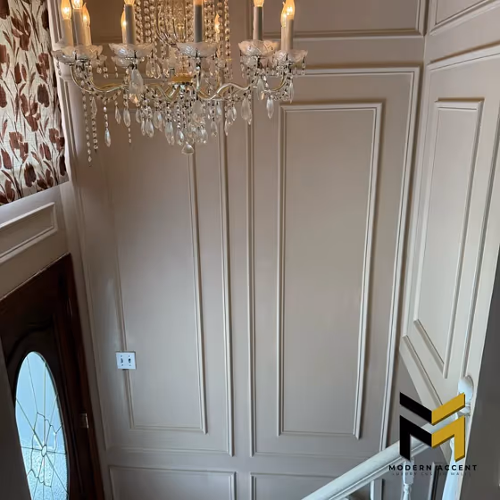
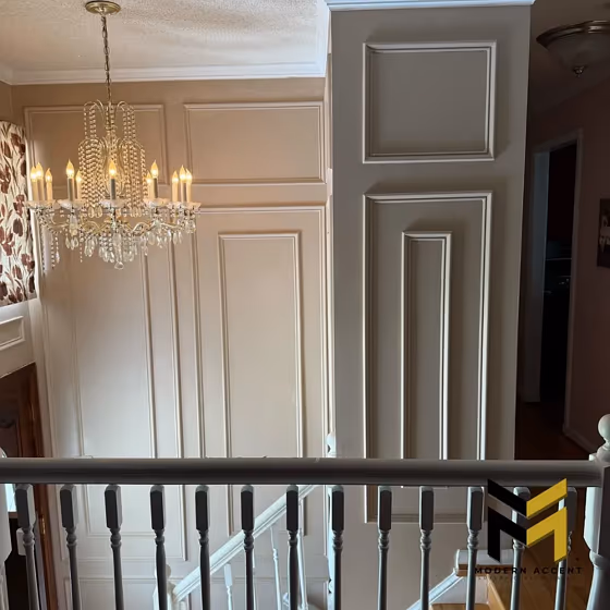
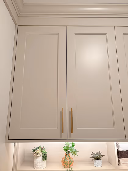
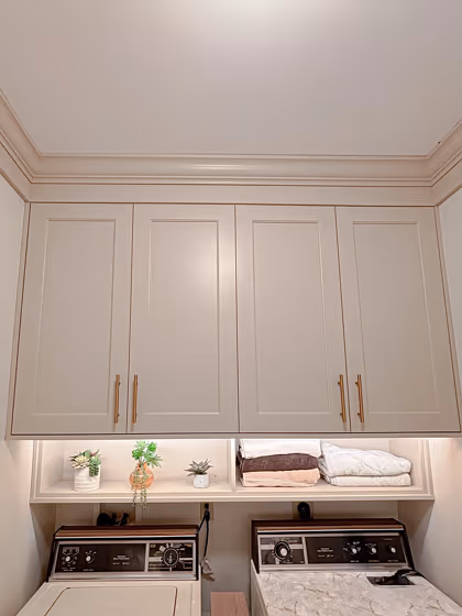
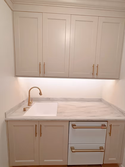
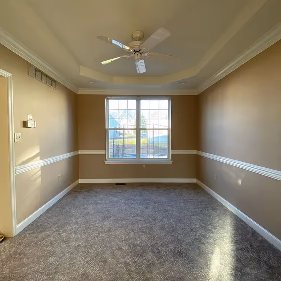
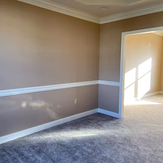
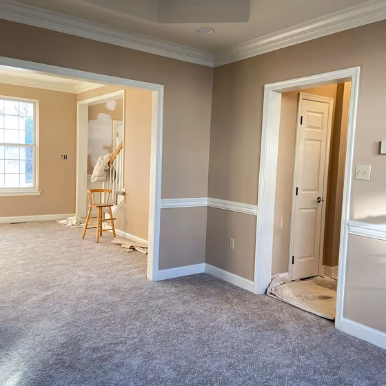
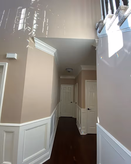
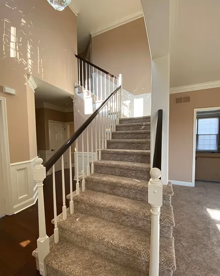
- Sherwin Williams Practical Beige reviews (13 photos)
- What are Sherwin Williams Practical Beige undertones?
- Is Practical Beige SW 6100 cool or warm?
- How light temperature affects on Practical Beige
- Monochromatic color scheme
- Complementary color scheme
- Color comparison and matching
- LRV of Practical Beige SW 6100
- Color codes
- Color equivalents
| Official page: | Practical Beige SW 6100 |
| Code: | SW 6100 |
| Name: | Practical Beige |
| Brand: | Sherwin Williams |
| Collections: | Living Well - Unplug, Naturally Neutral, Warm Neutrals |
What color is Sherwin Williams Practical Beige?
Enhance your space with the warm and inviting tones of Sherwin Williams SW 6100 Practical Beige. This versatile color seamlessly blends earthy beige undertones with a touch of sophistication, creating a modern yet cozy ambiance. Pair Practical Beige with accents in SW 7008 Alabaster for a crisp and clean contrast, or with SW 6204 Sea Salt for a serene and harmonious palette. Elevate your interior design with this timeless neutral hue that complements a variety of decor styles, from contemporary to traditional. Experience the transformative power of Practical Beige in your home today.
Loading...
LRV of Practical Beige
Practical Beige has an LRV of 46.52% and refers to Light Medium colors that reflect half of the incident light. Why LRV is important?

Light Reflectance Value measures the amount of visible and usable light that reflects from a painted surface.
Simply put, the higher the LRV of a paint color, the brighter the room you will get.
The scale goes from 0% (absolute black, absorbing all light) to 100% (pure white, reflecting all light).
Act like a pro: When choosing paint with an LRV of 46.52%, pay attention to your bulbs' brightness. Light brightness is measured in lumens. The lower the paint's LRV, the higher lumen level you need. Every square foot of room needs at least 40 lumens. That means for a 200 ft2 living room you'll need about 8000 lumens of light – e.g., eight 1000 lm bulbs.
Color codes
We have collected almost every possible color code you could ever need.
Not sure what the difference between HEX and RGB is? We break down color models in plain language. Understanding color models
| Format | Code |
|---|---|
| HEX | #c9b29c |
| RGB Decimal | 201, 178, 156 |
| RGB Percent | 78.82%, 69.80%, 61.18% |
| HSV | Hue: 29° Saturation: 22.39% Value: 78.82% |
| HSL | hsl(29, 29, 70) |
| CMYK | Cyan: 0.0 Magenta: 11.44 Yellow: 22.39 Key: 21.18 |
| YIQ | Y: 182.369 I: 20.775 Q: -1.981 |
| XYZ | X: 46.008 Y: 46.66 Z: 38.026 |
| CIE Lab | L:73.972 a:4.778 b:14.28 |
| CIE Luv | L:73.972 u:15.535 v:19.207 |
| Decimal | 13218460 |
| Hunter Lab | 68.308, 0.688, 14.81 |