Dulux Pressed Petal 10YR 37/143
Contentsshow +hide -
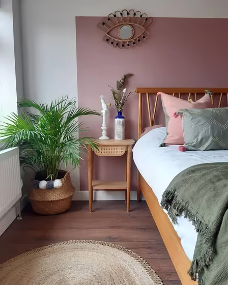
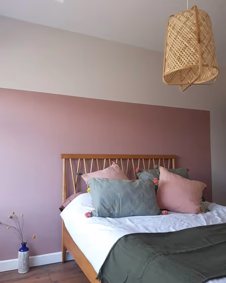
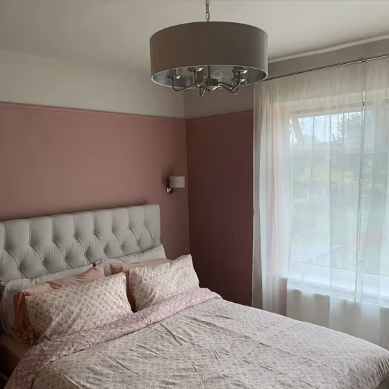
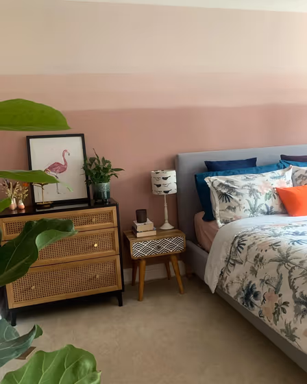
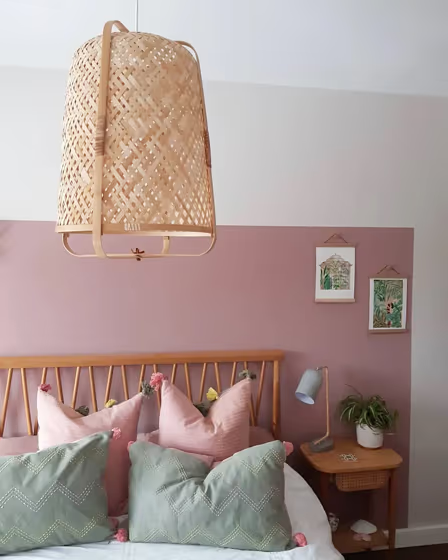
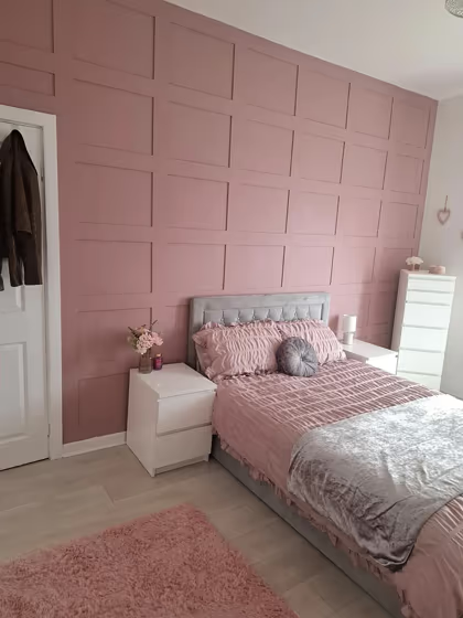
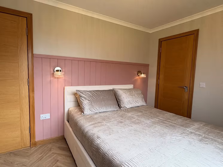
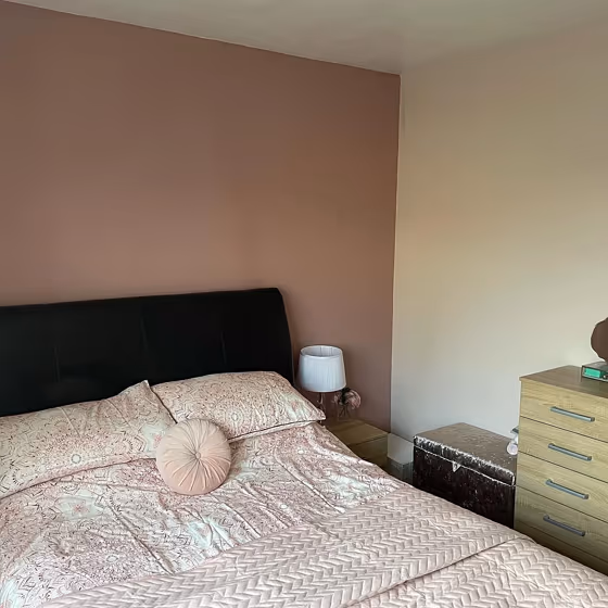
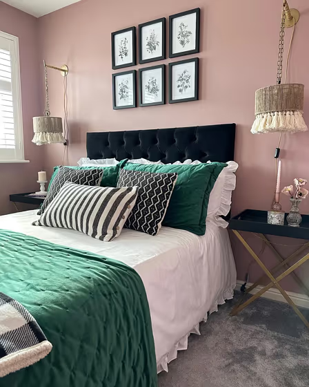
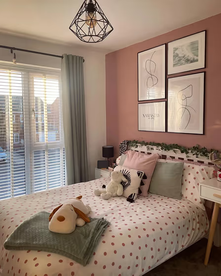
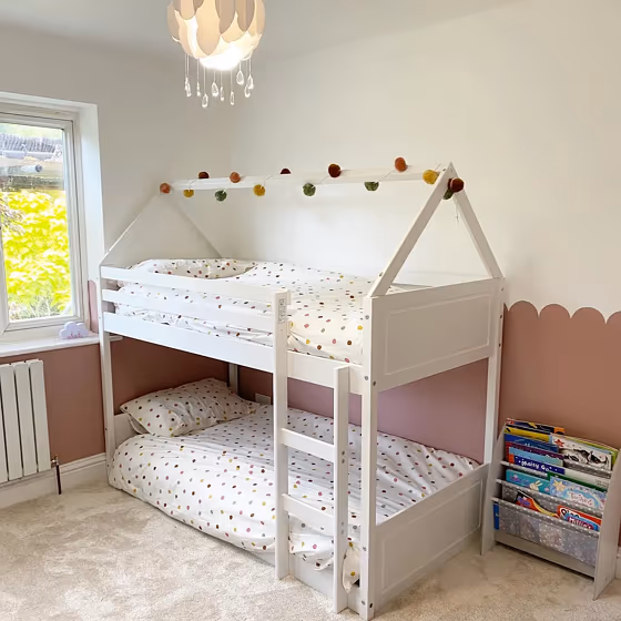
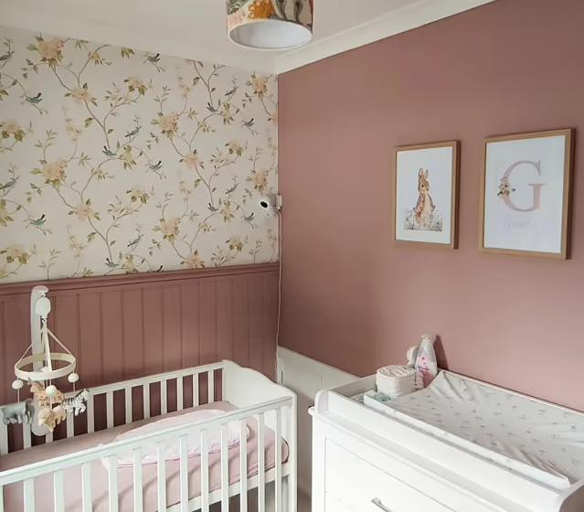
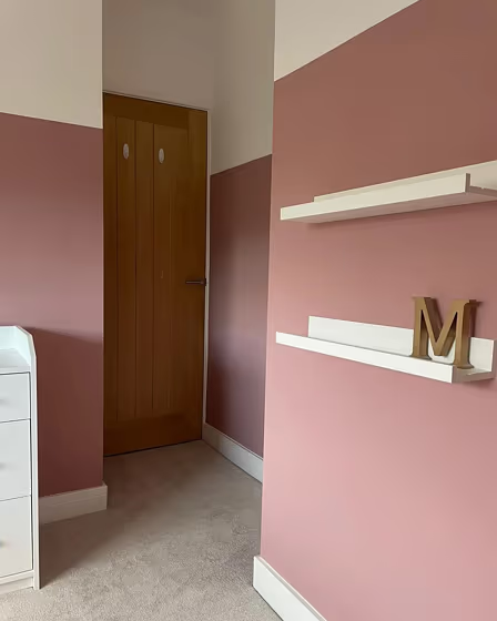
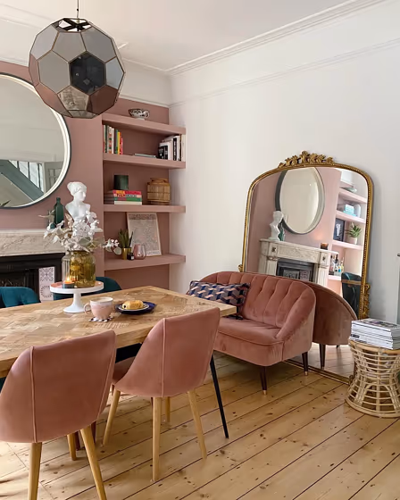
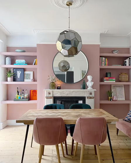
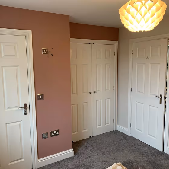
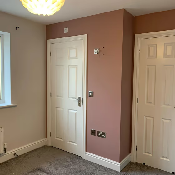
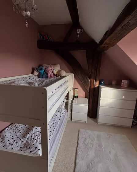
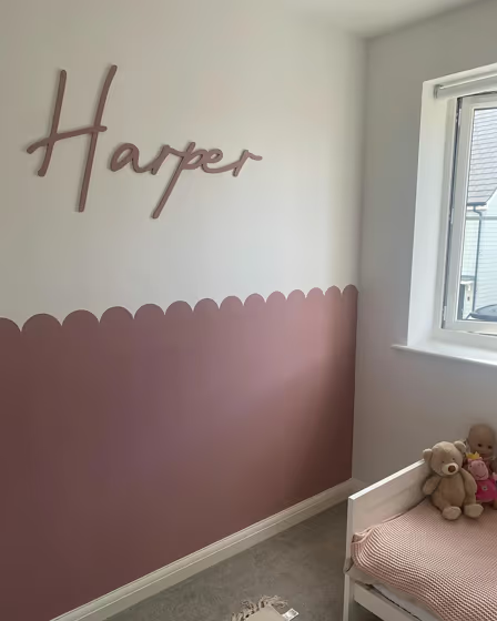
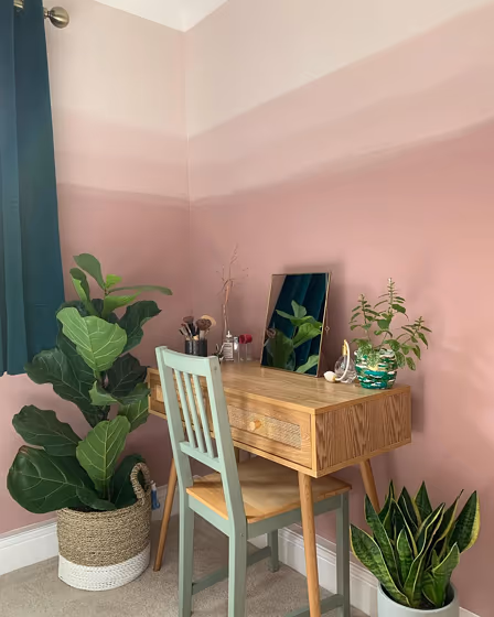
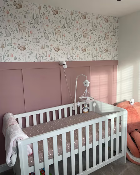
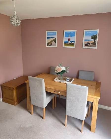
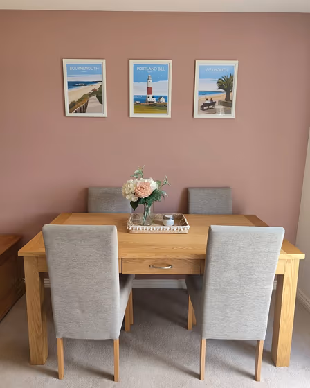
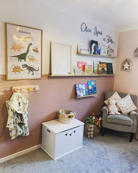
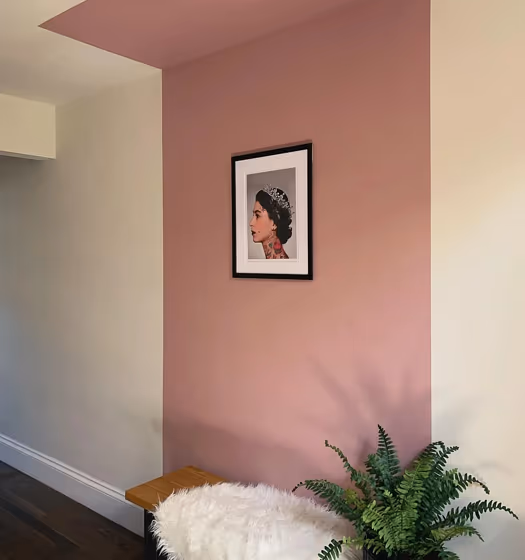
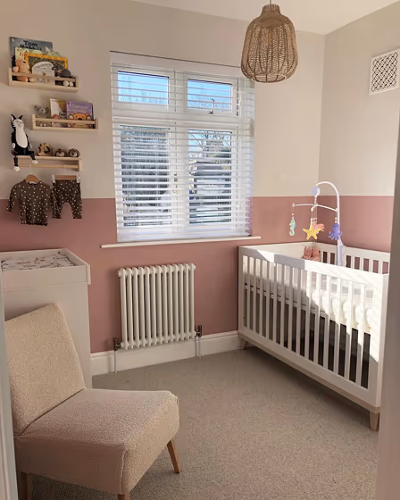
- Pressed Petal for bedroom (10 photos)
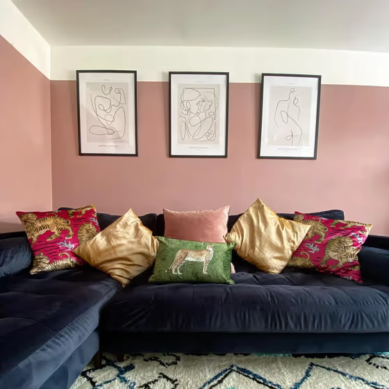
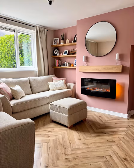
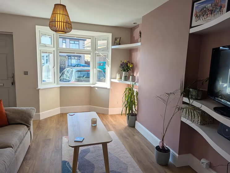
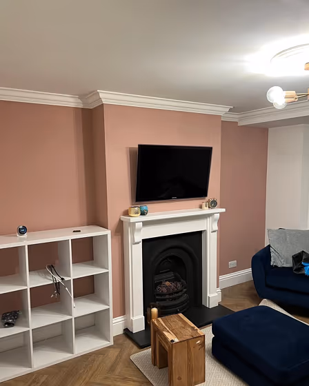
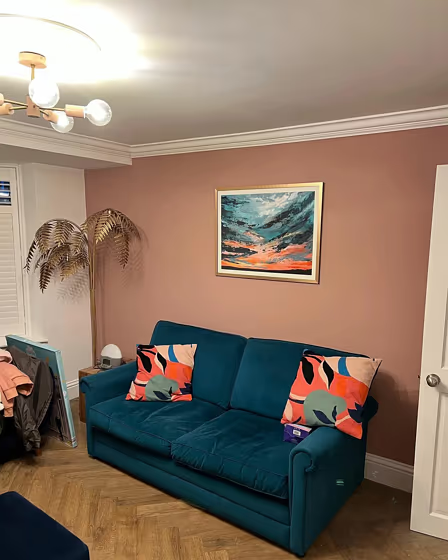
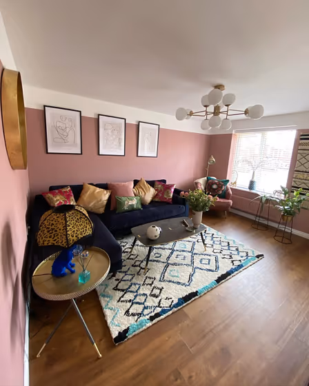
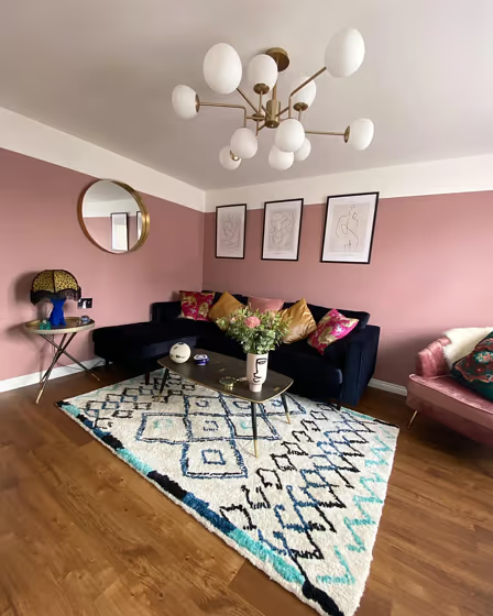
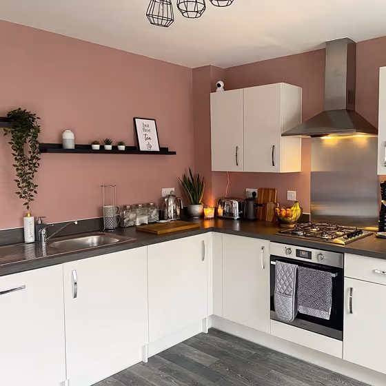
- Pressed Petal for living room (7 photos)
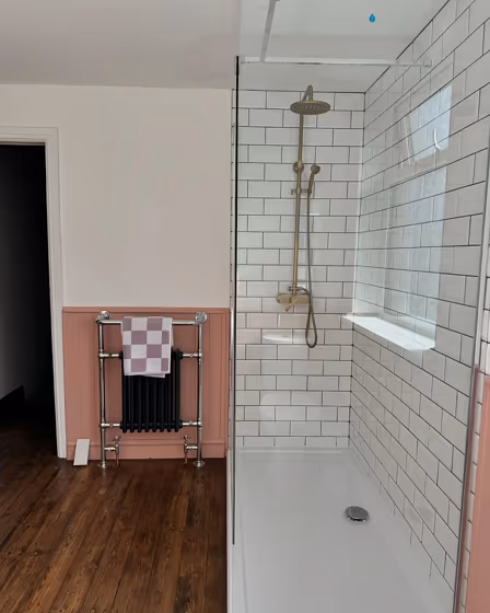
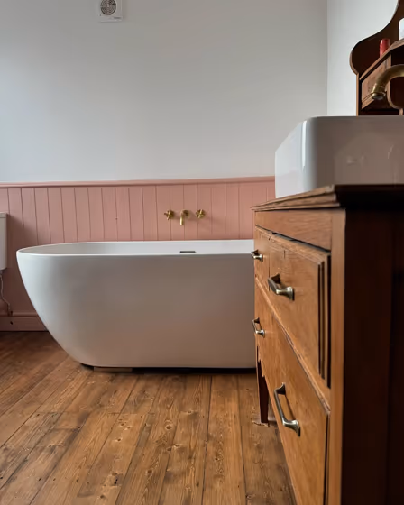
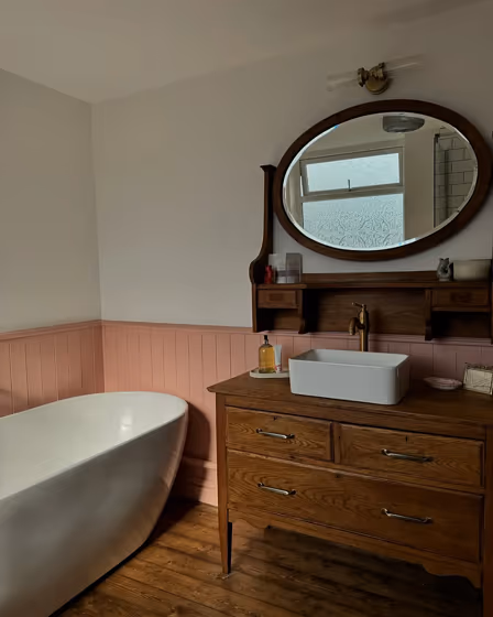
- Dulux Pressed Petal for bathroom (3 photos)
- Dulux Pressed Petal reviews (22 photos)
- What are Dulux Pressed Petal undertones?
- Is Pressed Petal 10YR 37/143 cool or warm?
- How light temperature affects on Pressed Petal
- Monochromatic color scheme
- Complementary color scheme
- Color comparison and matching
- Color codes
- Color equivalents
| Code: | 10YR 37/143 |
| Name: | Pressed Petal |
| Brand: | Dulux |
What color is Dulux Pressed Petal?
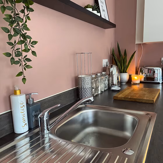
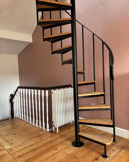
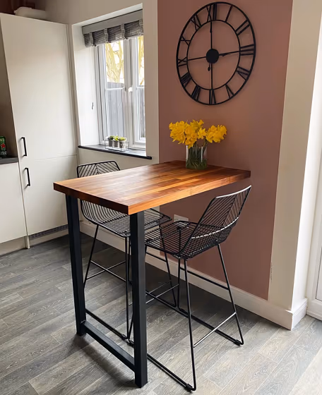
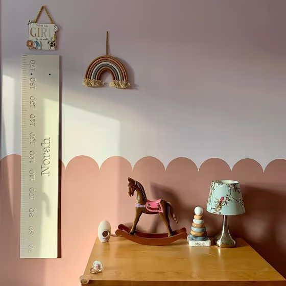
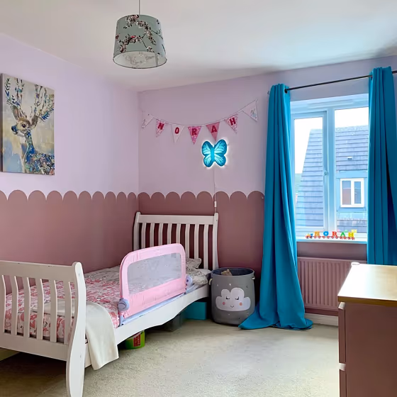
Let's dive into a full Pressed Petal paint color review. Take a look at pictures of real interiors and exteriors painted with beautiful 10YR 37/143. Find out if this gorgeous warm pink paint color would look great on your living room walls or trims, kitchen cabinet, bedroom accent wall, bathroom or house exterior.
Loading...
Color codes
We have collected almost every possible color code you could ever need.
Not sure what the difference between HEX and RGB is? We break down color models in plain language. Understanding color models
| Format | Code |
|---|---|
| HEX | #BC9795 |
| RGB Decimal | 188, 151, 149 |
| RGB Percent | 73.73%, 59.22%, 58.43% |
| HSV | Hue: 3° Saturation: 20.74% Value: 73.73% |
| HSL | hsl(3, 23, 66) |
| CMYK | Cyan: 0.0 Magenta: 19.68 Yellow: 20.74 Key: 26.27 |
| YIQ | Y: 161.835 I: 22.691 Q: 7.204 |
| XYZ | X: 37.23 Y: 34.996 Z: 33.219 |
| CIE Lab | L:65.745 a:13.487 b:6.301 |
| CIE Luv | L:65.745 u:23.226 v:6.464 |
| Decimal | 12359573 |
| Hunter Lab | 59.157, 8.812, 8.116 |