Sherwin Williams Primavera SW 9031
Contentsshow +hide -
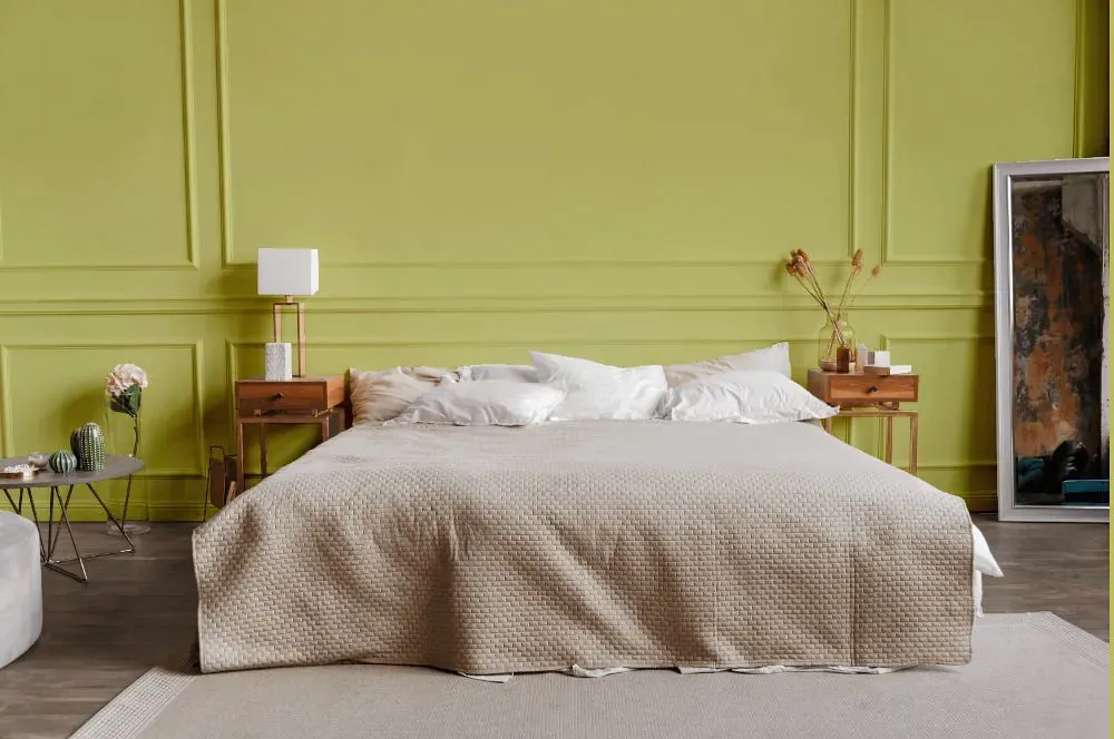
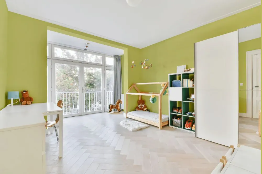
- Primavera for bedroom (1 photo)
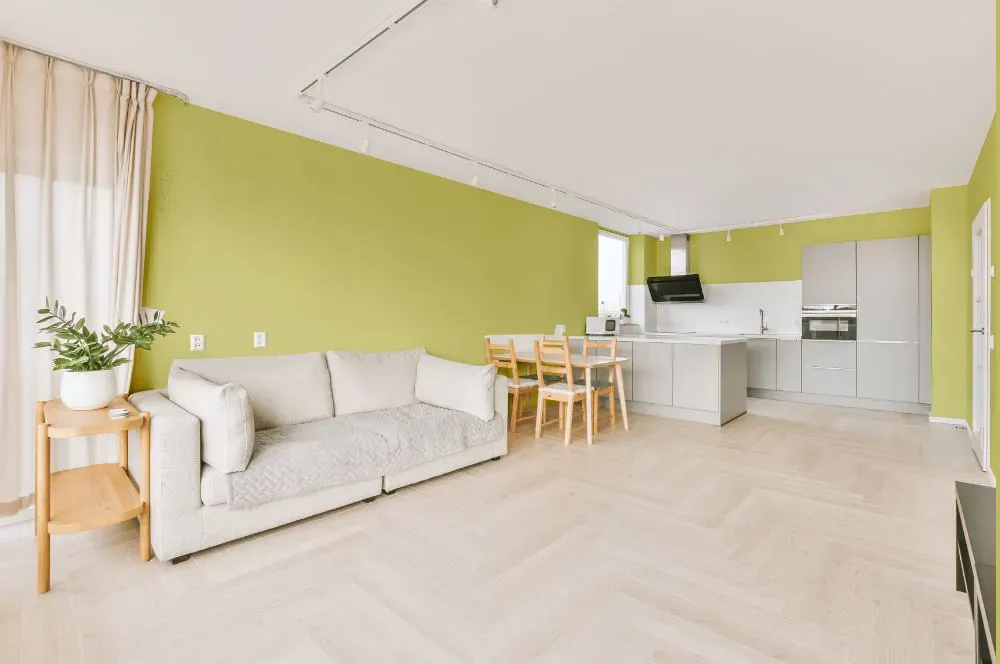
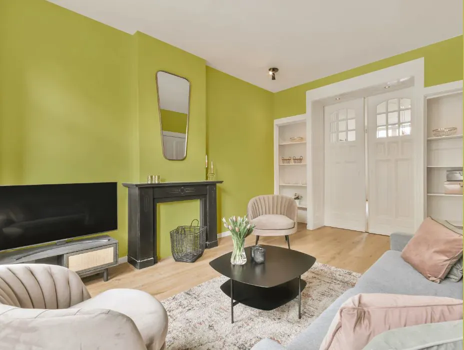
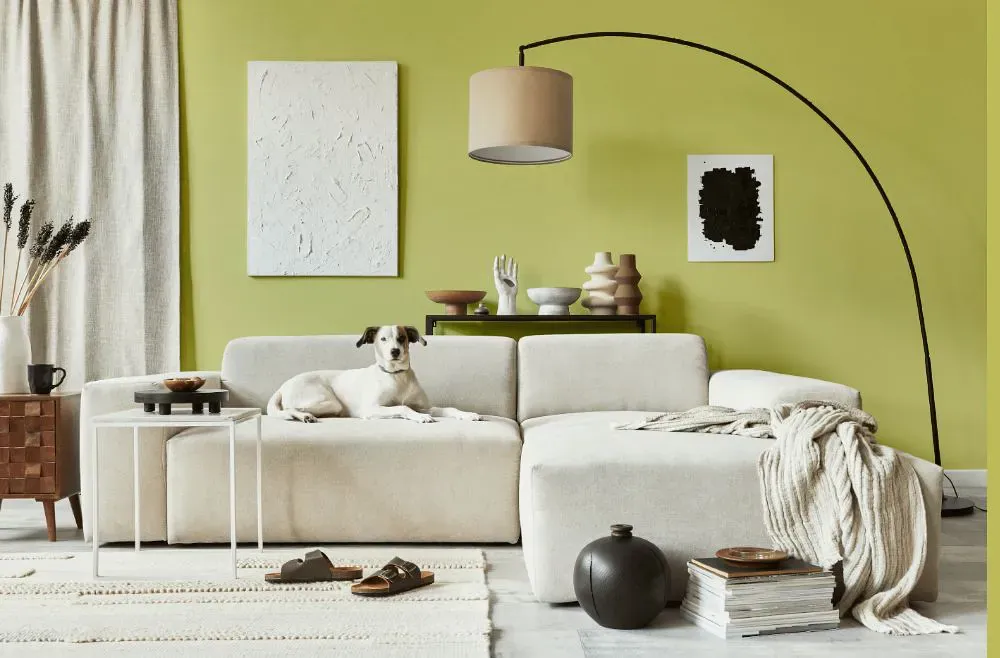
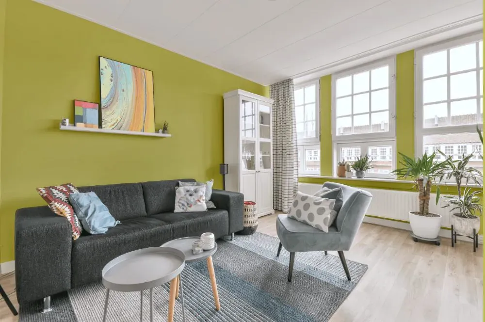
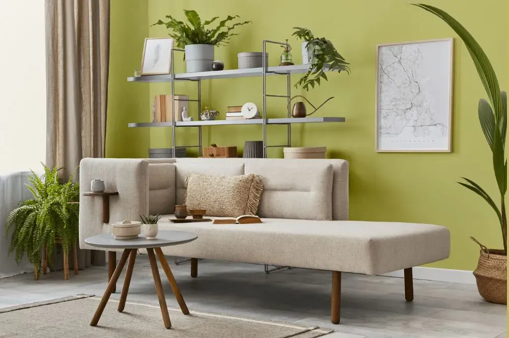
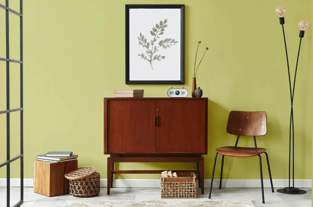
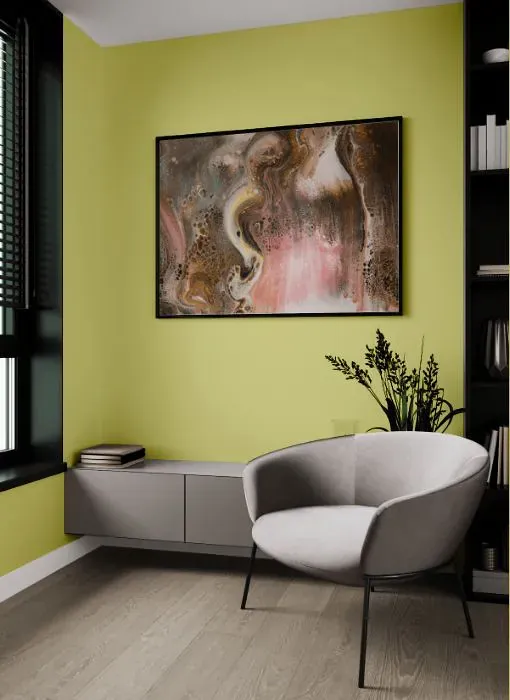
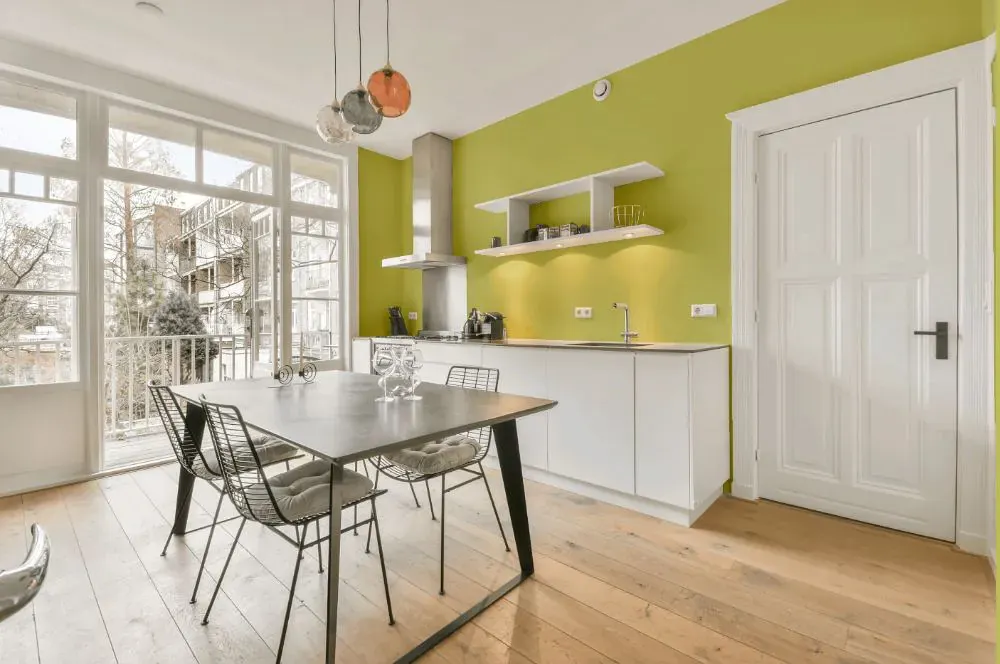
- Primavera for living room (7 photos)
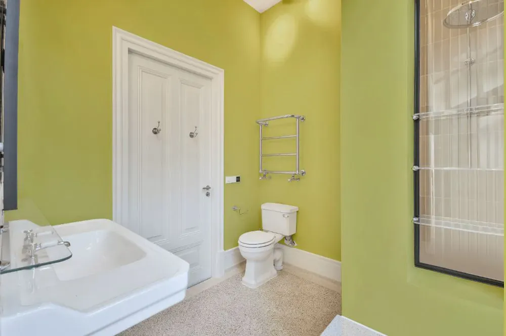
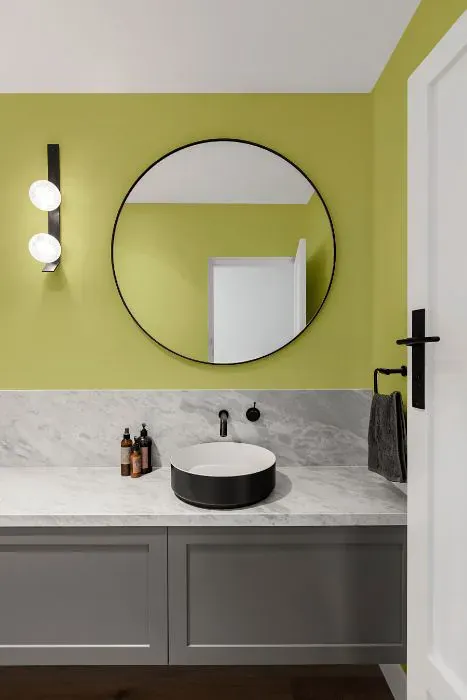
- Sherwin Williams Primavera for bathroom (2 photos)
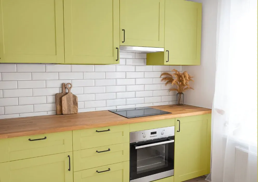
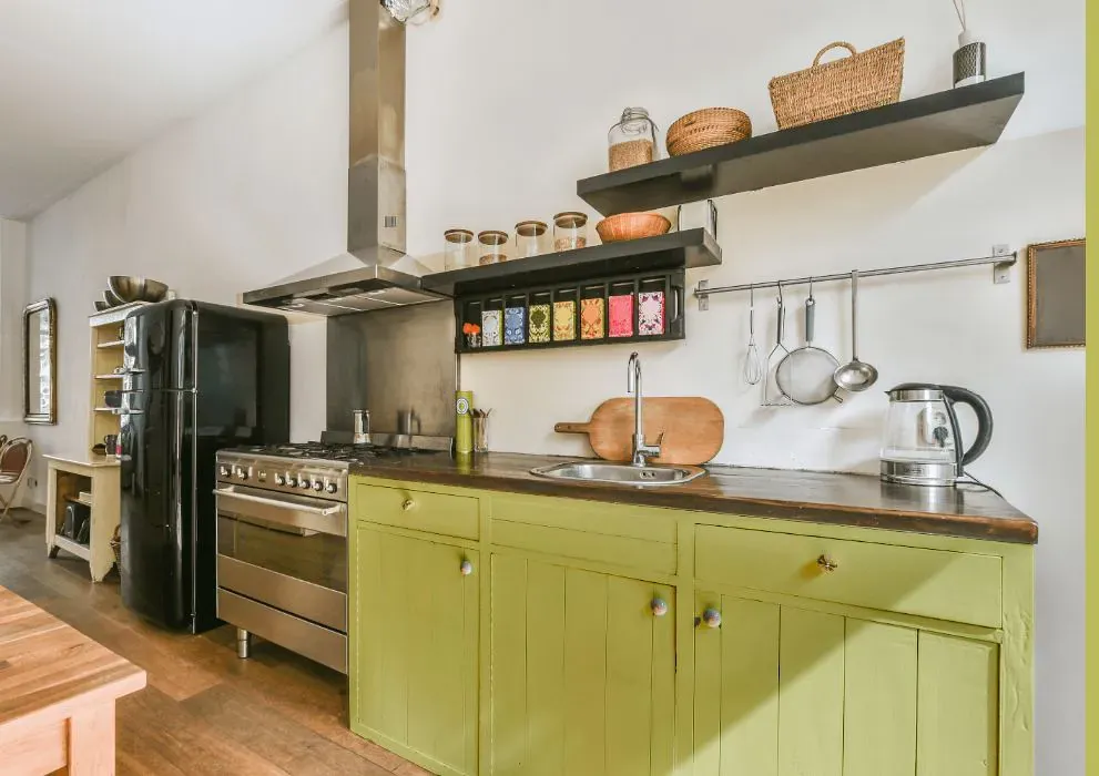
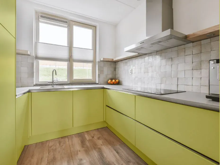
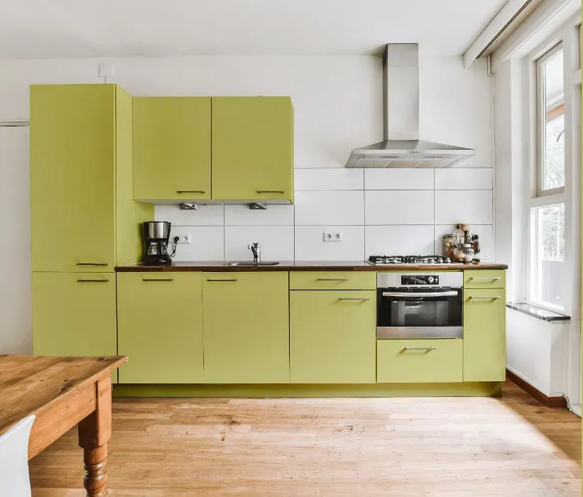
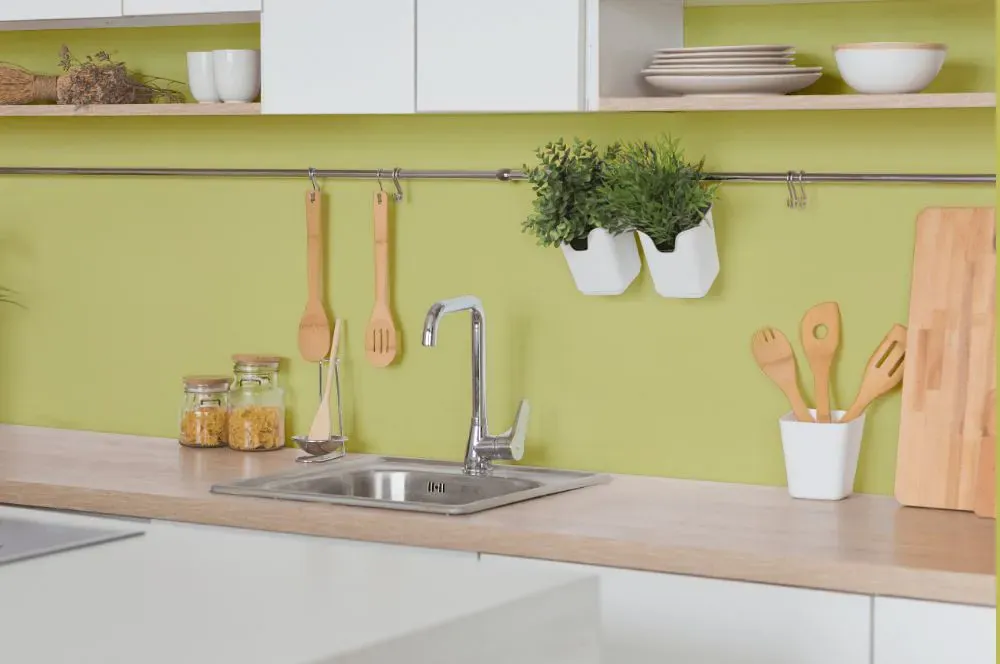
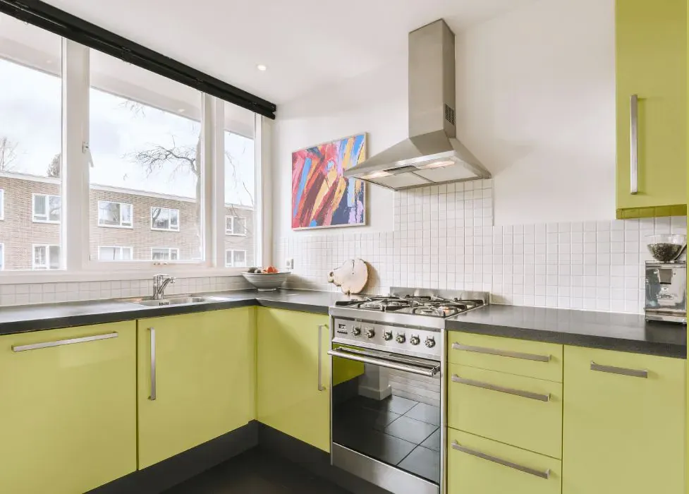
- Sherwin Williams SW 9031 on kitchen cabinets (4 photos)
- Sherwin Williams Primavera reviews (9 photos)
- What are Sherwin Williams Primavera undertones?
- Is Primavera SW 9031 cool or warm?
- How light temperature affects on Primavera
- Monochromatic color scheme
- Complementary color scheme
- Color comparison and matching
- LRV of Primavera SW 9031
- Color codes
- Color equivalents
| Official page: | Primavera SW 9031 |
| Code: | SW 9031 |
| Name: | Primavera |
| Brand: | Sherwin Williams |
| Collections: | 2019 Naturalist |
What color is Sherwin Williams Primavera?
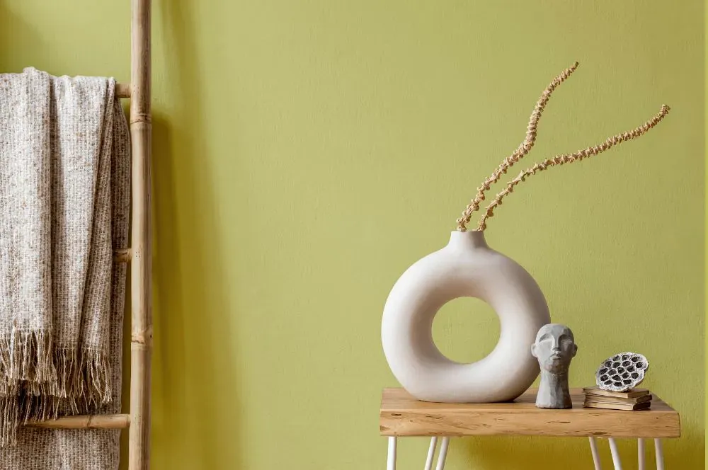
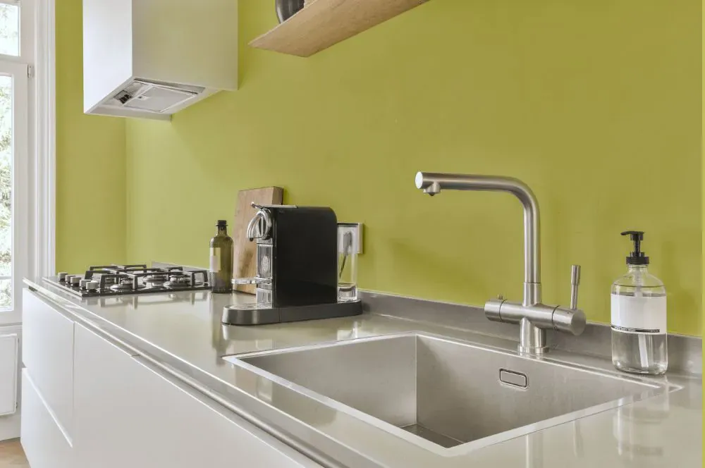
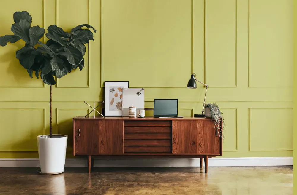
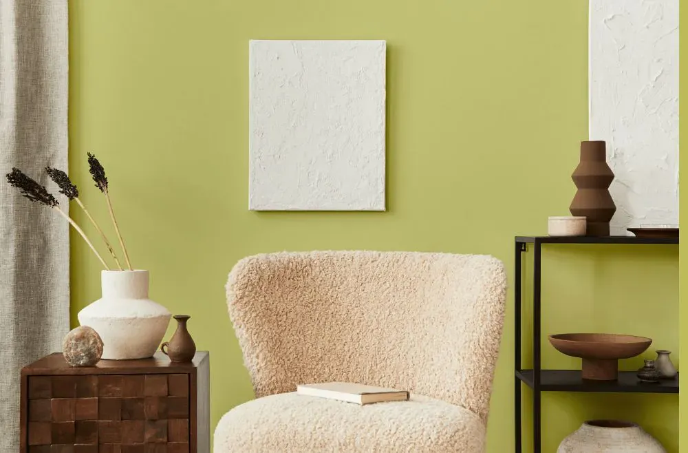
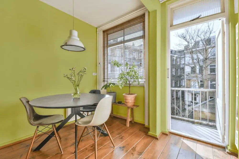
Sherwin Williams SW 9031 Primavera is a soft and soothing green with a subtle warmth that evokes a sense of tranquility. This color pairs beautifully with creamy whites, warm beiges, and soft grays to create a harmonious and inviting space. Combining it with natural wood tones and touches of gold or brass accents can enhance its earthy appeal and bring a touch of elegance to the room. Whether used as the main color or as an accent, Primavera adds a fresh and serene vibe to any interior.
Loading...
LRV of Primavera
Primavera has an LRV of 60.31% and refers to Light colors that reflect most of the incident light. Why LRV is important?

Light Reflectance Value measures the amount of visible and usable light that reflects from a painted surface.
Simply put, the higher the LRV of a paint color, the brighter the room you will get.
The scale goes from 0% (absolute black, absorbing all light) to 100% (pure white, reflecting all light).
Act like a pro: When choosing paint with an LRV of 60.31%, pay attention to your bulbs' brightness. Light brightness is measured in lumens. The lower the paint's LRV, the higher lumen level you need. Every square foot of room needs at least 40 lumens. That means for a 200 ft2 living room you'll need about 8000 lumens of light – e.g., eight 1000 lm bulbs.
Color codes
We have collected almost every possible color code you could ever need.
Not sure what the difference between HEX and RGB is? We break down color models in plain language. Understanding color models
| Format | Code |
|---|---|
| HEX | #d2d083 |
| RGB Decimal | 210, 208, 131 |
| RGB Percent | 82.35%, 81.57%, 51.37% |
| HSV | Hue: 58° Saturation: 37.62% Value: 82.35% |
| HSL | hsl(58, 47, 67) |
| CMYK | Cyan: 0.0 Magenta: 0.95 Yellow: 37.62 Key: 17.65 |
| YIQ | Y: 199.82 I: 25.935 Q: -23.539 |
| XYZ | X: 53.231 Y: 60.453 Z: 30.331 |
| CIE Lab | L:82.084 a:-10.634 b:38.491 |
| CIE Luv | L:82.084 u:5.067 v:52.64 |
| Decimal | 13815939 |
| Hunter Lab | 77.752, -13.859, 31.297 |