Tikkurila Pumice H487
| Code: | H487 |
| Name: | Pumice |
| Brand: | Tikkurila |
What color is Tikkurila Pumice?
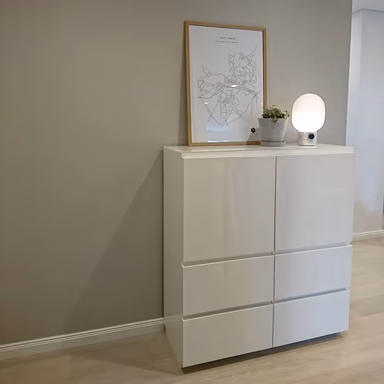
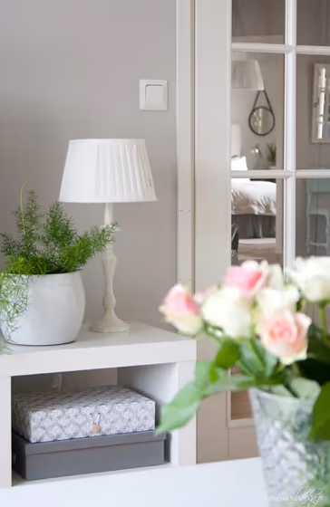
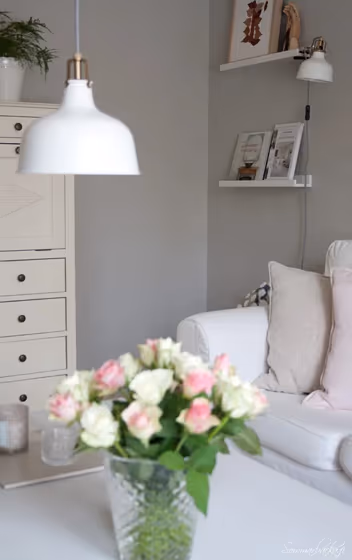
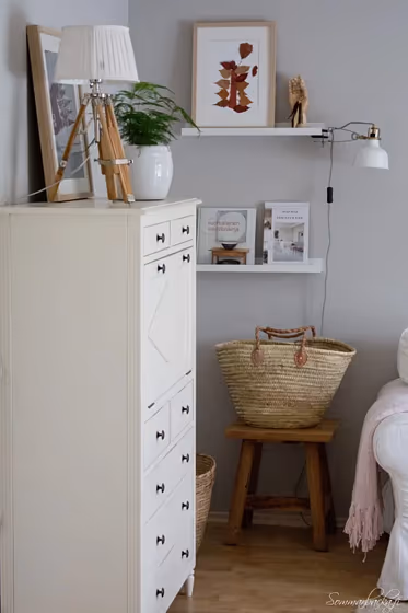
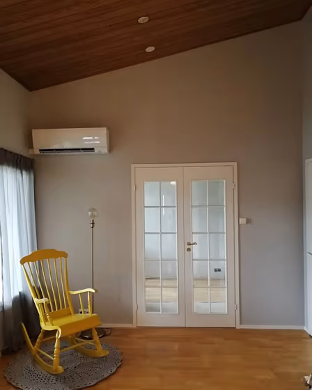
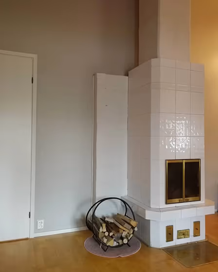
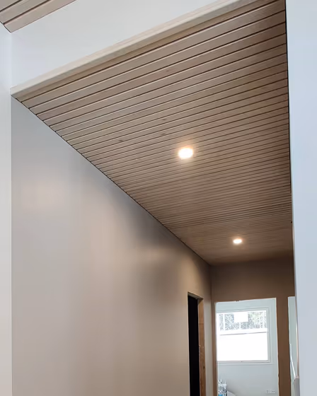
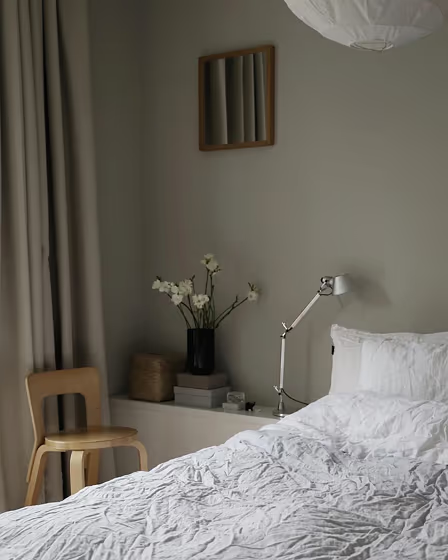
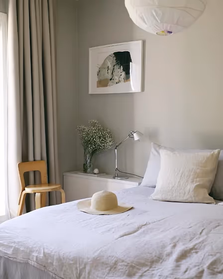
Tikkurila H487 Pumice is a versatile neutral shade that brings a sense of calm to any space. Its soft hue pairs beautifully with other natural tones like Tikkurila N499 Pebble and Tikkurila R497 Bark. Together, these colors create a harmonious palette that exudes sophistication and elegance. For a more modern look, consider combining Tikkurila H487 Pumice with cooler shades like Tikkurila A486 Fog and Tikkurila G488 Moss. Whether used as a wall color or accent, this subtle tone adds a touch of refinement to any room.
Tikkurila Pumice reviews
View the photos of real spaces painted with this that were not included in specific categories.Close-ups, painted furniture, storages and dressers, hallways, stairs and ceilings.
Try before you buy

100% accurate
reusable paint samples
Peel, stick,
and repeat
Twice painted
with real paint
Next day
delivery
What are Tikkurila Pumice undertones?
The undertone of Pumice can be accurately described as a Red hue, as is apparent from the color space provided. By isolating the pure hue and eliminating any tints, tones, and shades, we were able to precisely determine its undertone. This approach has proven to be more accurate than traditional methods of defining undertones on a white background, which are now considered outdated.
HEX value
HEX value:
#CBC5BE
RGB code:
203, 197, 190
Is Tikkurila Pumice H487 cool or warm?
With a hue of 32° thisGreyrefers warm paint shade according to HSL (Hue, Saturation, Lightness) on the color wheel.
H487 Pumice HSL code: 32, 11%, 77%
Hue - degree on a color wheel from 0 to 360. 0 is red, 120 is green, and 240 is blue.
Saturation is expressed as a percentage. At 0%, it appears as a shade of grey, and at 100%, it is in full color..
Lightness is also a percentage value. 0% is black, and 100% is white.
- Warm colors are ideal for kitchens, living rooms or bathrooms
- Warmer hues make larger spaces feel more inviting
- Warm grey shades are versatile and provide a neutral canvas for your interior design. They seamlessly complement any style, whether it's Victorian, Scandinavian, or Modern.
- To prevent a space from feeling too monotonous, consider pairing warm light shades with richer tones like deep greens or browns, or adding textures through fabrics and furnishings. Avoid using them in rooms with limited natural light, as they may appear too dull or yellowish
Act like a pro: Mixing warm and cool shades is a must have to get harmonius interior. Add accents that contrast with the primary color to create visual balance. If your walls are a warm color, don’t forget to add accent in cold colors (furniture, art, décor). A good practice is too use a complementary color scheme.
How light temperature affects Pumice
Natural Lighting. During the day, natural light shifts from about 2000 K at sunrise/sunset to 5500–6500 K at noon.
In addition, natural‑light temperature depends on its direction:
| Direction of sunlight | Visible temp. | Hue | Duration |
|---|---|---|---|
| North | Cool | Bluish | All day |
| East | Warm | Yellow | Before noon |
| West | Warm | Orange‑red | After noon |
| South | Warm | Orange‑yellow | All day |
Artificial Lighting. When choosing bulbs, pay attention to their color‑temperature (Kelvins).
Use the slider to see how this Grey shade looks under different lighting:


4000K
Coordinating colors.
Colors that go with Tikkurila Pumice:
Monochromatic color scheme
This scheme consists of various shades, tints, and tones of a single color. While it offers a perfect combination of hues, without accent décor it may become monotonous.
Lighter shades
H487
Pumice
Darker shades
H487
Pumice
Complementary color scheme
This color scheme is a combination of two shades that are opposite each other on the color wheel. The high contrast between these colors creates a vibrant and dynamic visual effect. For the color Pumice with a orange hue, complementary colors are those with a blue hue close to 212, such as Tikkurila Surf and Agate.
H487
Pumice
LRV of Pumice
Pumice has an LRV of 57% and refers to Light colors that reflect most of the incident light. Why LRV is important?
Light Reflectance Value measures the amount of visible and usable light that reflects from a painted surface.
Simply put, the higher the LRV of a paint color, the brighter the room you will get.
The scale goes from 0% (absolute black, absorbing all light) to 100% (pure white, reflecting all light).
Act like a pro: When choosing paint with an LRV of 57%, pay attention to your bulbs' brightness. Light brightness is measured in lumens. The lower the paint's LRV, the higher lumen level you need. Every square foot of room needs at least 40 lumens. That means for a 200 ft2 living room you’ll need about 8000 lumens of light – e.g., eight 1000 lm bulbs.
Color codes
We have collected almost every possible color code you could ever need. To copy the code, just click the icon to the right of it.
| Format | Code | |
|---|---|---|
| HEX | #CBC5BE | |
| RGB Decimal | 203, 197, 190 | |
| RGB Percent | 79.61%, 77.25%, 74.51% | |
| HSV | Hue: 32° Saturation: 6.4% Value: 79.61% | |
| HSL | hsl(32, 11, 77) | |
| CMYK | Cyan: 0.0 Magenta: 2.96 Yellow: 6.4 Key: 20.39 | |
| YIQ | Y: 197.996 I: 5.825 Q: -0.909 | |
| XYZ | X: 53.887 Y: 56.347 Z: 56.739 | |
| CIE Lab | L:79.811 a:0.849 b:4.249 | |
| CIE Luv | L:79.811 u:3.878 v:6.14 | |
| Decimal | 13354430 | |
| Hunter Lab | 75.065, -3.222, 7.73 |
Color equivalents
242
Pavilion Gray
Farrow and Ball

H486
Tikkurila

228
Cornforth White
Farrow and Ball

Slow Living
Dulux
X487
Plaster
Tikkurila

10182
White Linen
Jotun

12077
Sheer Grey
Jotun

00YY 63/024
Pale Taupe
Dulux

244
Dash of Soot
Little Greene

Deco Grey 1923
Tikkurila

90YR 55/051
Natural Taupe 2
Dulux

Dusted Cappuccino
Dulux

0553
Chino
Jotun

30YY 56/060
Shaded Stone
Dulux

X486
Median
Tikkurila

Y467
Shawl
Tikkurila

10YY 64/048
Rum Caramel 5
Dulux
275
Purbeck Stone
Farrow and Ball

243
Rubine Ashes
Little Greene

60YR 54/028
Perfectly Taupe
Dulux


