RAL Effect RAL 870-6
Contentsshow +hide -
| Code: | RAL 870-6 |
| Name: | |
| Brand: | RAL Effect |
What color is RAL Effect RAL 870-6?
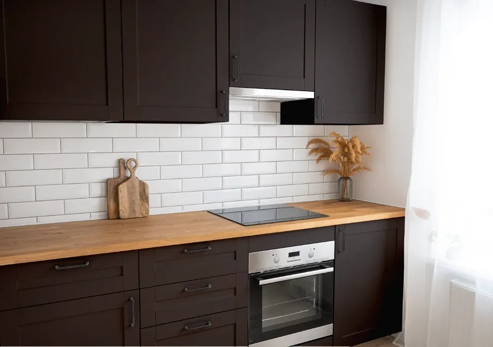
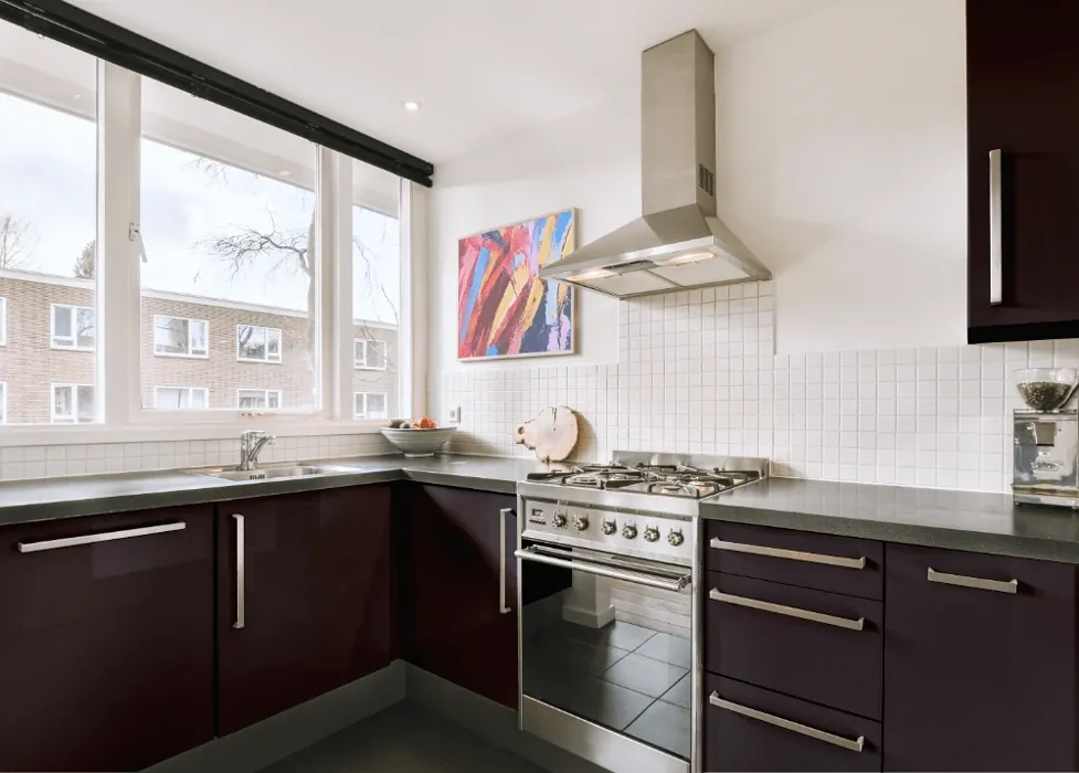
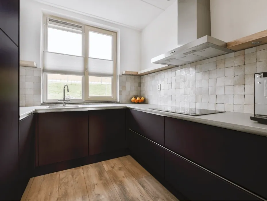
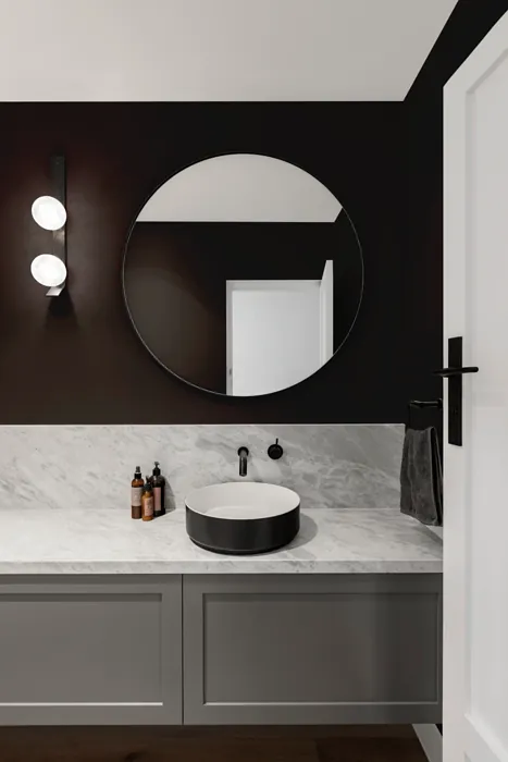
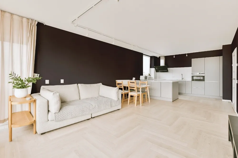
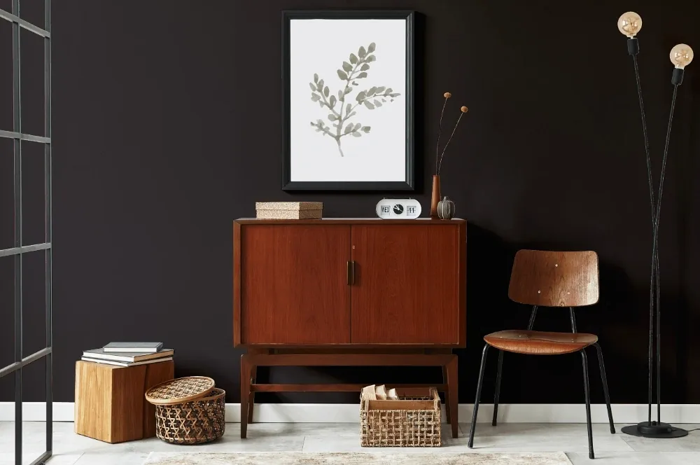
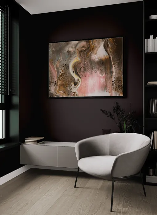
RAL 870-6 is a dark black shade with a luxurious appearance. RAL 870-6 works particularly well in modern and minimalist design styles, as well as in industrial and urban settings. However, it's important to balance it with lighter colors and textures to avoid making the space feel too dark and heavy
The nearest colors to RAL 870-6 are RAL Classic Grey brown and RAL Effect RAL 870-M, which are also dark black colors.
Loading...
LRV of RAL 870-6
RAL 870-6 has an LRV of 4.9% and refers to Dark colors which means that this color almost does not reflect light. Why LRV is important?

Light Reflectance Value measures the amount of visible and usable light that reflects from a painted surface.
Simply put, the higher the LRV of a paint color, the brighter the room you will get.
The scale goes from 0% (absolute black, absorbing all light) to 100% (pure white, reflecting all light).
Act like a pro: When choosing paint with an LRV of 4.9%, pay attention to your bulbs' brightness. Light brightness is measured in lumens. The lower the paint's LRV, the higher lumen level you need. Every square foot of room needs at least 40 lumens. That means for a 200 ft2 living room you'll need about 8000 lumens of light – e.g., eight 1000 lm bulbs.
Color codes
We have collected almost every possible color code you could ever need.
Not sure what the difference between HEX and RGB is? We break down color models in plain language. Understanding color models
| Format | Code |
|---|---|
| HEX | #3D3737 |
| RGB Decimal | 61, 55, 55 |
| RGB Percent | 23.92%, 21.57%, 21.57% |
| HSV | Hue: 0° Saturation: 9.84% Value: 23.92% |
| HSL | hsl(0, 5, 23) |
| CMYK | Cyan: 0.0 Magenta: 9.84 Yellow: 9.84 Key: 76.08 |
| YIQ | Y: 56.794 I: 3.575 Q: 1.269 |
| XYZ | X: 3.98 Y: 4.0 Z: 4.176 |
| CIE Lab | L:23.673 a:2.626 b:0.955 |
| CIE Luv | L:23.673 u:3.15 v:0.681 |
| Decimal | 4011831 |
| Hunter Lab | 20.001, 0.519, 1.622 |