Sherwin Williams Repose Gray SW 7015
Contentsshow +hide -
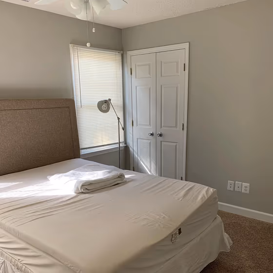
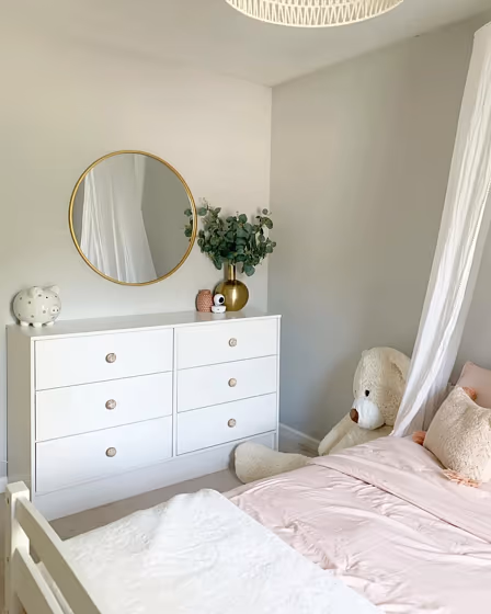
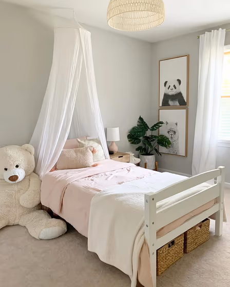
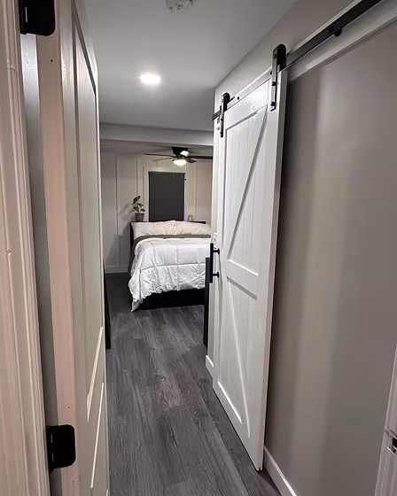
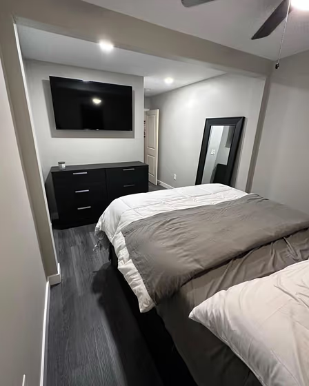
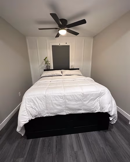
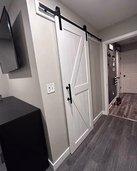
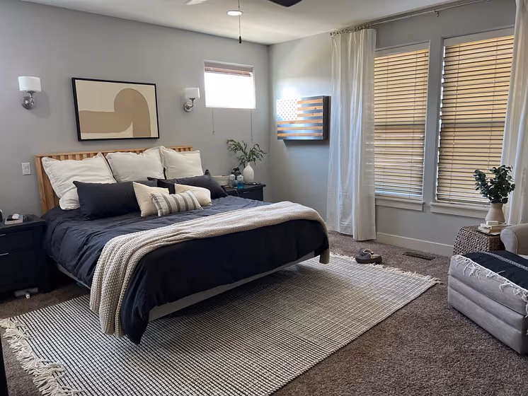
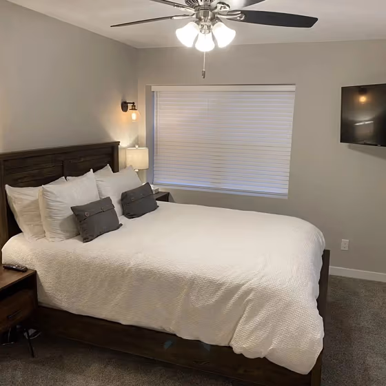
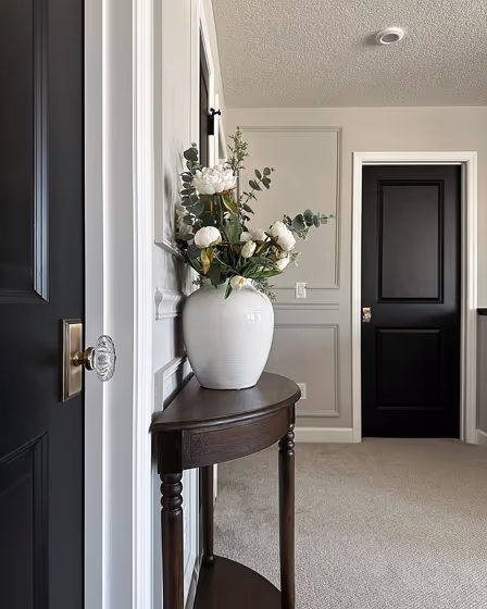
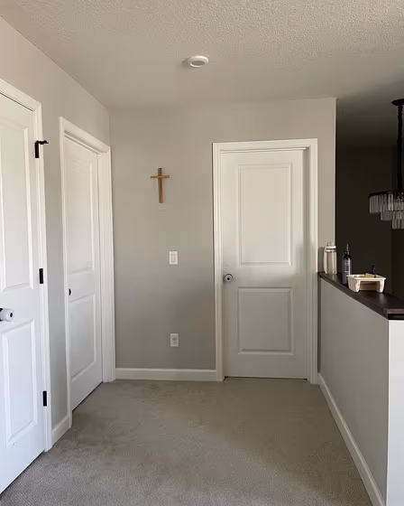
- Repose Gray for bedroom (9 photos)
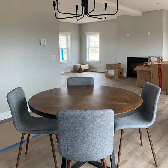
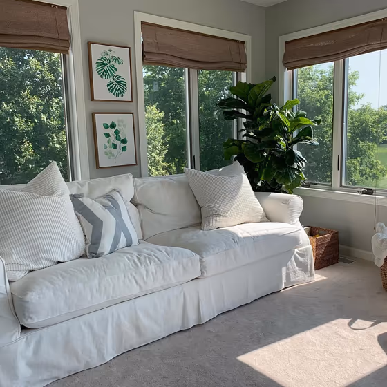
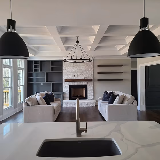
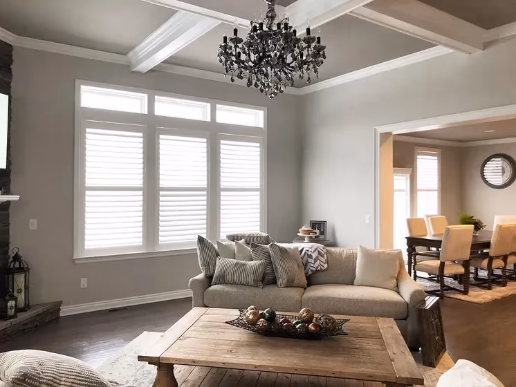
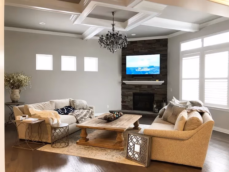
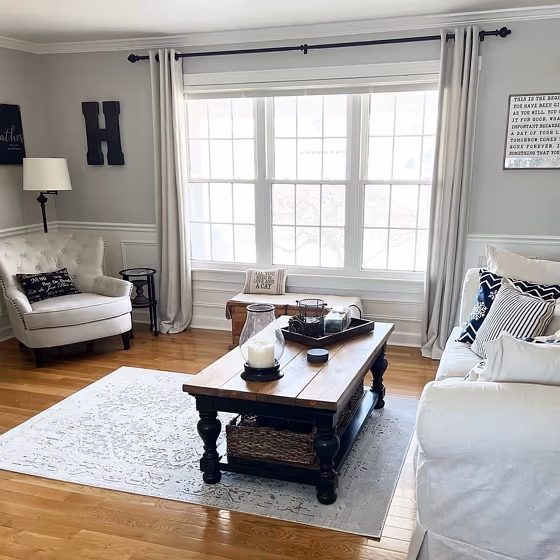
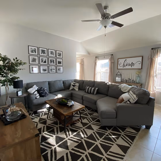
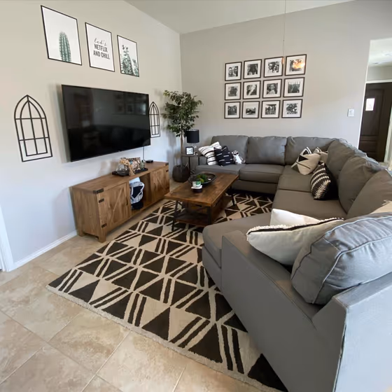
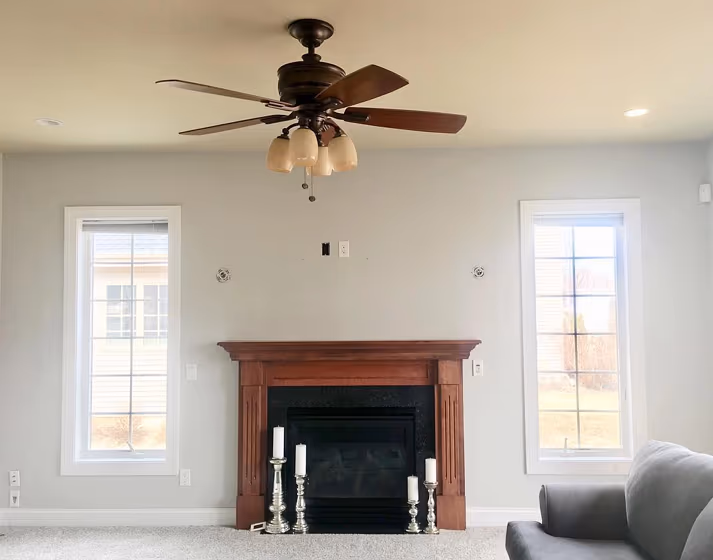
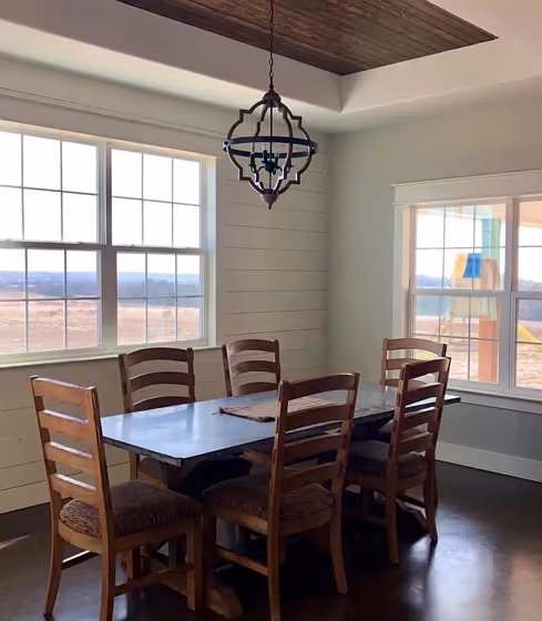
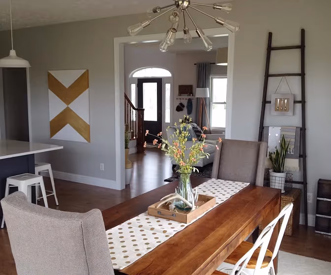
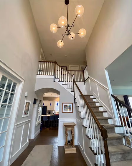
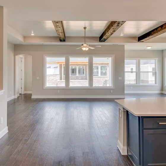
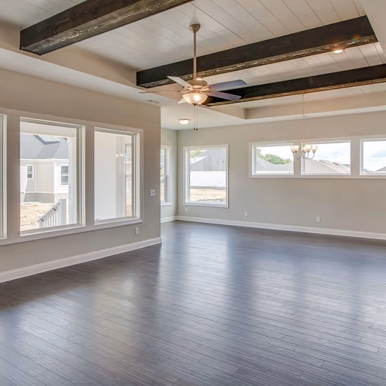
- Repose Gray for living room (9 photos)
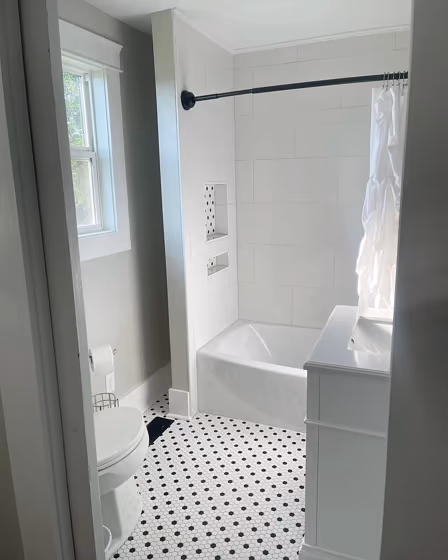
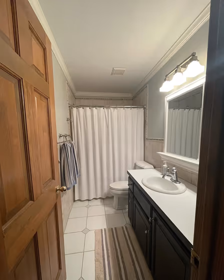
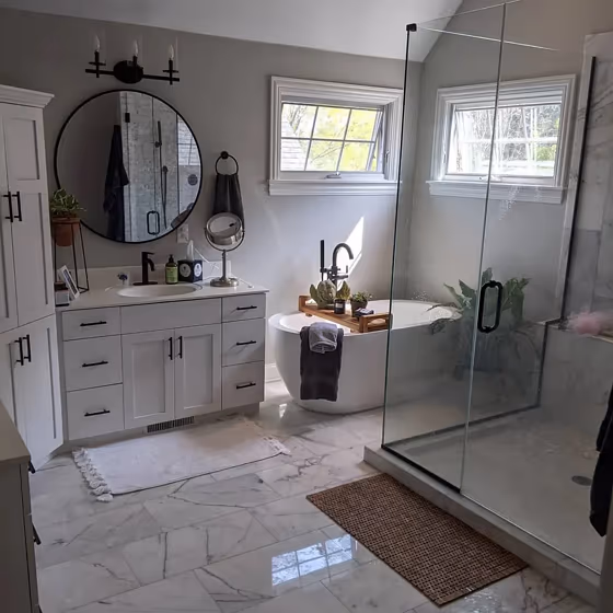
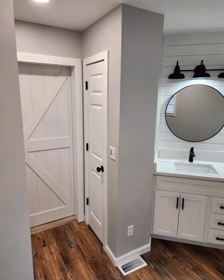
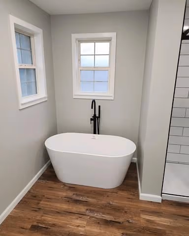
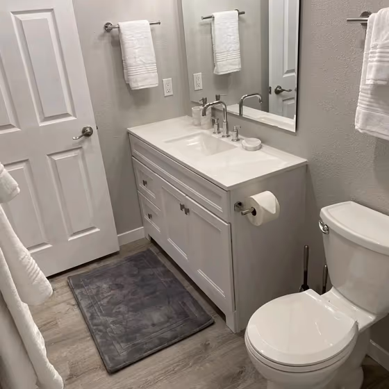
- Sherwin Williams Repose Gray for bathroom (6 photos)
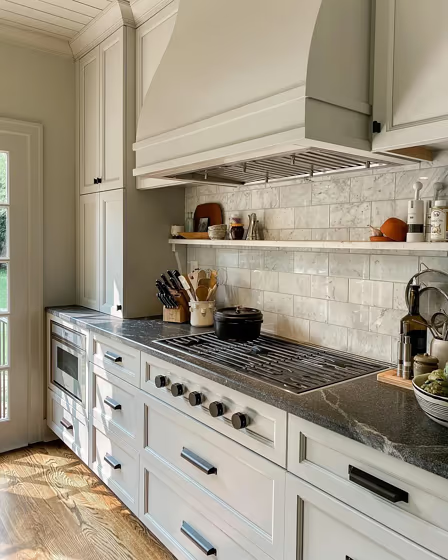
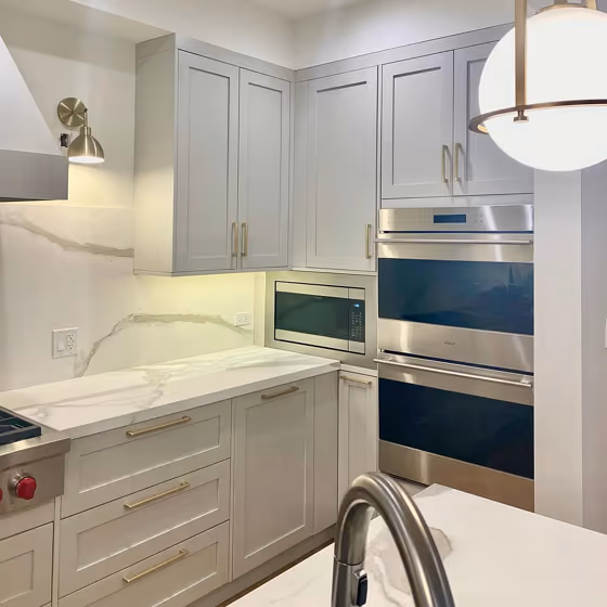
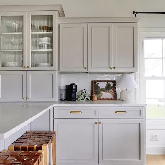
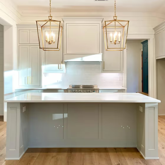
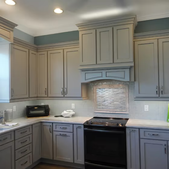
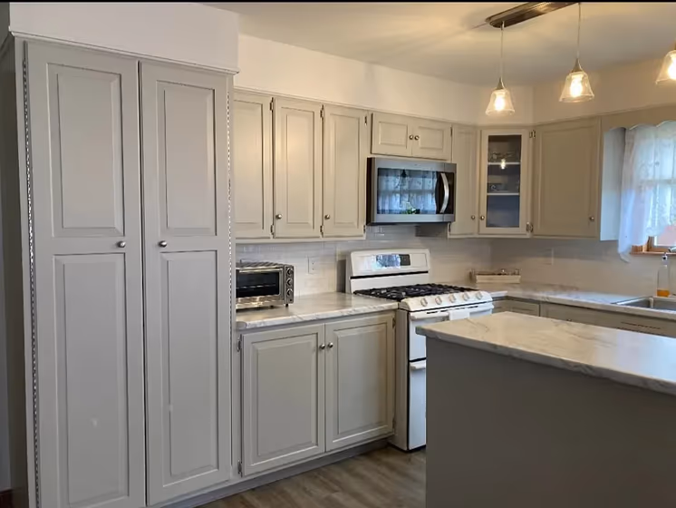
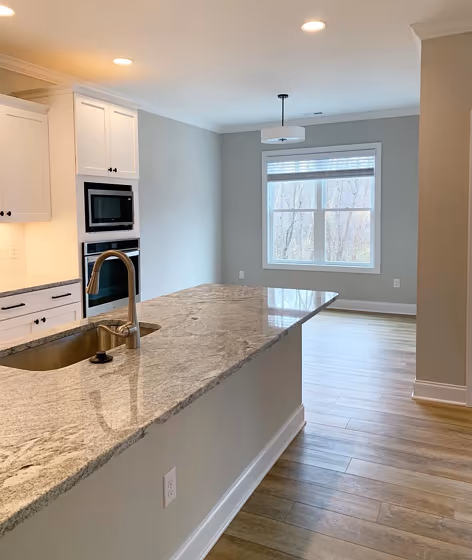
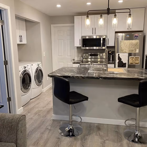
- Sherwin Williams SW 7015 on kitchen cabinets (7 photos)
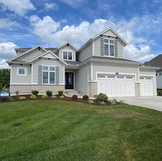
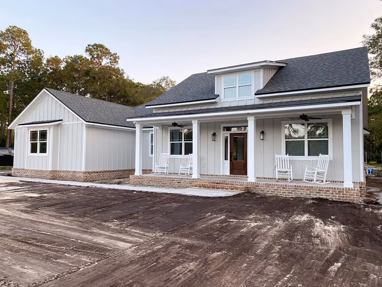
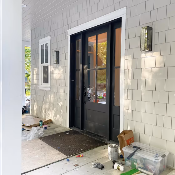
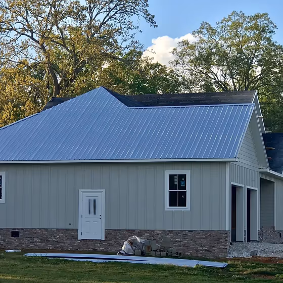
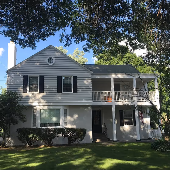
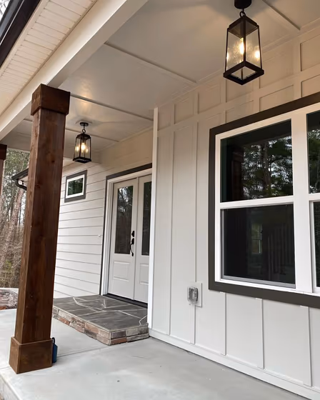
- Repose Gray for exterior (6 photos)
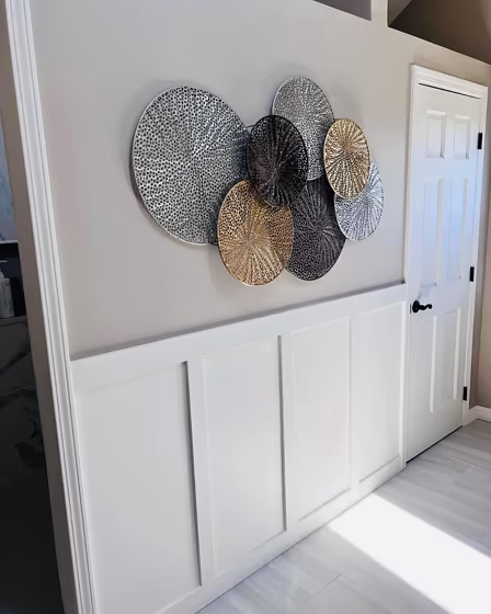
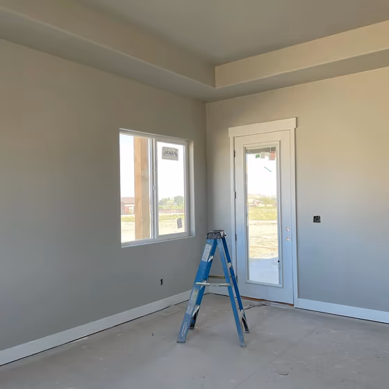
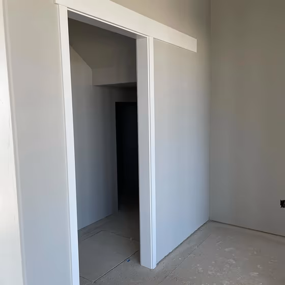
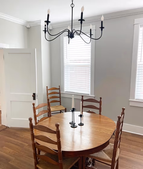
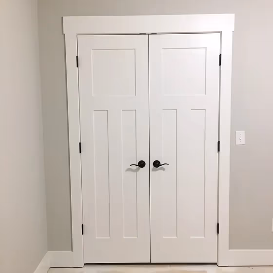
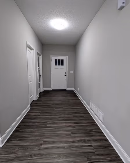
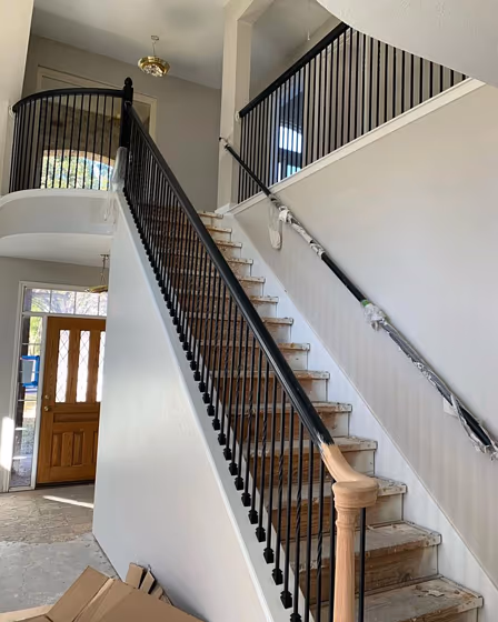
- Sherwin Williams Repose Gray reviews (18 photos)
- What are Sherwin Williams Repose Gray undertones?
- Is Repose Gray SW 7015 cool or warm?
- How light temperature affects on Repose Gray
- Monochromatic color scheme
- Complementary color scheme
- Color comparison and matching
- LRV of Repose Gray SW 7015
- Color codes
- Color equivalents
| Official page: | Repose Gray SW 7015 |
| Code: | SW 7015 |
| Name: | Repose Gray |
| Brand: | Sherwin Williams |
| Collections: | Top 50 Colors, Senior Living Cool Foundations, Pottery Barn, Dreamer, Living Well - Inspire |
What color is Sherwin Williams Repose Gray?
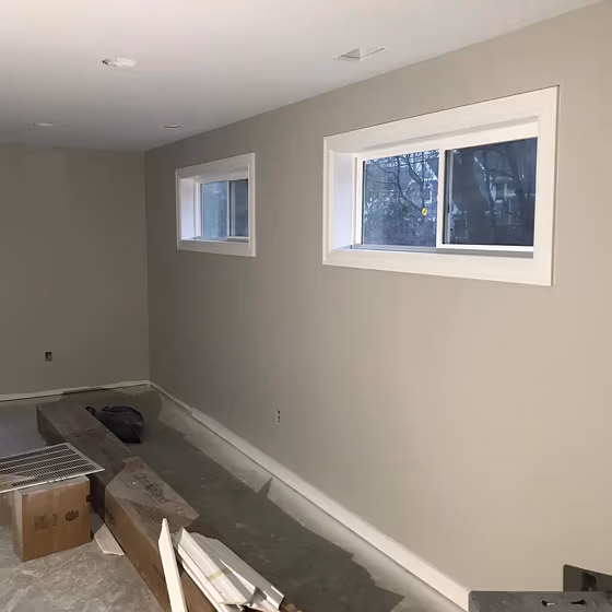
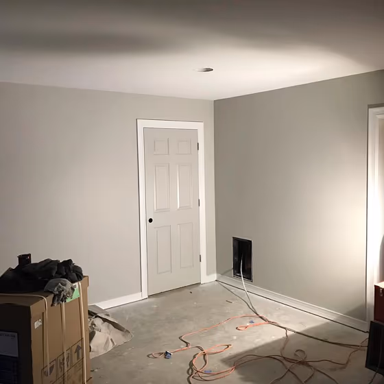
Sherwin Williams SW 7015 Repose Gray is a versatile and timeless color choice for any space. This soft gray with warm undertones creates a calming and elegant atmosphere. Repose Gray pairs beautifully with crisp whites such as Sherwin Williams Snowbound SW 7004 and soft neutrals like Sherwin Williams Agreeable Gray SW 7029. For a contemporary look, consider accentuating Repose Gray with pops of color like Sherwin Williams Naval SW 6244 or subtle blues like Sherwin Williams Sea Salt SW 6204. Whether used in a living room, bedroom, or kitchen, Repose Gray adds a soothing touch to any interior design scheme.
Loading...
LRV of Repose Gray
Repose Gray has an LRV of 58.22% and refers to Light colors that reflect most of the incident light. Why LRV is important?

Light Reflectance Value measures the amount of visible and usable light that reflects from a painted surface.
Simply put, the higher the LRV of a paint color, the brighter the room you will get.
The scale goes from 0% (absolute black, absorbing all light) to 100% (pure white, reflecting all light).
Act like a pro: When choosing paint with an LRV of 58.22%, pay attention to your bulbs' brightness. Light brightness is measured in lumens. The lower the paint's LRV, the higher lumen level you need. Every square foot of room needs at least 40 lumens. That means for a 200 ft2 living room you'll need about 8000 lumens of light – e.g., eight 1000 lm bulbs.
Color codes
We have collected almost every possible color code you could ever need.
Not sure what the difference between HEX and RGB is? We break down color models in plain language. Understanding color models
| Format | Code |
|---|---|
| HEX | #ccc9c0 |
| RGB Decimal | 204, 201, 192 |
| RGB Percent | 80.00%, 78.82%, 75.29% |
| HSV | Hue: 45° Saturation: 5.88% Value: 80.0% |
| HSL | hsl(45, 11, 78) |
| CMYK | Cyan: 0.0 Magenta: 1.47 Yellow: 5.88 Key: 20.0 |
| YIQ | Y: 200.871 I: 4.68 Q: -2.166 |
| XYZ | X: 55.301 Y: 58.417 Z: 58.217 |
| CIE Lab | L:80.97 a:-0.559 b:4.861 |
| CIE Luv | L:80.97 u:2.238 v:7.304 |
| Decimal | 13420992 |
| Hunter Lab | 76.431, -4.602, 8.341 |