Tikkurila Repose H450

Code:H450
Name:Repose
Brand:Tikkurila

What color is Tikkurila Repose?

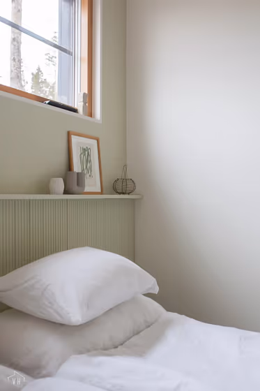
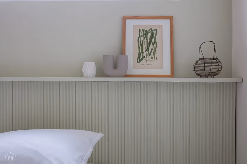
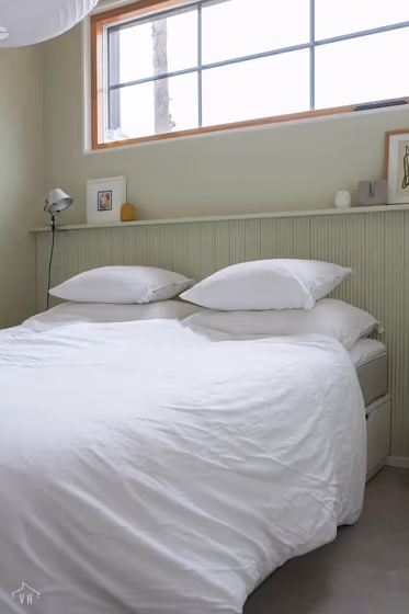
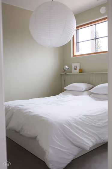
Immerse yourself in a serene oasis with Tikkurila H450 Repose, a gentle and calming hue that evokes a sense of tranquility in any space. This timeless shade, also known as Repose, is perfect for creating a soothing ambiance in bedrooms, living rooms, and home offices. Its subtle undertones of gray and hint of warmth make it versatile for both traditional and modern interiors. Embrace a sanctuary of relaxation with Tikkurila H450 Repose as your canvas, bringing a touch of sophistication and elegance to your home decor. Let the code H450 envelop you in a cocoon of timeless elegance and peaceful beauty.

Tikkurila Repose reviews

View the photos of real spaces painted with this that were not included in specific categories.Close-ups, painted furniture, storages and dressers, hallways, stairs and ceilings.

Interior with paint color Tikkurila Repose H450
Image source
Interior with paint color Tikkurila Repose H450
Image source
Interior with paint color Tikkurila Repose H450
Image source
Interior with paint color Tikkurila Repose H450
Image source

Try before you buy

Samplize samples on the wall
Samplize logo

100% accurate
reusable paint samples

Peel, stick and repeat

Peel, stick,
and repeat

Twice painted samples

Twice painted
with real paint

Fast delivery

Next day
delivery

Shop now

What are Tikkurila Repose undertones?

The undertone of Repose can be accurately described as a Yellow hue, as is apparent from the color space provided. By isolating the pure hue and eliminating any tints, tones, and shades, we were able to precisely determine its undertone. This approach has proven to be more accurate than traditional methods of defining undertones on a white background, which are now considered outdated.

R
G
B

HEX value

HEX value:

#D4CFB3

RGB code:

212, 207, 179

Is Tikkurila Repose H450 cool or warm?

warm
Color wheel
cool

With a hue of 51° thisGreenrefers warm paint shade according to HSL (Hue, Saturation, Lightness) on the color wheel.

H450 Repose HSL code: 51, 28%, 77%

Hue - degree on a color wheel from 0 to 360. 0 is red, 120 is green, and 240 is blue.
Saturation is expressed as a percentage. At 0%, it appears as a shade of grey, and at 100%, it is in full color..
Lightness is also a percentage value. 0% is black, and 100% is white.

  • Warm colors are ideal for kitchens, living rooms or bathrooms
  • Warmer hues make larger spaces feel more inviting
  • Warm green shades evoke a sense of nature and comfort, creating a welcoming and soothing environment ideal for living rooms, kitchens, and bedrooms.
  • To prevent a space from feeling too monotonous, consider pairing warm light shades with richer tones like deep greens or browns, or adding textures through fabrics and furnishings. Avoid using them in rooms with limited natural light, as they may appear too dull or yellowish

Act like a pro: Mixing warm and cool shades is a must have to get harmonius interior. Add accents that contrast with the primary color to create visual balance. If your walls are a warm color, don’t forget to add accent in cold colors (furniture, art, décor). A good practice is too use a complementary color scheme.

How light temperature affects Repose

Natural Lighting. During the day, natural light shifts from about 2000 K at sunrise/sunset to 5500–6500 K at noon.

In addition, natural‑light temperature depends on its direction:

Direction of sunlightVisible temp.HueDuration
NorthCoolBluishAll day
EastWarmYellowBefore noon
WestWarmOrange‑redAfter noon
SouthWarmOrange‑yellowAll day

Artificial Lighting. When choosing bulbs, pay attention to their color‑temperature (Kelvins).
Use the slider to see how this Green shade looks under different lighting:

Living‑room mockup
Living‑room overlay

4000K

2000K
3000K
4000K
5000K
6000K
7000K

LRV of Repose

Repose has an LRV of 61.16% and refers to Light colors that reflect most of the incident lightWhy LRV is important?

Light Reflectance Value scale illustration

Light Reflectance Value measures the amount of visible and usable light that reflects from a painted surface.
Simply put, the higher the LRV of a paint color, the brighter the room you will get.
The scale goes from 0% (absolute black, absorbing all light) to 100% (pure white, reflecting all light).

Act like a pro: When choosing paint with an LRV of 61.16%, pay attention to your bulbs' brightness. Light brightness is measured in lumens. The lower the paint's LRV, the higher lumen level you need. Every square foot of room needs at least 40 lumens. That means for a 200 ft2 living room you’ll need about 8000 lumens of light – e.g., eight 1000 lm bulbs.

Color codes

We have collected almost every possible color code you could ever need. To copy the code, just click the icon to the right of it.

FormatCode
HEX#D4CFB3Copy color code
RGB Decimal212, 207, 179Copy color code
RGB Percent83.14%, 81.18%, 70.20%Copy color code
HSVHue: 51° Saturation: 15.57% Value: 83.14%Copy color code
HSLhsl(51, 28, 77)Copy color code
CMYKCyan: 0.0 Magenta: 2.36 Yellow: 15.57 Key: 16.86Copy color code
YIQY: 205.303 I: 11.977 Q: -7.656Copy color code
XYZX: 57.6 Y: 61.878 Z: 51.545Copy color code
CIE LabL:82.849 a:-2.951 b:14.555Copy color code
CIE LuvL:82.849 u:4.515 v:21.542Copy color code
Decimal13946803Copy color code
Hunter Lab78.663, -6.955, 16.213Copy color code
Copy color code
Copy paint color code