Sherwin Williams Silverpointe SW 7653
Contentsshow +hide -
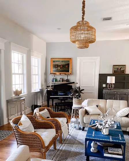
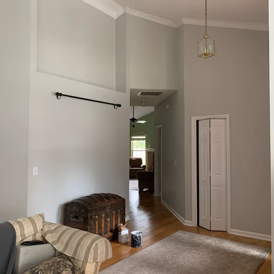
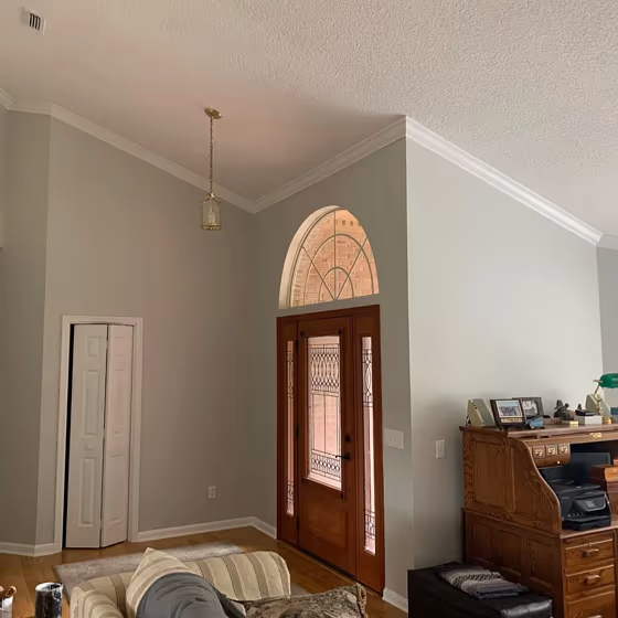
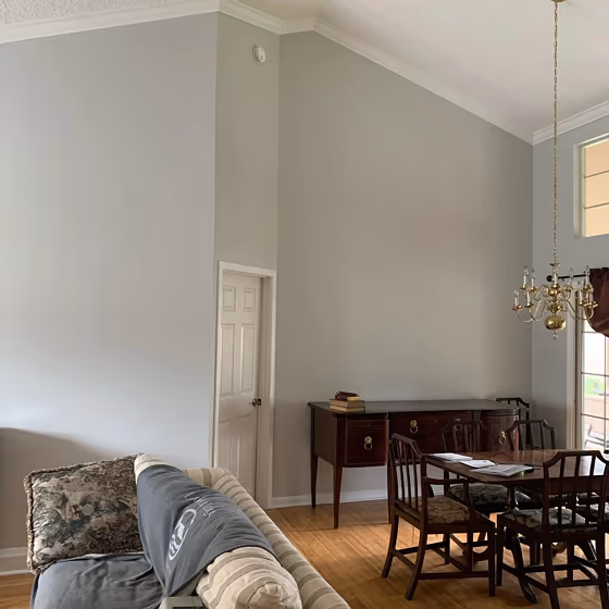
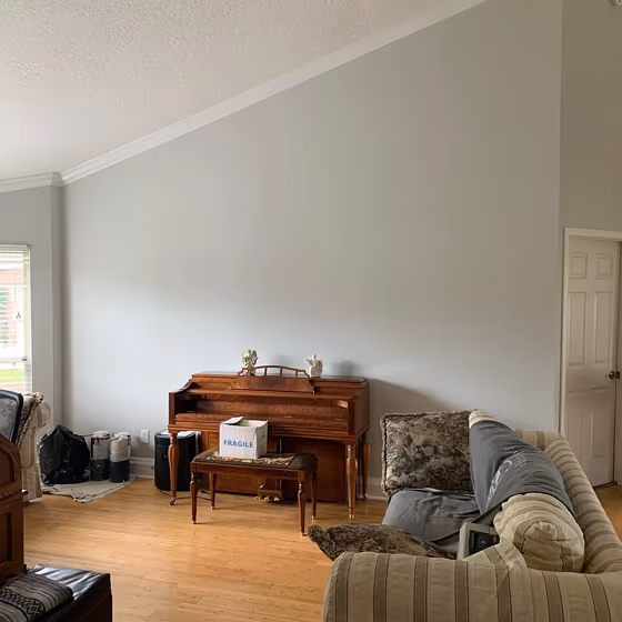
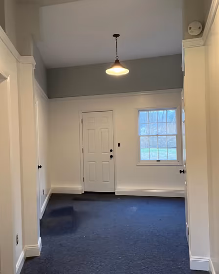
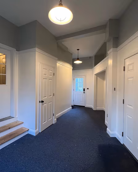
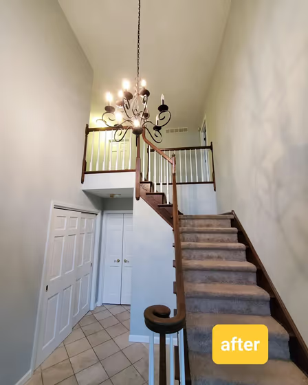
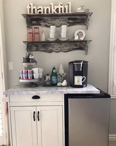
- Silverpointe for living room (5 photos)
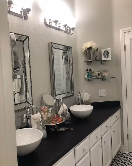
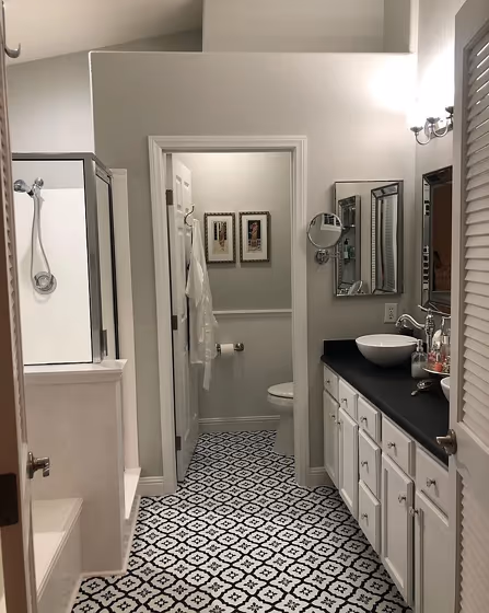
- Sherwin Williams Silverpointe for bathroom (2 photos)
- Sherwin Williams Silverpointe reviews (6 photos)
- What are Sherwin Williams Silverpointe undertones?
- Is Silverpointe SW 7653 cool or warm?
- How light temperature affects on Silverpointe
- Monochromatic color scheme
- Complementary color scheme
- Color comparison and matching
- LRV of Silverpointe SW 7653
- Color codes
- Color equivalents
| Official page: | Silverpointe SW 7653 |
| Code: | SW 7653 |
| Name: | Silverpointe |
| Brand: | Sherwin Williams |
| Collections: | Minimalist, Living Well - Reflect, Cool Neutrals |
What color is Sherwin Williams Silverpointe?
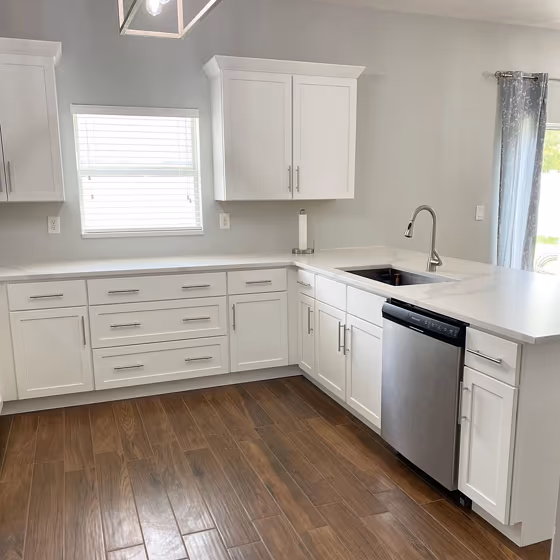
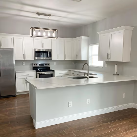
Embrace the serene elegance of Sherwin Williams Silverpointe (SW 7653) with its soft, silvery hues that effortlessly elevate any space. This sophisticated color is perfect for creating a calm and contemporary atmosphere in living rooms, bedrooms, and home offices. Silverpointe's versatility allows it to complement a variety of design styles, from modern to traditional, making it an excellent choice for those seeking a timeless and soothing color palette. Infuse your interiors with a touch of refinement and tranquility by incorporating Silverpointe into your decor scheme. Whether used as a main wall color or as an accent, this shade brings a whisper of luxury to any room it graces.
Loading...
LRV of Silverpointe
Silverpointe has an LRV of 64% and refers to Light colors that reflect most of the incident light. Why LRV is important?

Light Reflectance Value measures the amount of visible and usable light that reflects from a painted surface.
Simply put, the higher the LRV of a paint color, the brighter the room you will get.
The scale goes from 0% (absolute black, absorbing all light) to 100% (pure white, reflecting all light).
Act like a pro: When choosing paint with an LRV of 64%, pay attention to your bulbs' brightness. Light brightness is measured in lumens. The lower the paint's LRV, the higher lumen level you need. Every square foot of room needs at least 40 lumens. That means for a 200 ft2 living room you'll need about 8000 lumens of light – e.g., eight 1000 lm bulbs.
Color codes
We have collected almost every possible color code you could ever need.
Not sure what the difference between HEX and RGB is? We break down color models in plain language. Understanding color models
| Format | Code |
|---|---|
| HEX | #d1d2cb |
| RGB Decimal | 209, 210, 203 |
| RGB Percent | 81.96%, 82.35%, 79.61% |
| HSV | Hue: 69° Saturation: 3.33% Value: 82.35% |
| HSL | hsl(69, 7, 81) |
| CMYK | Cyan: 0.48 Magenta: 0.0 Yellow: 3.33 Key: 17.65 |
| YIQ | Y: 208.903 I: 1.654 Q: -2.39 |
| XYZ | X: 60.118 Y: 63.96 Z: 65.662 |
| CIE Lab | L:83.945 a:-1.599 b:3.347 |
| CIE Luv | L:83.945 u:-0.181 v:5.299 |
| Decimal | 13750987 |
| Hunter Lab | 79.975, -5.777, 7.304 |