Sherwin Williams Status Bronze SW 7034
Contentsshow +hide -
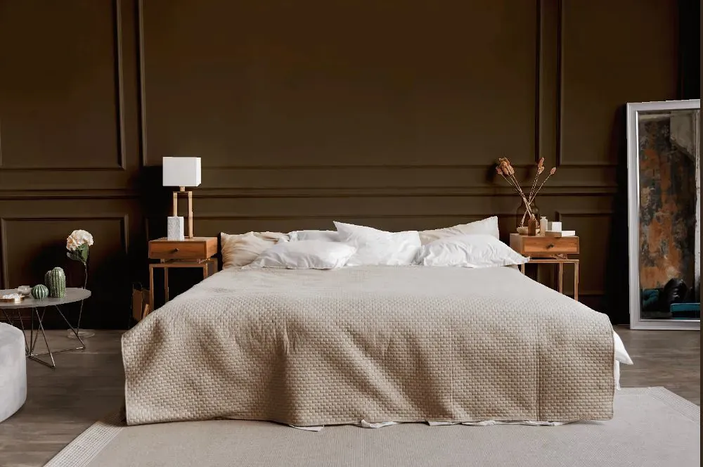
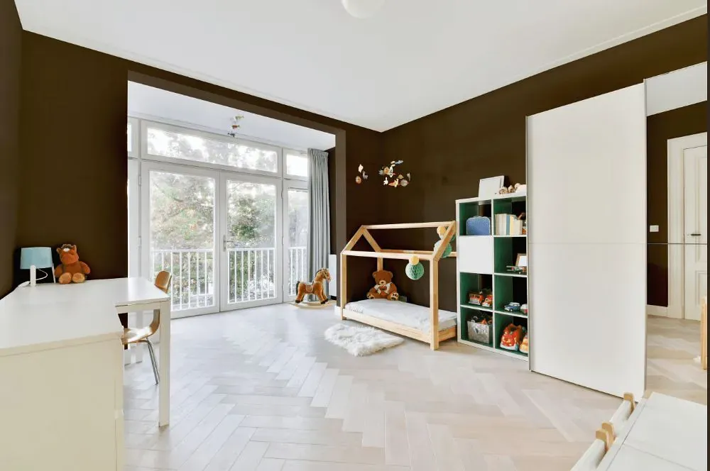
- Status Bronze for bedroom (1 photo)
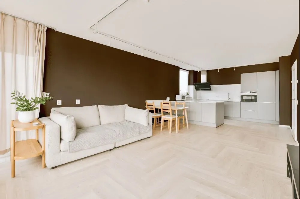
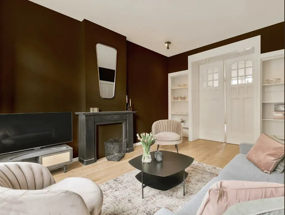
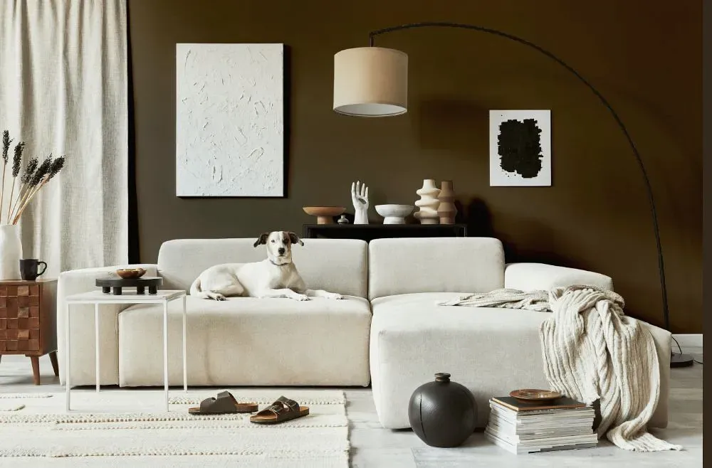
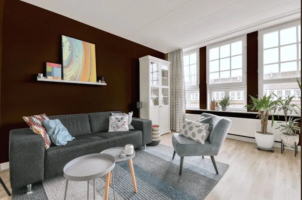
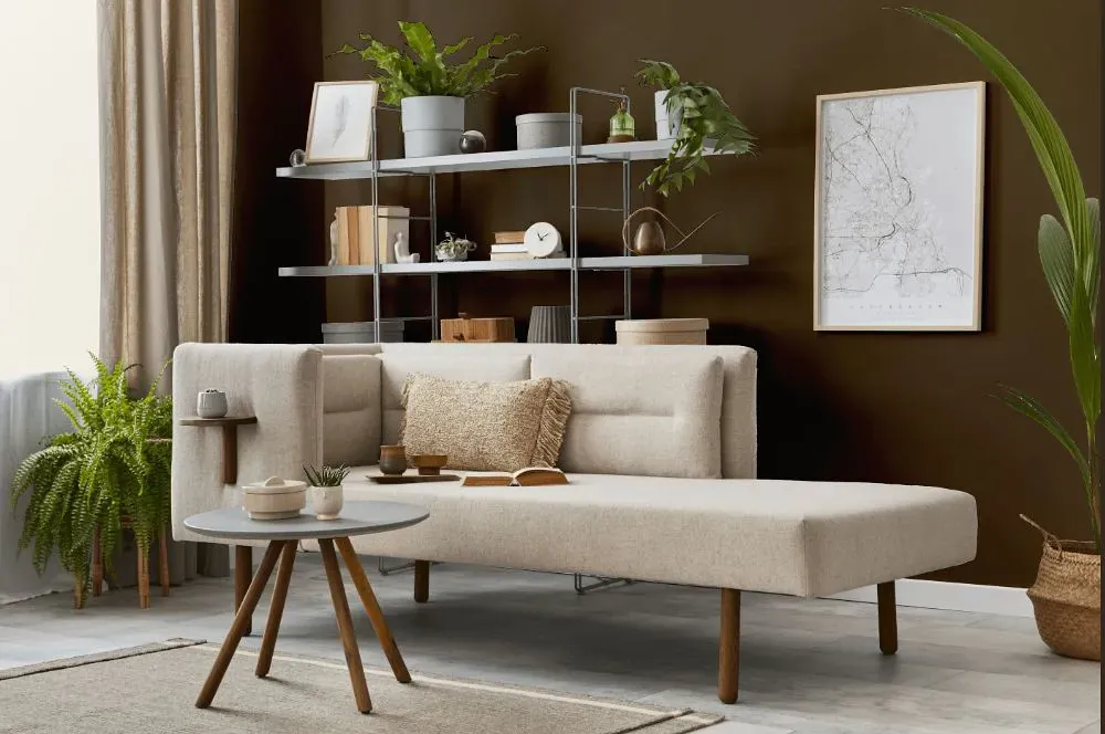
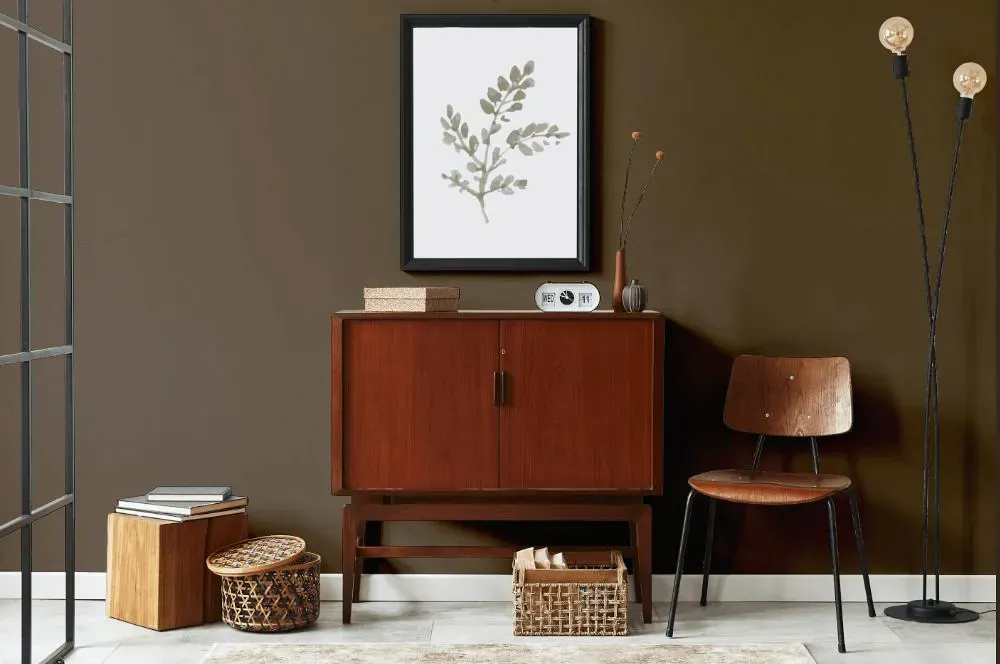
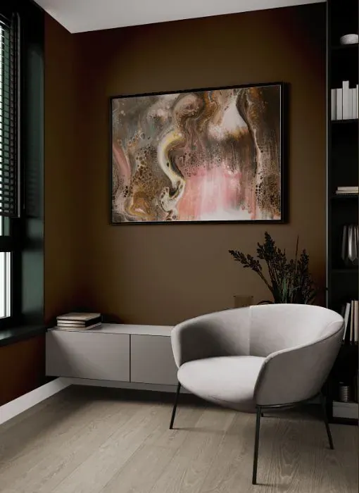
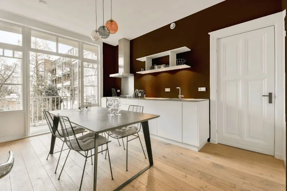
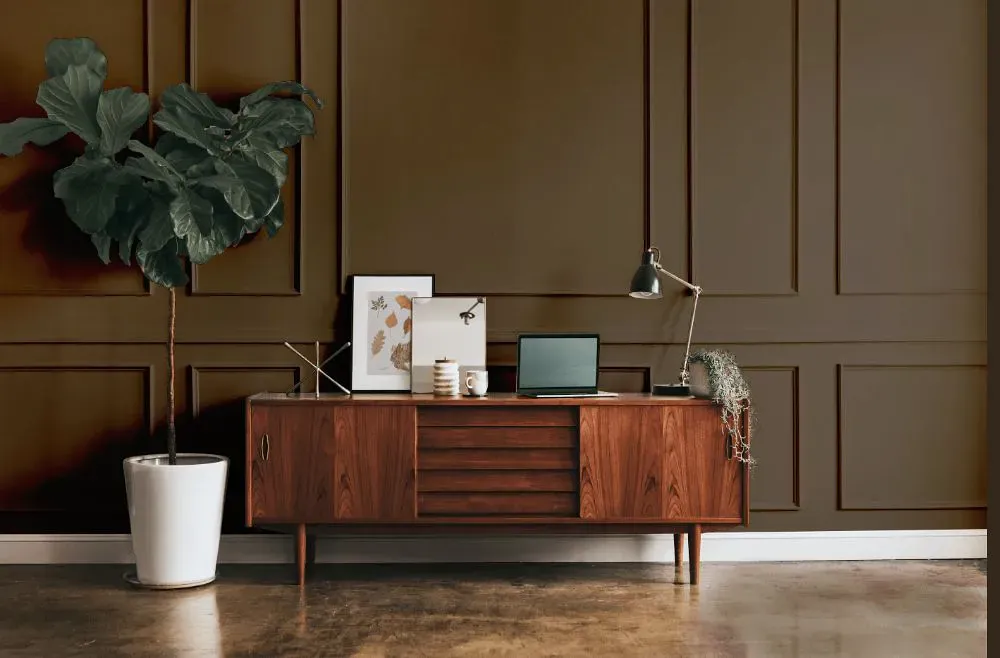
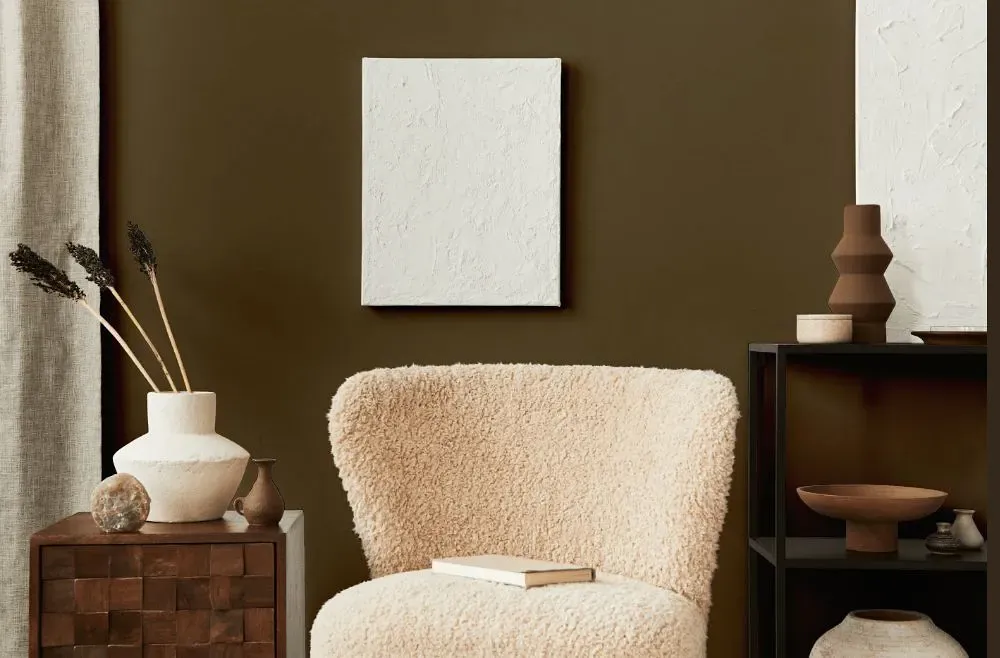
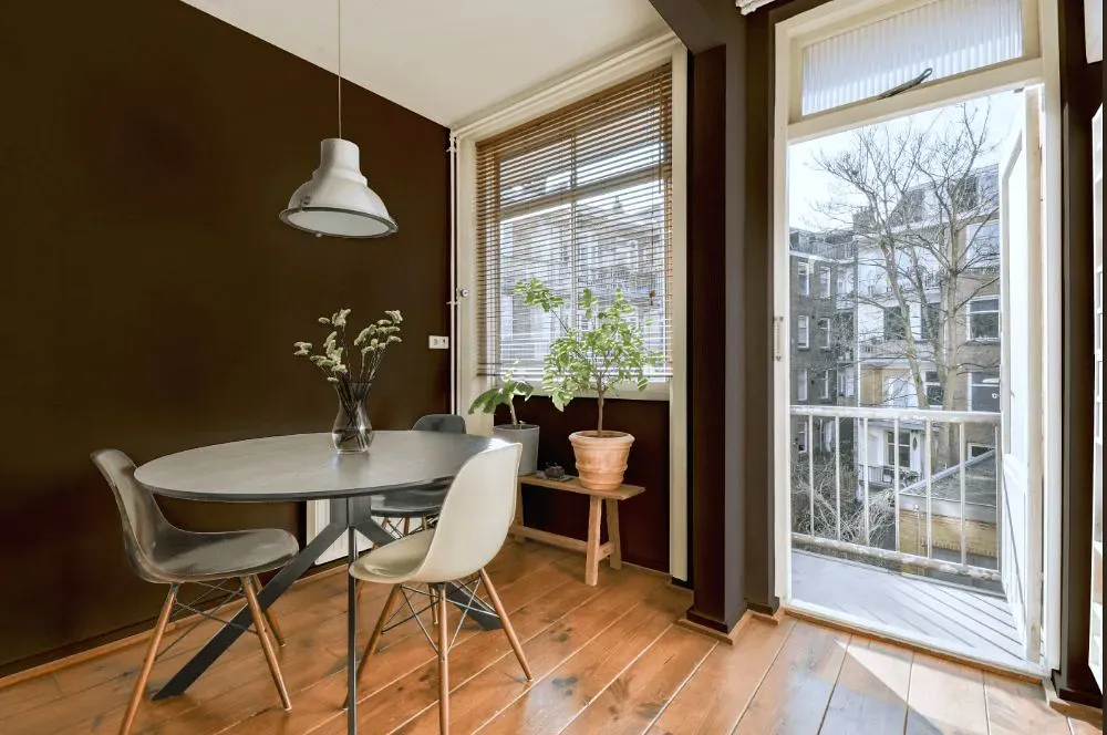
- Status Bronze for living room (7 photos)
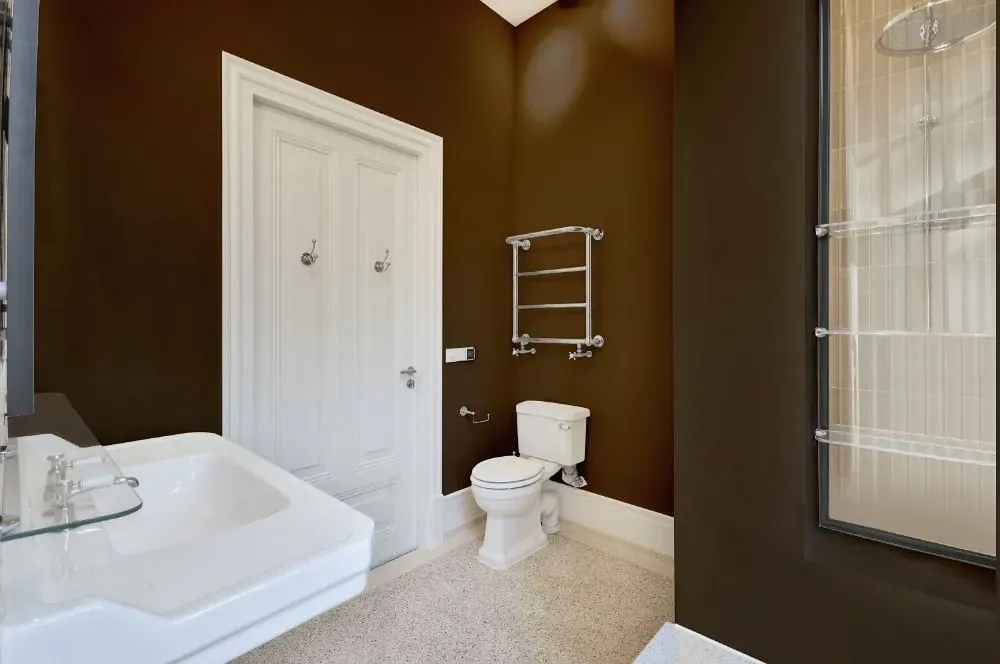
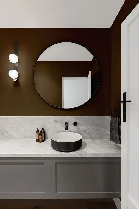
- Sherwin Williams Status Bronze for bathroom (2 photos)
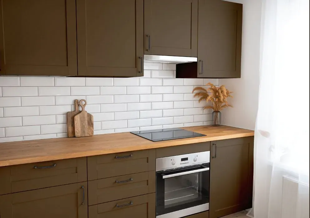
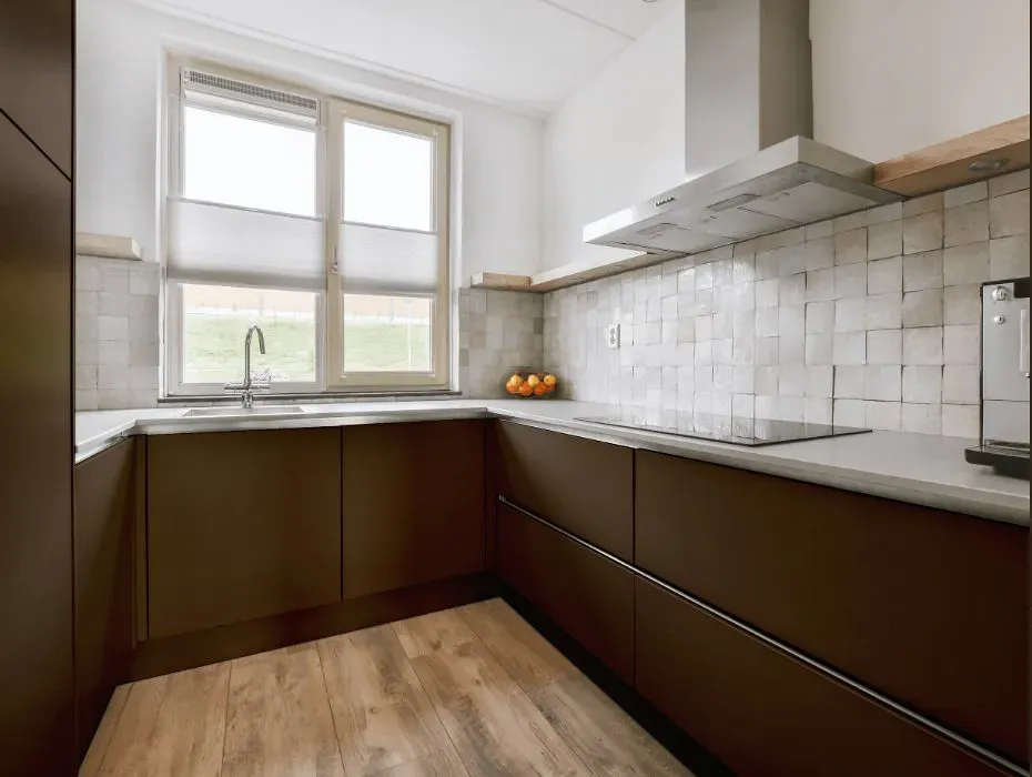
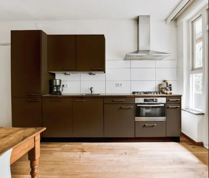
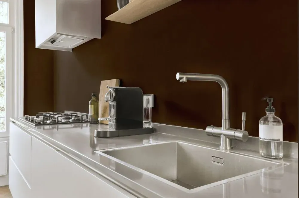
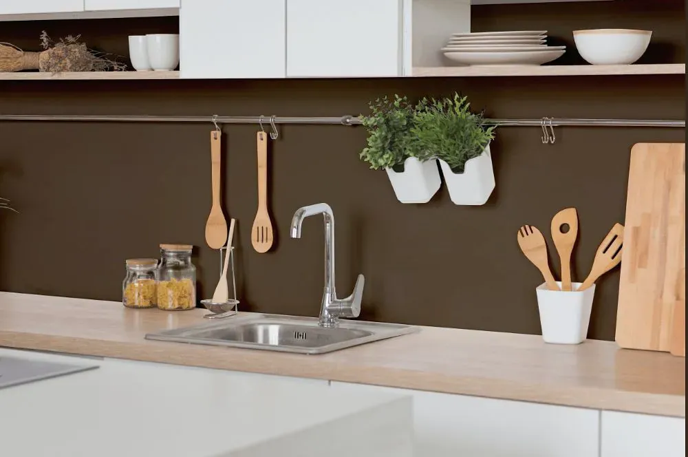
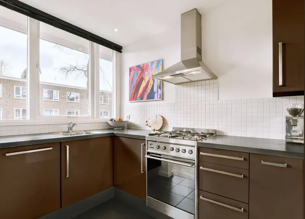
- Sherwin Williams SW 7034 on kitchen cabinets (4 photos)
- Sherwin Williams Status Bronze reviews (9 photos)
- What are Sherwin Williams Status Bronze undertones?
- Is Status Bronze SW 7034 cool or warm?
- How light temperature affects on Status Bronze
- Monochromatic color scheme
- Complementary color scheme
- Color comparison and matching
- LRV of Status Bronze SW 7034
- Color codes
- Color equivalents
| Official page: | Status Bronze SW 7034 |
| Code: | SW 7034 |
| Name: | Status Bronze |
| Brand: | Sherwin Williams |
What color is Sherwin Williams Status Bronze?
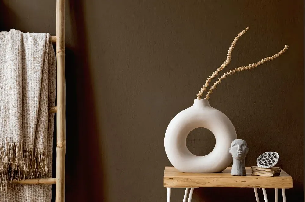
Sherwin Williams SW 7034, Status Bronze, adds a touch of warmth and sophistication to any space. This rich bronze hue pairs beautifully with creamy off-whites like Sherwin Williams SW 7008, Alabaster, for a soft contrast. For a more dramatic look, consider combining Status Bronze with deep charcoal shades like Sherwin Williams SW 7069, Iron Ore. The versatility of Status Bronze allows it to effortlessly complement both modern and traditional interior schemes. Experiment with different lighting to enhance the depth and character of this striking color.
Loading...
LRV of Status Bronze
Status Bronze has an LRV of 7.96% and refers to Dark colors which means that this color almost does not reflect light. Why LRV is important?

Light Reflectance Value measures the amount of visible and usable light that reflects from a painted surface.
Simply put, the higher the LRV of a paint color, the brighter the room you will get.
The scale goes from 0% (absolute black, absorbing all light) to 100% (pure white, reflecting all light).
Act like a pro: When choosing paint with an LRV of 7.96%, pay attention to your bulbs' brightness. Light brightness is measured in lumens. The lower the paint's LRV, the higher lumen level you need. Every square foot of room needs at least 40 lumens. That means for a 200 ft2 living room you'll need about 8000 lumens of light – e.g., eight 1000 lm bulbs.
Color codes
We have collected almost every possible color code you could ever need.
Not sure what the difference between HEX and RGB is? We break down color models in plain language. Understanding color models
| Format | Code |
|---|---|
| HEX | #5c4d3c |
| RGB Decimal | 92, 77, 60 |
| RGB Percent | 36.08%, 30.20%, 23.53% |
| HSV | Hue: 32° Saturation: 34.78% Value: 36.08% |
| HSL | hsl(32, 21, 30) |
| CMYK | Cyan: 0.0 Magenta: 16.3 Yellow: 34.78 Key: 63.92 |
| YIQ | Y: 79.547 I: 14.401 Q: -2.117 |
| XYZ | X: 7.883 Y: 7.91 Z: 5.385 |
| CIE Lab | L:33.794 a:3.422 b:12.438 |
| CIE Luv | L:33.794 u:10.174 v:13.433 |
| Decimal | 6049084 |
| Hunter Lab | 28.124, 0.817, 8.334 |