Sherwin Williams Stop SW 6869
Contentsshow +hide -
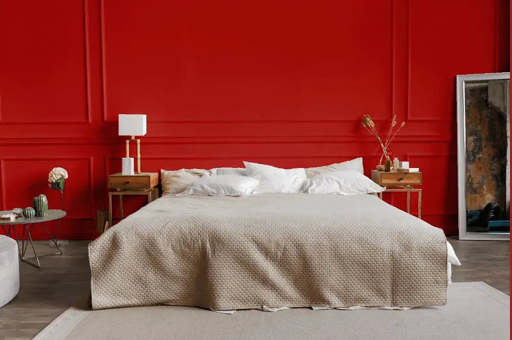
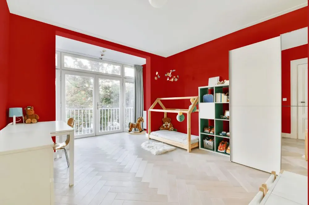
- Stop for bedroom (1 photo)
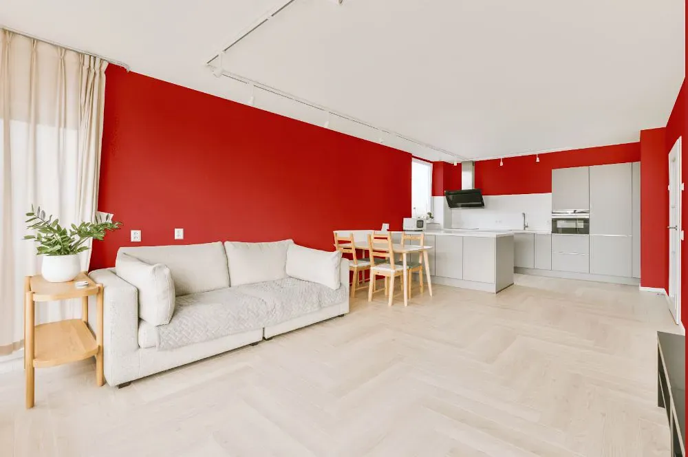
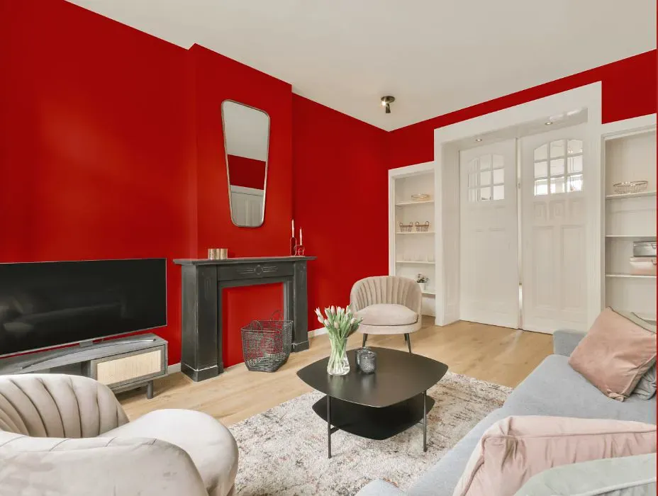
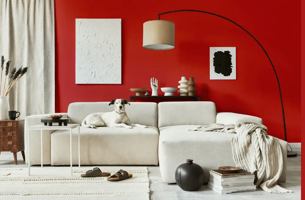
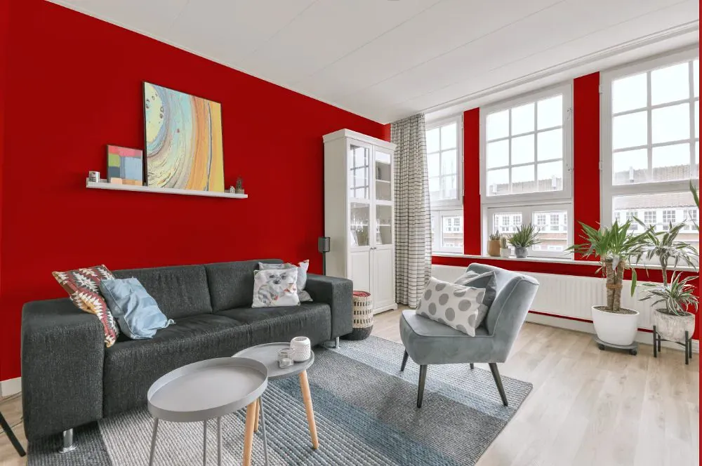
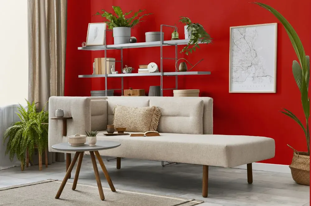
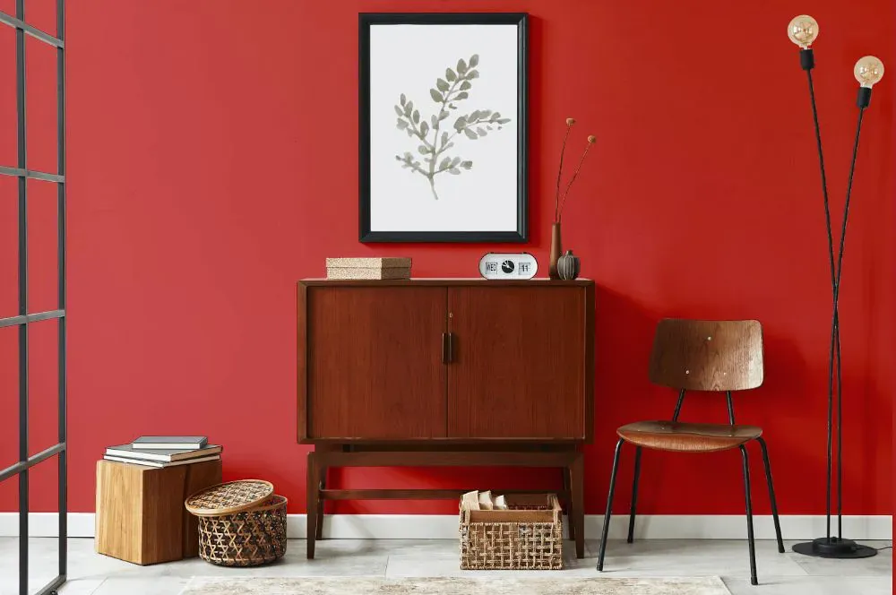
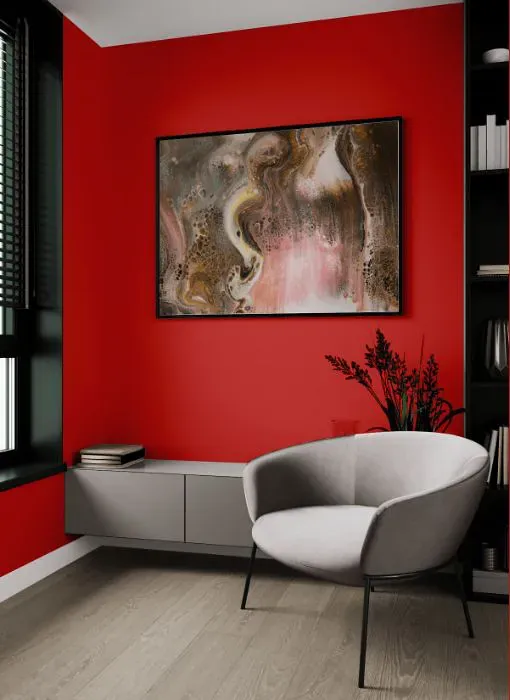
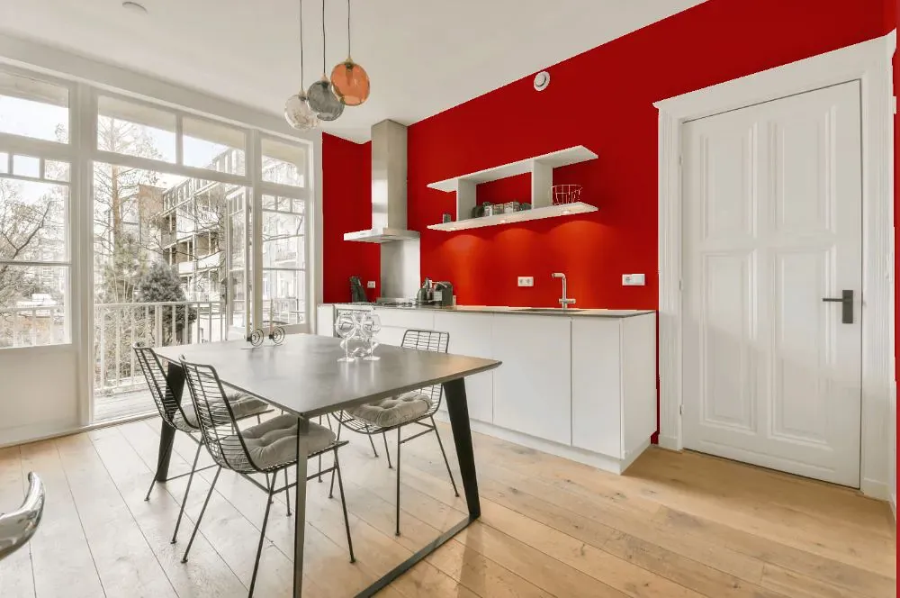
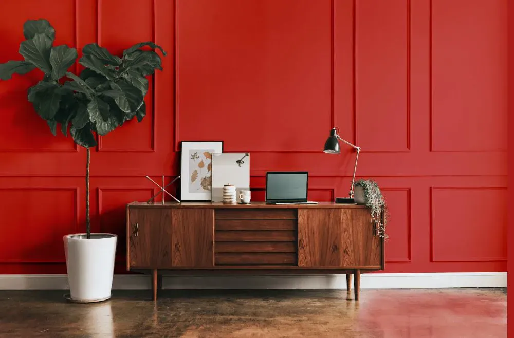
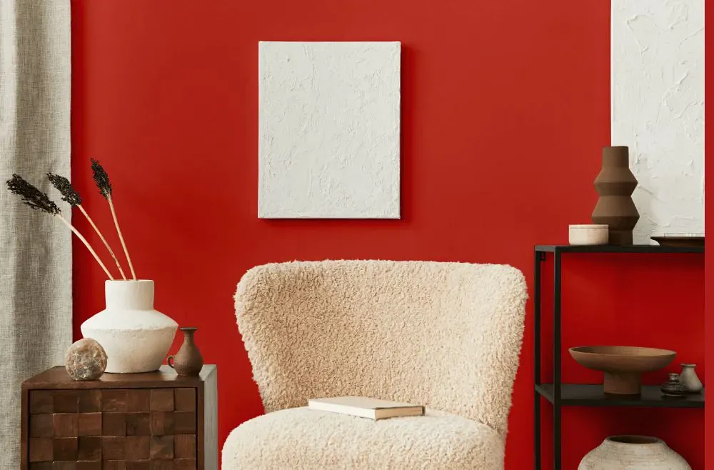
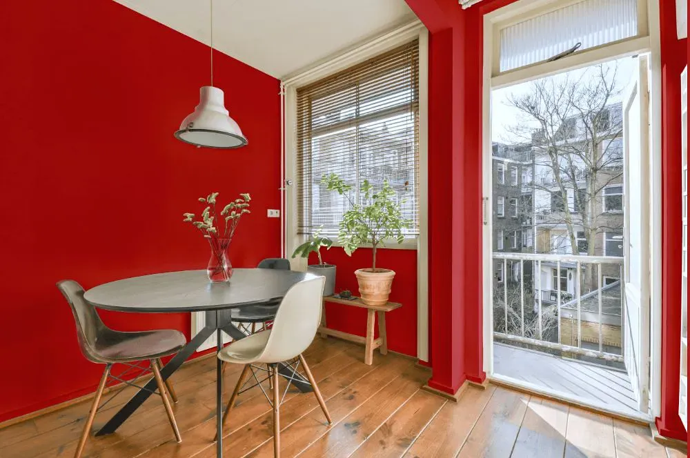
- Stop for living room (7 photos)
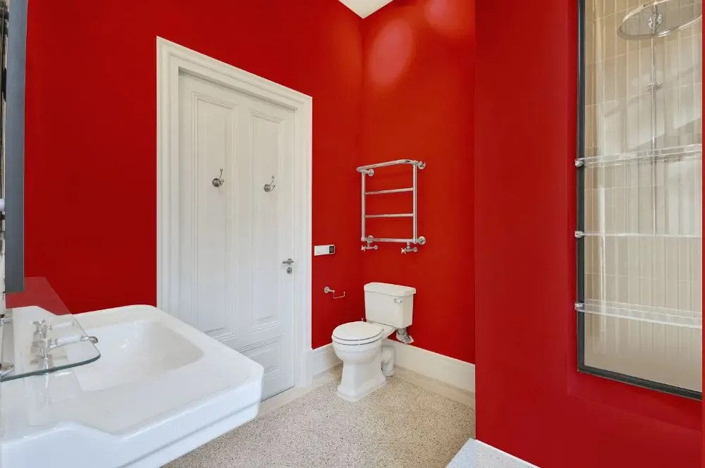
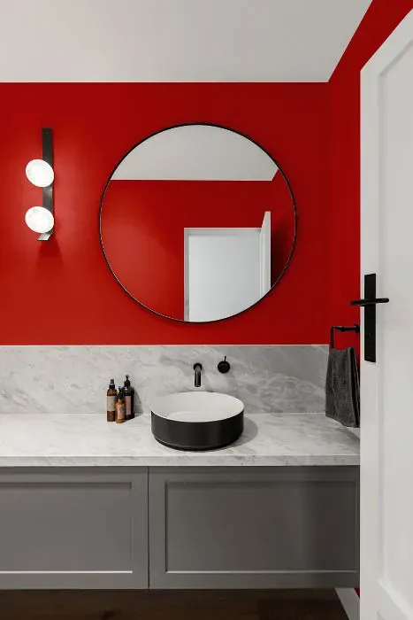
- Sherwin Williams Stop for bathroom (2 photos)
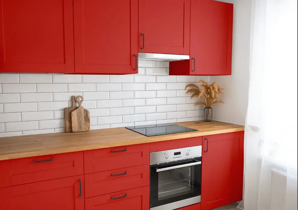
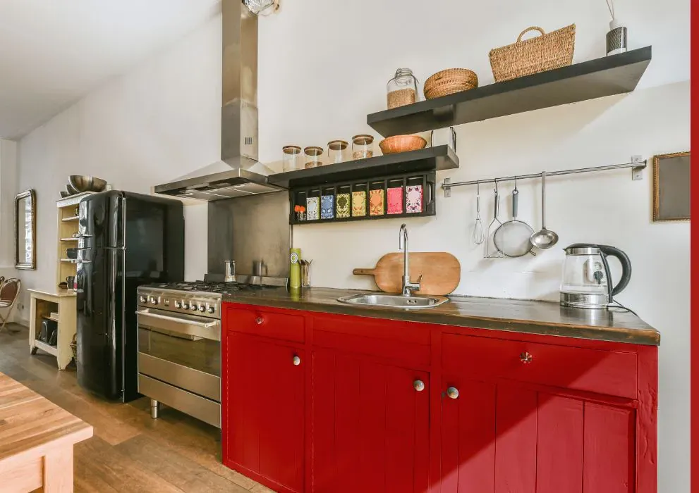
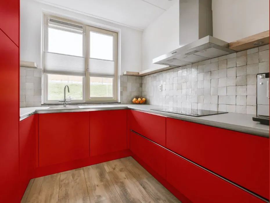
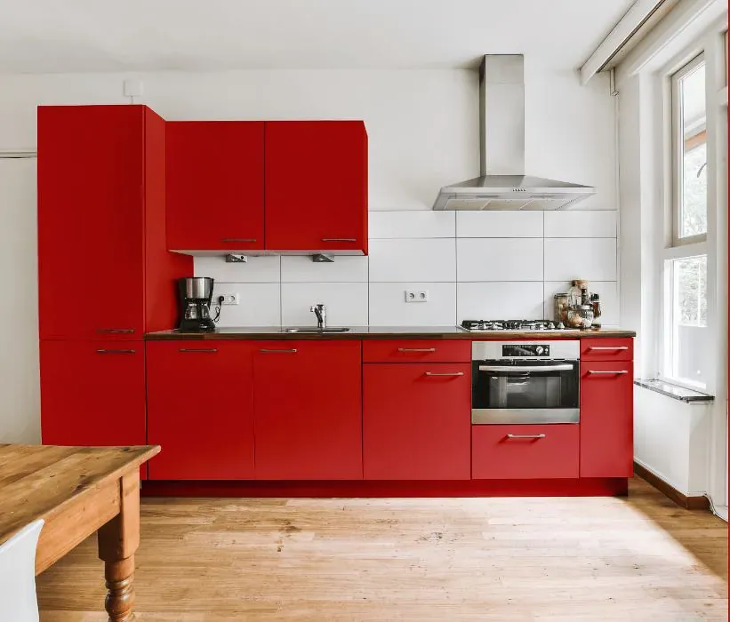
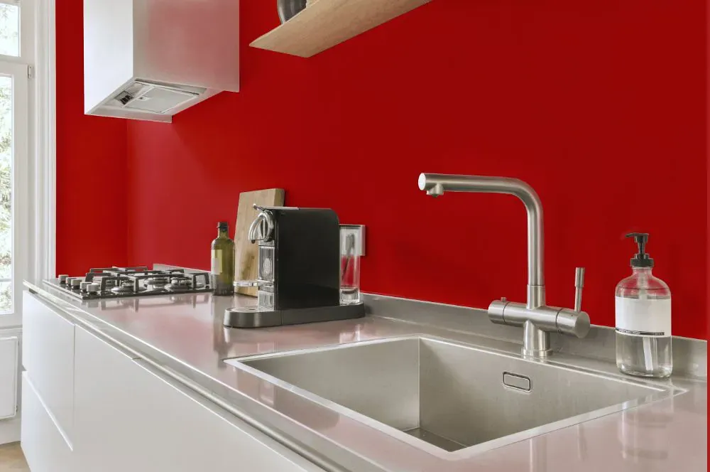
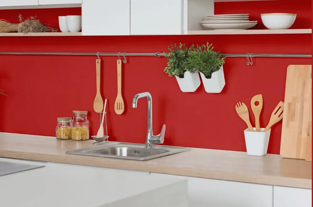
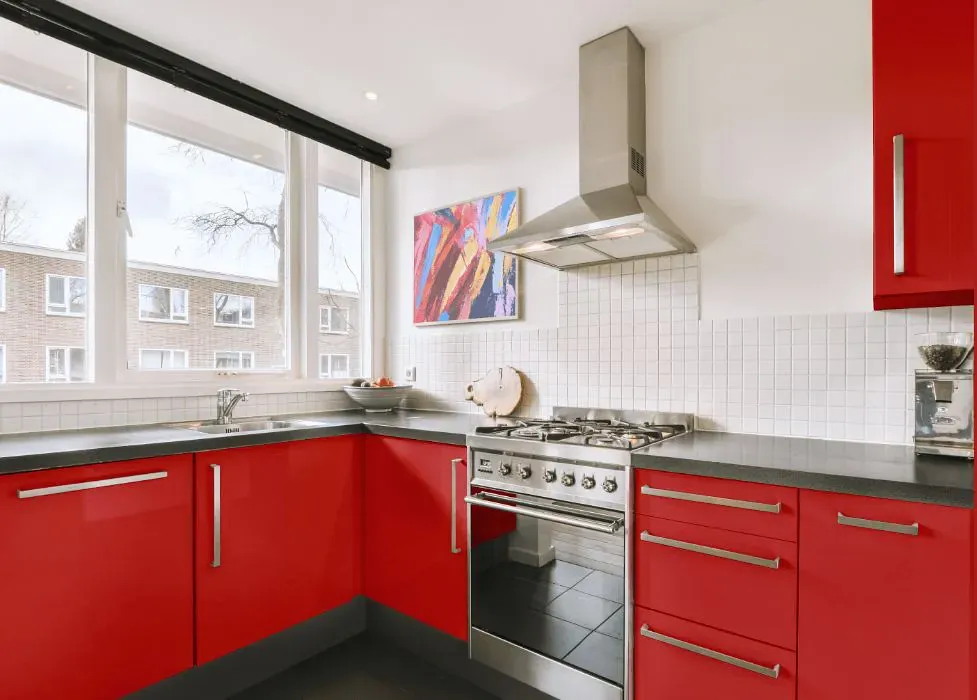
- Sherwin Williams SW 6869 on kitchen cabinets (4 photos)
- Sherwin Williams Stop reviews (9 photos)
- What are Sherwin Williams Stop undertones?
- Is Stop SW 6869 cool or warm?
- How light temperature affects on Stop
- Monochromatic color scheme
- Complementary color scheme
- Color comparison and matching
- LRV of Stop SW 6869
- Color codes
- Color equivalents
| Official page: | Stop SW 6869 |
| Code: | SW 6869 |
| Name: | Stop |
| Brand: | Sherwin Williams |
| Collections: | ABC's and 123's |
What color is Sherwin Williams Stop?
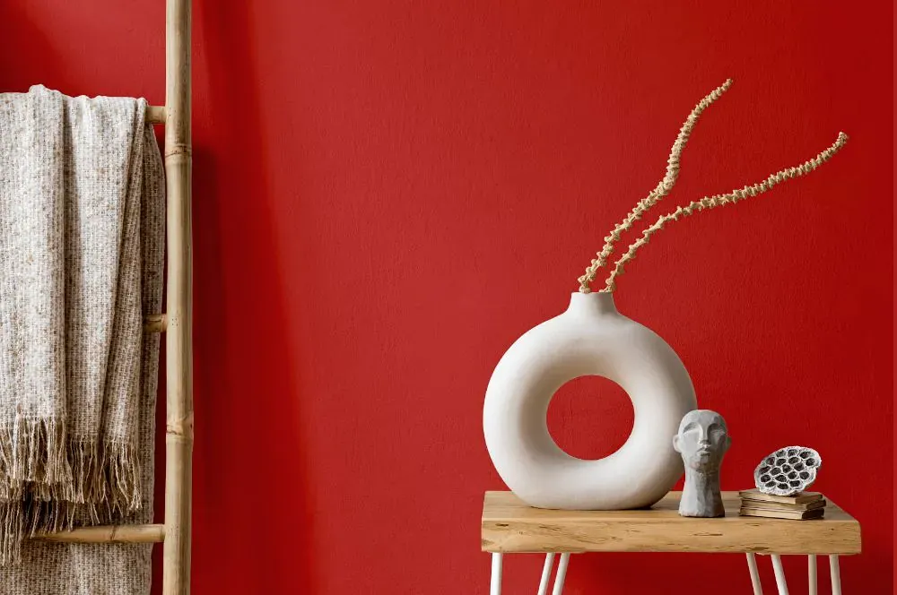
Sherwin Williams Stop SW 6869 is a clear, high-energy red with the familiar punch of a freshly painted stop sign. It reads bright rather than earthy, with a crisp warm undertone that keeps it from looking burgundy or brick-like. This is best used with intention: on a front door, a painted chair, a pantry door, or a small run of cabinetry where its intensity has room to stand out. In strong daylight, Stop looks especially vivid and clean, while warm evening bulbs can bring out a slightly richer, orange-red cast. Pair it with soft warm white walls, black hardware, natural oak, or charcoal stone to give the red a grounded backdrop.
Loading...
LRV of Stop
Stop has an LRV of 14.96% and refers to Medium Dark which means that this color reflects very little light. Why LRV is important?

Light Reflectance Value measures the amount of visible and usable light that reflects from a painted surface.
Simply put, the higher the LRV of a paint color, the brighter the room you will get.
The scale goes from 0% (absolute black, absorbing all light) to 100% (pure white, reflecting all light).
Act like a pro: When choosing paint with an LRV of 14.96%, pay attention to your bulbs' brightness. Light brightness is measured in lumens. The lower the paint's LRV, the higher lumen level you need. Every square foot of room needs at least 40 lumens. That means for a 200 ft2 living room you'll need about 8000 lumens of light – e.g., eight 1000 lm bulbs.
Color codes
We have collected almost every possible color code you could ever need.
Not sure what the difference between HEX and RGB is? We break down color models in plain language. Understanding color models
| Format | Code |
|---|---|
| HEX | #c33a36 |
| RGB Decimal | 195, 58, 54 |
| RGB Percent | 76.47%, 22.75%, 21.18% |
| HSV | Hue: 2° Saturation: 72.31% Value: 76.47% |
| HSL | hsl(2, 57, 49) |
| CMYK | Cyan: 0.0 Magenta: 70.26 Yellow: 72.31 Key: 23.53 |
| YIQ | Y: 98.507 I: 82.924 Q: 27.736 |
| XYZ | X: 24.687 Y: 14.898 Z: 5.065 |
| CIE Lab | L:45.494 a:53.955 b:34.097 |
| CIE Luv | L:45.494 u:104.757 v:24.131 |
| Decimal | 12794422 |
| Hunter Lab | 38.598, 46.621, 19.239 |