Tikkurila Canvas G485
Contentsshow +hide -
| Code: | G485 |
| Name: | Canvas |
| Brand: | Tikkurila |
What color is Tikkurila Canvas?
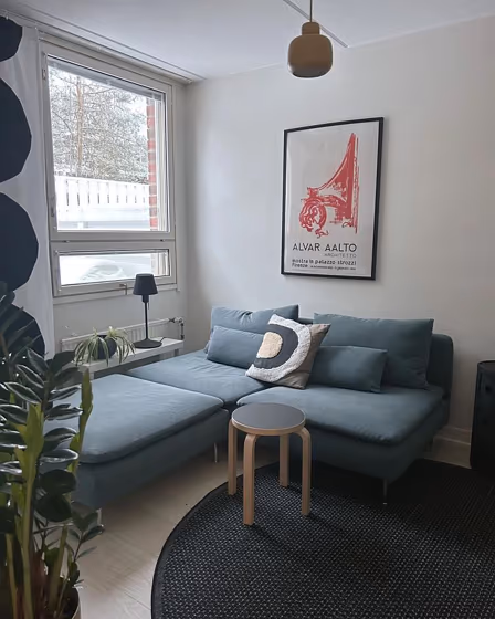
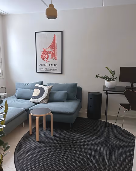
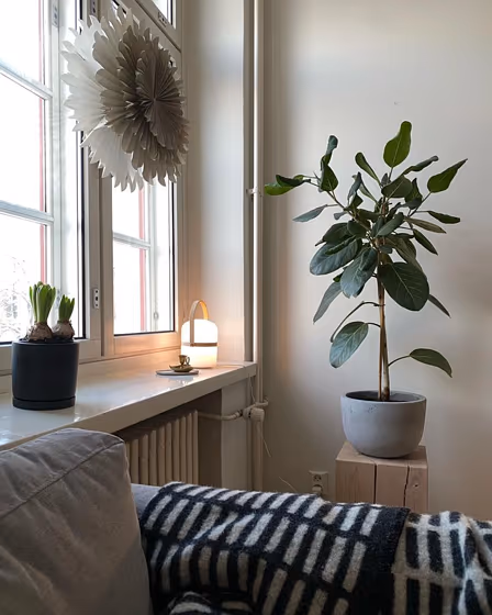
Experience serenity and sophistication with Tikkurila G485 Canvas, a timeless blend of warm gray undertones that infuse any space with tranquility. This versatile hue pairs seamlessly with accents in Tikkurila Y354 Secret Moss or Tikkurila Y487 Pure Shadow for a harmonious and elegant look. Create a modern yet cozy atmosphere by combining G485 Canvas with furnishings in Tikkurila G457 Cloudy Day or Tikkurila G320 Rustic Earth. Elevate your décor with this stylish and inviting color that effortlessly complements both bold and neutral tones, making it a perfect choice for any interior design project.
Loading...
LRV of Canvas
Canvas has an LRV of 77.85% and refers to Off‑White colors that reflect a lot of light. Why LRV is important?

Light Reflectance Value measures the amount of visible and usable light that reflects from a painted surface.
Simply put, the higher the LRV of a paint color, the brighter the room you will get.
The scale goes from 0% (absolute black, absorbing all light) to 100% (pure white, reflecting all light).
Act like a pro: When choosing paint with an LRV of 77.85%, pay attention to your bulbs' brightness. Light brightness is measured in lumens. The lower the paint's LRV, the higher lumen level you need. Every square foot of room needs at least 40 lumens. That means for a 200 ft2 living room you'll need about 8000 lumens of light – e.g., eight 1000 lm bulbs.
Color codes
We have collected almost every possible color code you could ever need.
Not sure what the difference between HEX and RGB is? We break down color models in plain language. Understanding color models
| Format | Code |
|---|---|
| HEX | #E9E4DB |
| RGB Decimal | 233, 228, 219 |
| RGB Percent | 91.37%, 89.41%, 85.88% |
| HSV | Hue: 39° Saturation: 6.01% Value: 91.37% |
| HSL | hsl(39, 24, 89) |
| CMYK | Cyan: 0.0 Magenta: 2.15 Yellow: 6.01 Key: 8.63 |
| YIQ | Y: 228.469 I: 5.872 Q: -1.743 |
| XYZ | X: 74.131 Y: 77.925 Z: 78.134 |
| CIE Lab | L:90.746 a:0.135 b:4.988 |
| CIE Luv | L:90.746 u:3.38 v:7.507 |
| Decimal | 15328475 |
| Hunter Lab | 88.275, -4.583, 9.314 |