Sherwin Williams Turquish SW 6939
Contentsshow +hide -
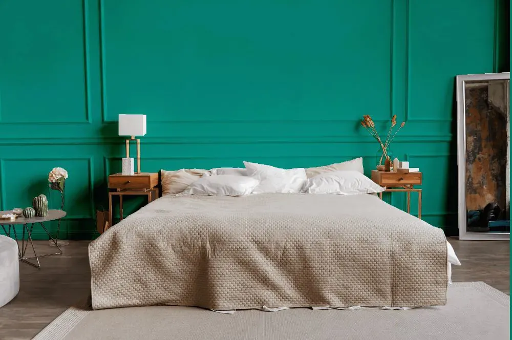
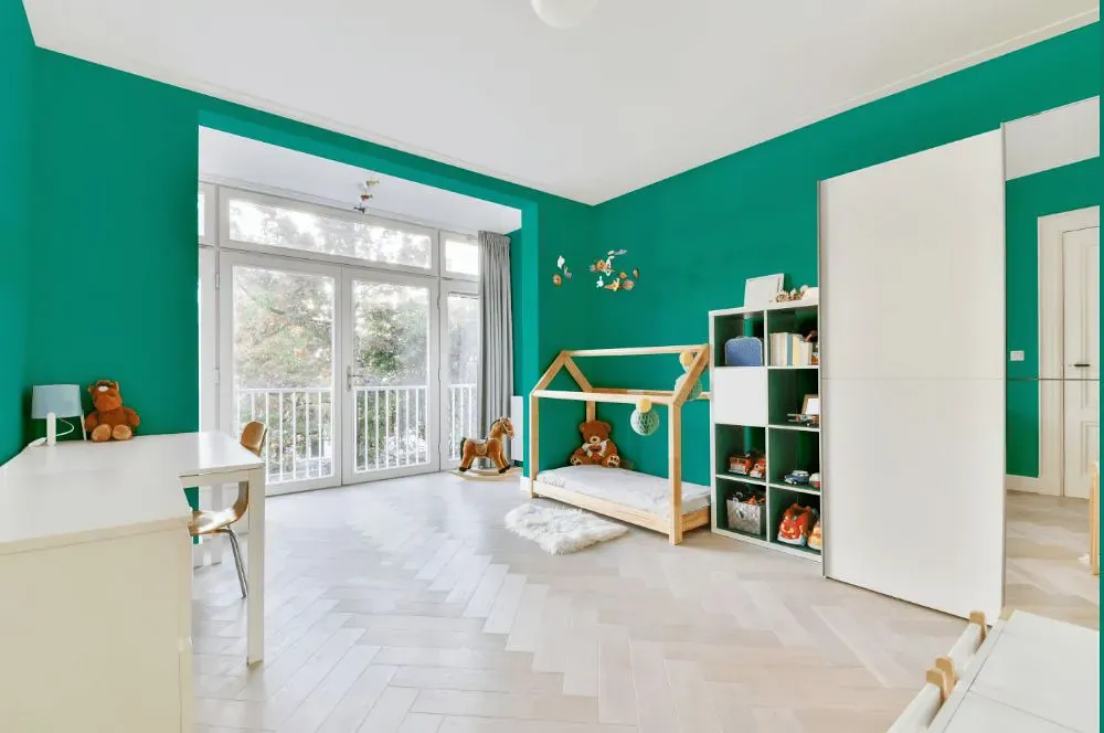
- Turquish for bedroom (1 photo)
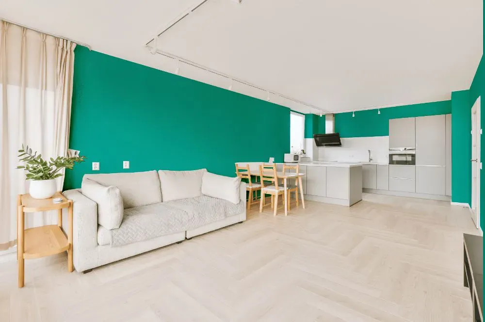
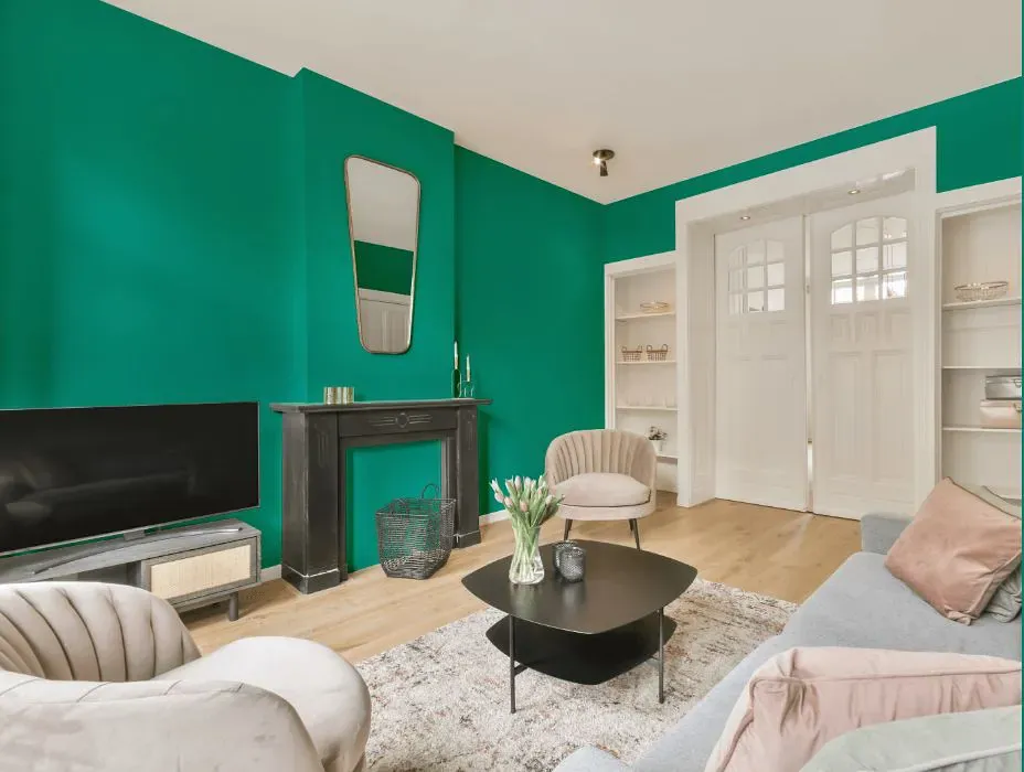
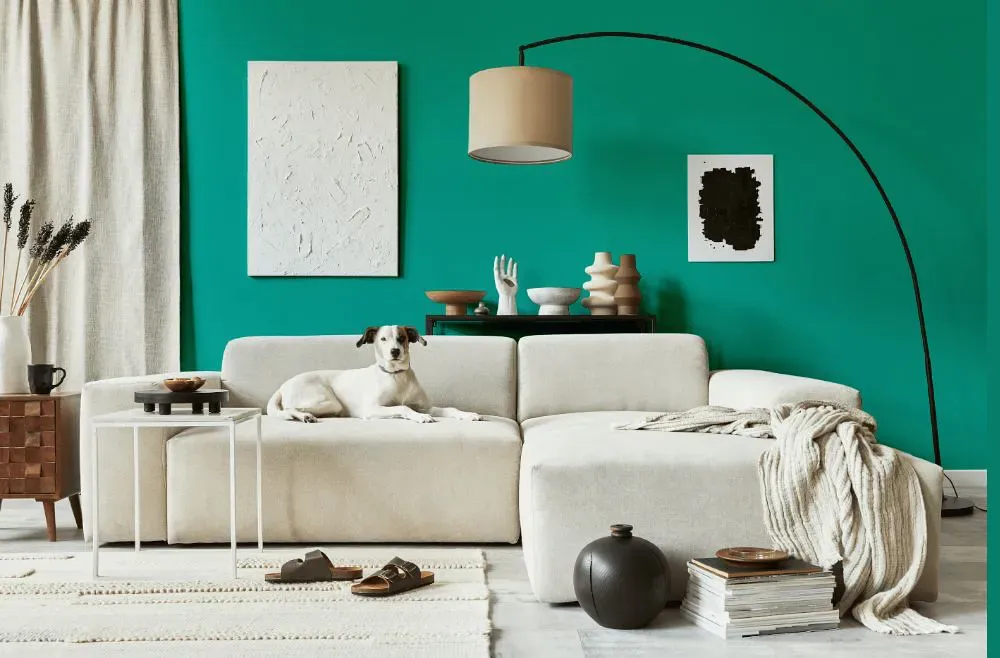
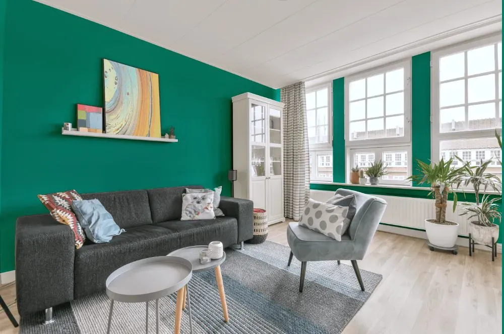
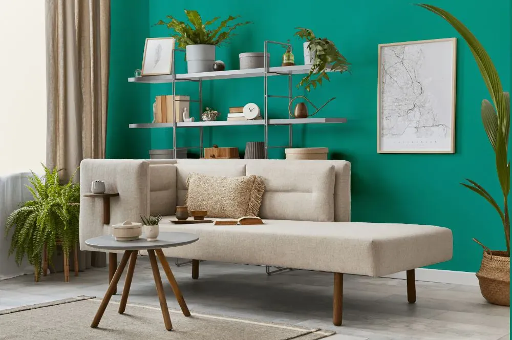
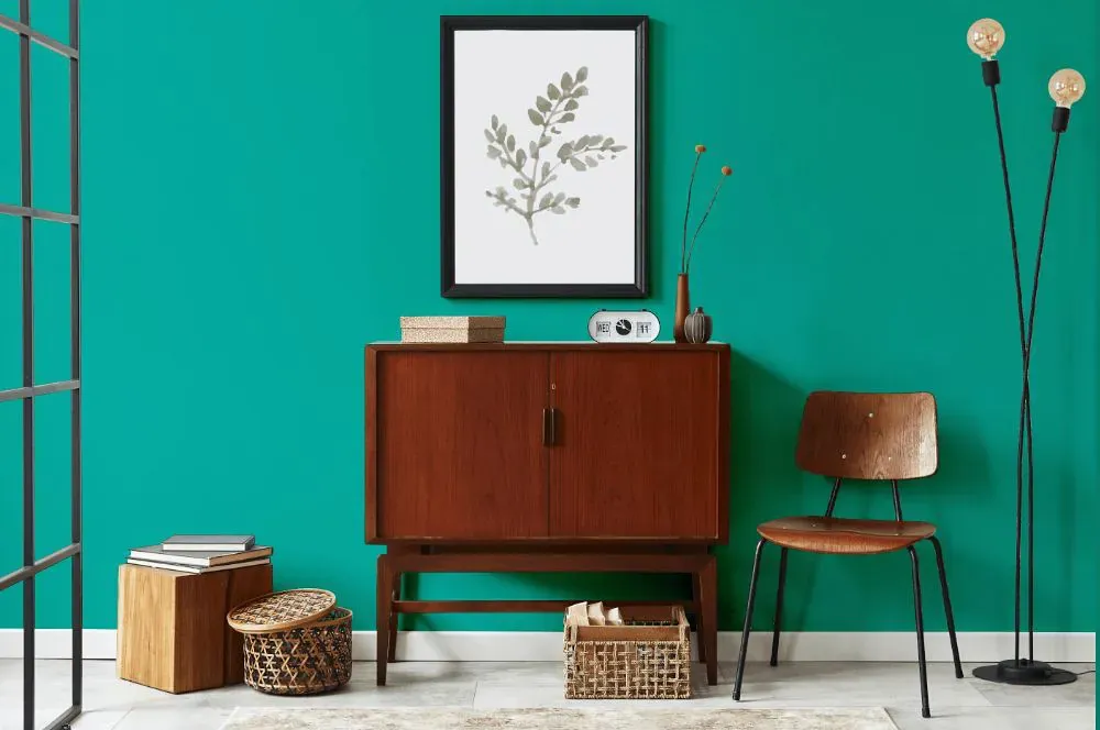
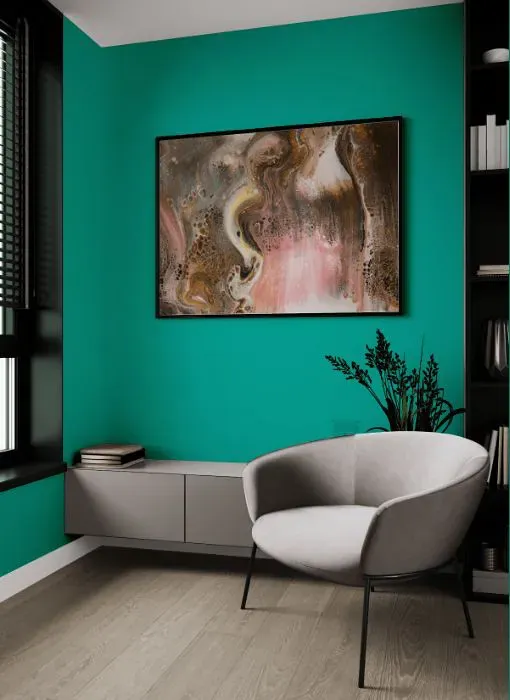
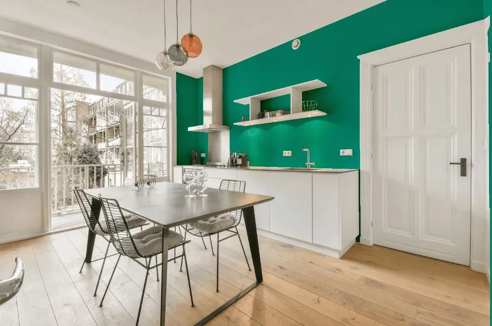
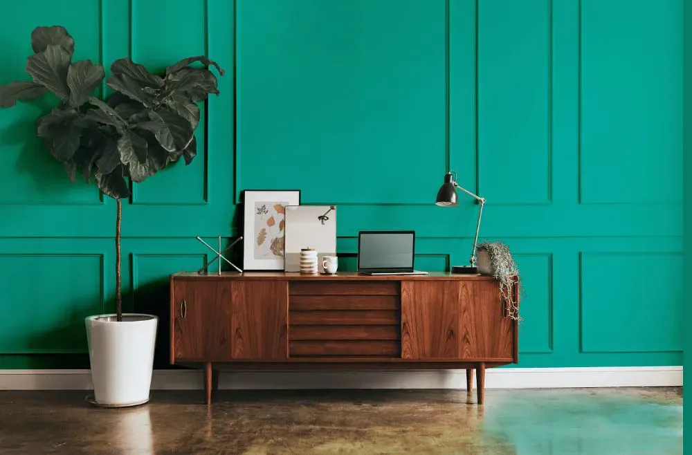
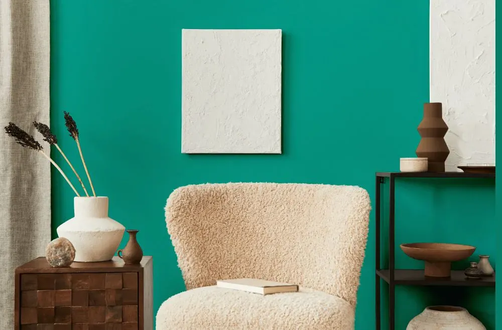
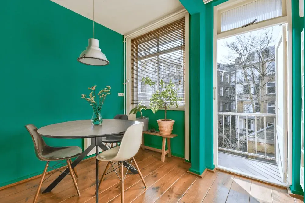
- Turquish for living room (7 photos)
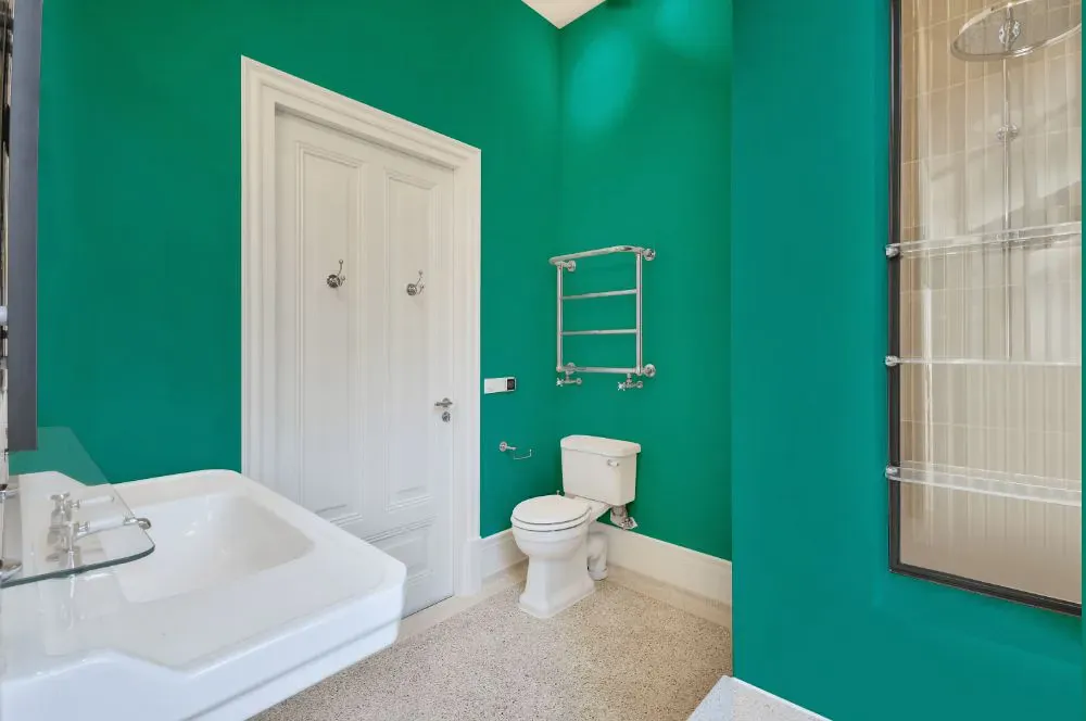
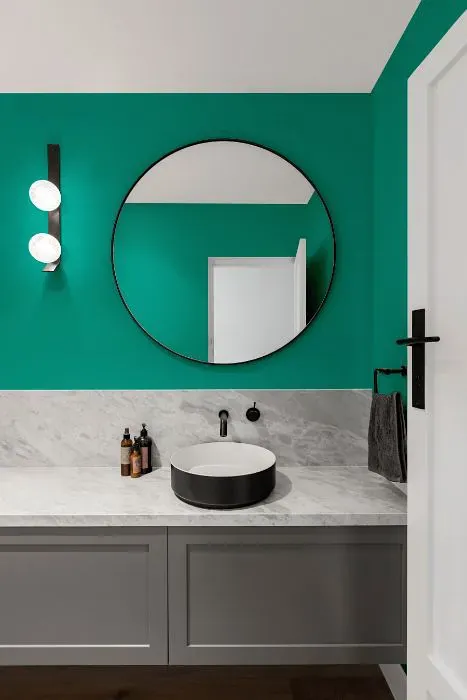
- Sherwin Williams Turquish for bathroom (2 photos)
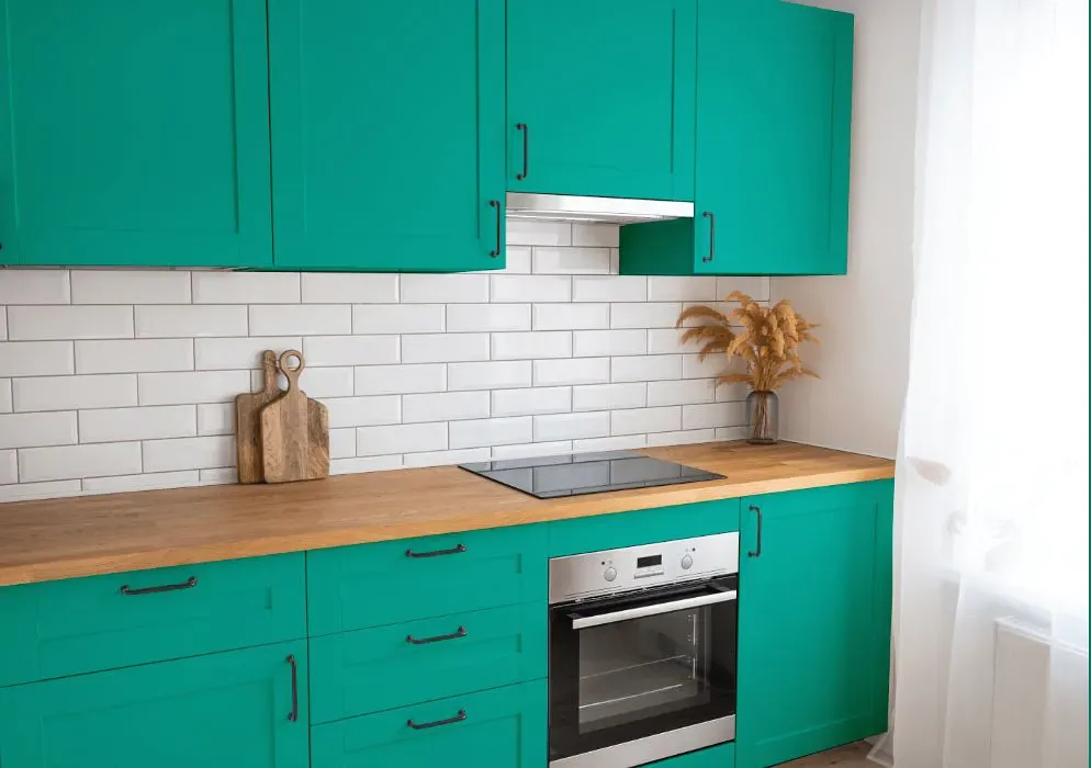
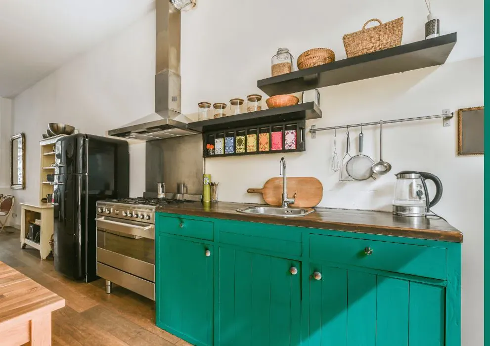
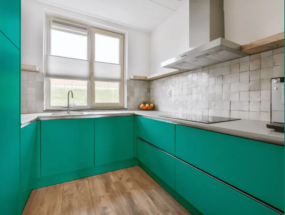
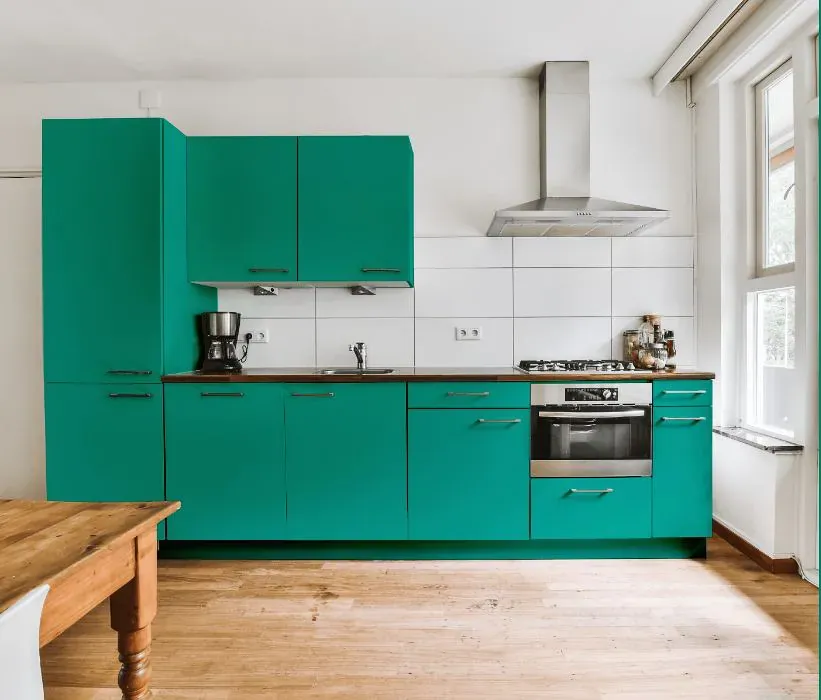
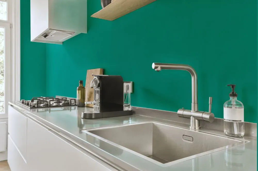
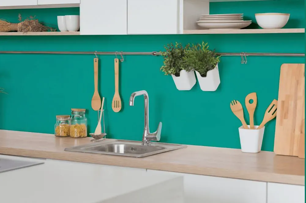
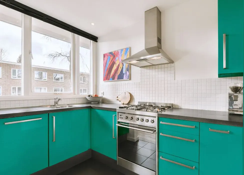
- Sherwin Williams SW 6939 on kitchen cabinets (4 photos)
- Sherwin Williams Turquish reviews (9 photos)
- What are Sherwin Williams Turquish undertones?
- Is Turquish SW 6939 cool or warm?
- How light temperature affects on Turquish
- Monochromatic color scheme
- Complementary color scheme
- Color comparison and matching
- LRV of Turquish SW 6939
- Color codes
- Color equivalents
| Official page: | Turquish SW 6939 |
| Code: | SW 6939 |
| Name: | Turquish |
| Brand: | Sherwin Williams |
What color is Sherwin Williams Turquish?
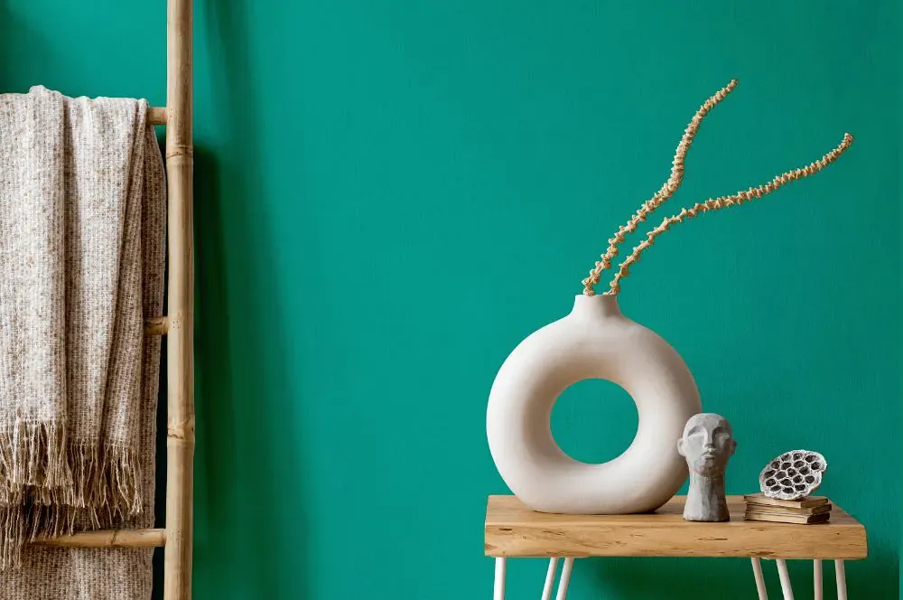
Enhance your space with the captivating allure of Sherwin Williams SW 6939 Turquish. This vibrant hue exudes a sense of tranquility and sophistication, making it a perfect choice for creating a statement wall or adding a pop of color to any room. Pair Turquish with neutral shades like SW 7008 Alabaster or SW 7036 Accessible Beige for a balanced and harmonious look. For a more daring approach, complement Turquish with SW 6864 Dynamo or SW 6283 Thistle, creating a dynamic and modern color palette that is sure to impress. Elevate your interior design with the timeless beauty of Turquish from Sherwin Williams.
Loading...
LRV of Turquish
Turquish has an LRV of 27.2% and refers to Medium colors that reflect a lot of light. Why LRV is important?

Light Reflectance Value measures the amount of visible and usable light that reflects from a painted surface.
Simply put, the higher the LRV of a paint color, the brighter the room you will get.
The scale goes from 0% (absolute black, absorbing all light) to 100% (pure white, reflecting all light).
Act like a pro: When choosing paint with an LRV of 27.2%, pay attention to your bulbs' brightness. Light brightness is measured in lumens. The lower the paint's LRV, the higher lumen level you need. Every square foot of room needs at least 40 lumens. That means for a 200 ft2 living room you'll need about 8000 lumens of light – e.g., eight 1000 lm bulbs.
Color codes
We have collected almost every possible color code you could ever need.
Not sure what the difference between HEX and RGB is? We break down color models in plain language. Understanding color models
| Format | Code |
|---|---|
| HEX | #01a192 |
| RGB Decimal | 1, 161, 146 |
| RGB Percent | 0.39%, 63.14%, 57.25% |
| HSV | Hue: 174° Saturation: 99.38% Value: 63.14% |
| HSL | hsl(174, 99, 32) |
| CMYK | Cyan: 99.38 Magenta: 0.0 Yellow: 9.32 Key: 36.86 |
| YIQ | Y: 111.45 I: -90.524 Q: -38.514 |
| XYZ | X: 17.943 Y: 27.569 Z: 31.562 |
| CIE Lab | L:59.498 a:-38.593 b:-2.194 |
| CIE Luv | L:59.498 u:-47.519 v:2.499 |
| Decimal | 106898 |
| Hunter Lab | 52.506, -30.888, 1.115 |