Tikkurila V497
Contentsshow +hide -
| Code: | V497 |
| Name: | |
| Brand: | Tikkurila |
What color is Tikkurila V497?
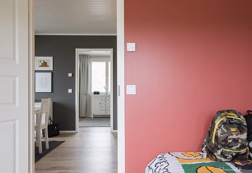
The Tikkurila V497 color, also known as Lush Green, brings a vibrant and refreshing touch to any space. This rich hue pairs beautifully with soft neutrals like Beige 1973 to create a harmonious balance, while also standing out against deep shades like Moody Blue 5588 for a bold contrast. Infusing a room with Tikkurila V497 adds a lively and invigorating atmosphere that works well in both modern and traditional settings. Its versatility allows for endless possibilities in interior design, making it a versatile and exciting choice for any home decor project.
Loading...
LRV of V497
V497 has an LRV of 15.07% and refers to Medium Dark which means that this color reflects very little light. Why LRV is important?

Light Reflectance Value measures the amount of visible and usable light that reflects from a painted surface.
Simply put, the higher the LRV of a paint color, the brighter the room you will get.
The scale goes from 0% (absolute black, absorbing all light) to 100% (pure white, reflecting all light).
Act like a pro: When choosing paint with an LRV of 15.07%, pay attention to your bulbs' brightness. Light brightness is measured in lumens. The lower the paint's LRV, the higher lumen level you need. Every square foot of room needs at least 40 lumens. That means for a 200 ft2 living room you'll need about 8000 lumens of light – e.g., eight 1000 lm bulbs.
Color codes
We have collected almost every possible color code you could ever need.
Not sure what the difference between HEX and RGB is? We break down color models in plain language. Understanding color models
| Format | Code |
|---|---|
| HEX | #6D6C67 |
| RGB Decimal | 109, 108, 103 |
| RGB Percent | 42.75%, 42.35%, 40.39% |
| HSV | Hue: 50° Saturation: 5.5% Value: 42.75% |
| HSL | hsl(50, 3, 42) |
| CMYK | Cyan: 0.0 Magenta: 0.92 Yellow: 5.5 Key: 57.25 |
| YIQ | Y: 107.729 I: 2.203 Q: -1.344 |
| XYZ | X: 14.117 Y: 14.956 Z: 14.971 |
| CIE Lab | L:45.573 a:-0.612 b:2.933 |
| CIE Luv | L:45.573 u:0.85 v:3.953 |
| Decimal | 7171175 |
| Hunter Lab | 38.673, -2.518, 4.118 |