Tikkurila Plaster X487

Code:X487
Name:Plaster
Brand:Tikkurila

What color is Tikkurila Plaster?

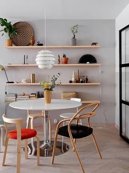
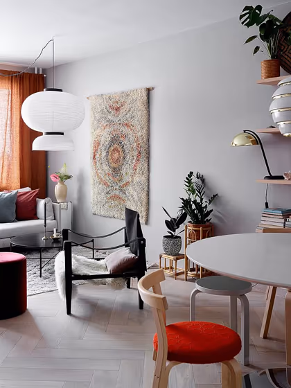
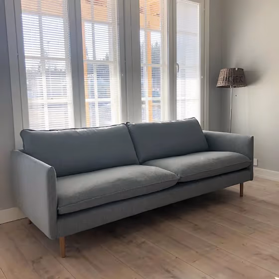
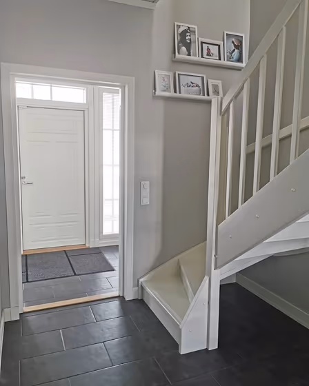
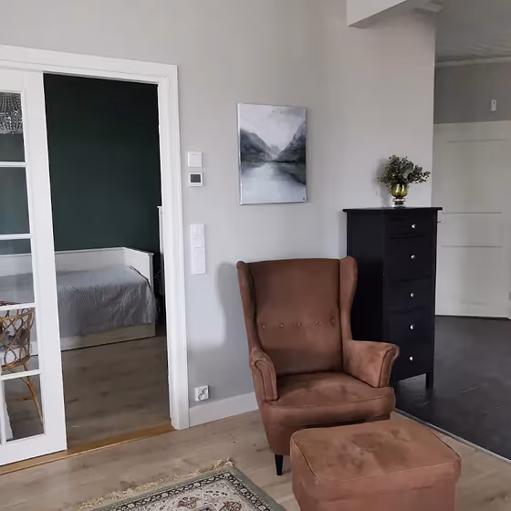
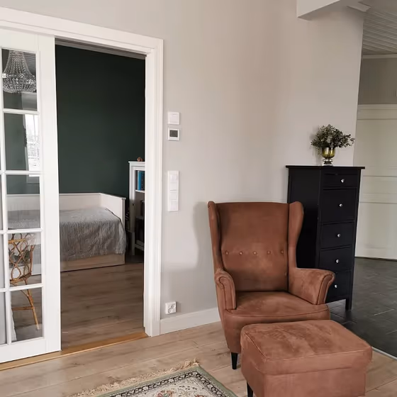
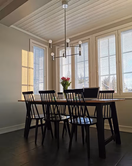
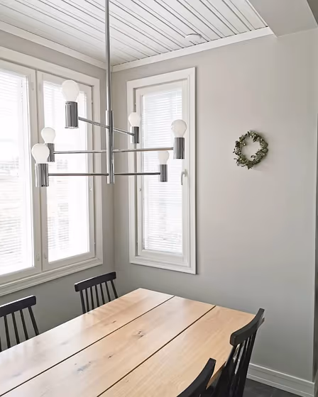
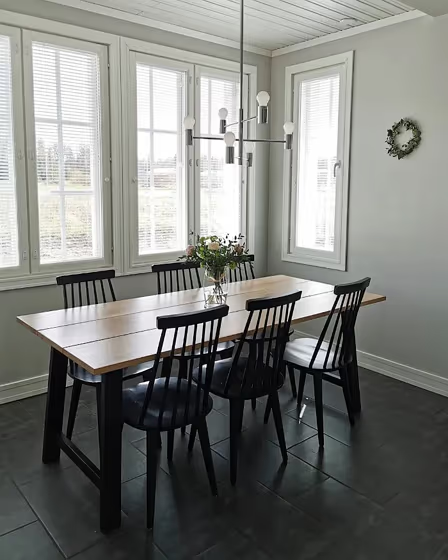
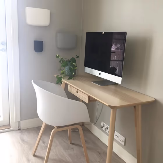
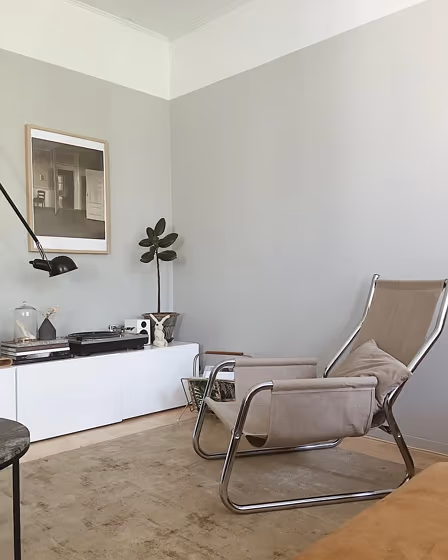
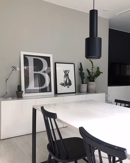
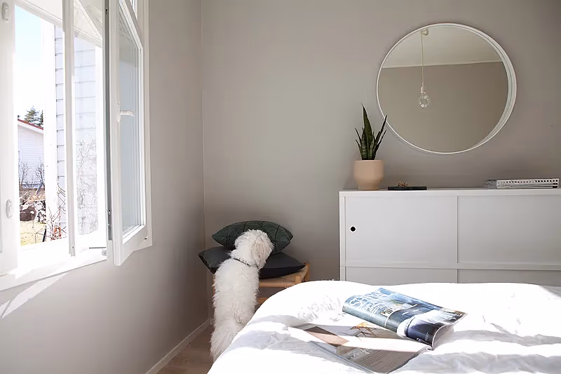
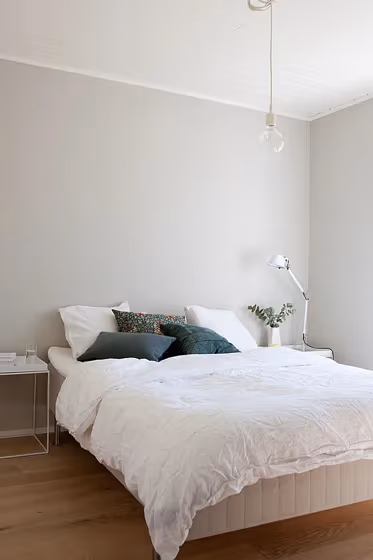
Immerse yourself in the timeless elegance of Tikkurila Plaster (X487). This warm and inviting hue brings a sense of tranquility and sophistication to any space. Ideal for living rooms, bedrooms, and home offices, the versatility of this color effortlessly creates a soothing ambiance. Whether you're looking to add a touch of refinement or create a cozy retreat, Tikkurila X487 Plaster is the perfect choice to enhance your decor. Embrace the understated beauty of this lovely shade and transform your room into a sanctuary of comfort and style.

Tikkurila Plaster reviews

Interior with paint color Tikkurila Plaster X487
Design Stories
Interior with paint color Tikkurila Plaster X487
Design Stories
Interior with paint color Tikkurila Plaster X487
Image source
Interior with paint color Tikkurila Plaster X487
Image source
Interior with paint color Tikkurila Plaster X487
Image source
Interior with paint color Tikkurila Plaster X487
Image source
Interior with paint color Tikkurila Plaster X487
Image source
Interior with paint color Tikkurila Plaster X487
Image source
Interior with paint color Tikkurila Plaster X487
Image source
Dining room with greige walls Tikkurila Plaster
@oiaurora_
Interior with paint color Tikkurila Plaster X487
Source link not active
Interior with paint color Tikkurila Plaster X487
Image source
Interior with paint color Tikkurila Plaster X487
Image source
Interior with paint color Tikkurila Plaster X487
Image source
Interior with paint color Tikkurila Plaster X487
Image source
Interior with paint color Tikkurila Plaster X487
Image source
Interior with paint color Tikkurila Plaster X487
Image source
Interior with paint color Tikkurila Plaster X487
Image source
Kitchen with white metro tiles and wall paint Plaster X487
Prosto Remont
Interior with paint color Tikkurila Plaster X487
Image source
Interior with paint color Tikkurila Plaster X487
Image source

View the photos of real spaces painted with this that were not included in specific categories.Close-ups, painted furniture, storages and dressers, hallways, stairs and ceilings.

What are Tikkurila Plaster undertones?

The undertone of Plaster can be accurately described as a Red hue, as is apparent from the color space provided. By isolating the pure hue and eliminating any tints, tones, and shades, we were able to precisely determine its undertone. This approach has proven to be more accurate than traditional methods of defining undertones on a white background, which are now considered outdated.

R
G
B

HEX value

HEX value:

#C8C4BB

RGB code:

200, 196, 187

Is Tikkurila Plaster X487 cool or warm?

warm
Color wheel
cool

With a hue of 42° this Grey refers warm paint shade according to HSL (Hue, Saturation, Lightness) on the color wheel.

X487 Plaster HSL code: 42, 11%, 76%

Hue - degree on a color wheel from 0 to 360. 0 is red, 120 is green, and 240 is blue.
Saturation is expressed as a percentage. At 0%, it appears as a shade of grey, and at 100%, it is in full color..
Lightness is also a percentage value. 0% is black, and 100% is white.

  • Warm colors are ideal for kitchens, living rooms or bathrooms
  • Warmer hues make larger spaces feel more inviting
  • Warm grey shades are versatile and provide a neutral canvas for your interior design. They seamlessly complement any style, whether it's Victorian, Scandinavian, or Modern.
  • Warm beige shades create a cozy and inviting atmosphere, making any room feel comfortable and welcoming, perfect for living rooms, bedrooms, and hallways.
  • Warm greige shades combine the warmth of beige with the modernity of grey, offering a versatile and inviting backdrop for living rooms, dining areas, and bedrooms.
  • To prevent a space from feeling too monotonous, consider pairing warm light shades with richer tones like deep greens or browns, or adding textures through fabrics and furnishings. Avoid using them in rooms with limited natural light, as they may appear too dull or yellowish

Act like a pro: Mixing warm and cool shades is a must have to get harmonius interior. Add accents that contrast with the primary color to create visual balance. If your walls are a warm color, don’t forget to add accent in cold colors (furniture, art, décor). A good practice is too use a complementary color scheme.

Coordinating colors.
Colors that go with Tikkurila Plaster:

Monochromatic color scheme

Monochromatic color scheme

This scheme consists of various shades, tints, and tones of a single color. While it offers a perfect combination of hues, without accent decor, it may become monotonous.

Lighter shades

Darker shades

Complementary color scheme

Complementary color scheme

This color scheme is a combination of two shades that are opposite each other on the color wheel. The high contrast between these colors creates a vibrant and dynamic visual effect.

X487
Plaster

Compare Plaster to any other colors

Compare colors
arrow