Tikkurila Batiste G487
Contentsshow +hide -
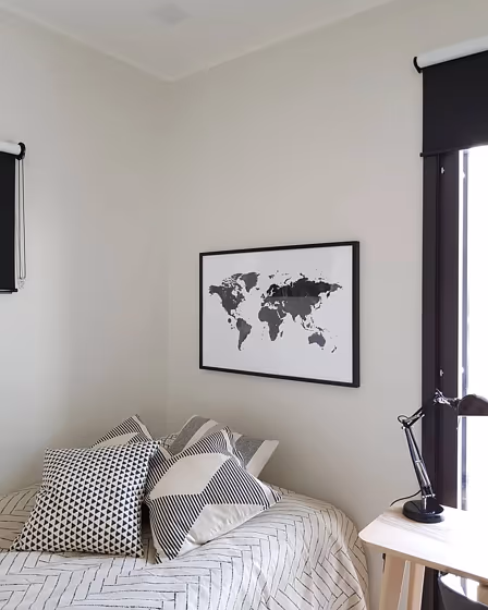
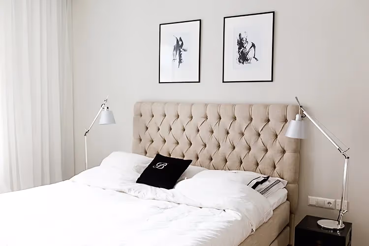
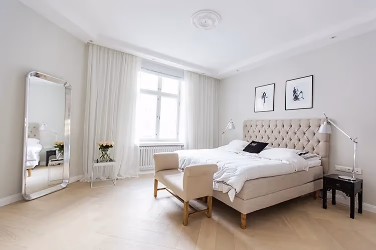
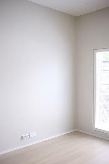
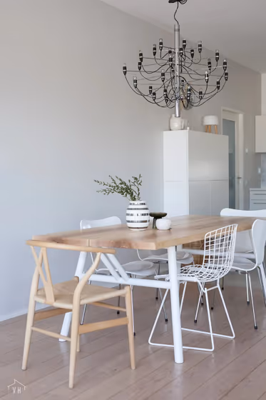
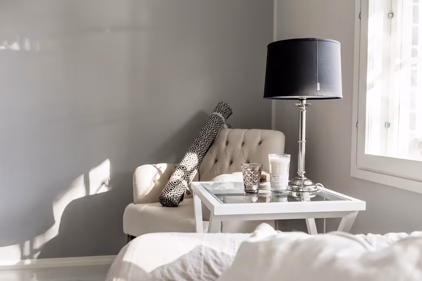
- Batiste for bedroom (3 photos)
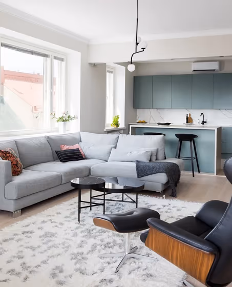
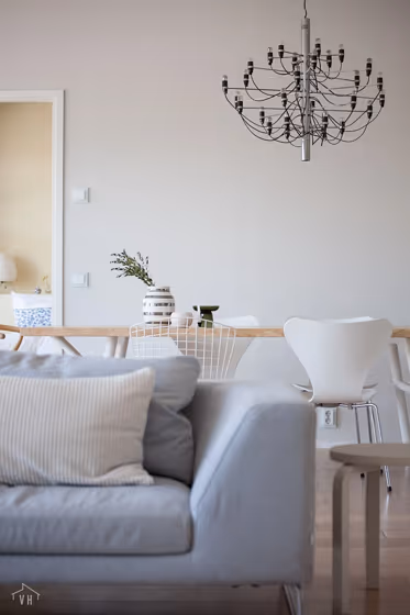
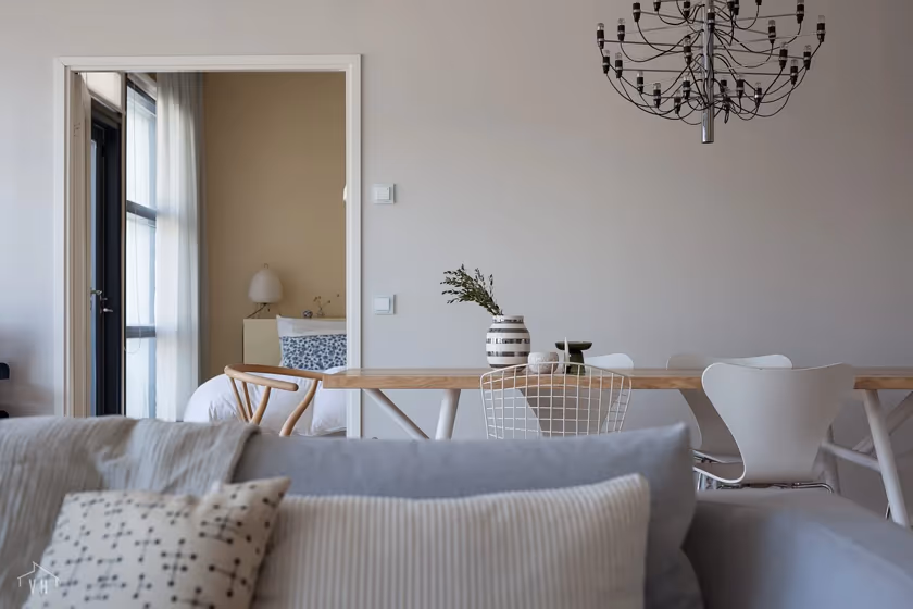
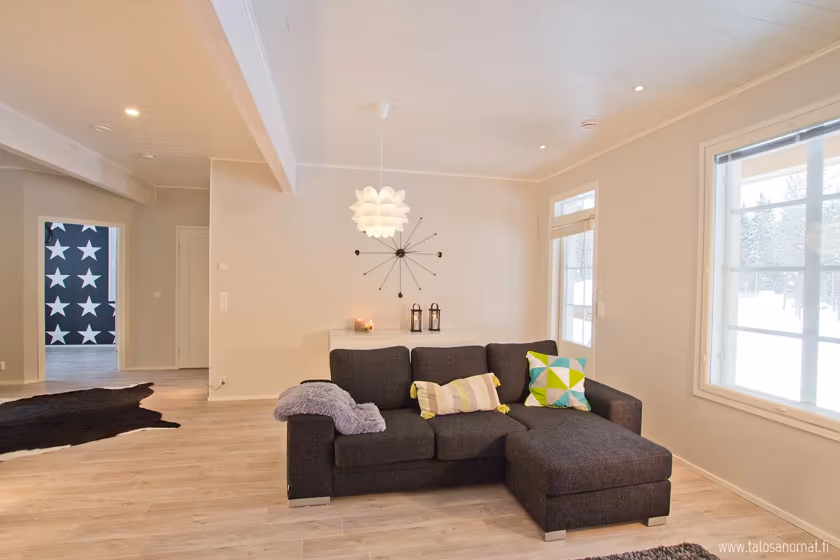
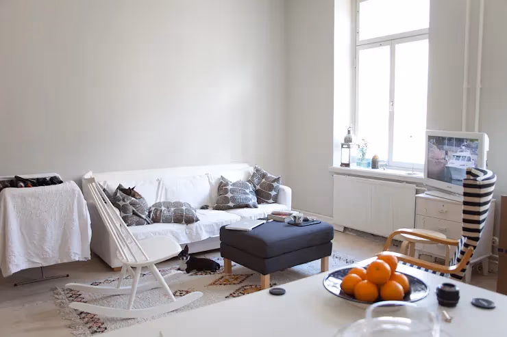
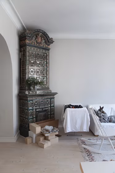
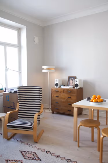
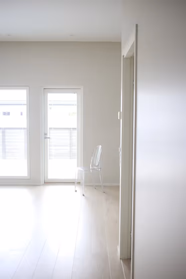
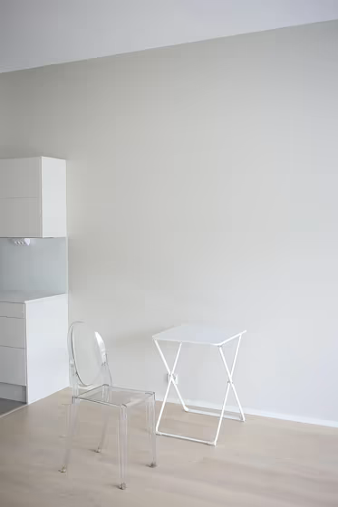
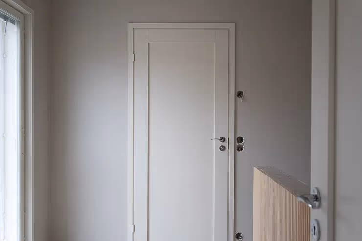
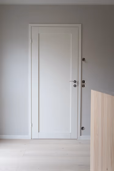
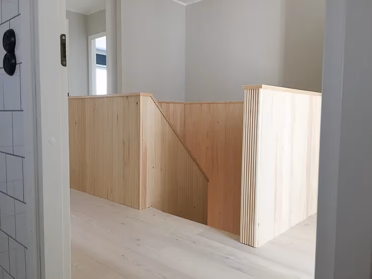
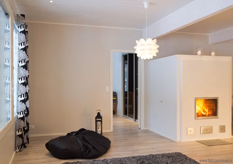
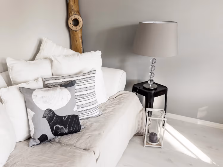
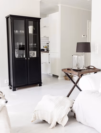
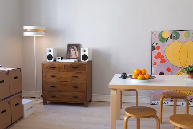
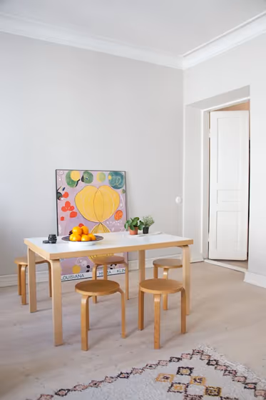
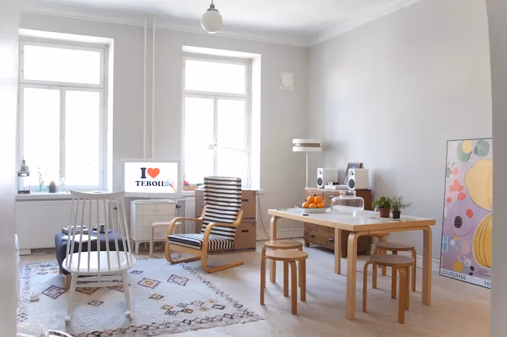
- Batiste for living room (7 photos)
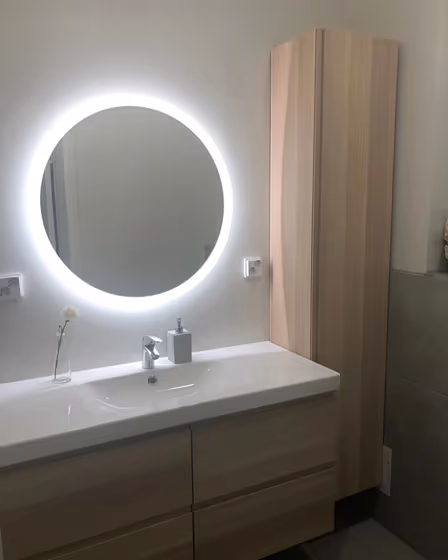
- Tikkurila Batiste for bathroom (1 photo)
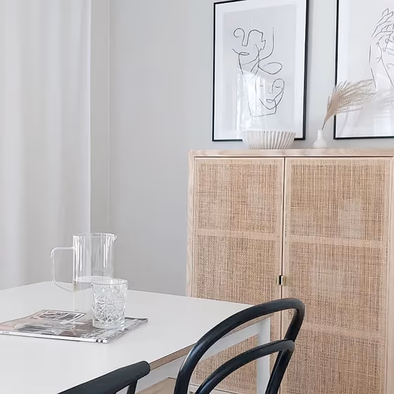
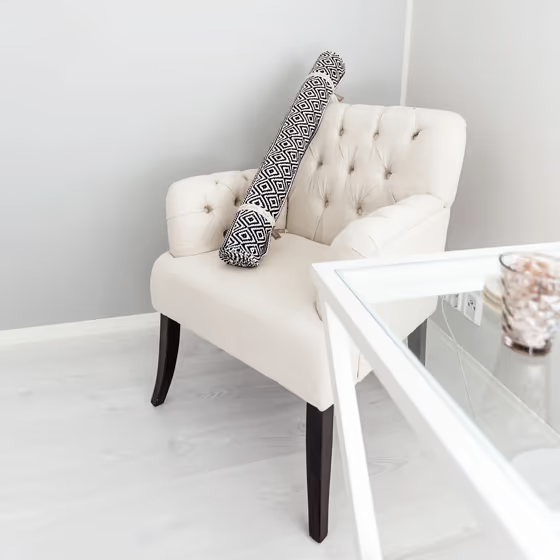
- Tikkurila Batiste reviews (17 photos)
- What are Tikkurila Batiste undertones?
- Is Batiste G487 cool or warm?
- How light temperature affects on Batiste
- Monochromatic color scheme
- Complementary color scheme
- Color comparison and matching
- LRV of Batiste G487
- Color codes
- Color equivalents
| Code: | G487 |
| Name: | Batiste |
| Brand: | Tikkurila |
What color is Tikkurila Batiste?
Tikkurila G487 Batiste is a soft and creamy off-white color that exudes warmth and sophistication. This neutral shade effortlessly complements a range of colors, including deep navy blue like Tikkurila N499 Azure Abyss, soft gray like Tikkurila S150 Foggy Day, and warm beige like Tikkurila Y354 Golden Field. When paired with these colors, Tikkurila G487 Batiste creates a harmonious and inviting color palette that is perfect for creating a serene and timeless interior space. Whether used as the main wall color or as an accent, Tikkurila G487 Batiste adds a touch of elegance and tranquility to any room.
Loading...
LRV of Batiste
Batiste has an LRV of 67.11% and refers to Light colors that reflect most of the incident light. Why LRV is important?

Light Reflectance Value measures the amount of visible and usable light that reflects from a painted surface.
Simply put, the higher the LRV of a paint color, the brighter the room you will get.
The scale goes from 0% (absolute black, absorbing all light) to 100% (pure white, reflecting all light).
Act like a pro: When choosing paint with an LRV of 67.11%, pay attention to your bulbs' brightness. Light brightness is measured in lumens. The lower the paint's LRV, the higher lumen level you need. Every square foot of room needs at least 40 lumens. That means for a 200 ft2 living room you'll need about 8000 lumens of light – e.g., eight 1000 lm bulbs.
Color codes
We have collected almost every possible color code you could ever need.
Not sure what the difference between HEX and RGB is? We break down color models in plain language. Understanding color models
| Format | Code |
|---|---|
| HEX | #D9D6CE |
| RGB Decimal | 217, 214, 206 |
| RGB Percent | 85.10%, 83.92%, 80.78% |
| HSV | Hue: 44° Saturation: 5.07% Value: 85.1% |
| HSL | hsl(44, 13, 83) |
| CMYK | Cyan: 0.0 Magenta: 1.38 Yellow: 5.07 Key: 14.9 |
| YIQ | Y: 213.985 I: 4.358 Q: -1.855 |
| XYZ | X: 63.8 Y: 67.301 Z: 68.005 |
| CIE Lab | L:85.656 a:-0.384 b:4.31 |
| CIE Luv | L:85.656 u:2.172 v:6.529 |
| Decimal | 14276302 |
| Hunter Lab | 82.037, -4.747, 8.278 |