

Behr Creme Fraiche vs. Behr Inferno
The colors, each unique in their hue and saturation, embody their own individual beauty and value. It's important to note that the colors have different hues. Behr S240-1 leans towards orange hues, while Behr P190-7 is red.
Behr P190-7 is more saturated than Creme Fraiche
They differ in their values, Behr S240-1 radiating a lighter essence compared to P190-7.
Supported paint brands for comparison: Behr, Benjamin Moore, Farrow and Ball, Dulux, Jotun, Little Greene, NCS, Ral Classic, Ral Design, Ral Effect, Sherwin Williams, Valspar, Tikkurila
First color
Second color

| Behr Creme Fraiche | Behr Inferno |
|---|---|
| Shared hue scale | |
12 | |
| Hue | |
| 33°orange | 12°red |
| Saturation | |
| 44% | 69%more saturated |
| Lightness?Simple 0–100% measure derived from the minimum and maximum sRGB channels. Use CIE L* for perceptual lightness. | |
| 85% | 53%darker |
| LRV?Light Reflectance Value measures the percentage of light reflected by a color, from 0 for absolute black to 100 for pure white. | |
| 72.50 | 19.77looks darker |
| CIE L?Perceptual lightness. CIE Lab lightness ranges from 0 for black to 100 for diffuse white. | |
| 88.148 | 54.018looks darker |
| Color difference ΔE*₀₀?CIE color difference. Smaller is closer: about 0–1 is imperceptible, 1–2 just noticeable, 2–5 a small difference, 5–10 clear, and more than 10 very different. | |
| 35.376 | |
| Temperature | |
| Warm | Warm |

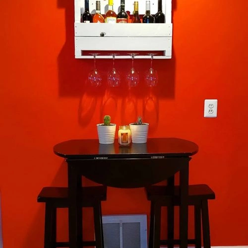

Please note that the color shown on this page is a representation and might not exactly match the real shade of the cards, fan decks, or color collections. Your monitor, browser, and screen angle can all affect how the paint looks, so it may not be the same as what you see here. All information on this page is based on RGB and HEX values provided by manufacturers.
It's important to keep in mind that the same color may appear differently on various surfaces due to the nature of those surfaces. For example, the same shade will look different on a rough wall compared to the smooth surface of cabinets.
Color comparisons featuring Behr Creme Fraiche

S240-1 Creme Fraiche vs R36D Rustic Rose


S240-1 Creme Fraiche vs 13YY 77/083 Natural Wicker

S240-1 Creme Fraiche vs OR-W12 Mourning Dove

S240-1 Creme Fraiche vs S240-2 Rice Crackers

S240-1 Creme Fraiche vs S230-3 Beech Nut

S240-1 Creme Fraiche vs N240-3 Sonoran Desert

S240-1 Creme Fraiche vs N250-2A Bali Sand

S240-1 Creme Fraiche vs OR-W02 So Much Fawn

S240-1 Creme Fraiche vs PPU4-11 Porcelain Peach

S240-1 Creme Fraiche vs 241 Skimming Stone

S240-1 Creme Fraiche vs 294 Sulking Room Pink

S240-1 Creme Fraiche vs N490-2 Icicles

S240-1 Creme Fraiche vs 2099-60 Malted Milk

S240-1 Creme Fraiche vs N100-7 Aubergine

S240-1 Creme Fraiche vs N110-5 Royal Raisin

S240-1 Creme Fraiche vs SW6696 Quilt Gold

S240-1 Creme Fraiche vs HC-186 Charleston Brown

S240-1 Creme Fraiche vs 0471 Antique White

S240-1 Creme Fraiche vs 1495 October Mist

S240-1 Creme Fraiche vs 521 Nantucket Breeze

S240-1 Creme Fraiche vs HC-111 Nantucket Gray

S240-1 Creme Fraiche vs SW6177 Softened Green

S240-1 Creme Fraiche vs CW-270 Nicolson Red

S240-1 Creme Fraiche vs 2110-50 Gobi Desert

S240-1 Creme Fraiche vs 2110-40 Seaside Sand

S240-1 Creme Fraiche vs 231 Setting Plaster

S240-1 Creme Fraiche vs 2164-60 Soft Satin

S240-1 Creme Fraiche vs 2163-60 Latte

S240-1 Creme Fraiche vs 311 Scallop

S240-1 Creme Fraiche vs S220-1 Autumn Blush

S240-1 Creme Fraiche vs OC-42 Old Prairie

S240-1 Creme Fraiche vs 2143-40 Camouflage

S240-1 Creme Fraiche vs PPU25-21 City Rain

S240-1 Creme Fraiche vs SW6167 Garden Gate

S240-1 Creme Fraiche vs SW7679 Golden Gate