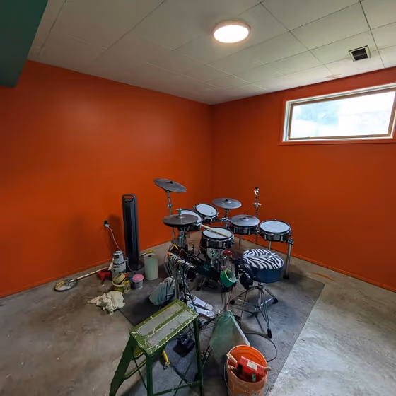
Behr Inferno P190-7
Contentsshow +hide -
| Code: | P190-7 |
| Name: | Inferno |
| Brand: | Behr |
What color is Behr Inferno?
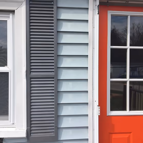
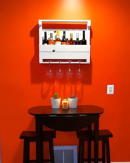
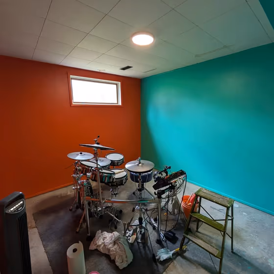
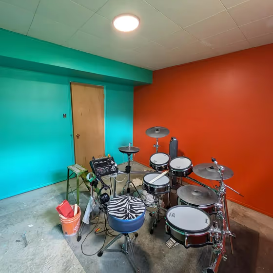
Behr's P190-7 Inferno is a rich and dynamic shade that brings warmth and depth to any space. This bold red with undertones of burgundy and brown creates a cozy and inviting atmosphere perfect for a living room or dining area. Pair Inferno with crisp white accents to make the color pop, or combine it with beige and gold elements for a luxurious look. For a modern twist, consider complementing Inferno with hints of charcoal gray or deep navy blue to create a sophisticated color palette. Whether used as a statement wall or throughout the room, Inferno adds a touch of drama and elegance to any decor scheme.
Loading...
LRV of Inferno
Inferno has an LRV of 19.77% and refers to Medium Dark which means that this color reflects very little light. Why LRV is important?

Light Reflectance Value measures the amount of visible and usable light that reflects from a painted surface.
Simply put, the higher the LRV of a paint color, the brighter the room you will get.
The scale goes from 0% (absolute black, absorbing all light) to 100% (pure white, reflecting all light).
Act like a pro: When choosing paint with an LRV of 19.77%, pay attention to your bulbs' brightness. Light brightness is measured in lumens. The lower the paint's LRV, the higher lumen level you need. Every square foot of room needs at least 40 lumens. That means for a 200 ft2 living room you'll need about 8000 lumens of light – e.g., eight 1000 lm bulbs.
Color codes
We have collected almost every possible color code you could ever need.
Not sure what the difference between HEX and RGB is? We break down color models in plain language. Understanding color models
| Format | Code |
|---|---|
| HEX | #da5736 |
| RGB Decimal | 218, 87, 54 |
| RGB Percent | 85.49%, 34.12%, 21.18% |
| HSV | Hue: 12° Saturation: 75.23% Value: 85.49% |
| HSL | hsl(12, 69, 53) |
| CMYK | Cyan: 0.0 Magenta: 60.09 Yellow: 75.23 Key: 14.51 |
| YIQ | Y: 122.407 I: 88.667 Q: 17.442 |
| XYZ | X: 32.991 Y: 21.993 Z: 5.997 |
| CIE Lab | L:54.019 a:49.582 b:44.629 |
| CIE Luv | L:54.019 u:104.38 v:36.061 |
| Decimal | 14309174 |
| Hunter Lab | 46.896, 43.503, 25.246 |