

Behr Peaceful Blue vs. Behr Opal Silk
The colors, each unique in their hue and saturation, embody their own individual beauty and value. It's important to note that the colors have different hues. Behr S470-3 leans towards hues, while Behr PPU12-08 is .
Behr S470-3 and Behr PPU12-08 differ significantly in saturation. Behr S470-3 is more saturated.
Despite their differences, both colors share a similar value, Behr S470-3 radiating a lighter essence compared to PPU12-08.
Supported paint brands for comparison: Behr, Benjamin Moore, Farrow and Ball, Dulux, Jotun, Little Greene, NCS, Ral Classic, Ral Design, Ral Effect, Sherwin Williams, Valspar, Tikkurila
First color
Second color

Lightness value from CIE Lab color space.
Values from 0 (black) to 100 (diffuse white)
Smaller is closer:
~0–1 (imperceptible),
1–2 (just noticeable),
2–5 (small difference),
5–10 (clear),
more than 10 (very different).
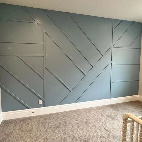


Please note that the color shown on this page is a representation and might not exactly match the real shade of the cards, fan decks, or color collections. Your monitor, browser, and screen angle can all affect how the paint looks, so it may not be the same as what you see here. All information on this page is based on RGB and HEX values provided by manufacturers.
It's important to keep in mind that the same color may appear differently on various surfaces due to the nature of those surfaces. For example, the same shade will look different on a rough wall compared to the smooth surface of cabinets.
Color comparisons featuring Behr Peaceful Blue

S470-3 Peaceful Blue vs OC-111 Corinthian White


S470-3 Peaceful Blue vs 291 School House White

S470-3 Peaceful Blue vs MQ6-51 Fern Leaf

S470-3 Peaceful Blue vs AF-575 Instinct

S470-3 Peaceful Blue vs 1667 Blue Haze

S470-3 Peaceful Blue vs N490-3 Shaved Ice

S470-3 Peaceful Blue vs N240-2 Adobe Sand

S470-3 Peaceful Blue vs N460-1 Evening White

S470-3 Peaceful Blue vs 709 Heavenly Blue

S470-3 Peaceful Blue vs 2135-50 Soft Chinchilla

S470-3 Peaceful Blue vs CW-565 Anderson Blue

S470-3 Peaceful Blue vs SW7551 Greek Villa

S470-3 Peaceful Blue vs OC-65 Chantilly Lace

S470-3 Peaceful Blue vs SW7683 Buff

S470-3 Peaceful Blue vs SW6866 Heartthrob

S470-3 Peaceful Blue vs N140-1 White City

S470-3 Peaceful Blue vs UPW Ultra Pure White

S470-3 Peaceful Blue vs MQ3-27 Etched Glass

S470-3 Peaceful Blue vs 3003-10C Cream in My Coffee

S470-3 Peaceful Blue vs MQ2-27 Studio Clay

S470-3 Peaceful Blue vs M243 Mushroom Risotto

S470-3 Peaceful Blue vs 20YY 43/083 Ancient Artefact

S470-3 Peaceful Blue vs N210-2 Cappuccino Froth

S470-3 Peaceful Blue vs PPU7-18 Sand Pearl

S470-3 Peaceful Blue vs 290E-1 Weathered Sandstone

S470-3 Peaceful Blue vs N290-1 Original White

S470-3 Peaceful Blue vs N290-3 Comfy Beige

S470-3 Peaceful Blue vs OR-W07 Spanish Sand

S470-3 Peaceful Blue vs 2005-6C Subtle Suede

S470-3 Peaceful Blue vs 2005-7B Terra Cotta Trail

S470-3 Peaceful Blue vs 111 Rio Rancho Clay

S470-3 Peaceful Blue vs 11173 Humble Yellow

S470-3 Peaceful Blue vs 1031 Carlisle Cream

S470-3 Peaceful Blue vs 2001-10C Santa Fe Spirit

S470-3 Peaceful Blue vs 2001-2C Apricot Ice

S470-3 Peaceful Blue vs 2008-8A Friendly Tan